Fall Critique
-
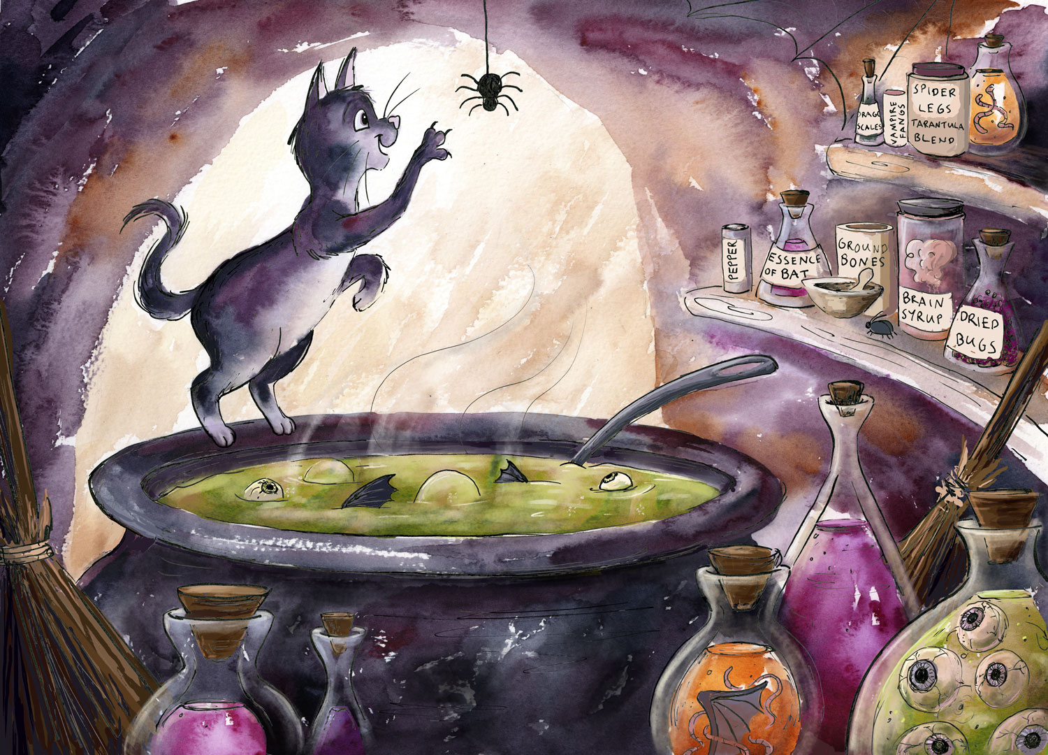
So I need to submit a piece for Fall Critique, and since I was planning on finishing my second 3rd Thursday sketch from last month anyway, that seemed a good fit. I've got this far....I've tried to stick to my previous 'loose' style that I was working on with my little sketches, but with a detailed piece and textures like glass, I still needed to make those details work...but I don't want to over-work the piece either. So now I'm not sure what to do, whether it is finished or whether I should work on parts of it more. Critique/suggestions welcome....
-
@Dulcie I think this is a marvelous piece and I would stop working on it and not change anything about it! It is perfectly balanced in color, texture and details, and very appealing. The texture of the walls is wonderful - makes me feel like trying out watercolor again (we had a love-hate affair that ended with a clear separation of our ways years ago). It´s like Lee White mixed with Quentin Blake...well, no, actually it is Dulcie all along and really nice!
I will contradict myself - there is one thing I would change if it is possible (but I do not know if it is at this stage). There is a near tangent between the opening at the back and the cat´s years. It is not something very glaring, but if there is a chance I would slightly raise the top of the arch and clear the cat from that edge.
Everything else is just perfect! -
I lover this. The eye balls and the bat wing in the bottle. Really nice work.
-
@smceccarelli - thank you so much for your lovely encouraging words - it’s so helpful to know that the style is working here and I can call it very nearly finished. Thank you also for the suggestion to remove the tangent, I should be able to fix that. I really enjoy both Lee White’s and Quentin Blake’s work (how could I not!) and both are very high up on my list of artist influences, so it makes me happy to read your comment about that
")
@evilrobot Thank you! Glad you like it, I enjoyed drawing those bits
-
@Dulcie Hi Dulcie - I think the loose style is working really nicely here. The one part I find a bit distracting in terms of the loose texture - is the arch on the left side of the image - starting around the cat's tail and going down from there. I feel like you have a cleaner/sharper line on the rest of the arch and then that part gets textured and almost distracts me a little bit. It draws my eye to that area and its not a key part of the scene.
I also notice you have some line work in the upper right, that looks like the start of a spider web. But given the size of the spider - I feel like it might help to add a few more rows to help it really read like a spider web as right now it feels unfinished there to me as well.
Otherwise I think you got some really great effects and color blends in the watercolor that really make this beautiful and serve you really well for all of the little potions and vials.
Nicely done!
-
@Dulcie Very well done. I love the scene and the colors and the cat. It's fun to look at.
-
@Pamela-Fraley Thank you very much, glad you like it!
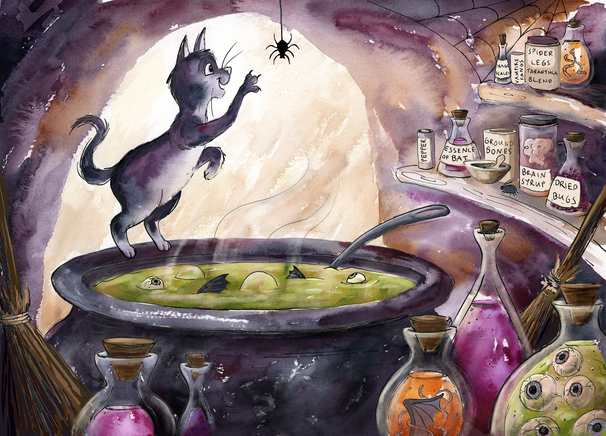
@Rich-Green Thank you for such a thoughtful and well-considered critique - good call on the spider's web. I've finished that off a bit better and also replaced the textured part of the arch...I do prefer it with a cleaner line...it looks further into the background now, to me. I wouldn't have thought of that without your advice, so thanks for that!
I also moved the cat's ears away from the arch, and re-drew the spider. Here's where I am now...hopefully pretty much finished:
-
@Dulcie So glad it was of help. I think the change to the edge of the arch really worked out nicely. The focus remains on the cat now and you are right it does push the wall back a bit which is nice.
I'd say it is now time for you to sit back, relax and enjoy yourself a big cup of brain syrup. Perhaps with a splash of bat essence. Just be careful with that stuff, a little goes a long way. Ha!
-
Haha! Yes, I should do that…perhaps with a nice crunchy beetle chip biscuit on the side…
-
@Dulcie This is looking great! I like the changes you have made - there is one thing i will mention and it may be just me - i keep ending up on the bat wing in the orange fluid and staying there - it is a strong second focal point for me - i really like the bottles (and the crazy things you put in them) but if i crop the image just above the orange fluid in the bottle it seems more harmonious and the focal point is clear - also the bottle tops still provide a nice circular composition which sends me round and round without getting stuck on the preserved bat wing - it could be just me though of course - really nice piece!
-
@Kevin-Longueil Thanks for your nice words and considered thoughts, it's appreciated! You know, I had been thinking similar things about the bottles...my wonderings were mainly about the purple one but now you mention it, maybe it is the orange one that draws attention more. I was thinking that an alternative solution might be to desaturate the orange one a bit, rather than crop it.
I'm tempted to submit it as it is, to see what comes out of the critique..but if I do I'm expecting a similar comment to yours
-
@Dulcie Yes - desaturate for sure - i was just saying that if i block the orange is flows better because it does not grab my attention - desaturating would be way better than cropping
-
This piece is awesome! You did a great job on this - playful and creepy at the same time