Interior scene idea
-
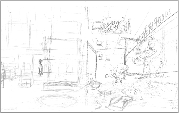
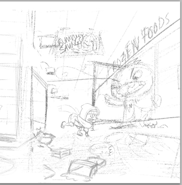
I really don't have any interior environments in my portfolio so I'm working on a scene that's inside a convenience store. It's summer and there's an icy world beyond the freezer doors and this being has escaped. It's been ruining summer around town with it's icy powers so this kid is going to fight it. That's the little story but I don't have it written.(Writing is not my cup of tea) I don't know if I should go all the way with a book dummy or just stick to this scene only for the sake of having an interior shot. What should I do? If I only do this scene does the top viewpoint work or should I try something else? Thank you guys!
-
First of all, this is a very cool idea! (if you'll excuse the pun). Very imaginative and would be great for a children's book. I think you could push the composition better in terms of framing the entrance of the monster...all of the sketches look very nice in terms of showing an environment - especially the top one - and I know with your skills you would make it visually great....but in storytelling terms I wonder if the monster could be placed to be more important somehow.
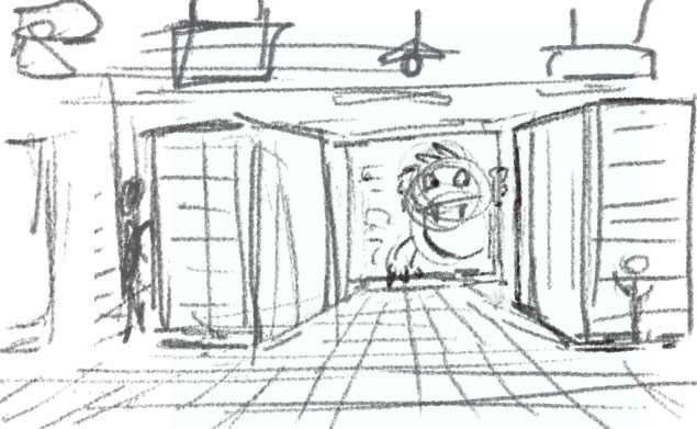
This is just an alternative idea, but you could do something where you use the one-point perspective to frame the monster at the end of an aisle, a bit like this, if you'll excuse the very quick and messy sketch...would give you plenty of space to show an interior while still being sure where the focus is....
If you're not sure that writing is your thing, there is an alternative to going the whole hog and making a dummy book....you could start off with this scene, since you want it for your portfolio..then afterwards you could do a character line-up or sketches, to show your vision for the characters. If you still like the project after that, you could do a spot for another page...and maybe by that point you'll either have more story in your head ready for the full dummy, or you'll be sick of it and wanting a new project
") But either way, you'll have the portfolio work done...including the very good thing of repeated consistently drawn characters in a story setting....and you could easily present the work to a publisher if you wanted to, and they would get the idea.
But either way, you'll have the portfolio work done...including the very good thing of repeated consistently drawn characters in a story setting....and you could easily present the work to a publisher if you wanted to, and they would get the idea.Editing to add, I had another thought - if you cropped the left side away from your original composition to make it simpler, I think that would also work...you would have the monster in the 'third' sweet spot but still framing the interior and all the chaos and the child. I know that's less interior to show off your skills with, but storytelling-wise I think that's better. (all personal opinion though, feel free to ignore!)
-
I think I will probably crop it as you suggested. I was concerned too much space was dedicated to the store but at the same time I wanted to draw as much as possible.
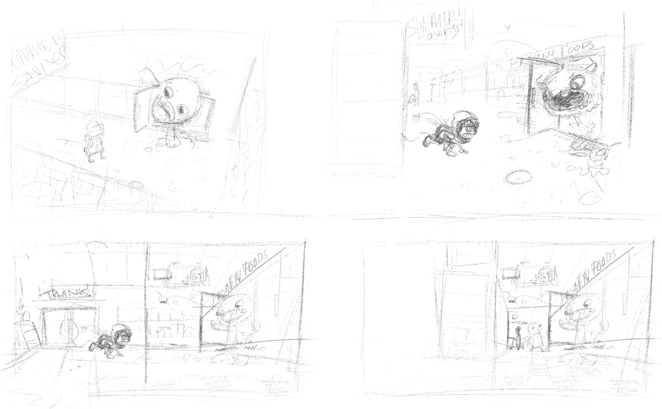
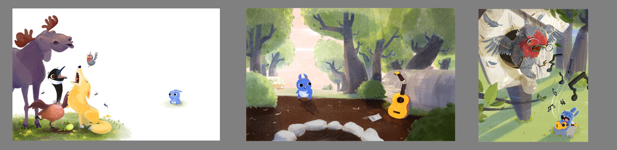
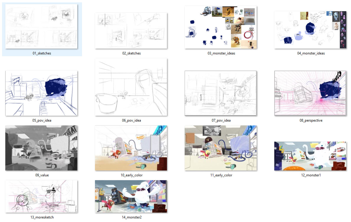
When I had a portfolio review at an SCBWI conference I was told I should make a book dummy. These 3 images are as far as I got! One was already done because it was January's 3rd Thursday. Whenever I would try to write my head would go "...... crickets chirping....." I like your idea - doing the characters and another image.
-
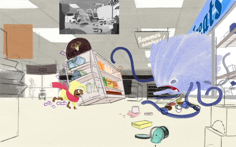
I hate this image so much right now. I've been trying and re-trying for about 2 weeks and I always end up staring at it with no idea how to move forward. So here are my issues:
-
It's a convenience store. Those typically have white floors and walls and they're loaded with garish colors. I am never happy with the ceiling, floor and wall color.
-
Despite the action happening in the scene I feel bored with it. I don't know if that's just me being crabby or if it really is blah and I need to start over with the drawing???
I really want to conquer this and finish it instead of walking away. I might cry on the floor for a while first but I'll finish it.
www.lydiamueller.com
Twitter @lydesigns -
-
@Lydia-M I think it looks really great! - your work always looks very professional to me (maybe you are a professional
") i see that you want it to be a wide shot so cropping to minimize the floor while still showing that it is a store is probably not what you want to do - my thought is how about a simple subtle grid pattern on the floor that has a nice dull waxed finish - you could add reflections of the scene in the floor itself and give it a lot of interest that way - you could play with the how blurred or crisp it is - did a super quick cut and past/blur/de-saturate just to see - looks a bit confusing the way i did it but i only spent a minute ore two - i think it has potential for adding interest though - maybe if it were more subtle - i think it would also be fun to paint - anyways - your painting looks very good to me
i see that you want it to be a wide shot so cropping to minimize the floor while still showing that it is a store is probably not what you want to do - my thought is how about a simple subtle grid pattern on the floor that has a nice dull waxed finish - you could add reflections of the scene in the floor itself and give it a lot of interest that way - you could play with the how blurred or crisp it is - did a super quick cut and past/blur/de-saturate just to see - looks a bit confusing the way i did it but i only spent a minute ore two - i think it has potential for adding interest though - maybe if it were more subtle - i think it would also be fun to paint - anyways - your painting looks very good to me 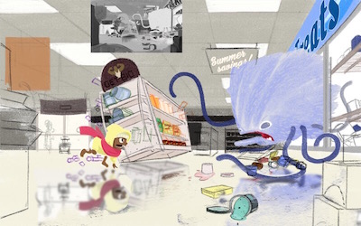
-
Just wanted to say I really love the start you have to the dummy book. I hope you finish it up. Maybe just figure out what happens and draw the pages and come up this the story later. They use to do that with comics a lot you just have the general idea of what happens in the story they would draw it out and someone would come up with the exact dialog later.
-
@Kevin-Longueil I would like to be a professional!
Your suggestion is kind of what I was going to do once I nail down the colors. There will be an icy puddle under the monster, some icicles and cold air. If I could just get past this stage though! My head is swirling because of all the colors I have to choose.@evilrobot I have a very basic idea in mind for a dummy book but no idea what the ending should be!
-
Those images with the blue rabbit are very very charming - I think there were some story ideas exchanged when you submitted your piece for Third Thursday which were good starting points. If writing makes you freeze (and I can relate to that), why not try a wordless book? There is a lot of story potential already in these three images: rabbit sees the animal singing and wants to sing too. He is completely out of tune, though, and pesters the animals in the wood with his awkward singing. You could show different animals having different reactions to his songs (fleeing, covering their ears, hiding their head in a hole, hugging together in despair, etc...)...he is sad and dejected and wants to give it all up. Suddenly, he hears somebody singing just out-of-tune as himself. He peeks from behind a bush and, lo and behold, it's a girl blue rabbit that sings just as badly! Last spread is a lovely tuneless choir of the two...
Sorry, got carried away by a silly idea, but I really believe that those three images have a lot of potential and you should do something with them.
As for the interior scene, I think the point of view you chose for the scene may not be the best one. It is one of those ping-pong, two-focus compositions that tend to flatten all images (Will and Jake talk about this problem specifically in the critique of one of the old Third Thursdays, the one with the prompt "Love". That may be the reason why the image looks boring to you. A worm's viewpoint (low, looking up) may give a sense of scale and menace to the monster and get rid of the white floor area, or maybe a view from behind the dog, with the monster coming towards him....
There is a wonderful layout drawing from Disney of a store similar to the one you describe - unfortunately I could not find it online (I have it in a book). However, you can see the sequence animated here:
How to hook up your home theatre
between 1:27 and 1:34 minutes. Maybe it can give you some idea or inspiration. One thing I notice is that they muted all the shelves completely color-wise, while they put a lot of garish colors on the banners hanging from the ceiling. -
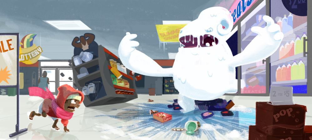
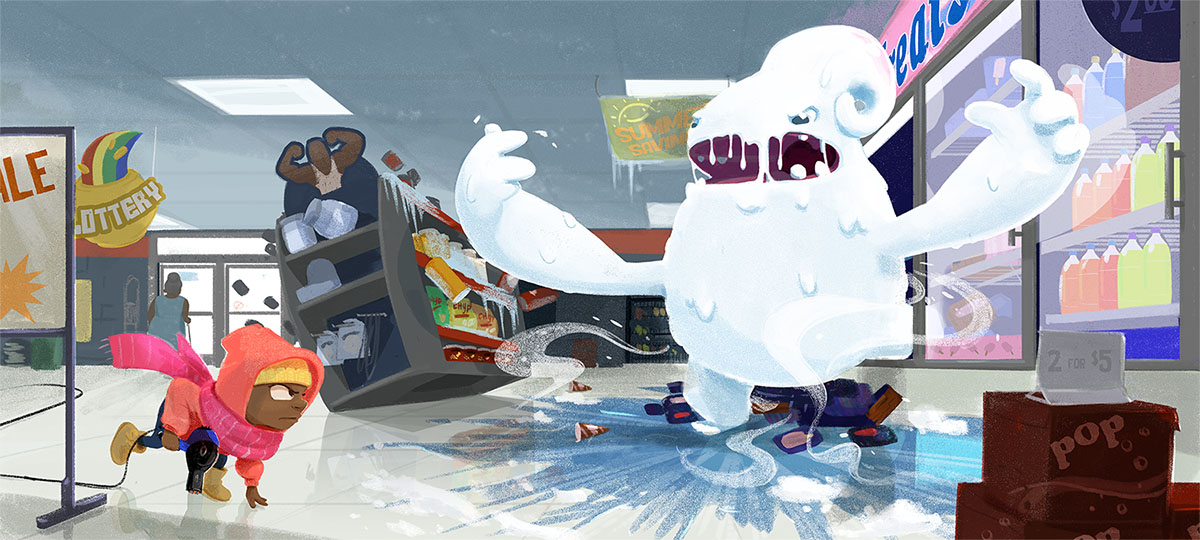
Oh my gosh I finally broke through the horribleness and here's where I'm at. I want to stay up all night and finish shadowing/refining but my body won't let me. This went through so many restarts! I'll try to post all the junk tomorrow.
www.lydiamueller.com
Twitter @lydesigns -
@Lydia-M First: love that monster! I also think the background elements are looking really cool.
One critique would be that the kid looks like a sprinter getting ready to plow into the monster (i.e., fight it) but the expression is more like "Yikes!"
If you were to keep the crouching pose maybe recede the figure to back behind that tipping shelf (although kids might look at that and think the kid is about to be crushed) OR re-draw it so that it is more of a fleeing/looking back pose.
-
I love this! All the details are amazing...including security sensor by the door. Wow! I agree with @mattramsey about the kid. There are a few contradictions--He is poised to lunge at the monster, but his face looks like he is startled; he is wearing a coat, scarf and hat as if he knows he will be battling a cold monster, but he is also wearing flip flops and shorts (though my son would totally try and walk out of the house into a blizzard dressed like that!) so I can't decide if he is there prepared to fight or surprised and about to flee. But I love the colors, reflection, monster, details... great piece!
-
Lovely piece, overall very successful balance of color and composition - I like it a lot! I agree that the kid is a little confusing - especially the way he is dressed and the pose. Indeed, looking at your first thumbnails I was convinced it was a dog. Another thing that I perceive as ambiguous is the monster's face. his mouth is very dark but his eyes have almost no contrast. At a first sight, i thought the eye was the red dot at the back of his head (which actually is background). It took me a few seconds to see the eyes. Maybe increasing the contrast there or reducing the contrast at the mouth could address that.
However, it is overall very nice, good job solving the composition and color! -
Me:
This thing.
-
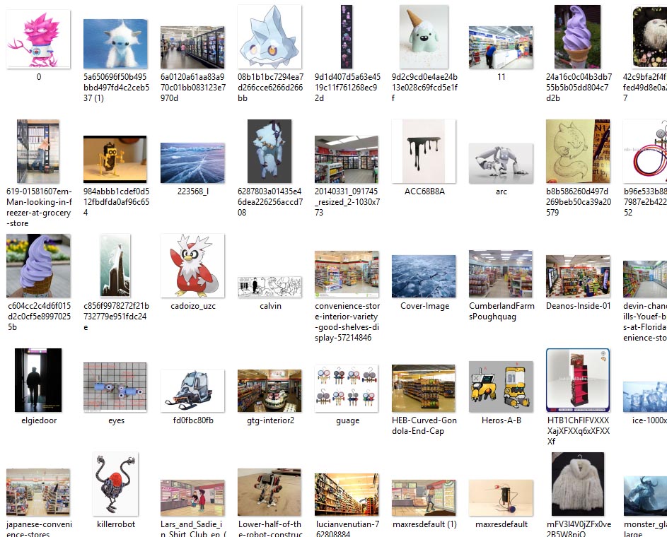
I wanted to say thank you all for your input on this. I stared at this for so long that I couldn't see certain things (her expression for example) until I changed it. Here's some process images and a sample of my giant reference folder...
-
All the work was worth it, it is an excellent piece! I also collect a thousand references for large illustrations - as many others do - it is very good practice! A trick used by Bobby Chiu and others is to place all references around the image in PS (on different layers for different groups of things) and then use two PS windows for the piece, so that you can zoom in on both the reference and the part you are working on. It is a very good way of staying organized (and I miss it a lot when I work in ProCreate....).
Congratulations on a great illustration! -
Fantastic illustration! Well done! You should be proud of it.