Society of Visual Storytelling

    SVSLearn Forums

    • Register
    • Login
    • Search
    • Recent
    • Tags
    • Popular
    • Users
    • Groups
    • Search

    First Mockup Book

    General Discussion
    6
    21
    5508
    Loading More Posts
    • Oldest to Newest
    • Newest to Oldest
    • Most Votes
    Reply
    • Reply as topic
    Log in to reply
    This topic has been deleted. Only users with topic management privileges can see it.
    • Doha
      Doha last edited by

      Hello everyone and happy Halloween!

      I started working on my own rendition of "Snow White" as a practice.
      I thought this will be a fun way to discover new styles and practice everything I learned with SVS.
      This way I'll end up with some coherent pieces for my portfolio.
      I will be sharing my progress here, and I will appreciate any critique. 🙂

      Page 2:

      0_1478011669905_snow white page1.png

      Doha Koma

      www.Komaart.net
      https://www.instagram.com/dohakomart/
      https://www.facebook.com/dohakoma/

      amberwingart 1 Reply Last reply Reply Quote 0
      • Chip Valecek
        Chip Valecek SVS Team SVS OG last edited by

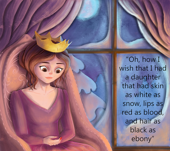
        The look on the face nails that she is in deep thought. Great job on that. I would go a little lighter on the window where the text is. The is a dark color and the text is dark which makes it a little hard to see. A little more contrast on those would be great. Also easier for a kid to make out the words.


        https://www.instagram.com/chipvalecek/
        https://www.facebook.com/cvalecek
        http://www.cshellmedia.com/

        Doha 1 Reply Last reply Reply Quote 1
        • Doha
          Doha @Chip Valecek last edited by

          @Chip-Valecek thank you, Chip. You are definitely right. I did not think about that. 🙂

          Doha Koma

          www.Komaart.net
          https://www.instagram.com/dohakomart/
          https://www.facebook.com/dohakoma/

          1 Reply Last reply Reply Quote 0
          • MOO
            MOO SVS OG last edited by

            There is someting about the text being perfectly framed in the window that bothers me. I don't really know why but I think it divides the picture from the text a bit and I wonder if the text were actually lighter (and the background a bit darker or faded?) with the text spread out over the frame a bit so that it flowed together more? I don't do digital so I can't really show it . I guess so that the text seems part of the composition more... Well, it's a beautiful picture nonetheless. Look forward to seeing more!

            Marsha Ottum Owen

            1 Reply Last reply Reply Quote 0
            • H
              Hana Hladikova last edited by

              I love your illustration. The expression of the queen is dreamy and thoughtful and the colours in your artwork work well together. The text is not however well placed in my opinion. You see strictly design wise if you have too short or too long line of text it becomes a problem and does not read easily. The placement inside the window pane traps the text further and it becomes sort of a trap for the eye. I would try to redesign the window so it would give you the whole bottom part free to use for the text. Also making the view outside the window (trees, sky, snow) with less contrast should help the legibility of the text.

              MOO 1 Reply Last reply Reply Quote 0
              • Doha
                Doha last edited by

                @Marsha-Kay-Ottum-Owen @Hana-Hladikova
                Thank you, Marsha and Hana! I really appreciate your feedback.
                To tell you the truth, I did not put much thought into the text. I forgot to consider it while designing the page.
                I like your Idea Hana of redesigning the window and giving it more space.
                I'll try that. 🙂

                Doha Koma

                www.Komaart.net
                https://www.instagram.com/dohakomart/
                https://www.facebook.com/dohakoma/

                1 Reply Last reply Reply Quote 0
                • Doha
                  Doha last edited by

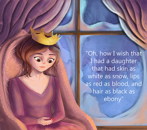
                  I changed the window and the text color. Does this improve the feel of the text or is it still too framed?

                  0_1478140139410_page 1 edited.png

                  Doha Koma

                  www.Komaart.net
                  https://www.instagram.com/dohakomart/
                  https://www.facebook.com/dohakoma/

                  MOO 1 Reply Last reply Reply Quote 0
                  • H
                    Hana Hladikova last edited by

                    I don´t think that it is too framed now. I like what you did, both with the window and the outside. The text colour is good, it contrasts better with the background however if you would do this as an assignment you would probably have to check if it would be OK. But since you don´t... I think that was a good decision.
                    One more thing you could try is changing the alignment of the text. Designers usually avoid using center alignment if the design don´t call for it outright. Apart of that little thing, I truly like this illustration. Work well done, I would say.

                    Doha 1 Reply Last reply Reply Quote 1
                    • Doha
                      Doha @Hana Hladikova last edited by

                      @Hana-Hladikova
                      Thanks, Hana, I will do that. 🙂

                      Doha Koma

                      www.Komaart.net
                      https://www.instagram.com/dohakomart/
                      https://www.facebook.com/dohakoma/

                      1 Reply Last reply Reply Quote 0
                      • MuttsGraphix
                        MuttsGraphix last edited by

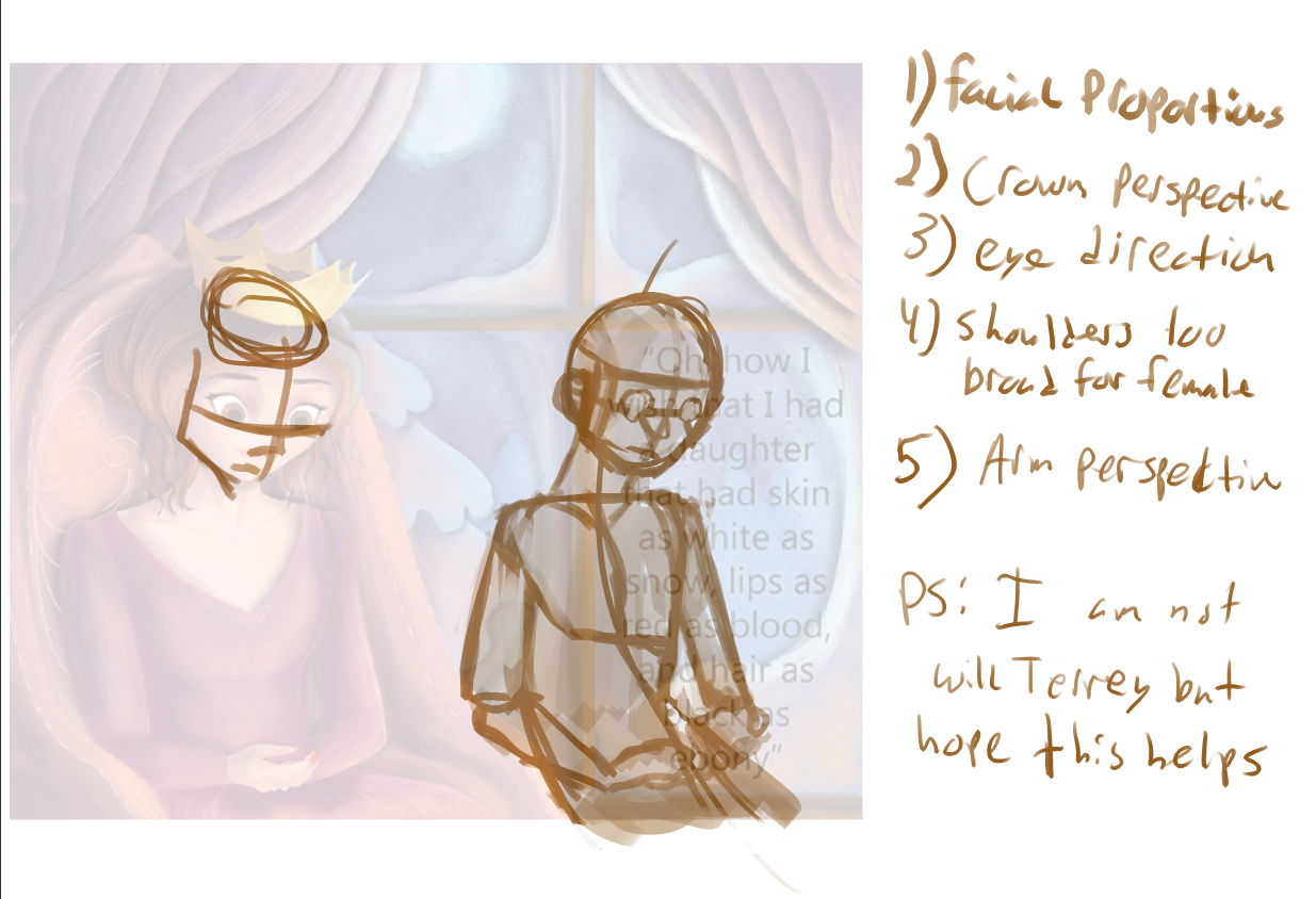
                        I am not Will Terrey

                        To begin though, I really like this painting. It's surreal, it's dreamy, it has great contrast of warm v. cool and I love the environment. I would want it on a Christmas card but as someone on the outside looking in, these are the things I saw.

                        alt text

                        https://www.artstation.com/artist/muttmarleybone
                        https://drawcrowd.com/muttmarleybone
                        muttsgraphix.squarespace.com

                        1 Reply Last reply Reply Quote 2
                        • Doha
                          Doha last edited by

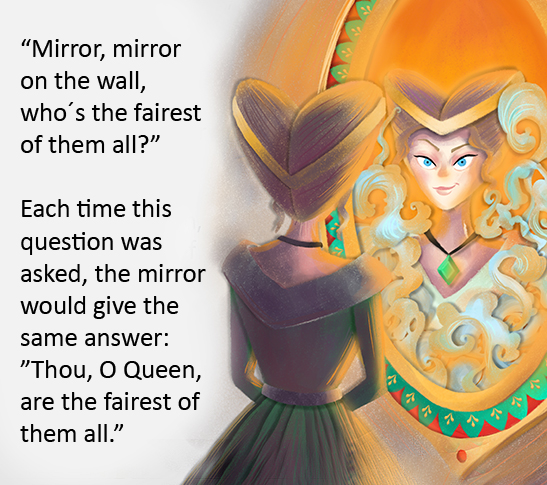
                          The evil stepmother.
                          upon finishing this I started to doubt the light effect I made.
                          When I compare it to the first illustration, it feels different, like they don't belong to the same book.
                          Maybe I should tune down the reflections.
                          What do you think?

                          0_1478278073114_page 5.png

                          Doha Koma

                          www.Komaart.net
                          https://www.instagram.com/dohakomart/
                          https://www.facebook.com/dohakoma/

                          1 Reply Last reply Reply Quote 0
                          • Doha
                            Doha last edited by

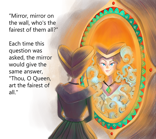
                            @MuttsGraphix Thank you for your notes! They definitely help. 🙂

                            Doha Koma

                            www.Komaart.net
                            https://www.instagram.com/dohakomart/
                            https://www.facebook.com/dohakoma/

                            MuttsGraphix 1 Reply Last reply Reply Quote 0
                            • MOO
                              MOO SVS OG @Doha last edited by

                              @Doha I think it looks much better now!

                              Marsha Ottum Owen

                              1 Reply Last reply Reply Quote 1
                              • MOO
                                MOO SVS OG @Hana Hladikova last edited by

                                @Hana-Hladikova That was a really great explanation, Hana.

                                Marsha Ottum Owen

                                1 Reply Last reply Reply Quote 0
                                • H
                                  Hana Hladikova last edited by

                                  I think that the style of the evil queen is OK. It is perhaps a bit more edgy then the first illustration, but considering the characters that would be a good thing. You still have plenty of elements connecting the illustrations, the style, the line, twirls, design of the dresses...
                                  What is more disrupting for me is an overall composition of the illustration. Firstly, the image looks a bit unbalanced. I think it is somewhat caused by the text placement partly on white and partly on the illustration and the big piece of unoccupied white space underneath it, but by the illustration composition also. The mirror shape´s cuts through the image are unfortunate, for it leads the eye out of the image. The image is rather top heavy. You have a lot of bright colour in there that attract the eye - the orange and even the pattern in the mirror itself. I don´t think you need so much of the mirror anyway. Everyone will know she is looking into the mirror, so you can show smaller piece of it. I would suggest cropping the image differently. I will include my take on the crop for you, but take it as a suggestion.
                                  The last advise is about the text itself. Format your text so you will not end up with an orphan - the single word on the line. It is best to be avoided. I do not know your process, but do you create your image first and then put the text on? Or do you consider the placement and size of the text during the development stages of the image?
                                  Ok, here is the crop:
                                  0_1478355481536_evil-queen.jpg

                                  1 Reply Last reply Reply Quote 0
                                  • Doha
                                    Doha last edited by

                                    @Hana-Hladikova
                                    Thank you, Hana, all your notes are on point. The crop you made makes it look so much better.
                                    This is my first try in children's illustration, so I don't really have a process. In the first one I added the text, in the end, hence the window frame. In this one, I considered the placement at the beginning but I did give much thought to the size and volume. I should work on that. Do you know if it's acceptable to change the text size on each page?

                                    Doha Koma

                                    www.Komaart.net
                                    https://www.instagram.com/dohakomart/
                                    https://www.facebook.com/dohakoma/

                                    1 Reply Last reply Reply Quote 0
                                    • MuttsGraphix
                                      MuttsGraphix @Doha last edited by

                                      @Doha No problem!

                                      https://www.artstation.com/artist/muttmarleybone
                                      https://drawcrowd.com/muttmarleybone
                                      muttsgraphix.squarespace.com

                                      1 Reply Last reply Reply Quote 0
                                      • H
                                        Hana Hladikova last edited by

                                        You are welcome. I am always happy to help.
                                        The text size should be constant for the whole book, I am afraid. Sometimes some small issues can be dealt with by for example adjusting the kerning or tracking of the type (these affects how close are the letters and words spaced). But that will be difficult to do if you don´t use InDesign for the completion of your illustrations and text.
                                        Maybe in this case you could actually use smaller size of the font, depending of the size of your picture book. Sometimes what looks OK on screen is just way too big when you print in out in size - it is one thing to watch out.

                                        1 Reply Last reply Reply Quote 1
                                        • amberwingart
                                          amberwingart @Doha last edited by

                                          @Doha What a lovely illustration! I agree with the others about lightening up the area outside the window, but really the one thing that immediately struck and stuck with me was her left hand. It took me looking at it for about 30 seconds before I realized her left hand is under her right hand. I'd change the pose of her arms so that both of her hands are somehow showing. Also, her right arm looks like it's melted into her body - I'd either make the area directly under that arm a very dark color so that you can tell the difference between her arm and her dress, or I'd create just a little triangle of space where the chair shows through, like you on the left arm. Other than that, you've got a lovely piece!

                                          Facebook Page: http://www.facebook.com/amberwingart
                                          Instagram: @savinafranciscoart
                                          YouTube: http://www.youtube.com/amberwingart
                                          Website: http://www.amberwingart.com
                                          SVS Sketchbook: http://forum.svslearn.com/topic/915/savina-s-sketchbook-updated-2-13-16

                                          1 Reply Last reply Reply Quote 1
                                          • amberwingart
                                            amberwingart last edited by

                                            I think the step mother looks great, especially with the updates that Hana made. I really like the devious expression on her face. You're really capturing the feeling of the characters well so far!

                                            Facebook Page: http://www.facebook.com/amberwingart
                                            Instagram: @savinafranciscoart
                                            YouTube: http://www.youtube.com/amberwingart
                                            Website: http://www.amberwingart.com
                                            SVS Sketchbook: http://forum.svslearn.com/topic/915/savina-s-sketchbook-updated-2-13-16

                                            Doha 1 Reply Last reply Reply Quote 1
                                            • First post
                                              Last post