More testing
-
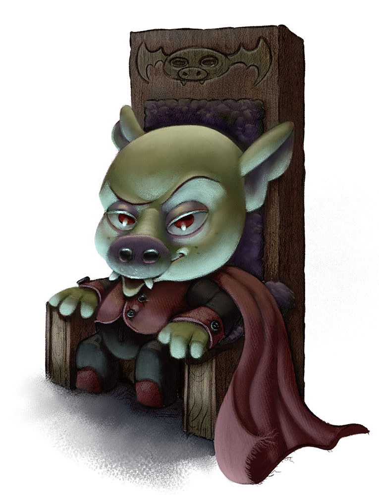
Thank you very much. Here's some work on this one.
-
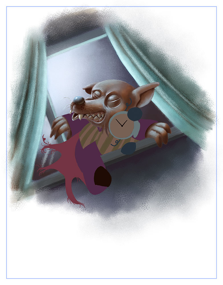
Work in progress on this one.
-
@evilrobot It all looks good but I absolutely love the Vampire Pig

-
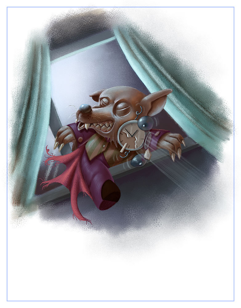
Finished this up
-
This is looking really great - the rendering is got to a higher level, and I think it combines the best of both your rendering styles (the highly polished one and the watercolor-textured one). Use of color is perfect. This last scene with the alarm clock is hilarious too! Is there only the two characters in the book?
-
@evilrobot said in More testing:
Thank you very much. Here's some work on this one.

I really like 90-95% of what you've got going on with this piece. You have an awesome level of detail/color and light going on here.
That 5-10% are things like: the pupils in his eye are a little strange--if those ARE pupils they would be more centered. If it's shadow, it would be more evenly spread out.
The eyebrow arcing down seems to be to long (it goes into the nose bridge too much).
Overall, the blueish light seems too harsh--it's almost as if a halogen lamp is 5" away from his body and unless he has super shiny skin, it wouldn't be reflecting that much light. For example, the highlight on his eyes is not much brighter than the bottom of his cheeks and the bottom of his cheeks are actually brighter than the "whites" of his eyes.
Finally, the main thing will probably be seen if you reverse the image. That is, the head shape, nose, etc. is somewhat lopsided. The body and chair seem really good.I really like the different hues of color you've put into the shadow areas. Very nice piece.
-
@smceccarelli thank you very much. No there is a pet cat as well I was starting with the spot and the vignettes to see how it would go before I do two full spread illustrations which have the third character in them. I have been trying to get that balance not over rendered and not too simple. I'm glad it's coming through. I'm just trying to finish all the pieces then I'll spend a week touching them up before I send this out again. I guess I'm just leaving the rest of the dummy book just rough line work? I'm not quite sure how far I'm suppose to take the rest of the illustrations in the dummy. I sent this out already in the other style with just rough pencil sketches and three finished spreads. I'm wondering if I should take the pencil sketches all the way to finished line work this time.
@mattramsey thank you for the great feedback. I was not real fond of that illustration. I was going to revisit it at the end because I was getting stuck on it. Thanks for the crit that should help greatly when I get back to it. I have a very hard time with night scenes...so of course I wrote a book where every page is a night scene....lol.....
-
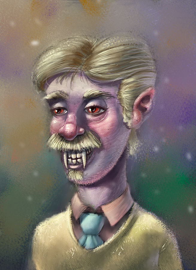
Warm up from tonight messing around with some texture and blending modes.
-
Very cute!
Loving the lighting on this one but i would question the overall perspective of the piece and maybe include some contrasting like maybe the pig is wearing red pajamas with some cool ambient light bouncing up on him from the sheets. -
I love these!! Did you get a new Cintiq? So jealous...

-
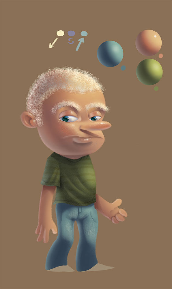
And some more rendering and texture practice.
-
Nice! I am loving these sketches.
How did you find your new Cintiq?