Society of Visual Storytelling

    SVSLearn Forums

    • Register
    • Login
    • Search
    • Recent
    • Tags
    • Popular
    • Users
    • Groups
    • Search

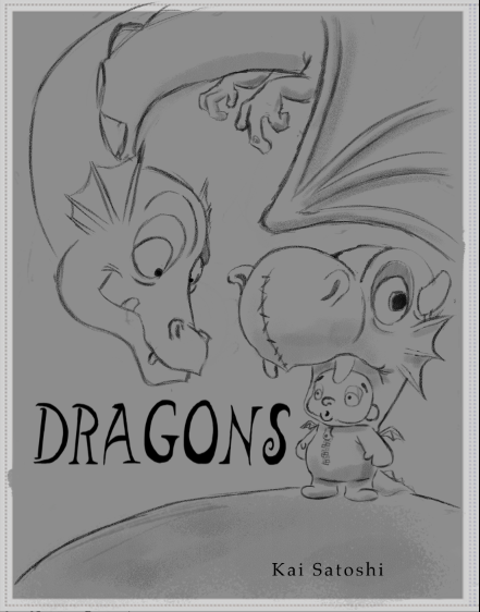
    Book Cover for my createspace book I have begun to work on.

    General Discussion
    6
    14
    2688
    Loading More Posts
    • Oldest to Newest
    • Newest to Oldest
    • Most Votes
    Reply
    • Reply as topic
    Log in to reply
    This topic has been deleted. Only users with topic management privileges can see it.
    • kai satoshi
      kai satoshi last edited by

      Hello All,
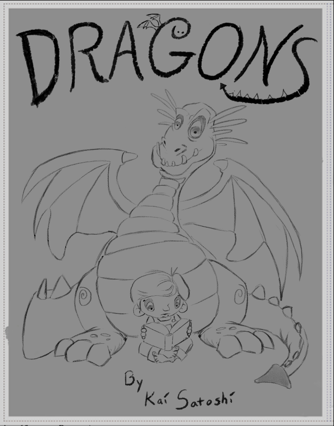
      I posted last week that I was beginning work on a createspace book. The book is a poetry book about dragons. Below is the Cover. I would love to know your thoughts before I begin the painting.
      Thanks! 🙂

      0_1479060698311_Screen Shot 2016-11-13 at 1.09.39 PM.png

      https://www.facebook.com/kaisatoshiart
      https://www.youtube.com/channel/UCt6tfoLEMU6uZkRzs2KUzVw

      1 Reply Last reply Reply Quote 1
      • jimsz
        jimsz last edited by

        Looks good for the most part.

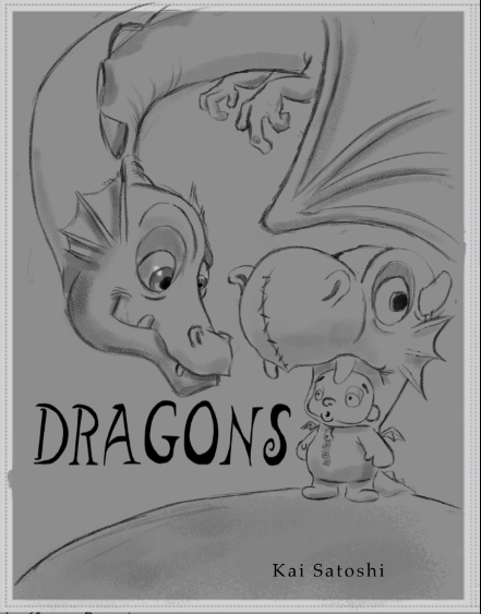
        The dragon looks like he is staring off into space though. Also, no arms or hands on the dragon?

        http://www.kidstimestudio.com - http://www.kidstimestudio.com/100days

        kai satoshi 1 Reply Last reply Reply Quote 0
        • kai satoshi
          kai satoshi @jimsz last edited by

          @jimsz thanks Jim. Was trying to make him look at the "camera" . Perhaps I should make him look down.

          https://www.facebook.com/kaisatoshiart
          https://www.youtube.com/channel/UCt6tfoLEMU6uZkRzs2KUzVw

          jimsz 1 Reply Last reply Reply Quote 0
          • jimsz
            jimsz @kai satoshi last edited by

            @kai-satoshi

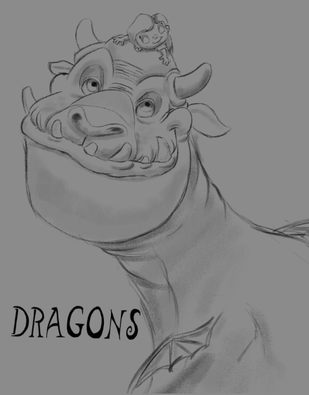
            Just alter the eyes a little bit if you want the dragon looking at the viewer! It rough but something like this

            0_1479143034779_1479060699348-screen-shot-2016-11-13-at-1.09.39-pm.png

            http://www.kidstimestudio.com - http://www.kidstimestudio.com/100days

            1 Reply Last reply Reply Quote 0
            • Lee White
              Lee White SVS Team SVS Instructor Pro SVS OG last edited by Lee White

              Very cool subject matter. I think you should go back to the thumbnail phase and doing like 20 or 30 good cover options. Then, pick the top 5 and flesh them out a little better. This way we can see what is working and what is not.

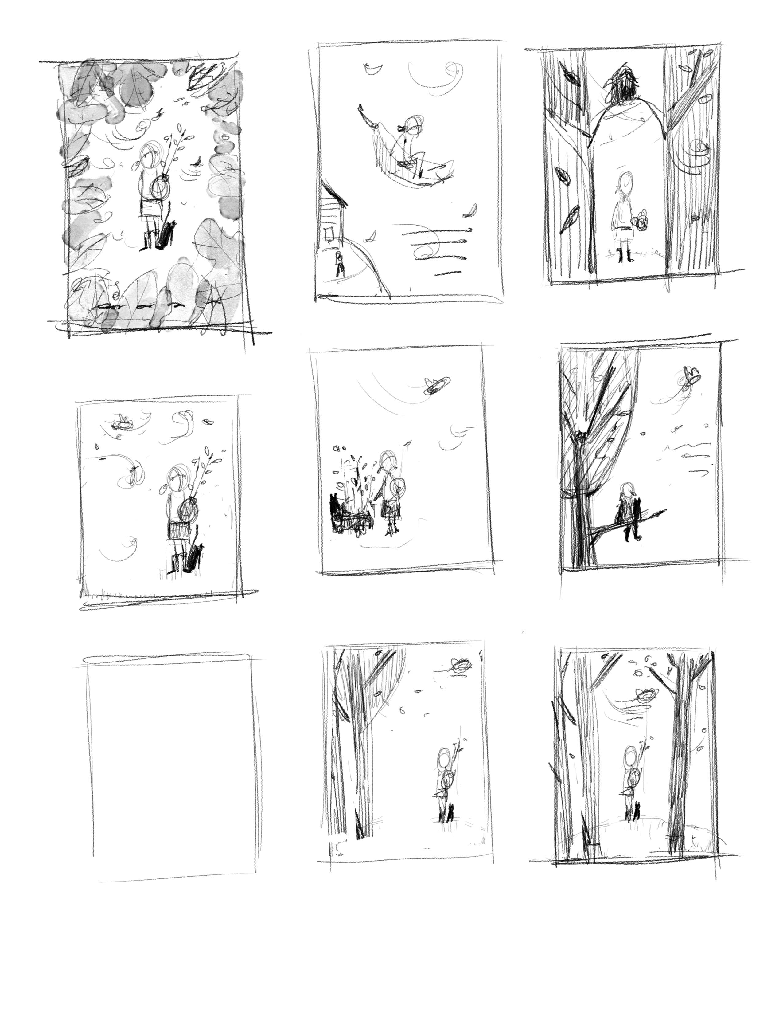
              There is nothing more difficult to critique than just posting one sketch. Be loose in the beginning and try some things out. Don't worry about making the drawings perfect at this stage. I've added a page of book covers I'm doing today for a new children's book that comes out next year. I don't ever show my clients these and I keep them really loose. I'll do about 50 of these and just mess around with design. It's a fun stage and should be approached as play. You will be amazed at where you can go doing this quick step. I only spend about 5 minutes on each one. Then, I'll pick the good ones and work on them a bit more to present to the client.

              Good luck! Can't wait to see what you come up with! : )

              0_1479145833330_Cover 2.jpg

              SVS Faculty Instructor
              www.leewhiteillustration.com

              kai satoshi 1 Reply Last reply Reply Quote 0
              • kai satoshi
                kai satoshi @Lee White last edited by

                @Lee-White Thanks Lee. I will see what I can come up with and post again 🙂

                https://www.facebook.com/kaisatoshiart
                https://www.youtube.com/channel/UCt6tfoLEMU6uZkRzs2KUzVw

                1 Reply Last reply Reply Quote 1
                • kai satoshi
                  kai satoshi last edited by

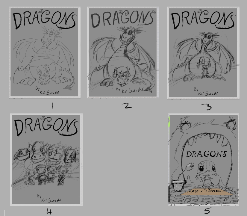
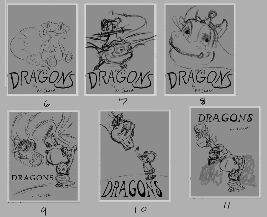
                  Here are the thumbnails I did (A through R). Some a bit further than others. But anyway, here they are. Below those are my favorites and of the favorites the ones I like best are listed. I would love any thoughts that you all have. Which ones do you like? Any thoughts are welcome 🙂 Thanks.

                  0_1479244238571_Screen Shot 2016-11-15 at 4.08.51 PM.png
                  1_1479244238572_Screen Shot 2016-11-15 at 4.09.05 PM.png

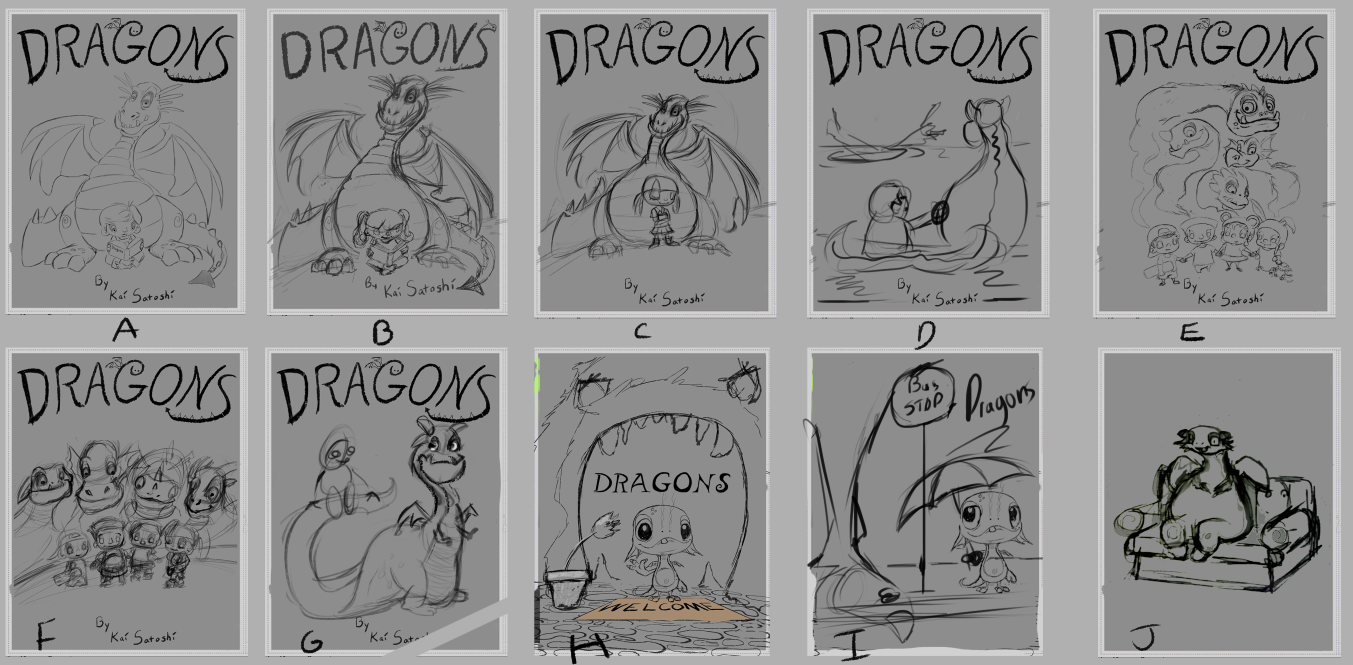
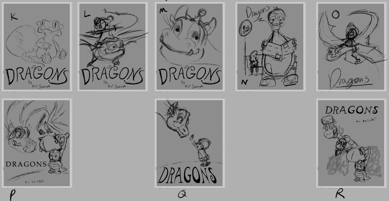
                  Here are my favorites. Of those I like 1, 3, 8, 9, 11

                  0_1479244398848_Screen Shot 2016-11-15 at 4.06.11 PM.png
                  1_1479244398848_Screen Shot 2016-11-15 at 4.06.21 PM.png

                  https://www.facebook.com/kaisatoshiart
                  https://www.youtube.com/channel/UCt6tfoLEMU6uZkRzs2KUzVw

                  jimsz 1 Reply Last reply Reply Quote 0
                  • kai satoshi
                    kai satoshi last edited by kai satoshi

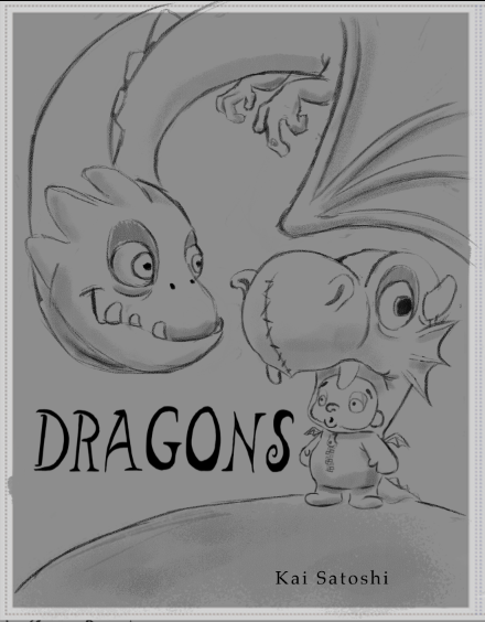
                    Here is a more cleaned up version of one of the ones I like
                    0_1479251917644_Screen Shot 2016-11-15 at 6.17.33 PM.png0_1479257025851_Screen Shot 2016-11-15 at 7.42.52 PM.png0_1479257647269_Screen Shot 2016-11-15 at 7.53.35 PM.png0_1479258168753_Screen Shot 2016-11-15 at 8.02.08 PM.png0_1479314691520_Screen Shot 2016-11-16 at 11.43.56 AM.png

                    https://www.facebook.com/kaisatoshiart
                    https://www.youtube.com/channel/UCt6tfoLEMU6uZkRzs2KUzVw

                    Rich Green 1 Reply Last reply Reply Quote 0
                    • Rich Green
                      Rich Green SVS OG @kai satoshi last edited by

                      @kai-satoshi I really like #9 (or letter P). It jumped out right away as so much more charming and dynamic than the rest.

                      I see it is also the one you did this cleaned up version on here. But I really prefer the Dragon better in your thumbnail. There is something about the longer nose/snout that works so much better in my opinion The real dragon character loses it's charm in this cleaned up version you posted here.

                      And I also think there was so much connection and impact when the real dragon was looking directly at the little person dressed as a dragon. That eye to eye contact is much more powerful than this sort of blank stare you have going on in the cleaned up version.

                      www.richgreenart.com instagram.com/richgreenart/

                      1 Reply Last reply Reply Quote 0
                      • kai satoshi
                        kai satoshi last edited by kai satoshi

                        I will definitely do another version with the different dragon head :). As far as the stare goes, I was aiming the look at the head of the other dragon. After doing this drawing it gave me an idea for the story behind it and it became less about the boy and more about the fake dragon. lol... But I will definitely be going back and forth with the idea and where the characters should be looking :). Thanks Rich

                        https://www.facebook.com/kaisatoshiart
                        https://www.youtube.com/channel/UCt6tfoLEMU6uZkRzs2KUzVw

                        1 Reply Last reply Reply Quote 1
                        • jimsz
                          jimsz @kai satoshi last edited by

                          @kai-satoshi

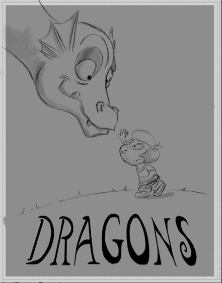
                          Thumbnail "P" "9" is one I really like. The composition really works for me.

                          http://www.kidstimestudio.com - http://www.kidstimestudio.com/100days

                          1 Reply Last reply Reply Quote 0
                          • Chip Valecek
                            Chip Valecek SVS Team SVS OG last edited by

                            I agree with the others, 9 or P jumped out first for me as well.


                            https://www.instagram.com/chipvalecek/
                            https://www.facebook.com/cvalecek
                            http://www.cshellmedia.com/

                            1 Reply Last reply Reply Quote 0
                            • DanetteDraws
                              DanetteDraws last edited by

                              @kai-satoshi I agree with the others that I like 9 the best. However, I do also like 10 but it depends really on what mood you're going for. #9 is more dynamic, it gives me the sense that it will be an actionable book, maybe on the humourous side. #10 I would definitely expect to be a "quiet" book, perhaps about friendship. If you think about it from the perspective of what you want it to say as a PRODUCT, then it'll be clear which to go with.
                              I just would like to say re: #9, I love how everything "fits" into the composition. Will Terry is very good at that and it looks like you may have picked up a thing or two from him in that regard 🙂

                              https://danettebyatt.com
                              Twitter @DanetteDraws
                              Instagram @DanetteDraws

                              kai satoshi 1 Reply Last reply Reply Quote 0
                              • kai satoshi
                                kai satoshi @DanetteDraws last edited by

                                @DanetteDraws Thanks Danette. I'm in agreement with the rest of you... I'm liking #9. The book will have a combo of funny poems with a couple poems that are a bit "serious". But I definitely lean to the humorous side. Thanks for the compliments ! 🙂

                                https://www.facebook.com/kaisatoshiart
                                https://www.youtube.com/channel/UCt6tfoLEMU6uZkRzs2KUzVw

                                1 Reply Last reply Reply Quote 1
                                • First post
                                  Last post