SCBWI Tomie dePaola contest
-
@Marsha-Kay-Ottum-Owen Thank you very much, glad you like where it's going

Thanks @Kevin-Longueil for all your thoughts - it's really useful to hear all the things that stand out to you, that I could improve. You're right that, like you, I'm always really happy to hear anything at all about what is working/not working...because if I know about it, I can at least try to fix it (even if I don't succeed, hopefully I'll learn something along the way...)
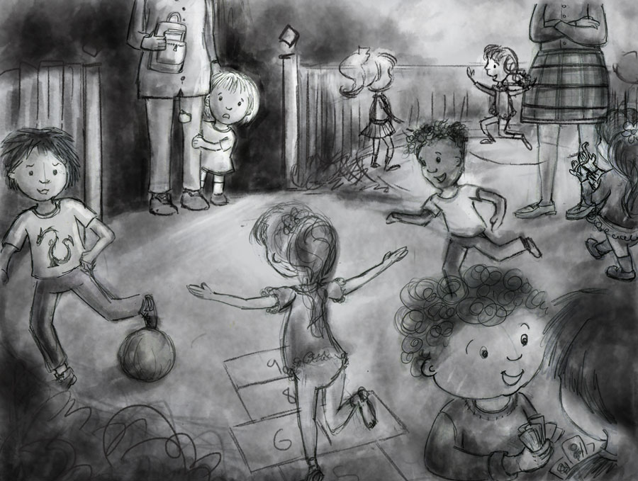
Yes looking at it, I think you're right about the hopscotch. I've tried to make it better in the latest sketch... and the values/focus on the little girl, I'm going to try and increase that contrast in the final piece, to match that thumbnail better...and add some more chunky lines too (if it works). I'll also try to subdue those front right-corner kids with the lighting. So I'm moving into the final piece now, because if I don't I won't get it finished in time! But this is how I amended the final sketch...
Thanks again for your thoughts


-
Beautiful sketch. I really love it and I bet it will be a wonderful piece. Just wanted to point out one little thing: you need to change the little girl in the background in front of the fence a bit, because now her left hand is visible when it should be hidden behind the skirt of the lady standing there...
-
@Dulcie This is looking awesome! The only thing I can suggest is maybe lightening the value of the adult standing with her arms crossed and the little boy behind her. This is my first time seeing your piece and my eyes keep going directly to those two. They're kind of placed in the "sweet spot" of the image, so you'll need to really make them more mid-tone for them not to grab focus. Aside from that, I'm loving this image & concept!
-
@Hana-Hladikova Thank you, both for the kind words and the suggestion - that's an easy fix, I like that!

@amberwingart Thank you! I can see what you mean...hopefully now I've progressed it a bit, I'm hoping that the colours/contrast are keeping the focus on the girl...but any more suggestions always welcome!

Well, here's where I am now...I'm really tired of looking at it. So, any suggestions/nitpicky things?

-
@Dulcie This looks amazing!! It definitely looks a lot better, but her skirt is still pulling the eye over there - I think it's the pattern and the fact that the stripes include black - it's the darkest dark competing with the lightest light (the child). Can you either make those stripes a mid-tone grey instead of black or make her skirt solid and the other teacher's pants striped? Everything else looks awesome (I especially LOVE the expression on the little girl's face!).
-
@Dulcie It's beautiful! Very nice color scheme, the warm-cool tension really gives a great richness to the piece. And the value scheme really works in putting the little you in focus. One thing to consider is to reduce the contrast on all the rest of the piece (a "curves" or "levels" andjustment layer with a soft mask is how I would do it). There are a lot of attention vampires in the image (that is a new word I learnt this week from an Art Director!) - faces, patterns, dynamic poses, etc... - and I feel they create a bit of unrest. A bit of contrast tweaking could also help in creating some more depth. Despite the perspective, many things appear to be on the same plane. I had some difficulty in sorting out the plane of the rope from the plane of the teacher's legs or the boys playing cards in front from the boy running in the back, etc... Maybe adding a little atmospheric perspective with contrast adjustement could make the image read more clearly.
It is however a very beautiful piece - I would try out a couple of contrast tweaks just to see if it gets even better, but it may just as well be perfect as is.
Good luck with the contest! -
@amberwingart Thank you, both for your kind words and the suggestion about turning the black skirt stripes to grey - I tried it with a greyish blue and I really loved how it changed the image. Hope it fixed the attention-grabbing-ness that you noticed
 Thanks again for persevering with the suggestion!
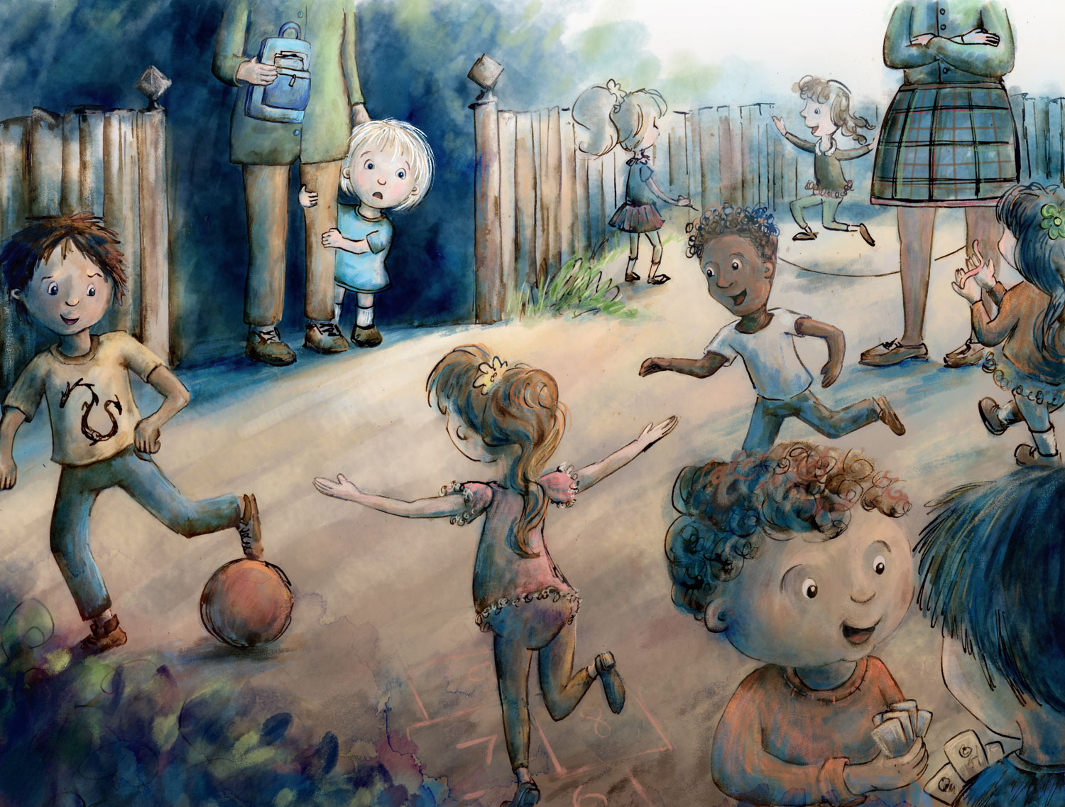
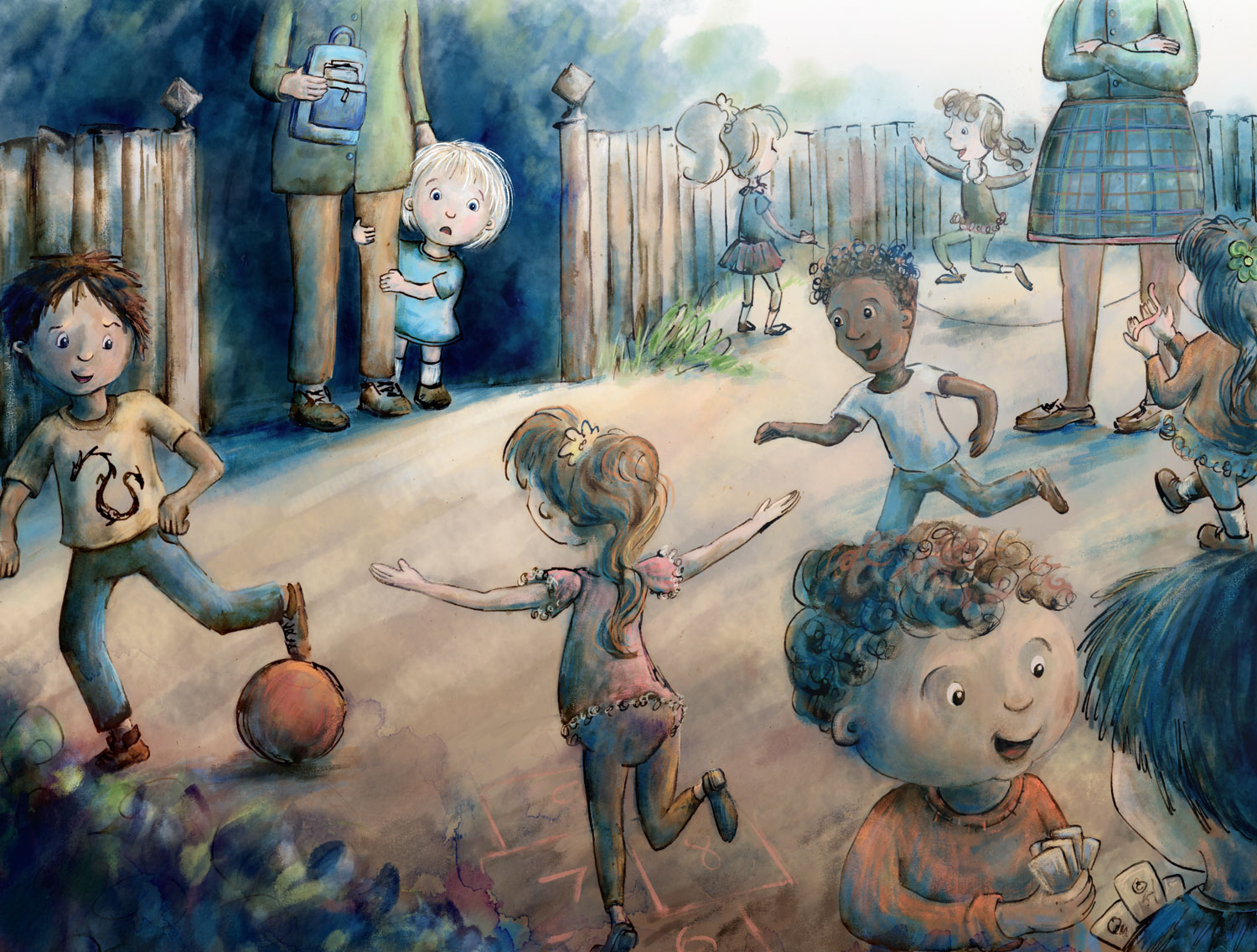
@smceccarelli Thank you! I really appreciate your considered thoughts, kind words and suggestions. Well, I started out making a contrast adjustment layer...but then I went completely off-piste by increasing the contrast instead...there was something that was bugging me about the bottom part, and that change fixed it for me (I did try lowering it, it made it look a little sludgy) ...but worrying that you were going to completely disapprove of my changes, I also tried to make some atmospheric perspective with a layer of light blue on screen mode...and I really liked how that worked - so thank you so much for making these suggestions! I realise that it is certainly a flawed piece - perspective and drawing people are some of my worst qualities as an artist right now..... but hopefully practice will help. Adjustment layers are a new thing to me too, so it's been good to explore them a bit...I think I'll be using them a lot more.
Anyway, here is a (final?) update...

-
@Dulcie It looks beautiful and I am sure it will be very much appreciated in the contest! Your style does not require to be fully accurate with perspective, so I would not worry too much about it.
Adjustment layers are one of the best inventions ever (together with brush modes!) and I use them continuously - both in my day job (I do a lot of image editing) and illustration work! So definitely worth exploring! -
@Dulcie BINGO! You fixed the "attention pull" on the skirt. Now the attention goes right where it needs to!
-
Great work @Dulcie the little girl in the focal point looks super cute.
-
I remember that feeling, great energy.