Website structure
-
I'm interested in some opinions here. I've changed my website based on 3 different sites. First I made a site like Will Terry's which was fairly simple straight forward gallery of my work.
Then I did a little more upgrading to my site. I do two different styles of art so I thought I might need to subdivide what I was doing so I chose to try something more like Jake Parker's site.
Then I read Show Your Work! By Austin Kleon who had a different framework For his site. He chose to put the blog as his main page in order for people to keep up with the latest work you are creating. Blogs on process, etc.
So I don't know what version is best. Opinions? Thoughts on your own websites? I'm just interested to see what other people's thoughts are on how they present their work online.
-
Honestly, I think it is really a matter of what you want people to see first. Organize your site like a painting--make what you want seen first the most obvious, and then make other things easy to find once they look deeper. If your portfolio is what you want seen first, make that easiest to see. If you want your current projects to get the spotlight, make the blog the main event.
But of course, like a painting, what is simple in theory isn't always simple in practice.
")
-
I second @Sarah-LuAnn.
This is a nice article, too.
http://illustrationfriday.com/2015/08/the-first-5-seconds-of-your-portfolio-website/
One of my big issues with websites is ones that are hard to navigate, with the font too small, or buttons in a strange place, etc.
Just my two cents!
-
Agreeing with what's already said here. Keep it simple. I know a lot of people hate transition effects between images. Nice large images are great. Avoid compression artifacts too. I would stick to pngs.
-
I checked out your website and I think it's pretty great. However, with the blog right there when you arrive it does feel like a blog instead of a website.
Austin's book is good, and I agree with a lot of what he says, but I don't know if a blog format is what an artist wants people to see first. If you're a writer like Ausitn, I think it makes sense. But I also agree your most recent stuff should be easily seen too. I wonder if there's a compromise, like having your latest images up on the front page, and then you can click on them to see the blog posts?
Best thing to do is, to keep experimenting like you have been. See what works and what people do or do not respond to, then make changes as needed.
What are you building the site with?
-
I support the idea of smacking visitors in the face with your best work and a well written short (1-2 sentence) overview of what you and your web site are about. As for content, it comes down to who you are targeting. If you want people reading then it's more likely attracting fellow artists. If you're targeting art directors they won't be reading articles - so pull back on this.
Really consider social platforms too and using them natively. For example, instagram or pinterest for sketches and pieces - facebook to tell short stories about your art and providing interesting links to gain a following - just as an example. Web sites are losing relevance.
With your current site, you have a **massive **performance problem. Your front page fully loaded takes an average of 26 seconds and weighs in at 14MB. You will definitely be losing people from this. Performance is huge in web development right now with 20-25% people accessing content from mobile devices on limited data plans. Consider showing less posts and providing small thumb nails of production shots instead of full size.
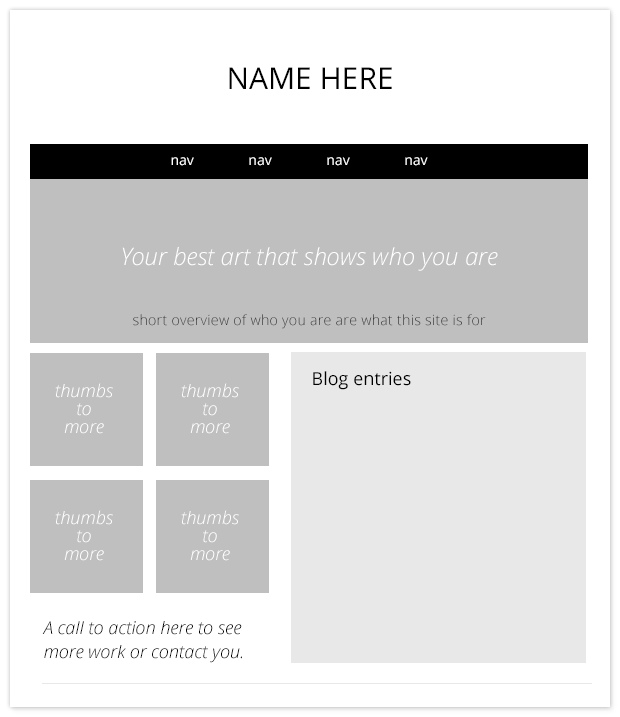
You could combine all these things too. Something like this perhaps - this is just a super quick wireframe as an idea.
-
Thanks for all the feedback. @Jake-Parker you are right about the writing bit. Also, I use weebly at their beginners plan which is $50 a year.
-
@Rowan-Ferguson thanks for the input. I didn't realize how slow and heavy my site was. Is there any articles out there that address this? Do you recommend a size format that is best without loss of compression?
Also, I have found the different social media sites to be a mixed bag.
Instagram- has some immediacy but doesn't seem real evergreen.
Tumblr- For me opposite. The stuff that hits has some lasting quality but not a lot of immediate attention
Pinterest- Baffles me. I always feel like I'm underwater. My wife is successful on there as a blogger and is constantly posting links to other stuff while putting her products in there sporadically. Most of the images I get in my feed seem to come from inspire first.Twitter- A mixed bag. I feel like I'm playing a game of poker with my hashtags.
And thanks for the design layout. I'll check it out! -
@Jake-Parker @Rowan-Ferguson Well I updated my site again. I tried to focus the home page on my best illustration work while also reducing the size of the images there. Thanks for the help guys. I really appreciate it.
-
@Ben-J-Hutchison The new layout looks great, I think this is a big improvement! As for image compression - you could make some big savings without noticeable loss of quality. For example, I took your Astrid image which is currently 328kb and compressed it at 80% compression (using "save for web" in photoshop) and got it down to 131kb. I've attached both below for comparison.
328kb:
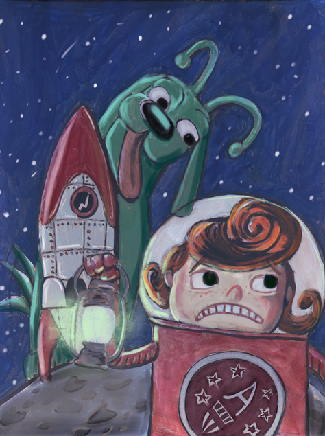
131kb:

-
Thats what I normally do, and you don't normally notice any difference.