Christmas Greetings Image
-
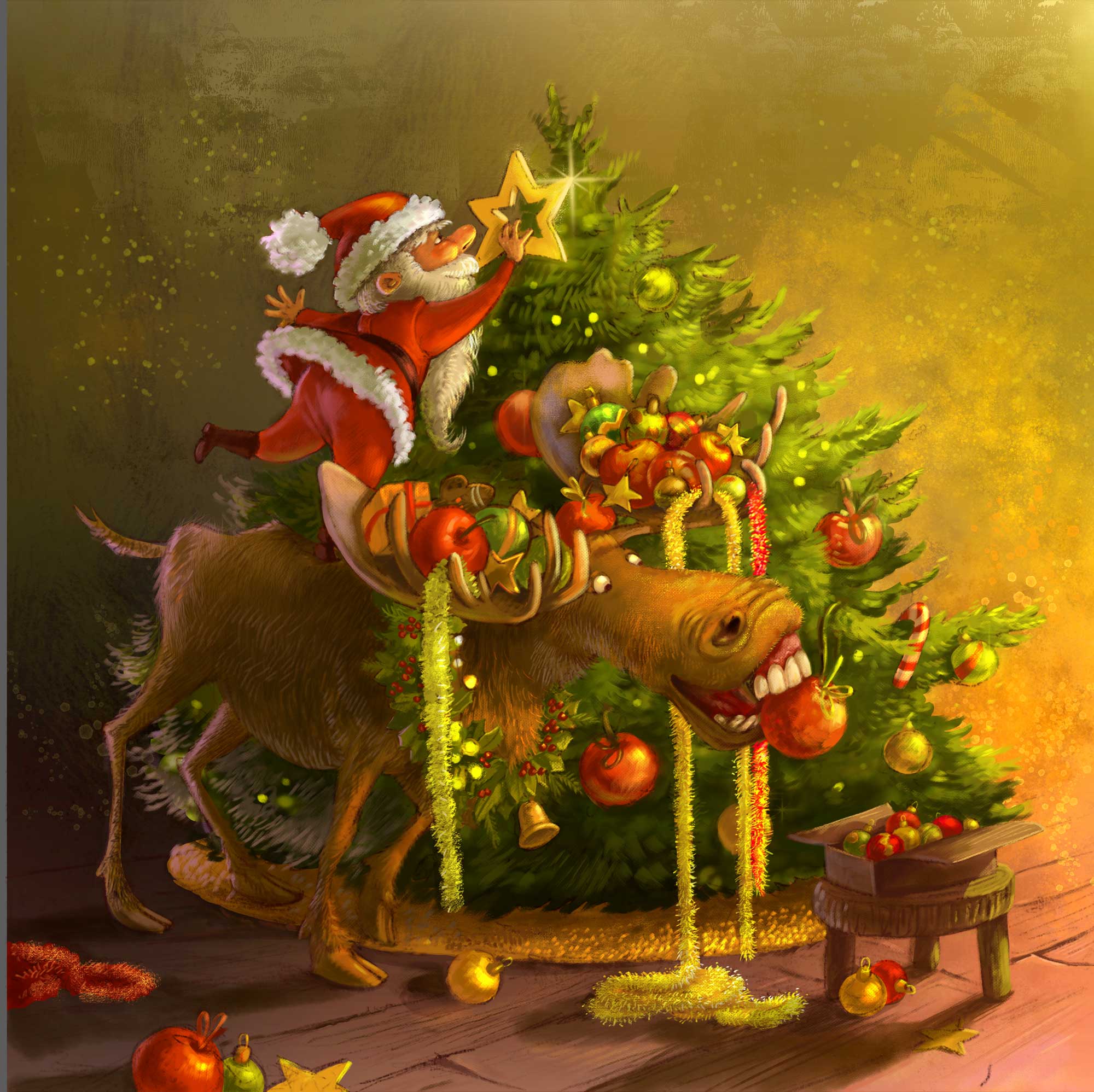
Taking a chance of a little free time today to work on my Xmas greetings image for this year.
Not sure if it should be a vignette with neutral background, or should have an environment (like a suggestion of interior) or rather have something abstract/decorative, like a door frame or a holly bough around. Thoughts and feedback welcome!!
-
@smceccarelli Great image! Love that moose!
Currently, I'd go with a hinted background for the ground that vignettes up to a flat color (white, black, color) on top ("flat color" could also be a faint pattern, like a star or snowflake pattern). Actually, you've kind of already done that with the detail of your sketch.
Here's some other thoughts I had prior to writing that:
What is the distributed use? (e.g. printed card, image embedded in an email, posted to a blog or social media post/header, screen for a video, etc.?) That may dictate the background some. (If a printed card, then I'd probably go with a full background rather than a vignette. If digital, then a vignette might be beneficial, if placed with copy-blocks or if you want to make it a transparent background to be on top of the web background or animated background (like changing colors))
Also, is this a night/dark environment or a day/light one? Either way, it can vignette off to dark/light; however, if the star, ornaments, possible lights are desired to glow, then it might have benefit of vignetting to dark, which would emphasize the glow.
If you have any text that will be placed on/with this image, that might call for a simple or flat background (or gradated out to one), at least where the text will be (assuming right now it would be to the top-right and even to the mid-right if the image is put into a horizontal layout).
Before reading your comment "suggestion of interior", I had assumed it was outdoors due to the moose, so if it is intended to be indoors, then it might bring some additional humor to the image to hint at it being indoors (since moose aren't typically indoors), whether by having a carpeted/wooden/tiled floor and/or having a baseboard trim, or something else.
I think that you already have a lot going on with details here, so you don't really need all that detailed of a background or border (particularly since those might distract away from the core image). With that said, you could use a faint pattern (like graphical snowflakes or a line pattern or a star pattern) on top of a simple/flat background (if you chose a vignette out to white, the pattern could be white so that it disappears with the gradient fadeout), and if you choose to do a border, I'd go more graphical/abstract like stars, moose footprints, or flourishes rather than something so illustrative like a holly bough (though, I suppose a highly graphical version might work but still, it is pretty complicated)
If you do a full image vignette (as opposed to just the top half-to-3/4), I might suggest reconsidering the cropping of the bottom-left elements. They seem to imply that this shouldn't be a vignette. It would be a simple fix of rendering them in full and moving within the boundary or turning off if their being cropped doesn't work with a vignette.
( ^ - ^ )
Scott Monaco | QuietYell.com
IG/FB/LI: @QuietYell
IG-2: @QuietYellSketches
TW/PIN/BEH/DEVART: @ScottMonaco
SCBWI: http://bit.ly/1r8Dmqr -
@QuietYell Wow, thank you for your thorough feedback! It´s mainly for posting on social media (Instagram, Twitter, FB). Maybe a couple of e-mails. I was not planning for text on the image. The setting is indoors and I think the idea of a carpet or a wooden floor is brilliant. The suggestion of indoor should come mostly from the lighting (candle-light). I think I will follow your advice and go for a 3/4 vignette with just a textured background suggesting a wooden interior. Thank you so much!
-
@smceccarelli so glad to be of help! I like that it is indoors; adds to the humor. Great work as always!
-
@smceccarelli btw, you might want to take a look at those social sites to see what canvas ratio might be best to accommodate all 3+. I've noticed that Twitter crops vertical images (unless I just don't know what I'm doing when I post - haha), horizontal images are on the small side in Pinterest, and square fits your profile display of images in Instagram the best (though, I believe it shows the image as vertical/horizontal in the post-feed that others see)
I guess you could also simply create multiple images that are cropped according to each social site...
Scott Monaco | QuietYell.com
IG/FB/LI: @QuietYell
IG-2: @QuietYellSketches
TW/PIN/BEH/DEVART: @ScottMonaco
SCBWI: http://bit.ly/1r8Dmqr -
I guess you could also simply create multiple images that are cropped according to each social site...
That is exactly what I try to do as often as possible
")
I always start with the Instagram format, unless I have other constrains... -
Great image @smceccarelli can't wait to see this painted.
")
-
Practically done. May re-check value balance in a couple of days, after it is out of my mind. Thoughts and feedback welcome!
-
@smceccarelli Looks great!
-
@smceccarelli - boy does this scene make me smile. That moose!!! Great job as always Simona!
-
@smceccarelli very excellent
-
Really nice image
Love your brush work aswell. -
This is SO brilliant @smceccarelli! I always love your character design (even the tree has so much pizazz!) so much and you're so very talented when it comes to rendering too. I'm also always a sucker for humour
The background is a bit too gold/brown for me - but this is a personal preference thing so very subjective. Feel free to ignore me on that! On the topic of background though, there's just two areas I find distracting. The texture behind/above Santa almost looks like a face to me and my eye keeps going there, trying to make out what it is. I'm also distracted by the two large rectangular shaped brush strokes (on a 45 degree-ish angle) in the upper right. I think those two areas could be blended a bit more. But otherwise I think it's fantastic! Great work as always
P.S. I'm blown away by the tinsel garland - wow!
-
STUNNING!
-
What a fun and beautiful image!
-
Wow! your work just gets more beautiful and lively every time I see it!
-
awesome image- my favorite is the background. Backgrounds are so difficult for me