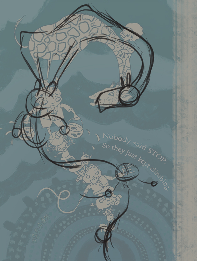
Circus WIP
-
Hi Maile,
Great revision. The giraffe looks a lot better and that curve really makes for a nice composition for the whole piece. To me, the ear still doesn't really have the shape of a giraffe's ear, those curvy lines wouldn't be there. I would just make it simpler and maybe make the little "antennae" thicker to be more giraffe-like. Not a big issue.
-
Good luck! it has turned out very lovely. So much fun, I love those characters and their swag haha.
-
just peeked in on this thread - and the improvements you made are fantastic! You really refined this and brought it all together so well! And I am glad you stuck with this color scheme - it has a great design quality to it!
-
@Vicky-Vicky said:
Hi Maile,
Great revision. The giraffe looks a lot better and that curve really makes for a nice composition for the whole piece. To me, the ear still doesn't really have the shape of a giraffe's ear, those curvy lines wouldn't be there. I would just make it simpler and maybe make the little "antennae" thicker to be more giraffe-like. Not a big issue.
Thanks Vicky. This kind of feedback is really helpful to me. It's a good reminder of how important it is to understand the anatomically correct way of drawing something before making an abstract departure. I didn't do that here, and I guess it shows!
-
@Naroth-Cow said:
Good luck! it has turned out very lovely. So much fun, I love those characters and their swag haha.
Thank you

-
Really nice! Love your color and design.
Only thing off for me is the character design of the giraffe. SInce he's gonna be a main focus, he needs to be perfect. IT's mainly his chin and ears that need work. The way they are now give him a sort of "dragon" look. I'd make the chin smaller/thinnner and look at some reference to do a stylized ear that is correct.
Great piece. I'd like to see more from this story. ; )
-
@Lee-White Thanks Lee (and everyone). It's so helpful to have fresh eyes on my work.
Off to study giraffes...
-
Here it is with a giraffe-ier head. I'm wondering if I might have gone too far toward realism, so that the head doesn't seem to fit the body or the boy's face. What do you think?
-
I think the new head is good! just darken the outlines on the spots to be consistent with the rest of him

-
It's looking good. I would just push the curve the people are on right now. Maybe make it a bit more twisty.
Just a quick paintover.

-
@Lynn-Larson Thanks Lynn.
-
@Javier-Diaz Ooh thank you! I love the feel of your curve. I'm going to go work on this now and see how it goes.
-
@Javier-Diaz Whew! Okay, here's the update. It was not easy for me to push things this much (and even looking at it now, I can see places where I could have pushed more, especially at the girl/cat section). But I think the result is quite an improvement over the original.
-
hehe, love it!!
-
@Lynn-Larson Thanks

-
@Maile-McCarthy said:
@Javier-Diaz Whew! Okay, here's the update. It was not easy for me to push things this much (and even looking at it now, I can see places where I could have pushed more, especially at the girl/cat section). But I think the result is quite an improvement over the original.
Awesome work!!

-
Such a big difference from where you started. I know you have to feel good about where it is now and all the great advice along the way!
-
@Javier-Diaz Thank you

-
@Thrace-Shirley-Mears said:
Such a big difference from where you started. I know you have to feel good about where it is now and all the great advice along the way!
I do! I'm so grateful to be a part of these forums.