Re-do of an old illustration
-
Preparing my portfolio for the SCBWI winter conference, I decided to re-paint an old illustration from 2014. I do not normally to re-visit old work (although strong arguments for it have been put forward by teachers and other artists), but this one had a special place in my heart and I wanted to bring it back into my portfolio. I am curious about your feedback on the re-do - it is difficult for me to gain distance from a piece I know so well.
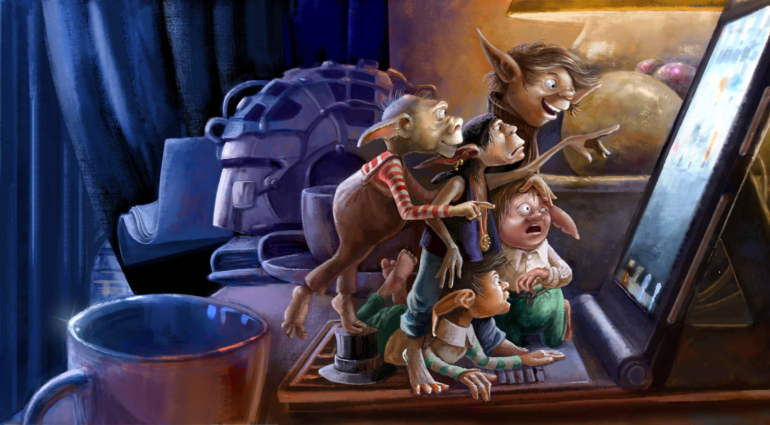
Also, would you use the full illustration or the cropped version?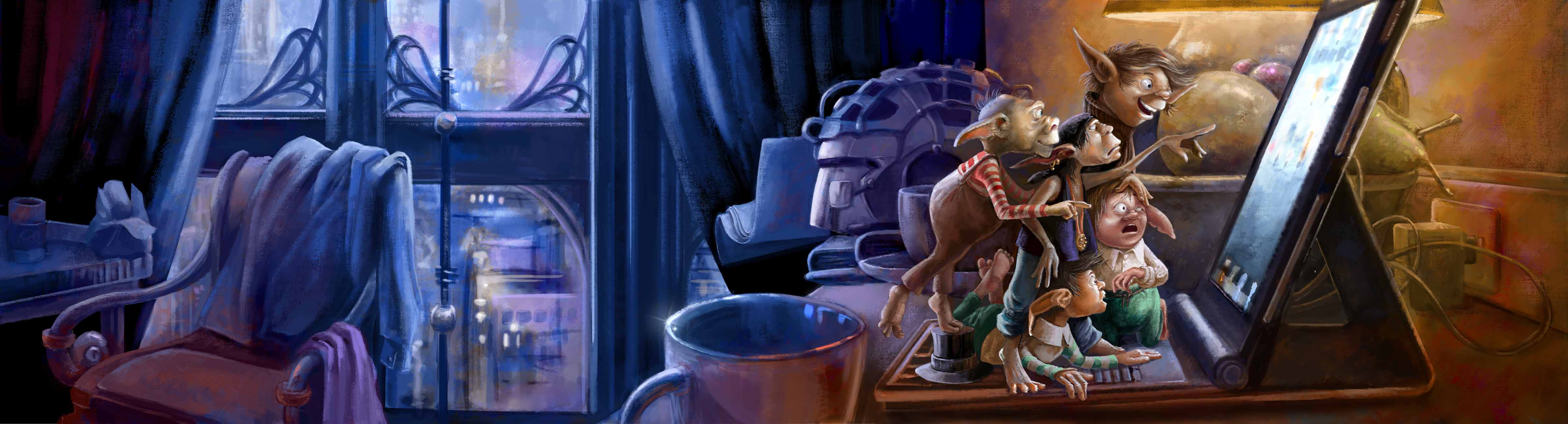
-
@smceccarelli Hi Simona! I keep trying to decide which of the versions I would include in my portfolio. The spread layout is really wonderful as it shows such a a nice transition from cool to warm light. And I like that this transition takes place with a 2:1 balance so its not happening right down the center. In the cropped version that play of cool/warm is 1/2 and 1/2 and I am not sure I like that quite as much.
Also that coffee cup in the foreground feels like it is out of perspective with the rest of the image. I think the side of the cup closer to us would be higher and we would see less into the cup overall. It does not stand out to me as much in the full image, but it definitely calls attention in the cropped version. So you might consider adjusting it a little to better read with the scene.
As always your choice of colors, the actions of your characters and your painterly style are very beautiful!
P.S. - I am not sure how you layout your portfolio. But the more I look at the two versions of your image stacked like this, the more I wonder if you might consider printing them onto a page in your portfolio this same way. As it shows the full scene as you planned it but gives the viewer a chance to see the most important details close up which may not be as easy to read if small on a standard sheet of paper.
-
I personally love the entire illustration, I am always a sucker for an elongated landscape. I especially the play between the warm and cool areas of your piece, I am glad you revisited it. I am not going to SCBWI this year, keep us posted on your experience! Best wishes!
-
@smceccarelli beautiful piece!
I would have to agree with @Rich-Green - if you can include both on your portfolio page, then go for that! If you can only choose one, I'd opt for the full elongated version. It has a nice mood to it, and it really shows just how tiny the characters are in comparison to their surroundings. With the atmosphere being so cool behind them, I feel 'concerned for their safety' and wonder about the story line - what will happen next? When it's cropped, there's less of that sense of the story. Plus, when it's cropped, the coffee cup draws my eye far too much. -
@smceccarelli Wonderful piece!
") I would also go for the large version because of the above mentioned reasons. I was also distracted by the cups perspective. There is also a tiny tension between the cup and the left edge of the table. Another thing is the right corner of the chair in front of the window. It seems too much down for me.
I would also go for the large version because of the above mentioned reasons. I was also distracted by the cups perspective. There is also a tiny tension between the cup and the left edge of the table. Another thing is the right corner of the chair in front of the window. It seems too much down for me.I love all the little details. There is always something to discover in this piece!
-
Beautiful! I agree with @Rich-Green, depending on the layout of your portfolio, it would be nice to have both included. I also agree the cup needs some tweaking. The perspective is off and in the elongated scene, it is right in the middle and breaks the scene in two. Good luck at the conference!
-
@smceccarelli This looks great Simona! - I like them both of course but if i had to choose one it would be the elongated version mostly because it tells more of a story - i have just a couple thoughts. The warm to cool transition is nice - for me though the lamp itself keeps pulling my eye(and the lit area behind the screen) so i would like to turn the lamp off in the background move the warm light source to the computer screen - if there was a warm image (like your Christmas card painting) this could work as the source - just an idea of course - to see how it looks - this would give just two light sources instead of the three - right now it feels like there should be more of a cool light on the characters fronts because of the cool screen - I think the main idea being that i think it would be nice if the faces of the characters had the warmest light and not the background - one other minor and most like wrong idea i have is it feels like the shadows should be deeper where light is not hitting like in the the center of the body masses and the side of the helmet in the background ....to make it feel more night-timey. The other thing is the face of the one eyed fellow keeps tugging at me - maybe give him two eyes just for the portfolio...only because in perfect profile he has the look of having been drawn wrong because i think we (i) assume at first that he has two eyes and so it looks like his eye has been drawn too far forward (possibly raising his cheekbone quite a lot to support the eye might make it a quicker one-eyed read though) - anyways..hope this made some sense - feel free to ignore of course - they really are very nice paintings as they are!
-
Thank you all for the precious and extremely useful feedback!!
I will try to include both the elongated and the cropped one in the layout - need to experiment a bit. I have moved the cup down and corrected the ellipse, as well as corrected the perspective of the chair - those were really good point. The cup falls exactly on the gutter, so its role in the image is less prominent than it appears when spread out. I have corrected the profile of the top guy, like @Kevin-Longueil suggested, and also reduced the intensity of the back light a tad...though I am not sure I will keep it that way, as it looks a little muddy, I believe....
Regarding the shadows....the original image was a lot darker, with the screen as the only real light source. The problem is, images like that work well on screen but are terrible in print - CYMK conversion and digital printing crunch the lower values together and you loose all definition. I have had so many problems with printing that I get anxiety attacks every time I need to print something - unfortunately my images tend to have large areas of dark, because light effects are one of my pet peeves. This time, I spent two hours in a great print shop I was recommended by a friend designer - just testing papers, printers and settings. We could find a combination that preserves most of the value structure even on dark images, but you still need to pay attention to the overall value caps - that is why I raised the levels of the all image during this re-do.
It would be so nice to see how my pictures look in offset printing, but it is impossibly expensive, of course....I will have to wait to have a book published ;-))
-
They are both wonderful, but I prefer the cropped version.
-
I love the feeling of the whole thing--I like the feeling the outside view brings to the picture.
-
I like both. So tough choice there. Also depends what else you have in your portfolio to show variety. I'd say change the backlight to the trolls. Both front and back light is same color, so maybe make the backlighting a blue or yellow instead of white.
-
Love the whole thing but the cropped comp is really nice!
-
@smceccarelli My favorite is the elongated one. Very nice atmosphere!
-
Nice piece @smceccarelli! Both pieces are great but I like the cropped version a bit more simply because it shows more detail on all of the little creatures and still shows the nice cool to warm transition.
But I don't think you can really go wrong with either one. Nicely done!
-
@smceccarelli
Your work is always amazing. On the long one my eyes go to the chair and then the window. On the small one my eyes go to the helmet. I think that is just me because I like blues and lavenders. Your characters design is fantastic! Great pieces for your portfolio.