Finishing an INKTOBER
-
I didn't make it to posting something every single day for Inktober, but I did have one drawing that I liked enough to take it to Finished (even if it's not Perfect). I really tried to push myself this Inktober, embracing Jake's idead of getting something done versus something I thought was perfect. This one was the exception, and I really tried to stretch myself — I rarely ink, let alone shade/color my sketches. Too afraid, too clumsy, too slow; all of it adds up to me stopping before I get going too far.
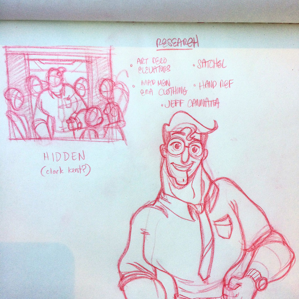
But watching some of the SVS classes, seeing others success, and sitting through a lot of Jake's youtube clips gave me the confidence to keep on pressing. Here's a couple of snapshots at my progress over the course of a week or so. Here's the first couple sketches and the wordlist.
-
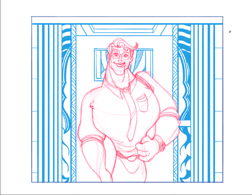
After figuring out the basic layout and looking up some reference (there's a specific elevator in an Art Deco building down the street that I've dying to draw) I redrew the Clark Kent on paper, scanned it, and dropped in the environment in Photoshop.
-
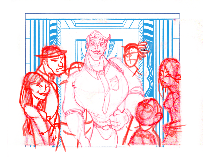
I had to draw on the go, so I pulled the PSD into Procreate on the iPad and roughed in the crowd around Clark. Some of these are based on real people from photos (the little guy screen right runs the elevator) some are from Starbucks sketch sessions, and a couple were imagined up on the fly. I'm really surprised how much I like drawing on the iPad!
-
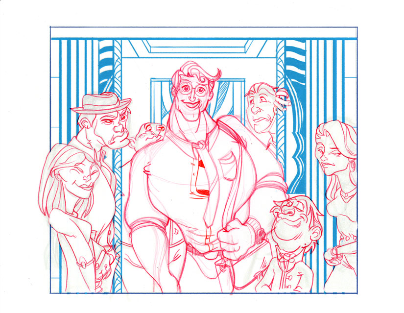
Back into Photoshop to tighten everything up with Kyle Webster brushes — I think this is the most fun part of the process for me, finding the personalities and trying to add little stories to each person's day. The story here is the prompt — even though the word 'Hidden' was the Inktober word of the day, Superman is far from it. The humor's supposed to come from the fact that, while Clark thinks his glasses turn the trick, everyone's reactions to him prove otherwise. Some of the crowd are surprised, some happy, others — well, they're kind of over it.
-
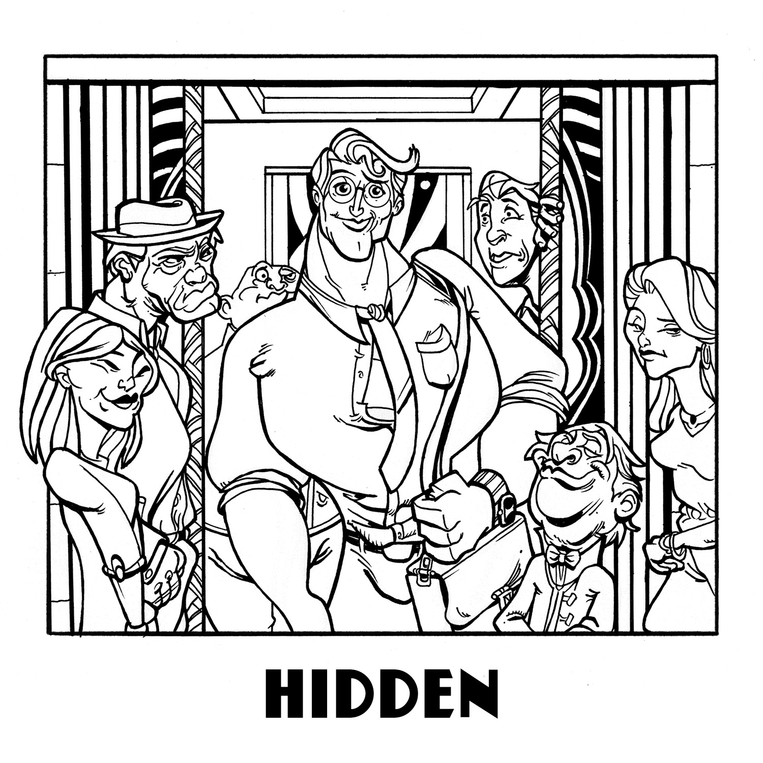
I followed Jake Parker's lead and printed out my PSD super light on some heavier stock paper and inked the piece by hand; some pen and some brush. This is probably my least comfortable part of the process — my hand just doesn't feel steady and nothing comes very quick. Sometimes I screw up on the lineweights and then doubleback to make the stroke more consistent, which I feel like results in chunky, clumsy lines.
-
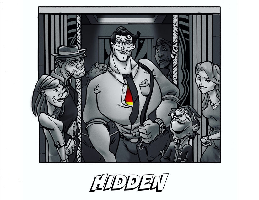
Colors, finally. It's probably too heavy-handed, way too contrasty, and a little unbalanced — but I pushed as hard as I could with this phase. Jake talks about studying and analyzing artists whose work you enjoy, and I've been trying to figure out Robert Valley for forever. Thankfully, he published a little PDF about his process on his Oscar-nominated (and hopefully, winning!) short, Pear Cider and Cigarrettes, and he was pretty thorough in how he approaches his shading. It's amazing how much he wrings out of a few simple tools.
I struggle to find a balance between flat designed cartoon simplicity and dimensional rendering, but this is one of the first times I've felt alright with what I've done with shapes and shading.
-
Wow! I really like your interpretation of the word "hidden." Thanks for sharing your process and good on you for plowing through and finishing it!
I can see the RObert Valley in it. Good job applying what you learned from him without going to far and over rendering this.
Do you have plans to do more?
-
@Jake-Parker Thanks for the comments — I can't tell you how pivotal SVS and especially your Youtube posts have been. So much of the fight artistically is psychological. I'm definitely going to be doing more of these, I want to experiment with more techniques and rendering styles; all quick and dirty brush, tight penwork, and mixing up some of the Robert Valley technique with zip-a-tone using the new Kyle Webster Halftone brushes.
I'm still amazed how far tools have come, in another life and a decade + ago I used to draw ashcan comics. Buying those zip-a-tone stickers were expensive!