Introduction & First Commission (for a friend)
-
I love the facial expressions, and I feel like you've really made the characters likeable. I guess my biggest issue with the image is that there's no definitive light source. Overall, the image is well-lit, and yet it's night time. If the primary light source is the fire, then I'd like to see the image being darker overall, with more confident shadows to reflect that. Consequently, I'd probably tone down the rim lighting on the bushes in the background. Hth.
-
Whoooo hoooo! Welcome! This is a fun illustration with really well crafted characters. Your rendering is quite good with the trees, and all the details. applause
You mentioned that you knew there were composition issues and some values that need tweaking. I thought I would lend some TOTALLY unsolicited critique of just the composition of the piece.
Since it is a wall mural (or is it not?) I know adding details is a giant pain... so I tried to keep this fairly simple but more complex than it was.
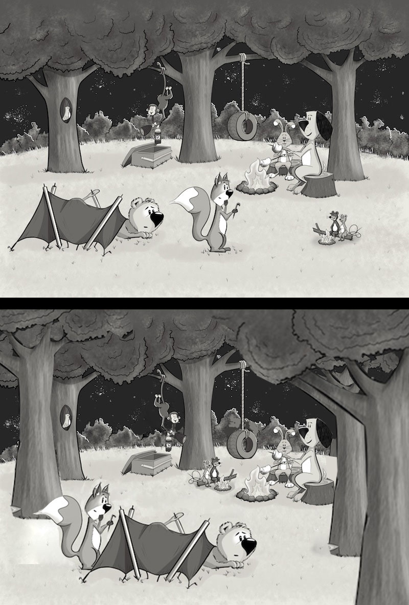
First off, whenever you have more than one character in a frame, you are implying a relationship of some kind. So I looked at your story here and found some ways to group the characters.The tent pitching guys were feeling distant and maybe unconnected _ I feel moving them closer and fixing the squirrel's eye line made it a little more readable. A little scaling up of the size too.
The little mice with their own campfire seemed distant as well and I imagined them trying to be like the dog and bunny with their big fire, so they set up shop on the opposite side of the fire. Now both groups are looking at one another. Similarly, I flipped your monky to be facing that direction. Flipping the monkey solved the relationship issue and also the readability of the ice chest vs. 2 Litre bottle conundrum. WIth those elements separated, the monkey stands out more and the ice chest has its place as well.
As you can see, I added more trees. The three that you proposed were equidistant and the middle one just about bisected the frame evenly - this lends to a more predictable and somewhat boring composition. Adding more trees and sizing them up and down makes the forest feel homey and wooded (though I would still move that center tree out of the dead center of the piece). Also, having the one tree go off the frame on the bottom right makes it feel almost like we are an observer without interaction to the scene. Like we are peeking in on an adventure or moment.
Lastly, your shrubs were all the same height (relatively) across the back of the image. That stripe was hiding the monkey and the tire swing - so I gave the hedge a little more randomness and dropped the tire a bit to start jogging the composition back and forth a little for more rhythm.
I know you said it was probably too late for this piece to change, but I really liked it so I thought I would add my two cents. Good luck with this and future pieces!
-
Hi Rapteev, thank you for the reply and comments! Yes I think I was somewhat shy with the shadows as I was worried about making the piece very dark overall. Following the suggestions about compositions from others as well I'll have another go at lighting as well and try to be more confident as you suggest...
Thanks so much again!
-
Hi Bob, Thank you so much for your welcome and detailed critique! I feel very humbled that someone what go to the time and effort to rework my illustration!!
The final piece isn't actually going to be very big, going into a 14" x 11" frame, which I feel makes it a little easier with regard to detail – much bigger and I'd probably be going nuts over how much detail to include
")
I love your suggestion for the composition and I think it would also make it easier with regards to lighting the scene as per @Rapteev comments above – really get that fire as the focus of the light.
I think I'm going to keep working on this beyond the commission and maybe colour it up for myself – maybe it'll even be my first proper portfolio piece...
Thank you so much again!
— James H —
-
WELCOME to the forums. I hope you enjoy your stay. Refreshments are by your left, and critical advice is by your right! I agree with @smceccarelli on composition. I'm pretty sure on future works you could improve on depth and perspective I have a nice commentary speed paint right here
The guy hasn't been on any form of internet in 7 months, but still a lot of other videos on his YouTube that are inspiring and really helpful. I wish you luck! -
@JamesH Tag me so i don't miss the final!
-
@JamesH Welcome to SVS! It's a great place here for advice and chat, I'm sure you'll love it. I'm also from the UK, and also came to art in a more roundabout way (I used to work in magazines) so I empathise with all the stories here from everyone who's taken the career change/leap of faith towards the creative side
-
@Bob-Crum Will do
-
@Ben-Migliore
Hi ben, thanks for the reply and link - going to check out the video now
-
Hi Dulcie, Thanks for the welcome and encouragement! It seems like there are quite a few of us from the UK here which is great! Should try and get the SVS guys to run a UK workshop sometime