Postcard mailer
-
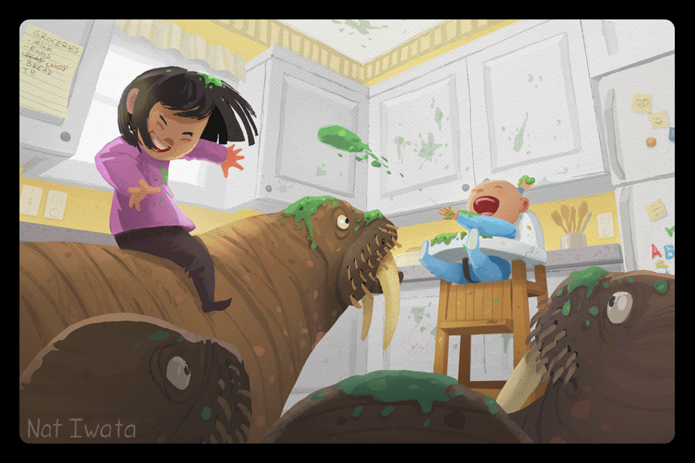
I've done text on the back and image only on front, but I'm fond of #4 here. It's clever and the splatter/ black text fits the scene. This image is awesome, lots of clear action and an adorable cast of characters. I think you'll fetch lots of attention with them.
I'm working on mine this week for ABLA, too. I need to add several new portfolio pieces.

-
@natiwata I thought i'd throw my 2 cents in even though i have no experience with this
") They are all very nice for sure! For me all of the versions with text within the confines of the cupboards are best - the ones where the text overlaps the cupboard/wall and the last one where it comes close to the edge do not read as well somehow - my 6 year old likes the second version and my 11 year old is enthusiastically supporting the third version with the smeared peas - i lean toward the third one too but possibly with the slightest desaturation of the peas on the cupboard (but not the peas in the air or hair)... or a tiny bit more saturation elsewhere?..on the top of the walrus? (some oranges i think) and mid-tones of the girl? - one little thing ....the rounded triangle under the main walrus's tusk pops forward at the moment because of the tangent there and the floor plane seems too high also... i feel like it is a cool forced perspective but that it reads better when i block that small patch of floor ...i think the reason for this lies in the highchair's front right leg (our left) tilting back slightly from whee it feels it should be... there might be a tangent at the bottom of the other leg too where it meets the valley formed by the two walruses ...my eye keeps ending up there - i am wondering if you could de-emphasise that spot somehow? I hope this was not annoying Nat! I tried to be thorough with my impressions even knowing that they may be off - any version will be great i'm sure - it is a really nice image!
They are all very nice for sure! For me all of the versions with text within the confines of the cupboards are best - the ones where the text overlaps the cupboard/wall and the last one where it comes close to the edge do not read as well somehow - my 6 year old likes the second version and my 11 year old is enthusiastically supporting the third version with the smeared peas - i lean toward the third one too but possibly with the slightest desaturation of the peas on the cupboard (but not the peas in the air or hair)... or a tiny bit more saturation elsewhere?..on the top of the walrus? (some oranges i think) and mid-tones of the girl? - one little thing ....the rounded triangle under the main walrus's tusk pops forward at the moment because of the tangent there and the floor plane seems too high also... i feel like it is a cool forced perspective but that it reads better when i block that small patch of floor ...i think the reason for this lies in the highchair's front right leg (our left) tilting back slightly from whee it feels it should be... there might be a tangent at the bottom of the other leg too where it meets the valley formed by the two walruses ...my eye keeps ending up there - i am wondering if you could de-emphasise that spot somehow? I hope this was not annoying Nat! I tried to be thorough with my impressions even knowing that they may be off - any version will be great i'm sure - it is a really nice image!Edit - i think i have the chair idea wrong.... maybe it just feels like it does not share the same overhead vanishing point as the room ....but the chair may not be parallel to the cabinets? ....should the leg on our right be kicked out way to the right? - there is something there i cannot put my finger on
-
Wow, thank you everyone for all of the thoughtful feedback! After taking what everyone said to heart and deciding the illustration needed some finishing touches, I reworked a few things and chose yet another name option. I tried out of frame, but couldn't get it looking quite right.
Haven't sent it to the printer yet, so feedback still welcome! I'll also show the back, my agent's contact info will go in the blank space, but I didn't think she'd appreciate me posting it publicly

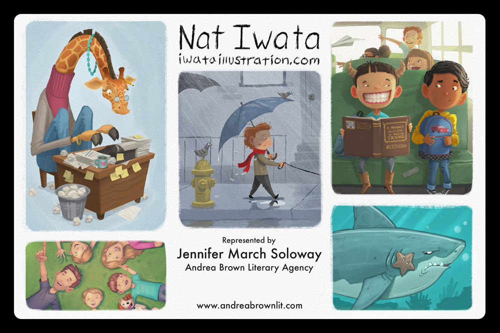
Nat Iwata
www.iwataillustration.com -
Really like that!! Love the extra detail in the scene; changing the colour of the word candy and the backwards 'N' is a nice touch
You're name as it is works great - it's clearly there but doesn't detract from the illustration, and then the illustrations and contact details on the reverse side feels nicely balanced!!
-
ooohhhh love 3 the splatter!
-
Can't believe how much that black boarder makes the "peas" image pop. I think the changes you made to the image are very strong and bump it up to another level of good.
I'd vote for that 100%. Awesome work.
-
@natiwata This update looks fantastic Nat. The black border is really sharp and does really make things pop. Beautiful work as always!
-
@natiwata Is this meant to be a single oversized postcard or 2 separate ones with black boarders or 2 separate ones that you are presenting on a black background?
I do like how you tucked your name subtly at the bottom left on the walrus
great work, buddy!
-
Perfect!!!
I agree with @JamesH for "candy", really nice touch! Also the fridge looks good, I think there was a little too much cupboard in your other version!For the back, I noticed a tiny detail that probably doesn't matter. You cropped the bottom left image RIGHT on the tip of the finger and the little boys right at the neck... which creates odd tangents. Since I already saw this painting before, I know it is a crop of the full image, but an art director might think it's the full image and if it was, the composition wouldn't be great...
Finally, I agree with everyone else, the black border is really making everything pop!
-
@natiwata totally awesome postcard! Beautiful work
-
Really beautiful! Works much better with the name in the bottom left corner!
-
This is a little off topic:
@smceccarelli I clicked the up arrow to "like" your post, but it still shows "0" and when I clicked again it went to "-1" (so i clicked again to make it go back to "0" even though it should show "1") - Do you notice this issue on your side? Just wondering if this is a momentary glitch or if I somehow did something wrong.
Scott Monaco | QuietYell.com
IG/FB/LI: @QuietYell
IG-2: @QuietYellSketches
TW/PIN/BEH/DEVART: @ScottMonaco
SCBWI: http://bit.ly/1r8Dmqr -
@QuietYell Hey Scott - this has happened to me a few times over the past 2 years - a couple of folks here have received panicked chat messages when i thought i had down voted them by mistake - i did eventually figure out that you can go into your profile and check if you have down voted anyone - (when i found that out i clicked it and found i had inadvertently down voted someones who's work i admired
 i think i must have done it while scrolling on the iPad)
 -
@Kevin-Longueil ahh interesting - thanks!