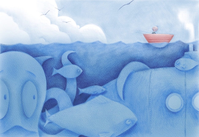
Is my character not reading well?
-
Been working on this for a little bit, and and having some success with the skin tone by mixing in the blues and the reds, but for how small he will be, I wonder if I should take a more blurry approach akin to Lee White's suggested method of not giving too much detail in the face when there is distance (at least I think it is Lee White who said that somewhere) what are your thoughts?
-
Hi Eric, I really like the piece, it's a great concept and nicely done!
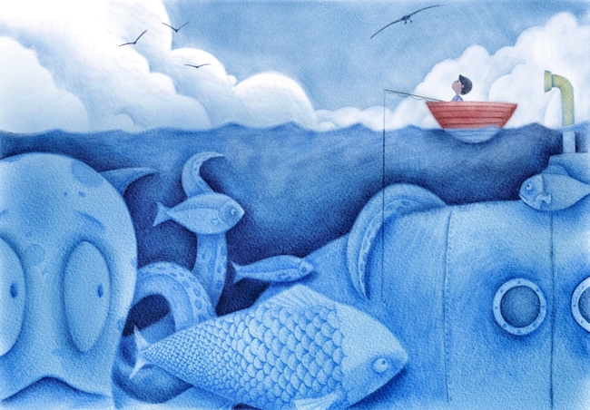
Two small thoughts; would giving a bit more variation in values between the boy and sky make the character read a little better? I feel like he gets a bit lost in the background. Second thought is what I would read as the exhaust/snorkel and fumes from the submarine on the far right... I just had a quick look on wiki and I think that an exhaust pipe/snorkel is kept underwater (as you have it) to stop the fumes being seen and giving away location. To keep your fumes, how would it work adding some turbulence to the water above the snorkel as if the gases are bubbling through or having the exhaust pipe/snorkel being just above the water? Alternatively what about changing it to a periscope looking at the boy for an added bit of comedy?
Anyway, just some thoughts - hope they are of use. Really like your style!
-
I agree with James. I squint, and the sea creatures are my first read, because they're so high contrast. Second read is the boat, because red. I think if you want the boy to read better, he's going to need to be able to compete with the sea life. I think as far as the facial features are concerned, you've hit the sweet spot with details.
-
Hi Eric!
I also agree that the boy need higher value contrast vs the background. Maybe you could have some white clouds repeating behind him ?
Also, LOVE James idea of a periscope. It would be very funny!
One last thing. You have some really HUGE fish. I know that they are supposed to be closer to us, but I think it would be good to add some smaller fish in there too! Right now you have huge, large and medium shapes, but not really any small shapes.
Hope this helps!
Noémie
-
@JamesH yes, that was the idea with the submarine. The concept behind the piece was a boy fishing and not realizing what was under him. The parascope was going to be looking at him as if it is something he could be made aware of if he just turned around. and I was contemplating adding someone inside the submarine looking through the scope, but idk.
-
Here is the final. Maybe a few touch ups, but pretty much done.
-
@Eric-Castleman Love it!!! The character really pops out!! there's a really nice richness in the colours/values!!
— James H —
-
@JamesH thanks! That means a lot!
-
@Eric-Castleman Your underwater world looks amazing
") It's cool to see how forum helped you improve this pic. Its looking very nice!
It's cool to see how forum helped you improve this pic. Its looking very nice!