Society of Visual Storytelling

    SVSLearn Forums

    • Register
    • Login
    • Search
    • Recent
    • Tags
    • Popular
    • Users
    • Groups
    • Search

    Trying a bit of color...been a while

    General Discussion
    7
    13
    2208
    Loading More Posts
    • Oldest to Newest
    • Newest to Oldest
    • Most Votes
    Reply
    • Reply as topic
    Log in to reply
    This topic has been deleted. Only users with topic management privileges can see it.
    • Kevin Longueil
      Kevin Longueil SVS OG last edited by Kevin Longueil

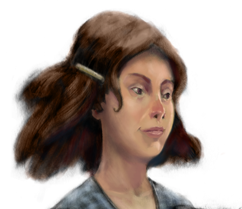
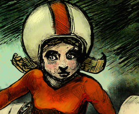
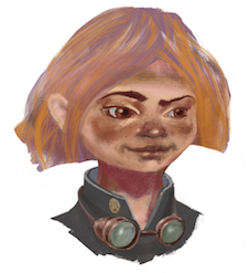
      Been about a year since i did any color i think....feel like that was a mistake - i have been enjoying the Oz series though - anyways here is my go at adding color to Dorothy - looks a bit bland at the moment but she is turning out much better than i was anticipating - thought i would throw in a thumbnail of Astrid and Lucy from 2 and 1 year ago to show progress 🙂

      0_1493591230408_Dorothy_color crop Small.png

      0_1493590792754_1458663833526-astrid-14-copy.jpg

      0_1493590817046_1458716274688-goggles.jpg

      Portfolio: kevinlongueil.com
      https://www.instagram.com/kevinlongueil/

      1 Reply Last reply Reply Quote 7
      • mattramsey
        mattramsey last edited by

        I like this a lot. I see a huge improvement over the astrid illustration.

        https://www.inprnt.com/gallery/mattramsey/
        https://mattramsey.artstation.com/
        https://twitter.com/mramseyART

        1 Reply Last reply Reply Quote 1
        • Sarah LuAnn
          Sarah LuAnn SVS OG last edited by

          This looks awesome! It hasn't lost any of the feel that your black and white pieces have and could still hang with them as a group, which I feel can sometimes be tricky when adding color.

          Amazing improvement overall, you should be proud of the whole series and how your work has developed over time!

          sarahluann.com

          Kevin Longueil 1 Reply Last reply Reply Quote 1
          • Kevin Longueil
            Kevin Longueil SVS OG @Sarah LuAnn last edited by

            @Sarah-LuAnn @mattramsey Thank you both!!

            Portfolio: kevinlongueil.com
            https://www.instagram.com/kevinlongueil/

            1 Reply Last reply Reply Quote 0
            • Chip Valecek
              Chip Valecek SVS Team SVS OG last edited by

              Did you just add a color layer over your grayscale? I found that if I do that my colors always seemed so dark/dirty. So now I add a hue/saturation layer with the saturation at 0%. Then I can turn it off and on to check values.


              https://www.instagram.com/chipvalecek/
              https://www.facebook.com/cvalecek
              http://www.cshellmedia.com/

              Kevin Longueil 1 Reply Last reply Reply Quote 1
              • evilrobot
                evilrobot SVS OG last edited by evilrobot

                Looking good Kevin. Just wondering if you've watched the digital painting video with Kevin Keele demo. He talks about using gradient map to turn your black and white image into a three color painting, then adding the color layer on top of that. It seems to work really well I tried it myself on a black and white image and it worked pretty good. Will Terry does something similar in his image as well tinting the black and white image towards a warm color before adding the base colors in a multiply layer over the top.

                http://www.palacioillustration.com/

                https://www.scbwi.org/illustrator-gallery/illustrator-detail/?illustrator_id=84142

                https://www.pinterest.com/evilrobot2/pins/

                https://twitter.com/MyEvilRobot

                Kevin Longueil 1 Reply Last reply Reply Quote 1
                • Kevin Longueil
                  Kevin Longueil SVS OG @Chip Valecek last edited by

                  @Chip-Valecek Hey Chip - her face is a "normal layer" painted directly onto the drawing - tried to keep it to one layer (in Procreate) - did not really paint the hair yet though...does she look dark/dirty to you? i've been trying to work on what i feel are my greatest weaknesses - faces and value are for sure on my list but color is definitely at the top so i need to get to work on it 🙂

                  Portfolio: kevinlongueil.com
                  https://www.instagram.com/kevinlongueil/

                  Chip Valecek 1 Reply Last reply Reply Quote 0
                  • Kevin Longueil
                    Kevin Longueil SVS OG @evilrobot last edited by

                    @evilrobot Hey William - funny... i'm looking all over the internet trying to figure out where to find the Kevin Keele video and it turns out i own it 🙂 Wow ...that was a while ago ... - i really had no idea what anyone was talking about back then (2013?) i bet some of it might sink now if i go back and re-watch the older videos. Thanks for the heads up!

                    Portfolio: kevinlongueil.com
                    https://www.instagram.com/kevinlongueil/

                    1 Reply Last reply Reply Quote 1
                    • smceccarelli
                      smceccarelli Pro SVS OG last edited by

                      This looks really good, not "bland" at all! I think there are a thousand ways to add color to a B&W layer in Photoshop - I personally prefer painting directly on top as well, but I always feel like experimenting....

                      1 Reply Last reply Reply Quote 2
                      • Kevin Longueil
                        Kevin Longueil SVS OG last edited by

                        @smceccarelli Thank you Simona! I think by bland I meant there is nothing really exciting going on - I tried to stay away from dramatic or theatrical lighting and just try to make believable color choices - I really appreciate getting your opinion!

                        Portfolio: kevinlongueil.com
                        https://www.instagram.com/kevinlongueil/

                        1 Reply Last reply Reply Quote 0
                        • Chip Valecek
                          Chip Valecek SVS Team SVS OG @Kevin Longueil last edited by

                          @Kevin-Longueil Nope not dark/dirty at all, that is why I was asking. I can never get it to look right.


                          https://www.instagram.com/chipvalecek/
                          https://www.facebook.com/cvalecek
                          http://www.cshellmedia.com/

                          Kevin Longueil 1 Reply Last reply Reply Quote 1
                          • natiwata
                            natiwata SVS OG last edited by

                            Kevin this is looking really good, huge improvement! The skin color choices are spot on, really nice variations.

                            Nat Iwata
                            www.iwataillustration.com

                            1 Reply Last reply Reply Quote 1
                            • Kevin Longueil
                              Kevin Longueil SVS OG @Chip Valecek last edited by

                              @Chip-Valecek Hey Chip.. i'm not very knowledgeable about layers but i think i remember in Jim Madsen video (which is awesome) that he mentions using an "overlay " layer sometimes to preserve the lighter tones in the painting when adding color and or texture.... i could be way off but maybe give it a try if you have not yet... i just did a little experiment myself and it does not seem as murky as the color layer in the darker tones.
                              @natiwata Thank you Nat!

                              Portfolio: kevinlongueil.com
                              https://www.instagram.com/kevinlongueil/

                              1 Reply Last reply Reply Quote 1
                              • First post
                                Last post