Creative Composition- 25 Things WIP
-
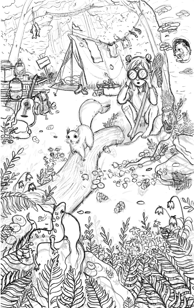
Hi Tess! Thanks for posting your work. A few of the videos I've watched recently really emphasized the relationship between value and focal point so that's fresh on my mind. Based on your explanation I assume the focal point should be somewhere around the squirrel and salamander but the values around them are very close. The highest contrast is around the horizon and my eye gets stuck there. Perhaps adjusting the contrast so that your focal point really pops can take it to the next level. If it's the salamander maybe you could lighten the value on the salamander or the rocks beneath. I really enjoy the concept and want to see the progression. I hope that helps!
-
Hi, it looks very intersting, cool story:) iam not an expert, just learning to draw, however it seems to me, that tree behind the girl should be similar value to the girl, so lighter. At this moment is at similar value as salamander, which doesnt look right to me. Just give it a try and see what happens;) iam sure its gonna be a cool piece!
-
Thanks, you guys.
@Jon Anderson- good point! I will play with it and see if I can emphasize the focal points better.
@aska- I see what you mean. Thanks!
-
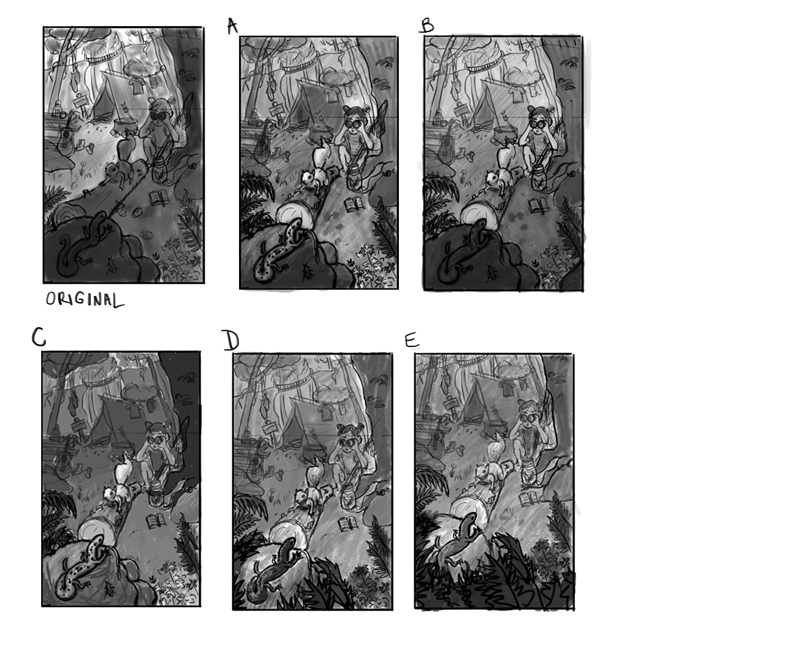
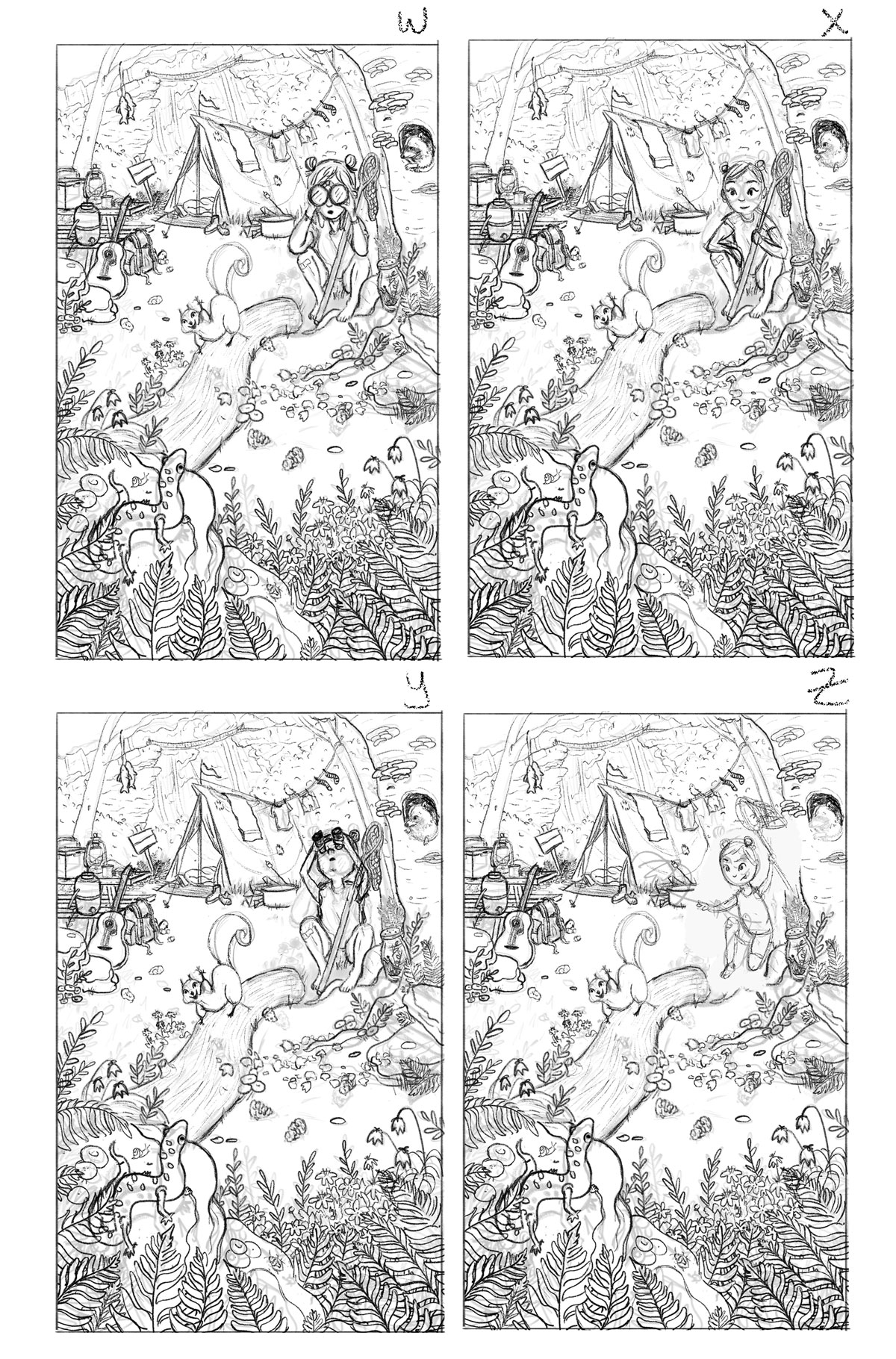
I worked on the value structure a bit more. I also changed the perspective of the log so the salamander's head would be framed by it more. Not sure if I like that change or not. I tried to put less contrast in the background and more contrast in the foreground. My color choices and rendering will also hopefully bring attention to the focal points more.
Not sure if I took them far enough or if there's enough variation between the versions
Website: www.tessawrathall.com
Instagram: www.instagram.com/tessawrathall_art/
-
@TessW I like E
-
@TessW Good work finding different values to experiment with. When I look at them zoomed out I'm more interested in the overall value of "C" with a couple of suggestions. I think a close, darker foreground like the leaves in "D" could add a good bit of depth and slightly lowering the value of the end of the log might help establish the salamander as a whole. This may just be a personal thing and while color could make a difference the value makes me think there's a separation between the salamander and it's head. Also, I didn't notice at first in the original the log created a tangent with the person but I think you corrected that nicely. Taking the time to do little tests like this lead to a better finished product. Keep it going!
-
@TessW I really like the highlighting in A and C but I think the plants from D add a lot of depth and attracted me to the image more it's a lovely image either way though I can't wait to see this one finished up!
-
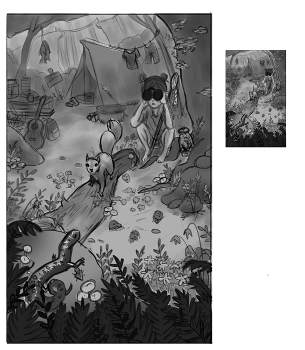
Thanks for the input, everyone! It helped a lot. I worked on it a bit more. I'm thinking it might be too dark overall and maybe I should lighten it?
Do you think I need to refine the line work even further? I don't intend for it to have linework in the finished illustration- or if I do, it will be subtle. Not sure how to proceed at this point. Also not sure how to transition to color. I think I'll save that for after I've taken a few color courses here.
Website: www.tessawrathall.com
Instagram: www.instagram.com/tessawrathall_art/
-
i love it. i am having some issues with scale in the middle ground. The girl is either too small, or the tent and surrounding are too big. Id adjust those just a little to give it more sense of depth.
-
and to add a bit more to values, I would make the tree on the right dark, like foreground and the trees on the left as well. i think it would frame the piece nicely
-
I really love the composition!
I am glad you changed the log framing the salamander. It was a good idea in theory, but it looked like the log was hitting the salamander in the head!
I think you're right that it's a little too dark overall.
I opened it in photoshop added a curve adjustment layer on it and I simply used the "automatic" button and I feel it makes a good difference!
For the sketch, I think you should do another more refine sketch before moving to color... At first I was usually starting my colors way to early because, like you, I didn't want to include the sketch in my final image so I thought it didn't matter. But everytime I ended up doing so much reworking and changing things which are a lot harder to fix in color. So now I usually do a rough sketch, rough value and rough color and then I clean up my sketch before starting the final color (usually I even go over my sketch twice... and each time I end up changing things and fixing problems I didn't see before)
-
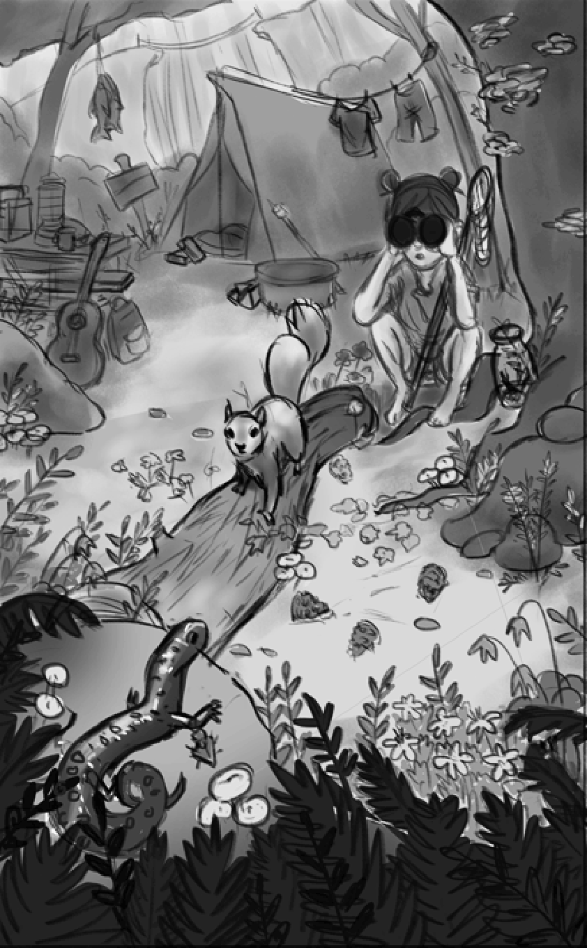
Thanks @MirkaH and @NoWayMe! I made the tent a bit smaller (the one on the right). Did I go far enough? I'm also going to refine the sketch more because I can see areas where I might have trouble painting out, like you were saying, @NoWayMe.
I played around with different poses of the salamander and I'm lean more toward this new one on the right. What do you think? I'm thinking it gives it more action, like the salamander is on alert and is poised to run away if necessary.
Website: www.tessawrathall.com
Instagram: www.instagram.com/tessawrathall_art/
-
You're going in the right direction! I would echo the comments about the values. I struggle greatly with values so I know it's easier said than done but you're making good progress.
-
@TessW I like the idea of the salamander about to run away. I would watch the arch in its back. A quick google search on salamanders doesn't show them with an arch like that, unless you are trying to show its curve in the body.
-
The tent is better but now the salamander is smaller, which now again makes it out of proportion. I'd ease on the curve of the back and bring the size of it up again. I'd also move the squirrel up over to the left on the tree branch a bit. The three things in the picture make a straight line, girl, squirrel, salamander, and I'd stagger them to make the composition look more natural.
-
It seemed less obvious when the salamander was partially covered in the leaves.
-
Ok, worked on it more, taking your suggestions in mind. Still playing with the look of the squirrel and salamander and might tweak the anatomy of the girl. I thought I tweaked the arch of the salamander's back, but I must have got my layers mixed up.
Website: www.tessawrathall.com
Instagram: www.instagram.com/tessawrathall_art/
-
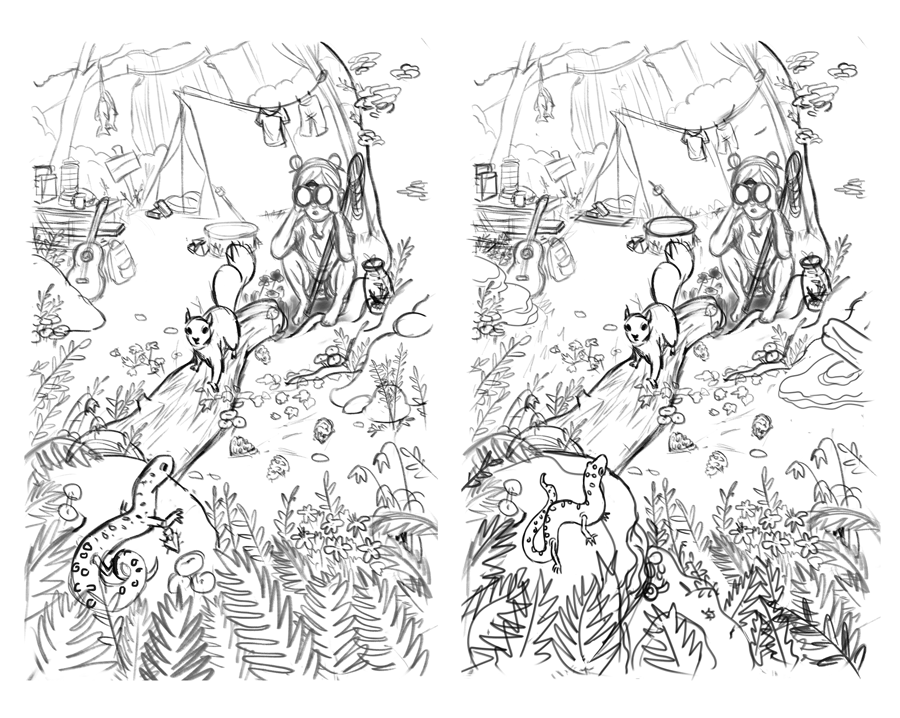
@TessW I love it there's so many little details and things to look at but the main focus still reads really well! I think you've done a great job with all the changes
-
Overall, I really like how this has changed from the beginning of the thread, but... If I might add my 2 cents...
I know this has mainly been about the values and all, but the thing that has really stuck out to me are the binoculars she is using. As close as she is to the action, binoculars aren't really needed. Maybe turn them into a camera.
also, it seems as if you added more detail to the background around the tent and cliff & bridge areas. To me, the bridge area work better with less detail, letting us know what is there, but not distracting from the foreground action. And the raccoon in the tree and rabbit(?) in the pot by the tent seem to distract as well. Not sure if you needed those to get to the 25 things, but they seem unnecessary to the story at large. Also, those clothes on the tent, again, add too much busy-ness.
-
Well, it's been a while since I worked on this piece. I was intimidated to start rendering, so I let it sit for a while. Coming back to it, I've played with the drawing a bit. Is there a version you like better?
@ambiirae Thanks!
@tombarrettillo said in Creative Composition- 25 Things WIP:
Overall, I really like how this has changed from the beginning of the thread, but... If I might add my 2 cents...
I know this has mainly been about the values and all, but the thing that has really stuck out to me are the binoculars she is using. As close as she is to the action, binoculars aren't really needed. Maybe turn them into a camera.
also, it seems as if you added more detail to the background around the tent and cliff & bridge areas. To me, the bridge area work better with less detail, letting us know what is there, but not distracting from the foreground action. And the raccoon in the tree and rabbit(?) in the pot by the tent seem to distract as well. Not sure if you needed those to get to the 25 things, but they seem unnecessary to the story at large. Also, those clothes on the tent, again, add too much busy-ness.
Thank you Tom! I guess I have a soft spot for little kids using binoculars. Have you ever noticed how they love playing with them to make them feel adventurous, even if they are totally using them wrong? I took your advice though, and tried some different options.
As far as the busy-ness goes, I hope to resolve that in the rendering stage. The spirit of the assignment is that you can have a lot of things going on in the piece, but you can still establish the focal points with color, values, textures,, etc. I will try to de-emphasize the areas you mentioned with less detail and contrast.
Website: www.tessawrathall.com
Instagram: www.instagram.com/tessawrathall_art/