Society of Visual Storytelling

    SVSLearn Forums

    • Register
    • Login
    • Search
    • Recent
    • Tags
    • Popular
    • Users
    • Groups
    • Search

    looking for opinions

    General Discussion
    8
    17
    3635
    Loading More Posts
    • Oldest to Newest
    • Newest to Oldest
    • Most Votes
    Reply
    • Reply as topic
    Log in to reply
    This topic has been deleted. Only users with topic management privileges can see it.
    • rcartwright
      rcartwright last edited by

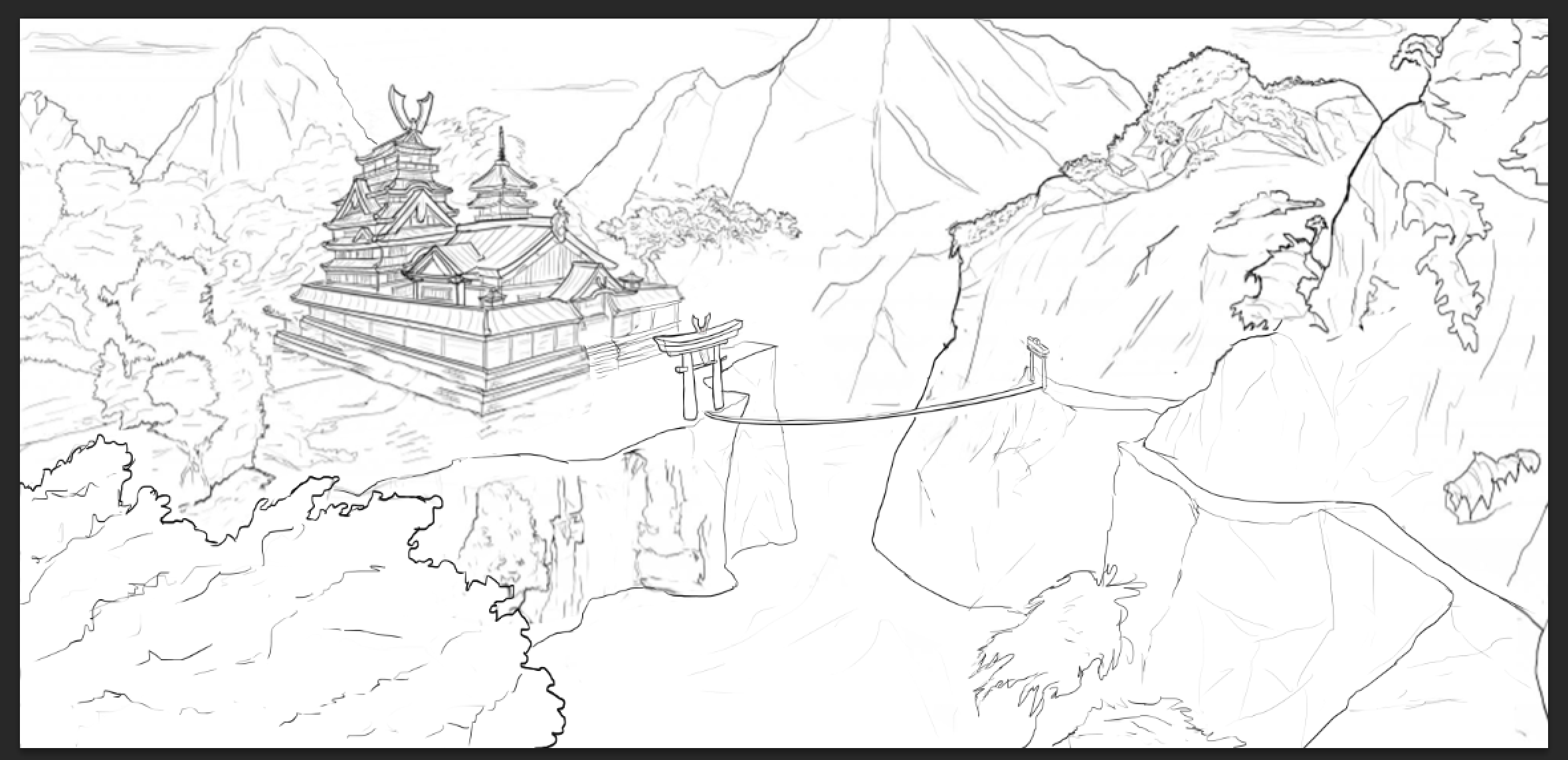
      The building seems like it is sort floating. As well the gate of the building would a large opening but the bridge which people will assume is a narrow rope bridge is roughly the same width across which I think throws off the perspective of the building

      https://www.scbwi.org/members/richard-cartwright/
      https://www.instagram.com/richardwcartwright/
      https://www.pinterest.ca/richcartwright3/art-of-richard-cartwright/
      https://www.richardwcartwright.ca/

      1 Reply Last reply Reply Quote 2
      • L
        linhb last edited by linhb

        😃 the bridge has 1 vp different 😃 i will work on the floating cattle and see what i can do thanks man

        1 Reply Last reply Reply Quote 0
        • L
          linhb @DOTTYP last edited by

          @DOTTYP thanks man

          1 Reply Last reply Reply Quote 1
          • L
            linhb last edited by

            haha vertical ropes along the rope bridge i miss that :(( i didnt use refs for that :((

            1 Reply Last reply Reply Quote 0
            • MirkaH
              MirkaH last edited by

              i think the rope ladder looks like it is very long, but it barely recedes into the distance. it is about the same width from one end to other. i think it would help making it bigger at this end, or changing its positioning in the image for better sense of space.

              http://www.mirkah.com
              http://instagram.com/mirkadraws
              http://www.twitter.com/mirkahokkanen
              http://Shoppicadoodlepress.etsy.com
              http://facebook.com/mirkahokkanen

              L 1 Reply Last reply Reply Quote 1
              • L
                linhb @MirkaH last edited by

                @MirkaH thanks thats really make sense 🙂

                1 Reply Last reply Reply Quote 0
                • TessaW
                  TessaW last edited by TessaW

                  I think I know why the building doesn't quite look like it fits in. First, it has to do with the line work. The line work on the complex is much heavier than the surroundings. But I think the most important factor at play is that your vanishing points for the palace(?) are too close together for the wide shot of the scene as a whole. If you made them further apart, I feel like the building would rest in the scene better. I would also line up the bridge so that it meets up with the entryway of the palace. Right now, if you were a person on the bridge, when you got off of it, it looks like you'd then have to walk in a diagonal path from the end of the bridge to enter the gates. It seems like whoever built the bridge would want to make the most impact by viewing the entryway head-on when walking toward the palace. It will also give more breathing room for that waterfall.

                  See how the vanishing points are pretty close together? When you make them too close, it can make objects feel warped. And see how the bridge leads directly to the wall, instead of the wall opening?
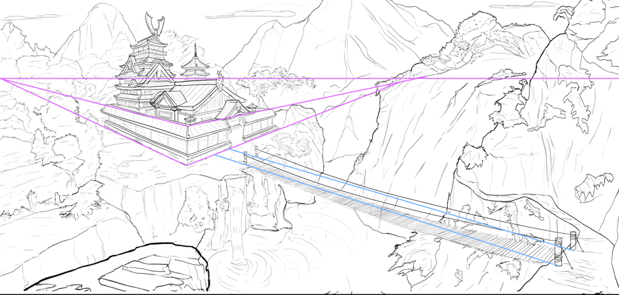
                  0_1497245538701_Untitled-3.png

                  Website: www.tessawrathall.com

                  Instagram: www.instagram.com/tessawrathall_art/

                  L 1 Reply Last reply Reply Quote 3
                  • L
                    linhb @TessaW last edited by linhb

                    @TessW yeah u r right really appreciate your thought. i start with design the building first and lazy to draw the building again to fit with the screen so the persp doesnt good. thats a lesson to me never be lazy =))

                    1 Reply Last reply Reply Quote 0
                    • L
                      linhb last edited by

                      0_1497698807365_Screen Shot 2017-06-17 at 6.24.20 PM.png
                      way too busy these day, today i have time to fix the problems u guys has point out 😃

                      1 Reply Last reply Reply Quote 5
                      • T
                        Tyler Hallstrom last edited by

                        This is a cool idea, do you have a color scheme in mind for the finished product?

                        Tyler J. Hallstrom
                        One Drawing at a Time.
                        https://www.tylerjhallstrom.com/

                        L 1 Reply Last reply Reply Quote 0
                        • L
                          linhb @Tyler Hallstrom last edited by linhb

                          @Tyler-Hallstrom
                          yeah i'll but before that i wanna adjust a little bit because the composition is sort of symmetrical 😃

                          1 Reply Last reply Reply Quote 0
                          • L
                            linhb last edited by

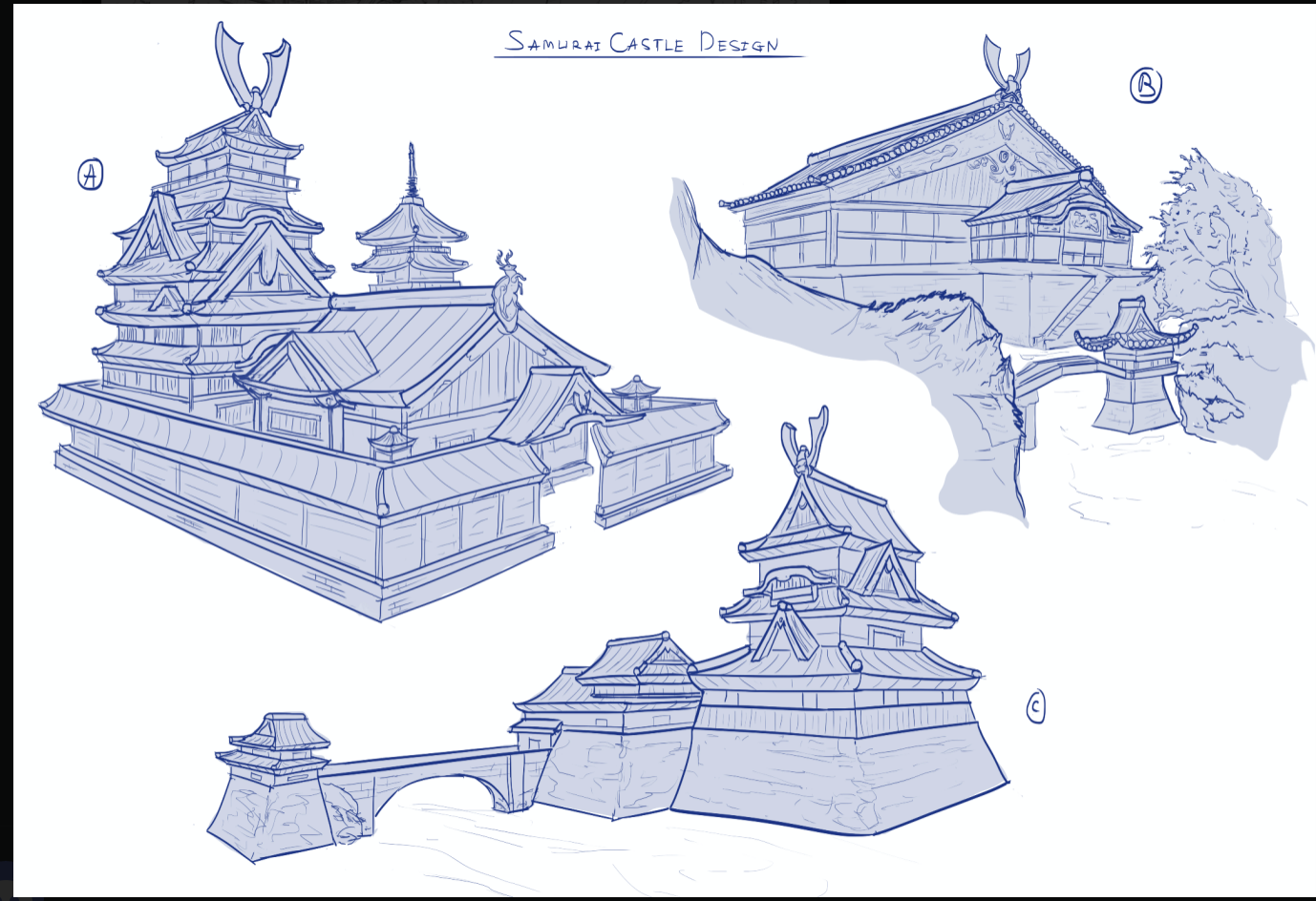
                            btw here is my buildings design
                            0_1497846734969_Screen Shot 2017-06-17 at 6.56.15 PM.png

                            1 Reply Last reply Reply Quote 1
                            • Doha
                              Doha last edited by

                              Great building designs! I especially love option B.
                              Great illustration.

                              Doha Koma

                              www.Komaart.net
                              https://www.instagram.com/dohakomart/
                              https://www.facebook.com/dohakoma/

                              1 Reply Last reply Reply Quote 0
                              • First post
                                Last post