Society of Visual Storytelling

    SVSLearn Forums

    • Register
    • Login
    • Search
    • Recent
    • Tags
    • Popular
    • Users
    • Groups
    • Search

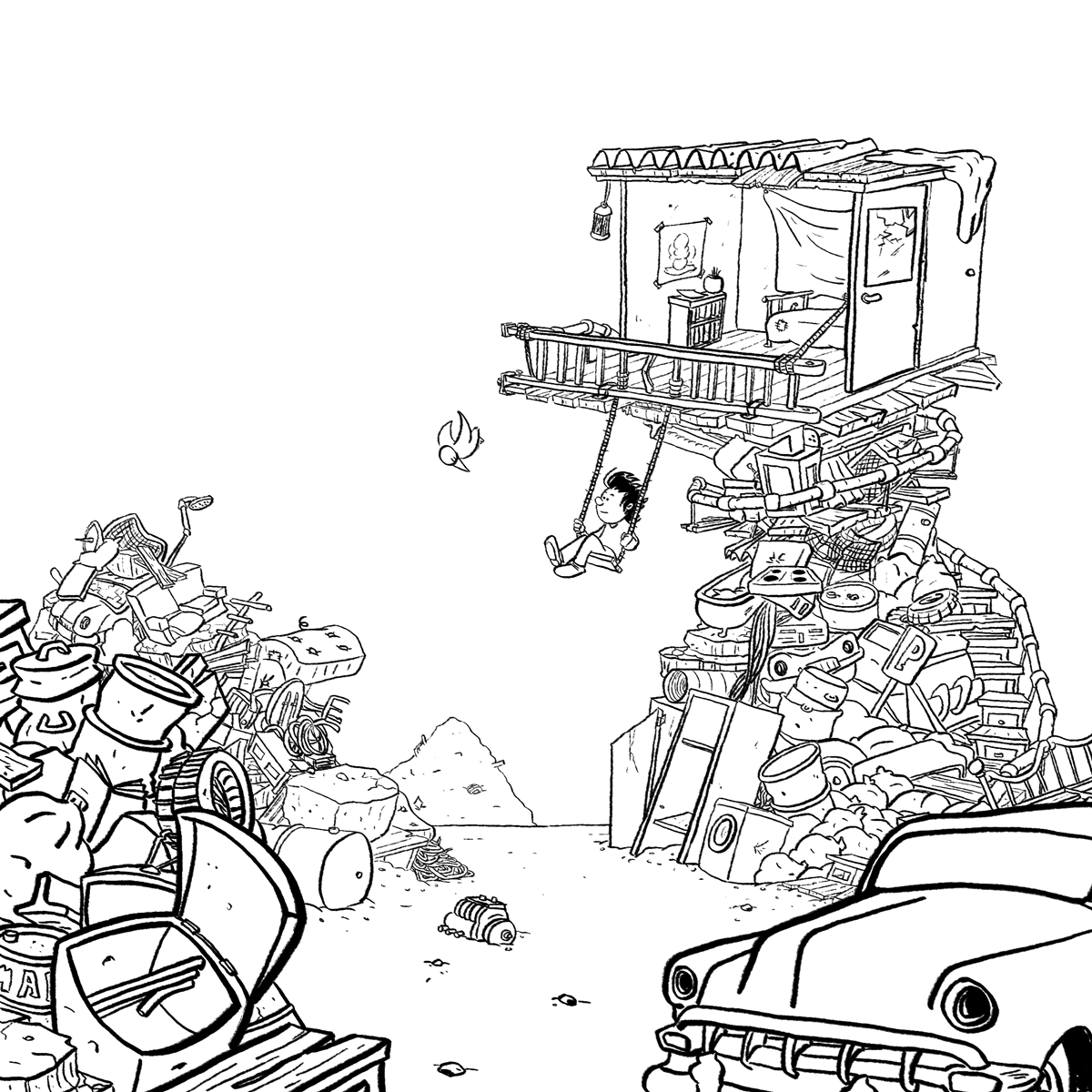
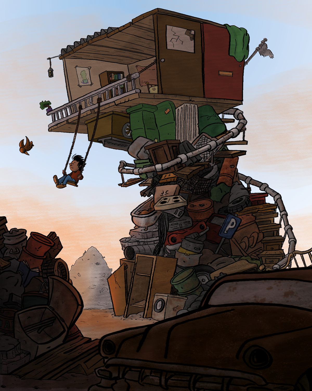
    WIP Treehouse on abandoned junkyard.

    General Discussion
    8
    17
    4273
    Loading More Posts
    • Oldest to Newest
    • Newest to Oldest
    • Most Votes
    Reply
    • Reply as topic
    Log in to reply
    This topic has been deleted. Only users with topic management privileges can see it.
    • Spencer Hale
      Spencer Hale last edited by

      Awesome! Really great concept. Playing with some more extreme variations in size will help. I can also see how adding the right values and colors to this piece could really add to the mood.

      I learned about using keywords more effectively in the illustration 1 class. This piece seems like it is really "hopeful" to me. think of that word or whatever keyword you can come up with as you map out the value and lighting on this piece.

      Looking forward to the final piece.

      spencerhalefire.tumblr.com | instagram.com/spencerhalefire | twitter.com/spencerhale

      Dennis Spaans 1 Reply Last reply Reply Quote 2
      • Laurie
        Laurie last edited by

        The setting in this one is so interesting and gives you so much room to imagine! - Can't wait to see the final!

        www.facebook.com/LMuggliArt
        www.instagram.com/lmuggliart/
        www.lmuggliart.etsy.com

        1 Reply Last reply Reply Quote 1
        • Dennis Spaans
          Dennis Spaans last edited by

          Thanks for all the enthousiastic replies! I'm as good as done with my line work now. All that rests is shadows, contrasts and colors. I'm really happy with it so far. What do you guys think?
          alt text

          Dennis Spaans
          Website: dscomics.nl
          Instagram: https://www.instagram.com/dscomicsnl/

          1 Reply Last reply Reply Quote 1
          • Dennis Spaans
            Dennis Spaans last edited by

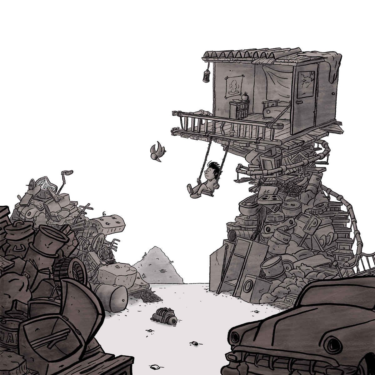
            Now with shadows and contrast. Next step: colors!
            alt text

            Dennis Spaans
            Website: dscomics.nl
            Instagram: https://www.instagram.com/dscomicsnl/

            1 Reply Last reply Reply Quote 1
            • Dennis Spaans
              Dennis Spaans @Spencer Hale last edited by Dennis Spaans

              @Spencer-Hale Thank you for your comment Spencer! I took it into account during the coloring part. Also my wife didnt like the original story so I altered it using hopeful as the theme. Hope you all like the final result:
              alt text

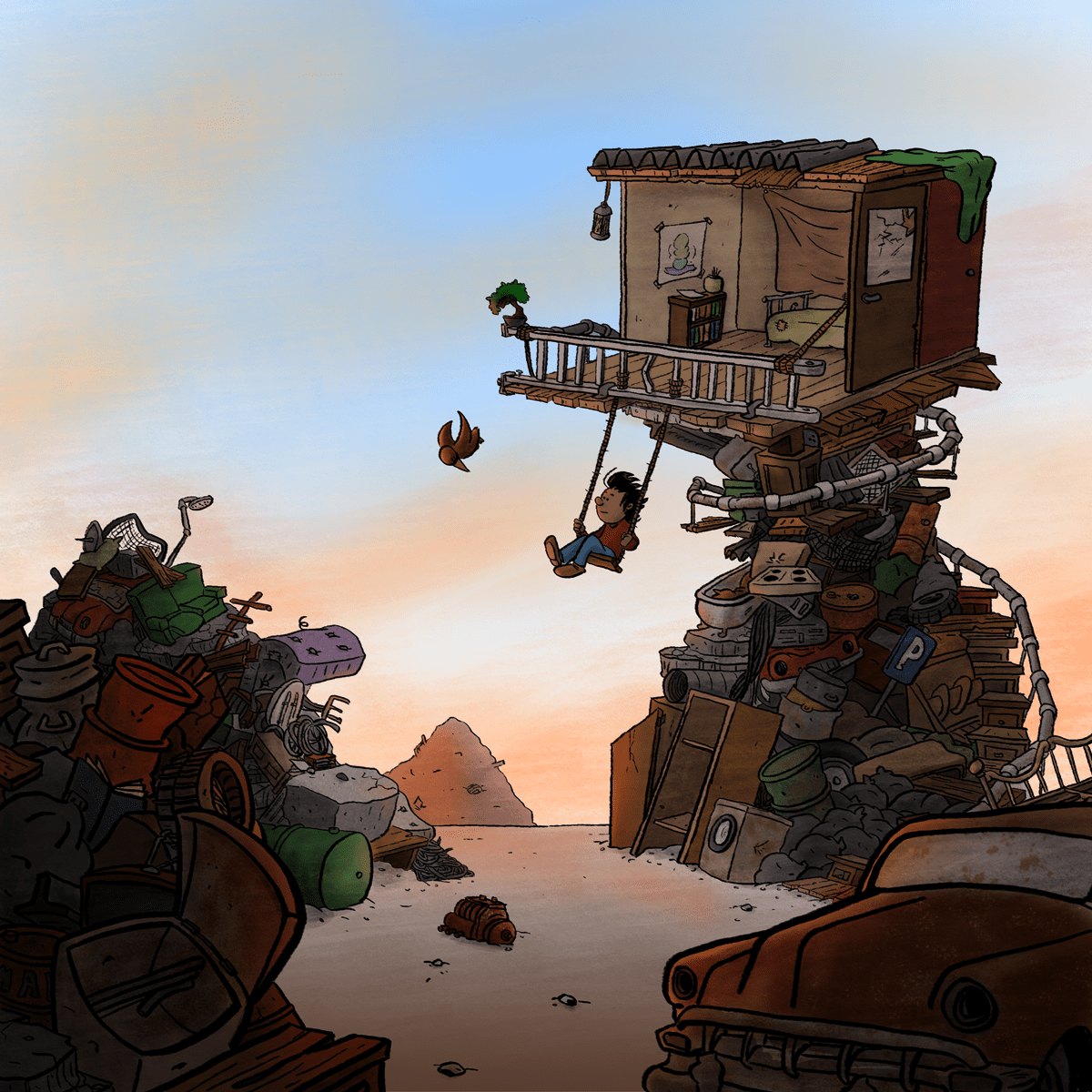
              There is a bigger version available on my website:dscomics.nl

              Dennis Spaans
              Website: dscomics.nl
              Instagram: https://www.instagram.com/dscomicsnl/

              Dennis Spaans 1 Reply Last reply Reply Quote 1
              • Dennis Spaans
                Dennis Spaans @Dennis Spaans last edited by

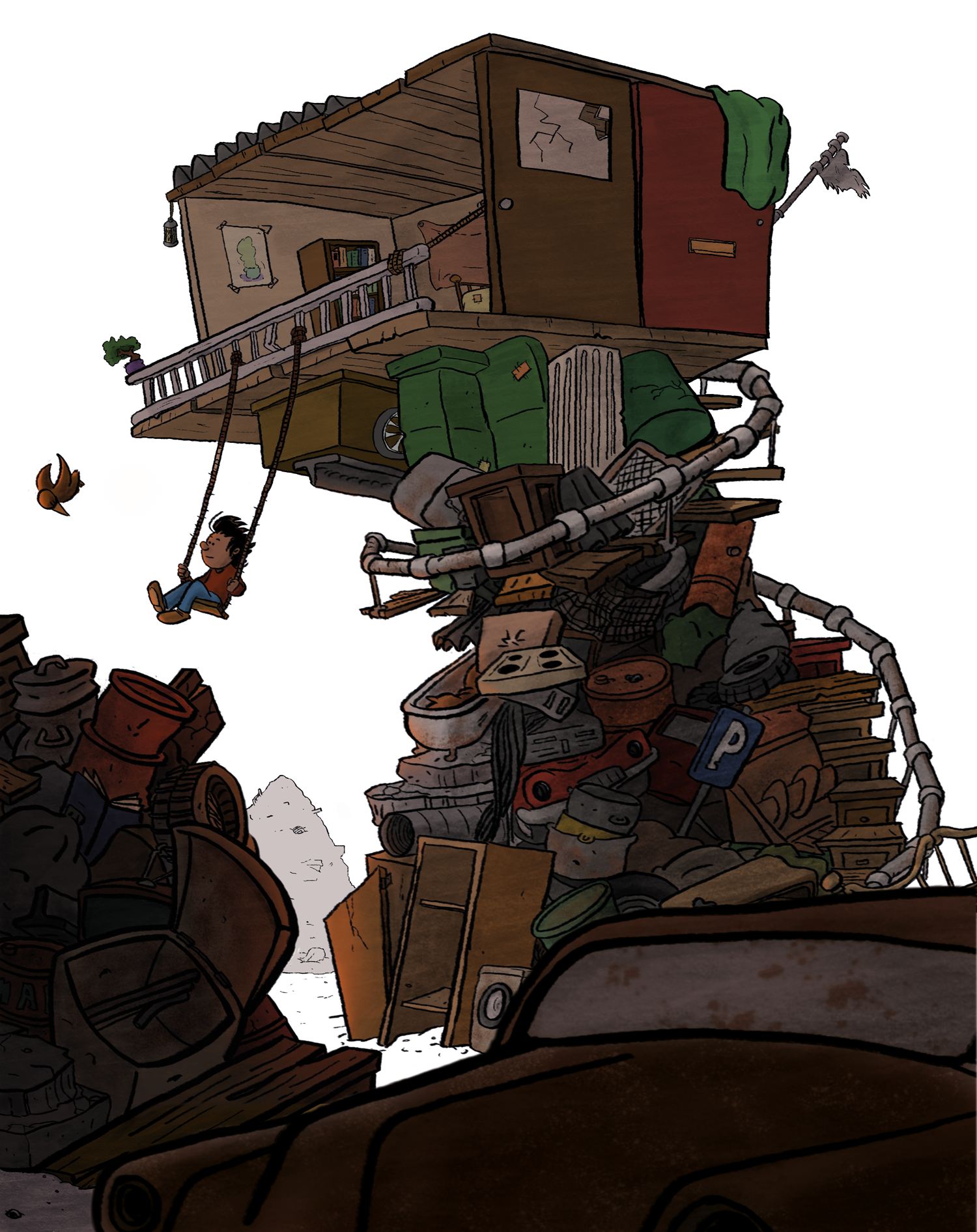
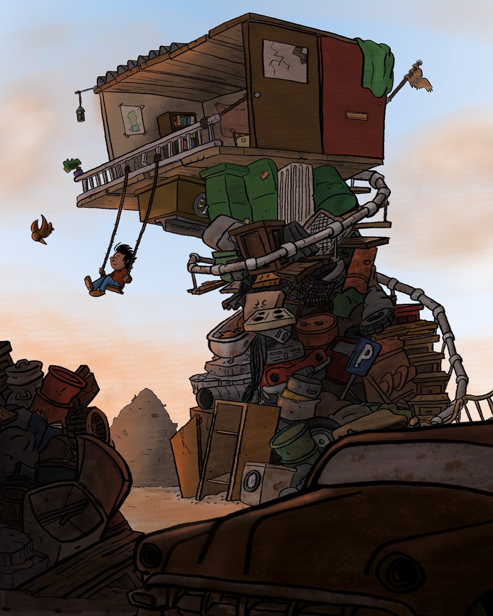
                @Dennis-Spaans After some good suggetions by Will Terry on the other thread, I altered the piece. It is not finished yet but I like it already. What do you guys think?
                alt text

                Dennis Spaans
                Website: dscomics.nl
                Instagram: https://www.instagram.com/dscomicsnl/

                S 1 Reply Last reply Reply Quote 0
                • S
                  smithdraws @Dennis Spaans last edited by

                  @Dennis-Spaans I hate to be contrarian but the little guy feels crowded to the left side. If the focal point was the "tree" house alone then the change would make sense. I do think the perspective updates work. That's my two cents which is about what it's worth 🙂

                  https://www.instagram.com/joshuasmithdraws/?hl=en

                  Twitter handle: @smittyjosh

                  1 Reply Last reply Reply Quote 2
                  • Leontine
                    Leontine last edited by

                    Super nice to see your process! I agree with @smithdraws, Its very crowded on the left side. The other comp worked better for me. Perhaps you can Punch him up with a bit of light round his silhouette?? One other thing, is it 'treehouse like' enough?

                    Leontine
                    "A picture is worth a thousand words."

                    https://leontineillustrator.com
                    https://www.instagram.com/leontine.illustrator/
                    http://www.facebook.com/leontineillustration

                    1 Reply Last reply Reply Quote 0
                    • Dennis Spaans
                      Dennis Spaans last edited by Dennis Spaans

                      Thanks for the comments, they are very helpful! I think I have the best of two worlds now. It was indeed too crowded on the left, and I missed the serenity of my first drawing. But the composition of the 2nd one I liked better, and having the perspective right. Also I like the bumper on the car, so I put that back in haha. I downed the pile on the left, moved Carlos and the lot somehow to the right to create more space. Im not 100% done yet, I need some highlights here and there, but the overal drawing and composition is final. I think... haha

                      What do you think?
                      alt text

                      Dennis Spaans
                      Website: dscomics.nl
                      Instagram: https://www.instagram.com/dscomicsnl/

                      aska S 2 Replies Last reply Reply Quote 0
                      • aska
                        aska @Dennis Spaans last edited by

                        @Dennis-Spaans now, it looks perfect 🙂

                        Aska
                        www.mugaska.com
                        https://www.instagram.com/mugaska/
                        https://www.etsy.com/uk/shop/mugaska

                        Dennis Spaans 1 Reply Last reply Reply Quote 0
                        • Dennis Spaans
                          Dennis Spaans @aska last edited by

                          @aska thanks!! 😃

                          Dennis Spaans
                          Website: dscomics.nl
                          Instagram: https://www.instagram.com/dscomicsnl/

                          1 Reply Last reply Reply Quote 0
                          • S
                            smithdraws @Dennis Spaans last edited by

                            @Dennis-Spaans The composition on its face is working. I'm still drawn to the serenity of the original but great job man. Alot to be proud of. 👏

                            https://www.instagram.com/joshuasmithdraws/?hl=en

                            Twitter handle: @smittyjosh

                            1 Reply Last reply Reply Quote 1
                            • Dennis Spaans
                              Dennis Spaans last edited by

                              I think I'm done. I'm gonna let it sink a few days before turning this one in, but I'm quite pleased:
                              alt text

                              Dennis Spaans
                              Website: dscomics.nl
                              Instagram: https://www.instagram.com/dscomicsnl/

                              1 Reply Last reply Reply Quote 1
                              • Doha
                                Doha last edited by

                                Awesome! Great illustration and story.
                                I love the original drawing too. Good luck

                                Doha Koma

                                www.Komaart.net
                                https://www.instagram.com/dohakomart/
                                https://www.facebook.com/dohakoma/

                                1 Reply Last reply Reply Quote 0
                                • First post
                                  Last post