"Fox in a Forest" Illustration Feedback
-
Mmm I keep getting "something went wrong while parsing server response" while trying to upload the scan file...I will try something else!
-
Shoot now it says that I don't have enough privilege for this action! haha Sorry I don't know what is going on- I will try to upload the scan version later as the colours look a little bit warmer...thanks anyway!
-
@karine-beaumier no advice... really cute and nice!
-
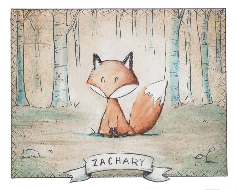
@Karine-Beaumier That's super cute! The fox looks so happy! And how big is this piece? I ask because last time I tried using the brush pen all my lines were super fat even though I was as careful as I could be!
For the commission, did they ask for earthy tones? There is only one thing that pops out to me. The shadows of the fox seem like they are just the same pigment but darken with black or Payne's Gray. Maybe next time you could use a cooler color to make the shadows. For example, if the main color is orange, try shading with a light wash of red. I would test this in a little sketch before I did the painting though.
")
Will Terry has a great class on color that has made my paintings more vibrant! Working in Color However it sounds like you weren't trying to go vibrant.
I like it overall! So adorable!
-
Sounds like you painted out of your "comfort zone", and are worried that the result is not up to par with your "usual" art. I think you came out with flying colors. And like you said, it gave you an opportunity to use some new knowledge. The piece is wonderful, the client is happy, and you have the beginnings of a new skill set to use on future artwork. : )
-
@karine-beaumier Love it!
-
@Felixius @tombarrettillo @Marsha-Kay-Ottum-Owen Cheers guys!
-
@Durribie Thanks a lot! The paper size is 8"x10" to fit a frame. For the brush pen, have you tried a different one? I used the Sakura pigma brush (micron) for this. The thin hatching was actually done with a technical pen (either 0.05 or 0.3) as it was much faster for me. If you haven't watched https://svs.thinkific.com/courses/how-to-ink yet, it was really helpful to see how Jake Parker do it and he shows different techniques for the line thickness and weight. I have also ordered a couple of brush pens listed on his website in the tool section to try next. As for the colors, it did had to match a photo reference of the kid's room but I actually forgot about the vibrant color tip from Will Terry's class!!! I will review my notes and practice this as this is new to me as well. Looking forward to it and super feedback- thanks again!
-
Nice work. Love the style on this one.
-
Thanks!
@evilrobot -
Uploading works again- yay! haha Thanks Aaron. This image is not really needed anymore but thought I'd share anyway in case you wanted to see it. It's the scan file for a better color accuracy. Cheers!
-
I like the gentle/soft way you're handling the media. I feel like the fox could pop a bit more- he's very brown. I'd love to see him a more orange/saturated! Even a bit more reddish would be a nice contrast to the green/teals. I also think that rounding out the bottom part of the face is a good idea to bring a cuter or friendlier feeling to the character, but I feel like we lose some of the "foxiness", and he feels a bit out of proportion or swollen. The triangular schnoz is very distinctive to a fox. Maybe there's a middle ground?
I do really love the details on the trees, too. Such a nice use of lost lines.
-
@Karine-Beaumier That makes sense about the colors! The pen I played with is the Pentel Brush pen. It is super sensitive! I need to spend more time with it using Jake's exercises in his class.

-
Thanks for the feedback @WithLinesOfInk - I am curious to try these suggestions and see what it would look like!