Tree house WIP
-
@tombarrettillo Great Idea! It flows really well.
@Chip-Valecek Yeah, sometimes you just got to move on and get the piece done. Can't wait to see it!
-
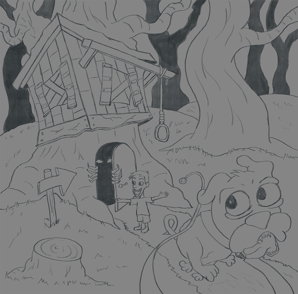
I had my local colors done and was about to start rendering when I saw another treehouse using the same reference that I had used... So my last time changing this up otherwise I will never finish on time. Here is my latest line work.
-
new house is scarier, cool
 however, i think i prefer old version of the kid. New one confuses me. I mean, his dog just run out and the house is quite scary, so i understand that he is happy to explore, but soooo happy? of course its only my impression
-
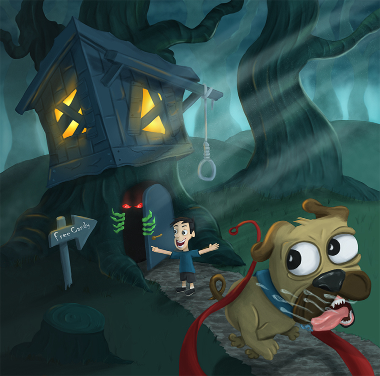
@aska the boy is happy cause the sign will say Free Candy. All he sees and cares about is the sign yet the dog sees the danger and is running away.
-
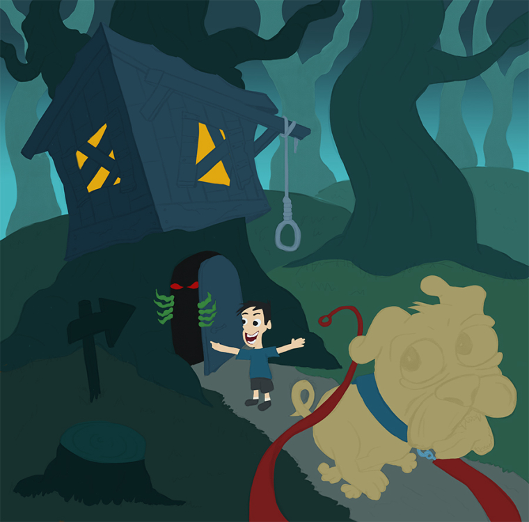
Found sometime to add most of the local color in. Hopefully I can get that finished tonight so i can start on rendering it. I want to push the creepy of it but also bring in a touch of warmness from the treehouse. Thoughts on color so far?
-
Going to put this here and sit on it till later before I submit. Want to see if anything pops out that needs fixing. If you see something please let me know.
-
Wow, it's looking really great!
I have two suggestions. First I think it might add something if the light that's coming from the windows had a greenish hue to make it look more sinister rather than friendly.
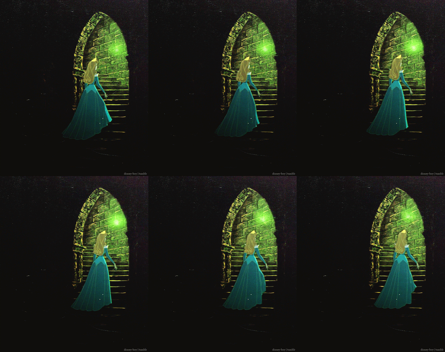
Second, I think the dog could look more scared if you tweaked his eyebrows/eyes a bit.
-
@tessw So you are saying use green instead of the orange/yellow i have in the windows now?
-
yeah, maybe something like this:
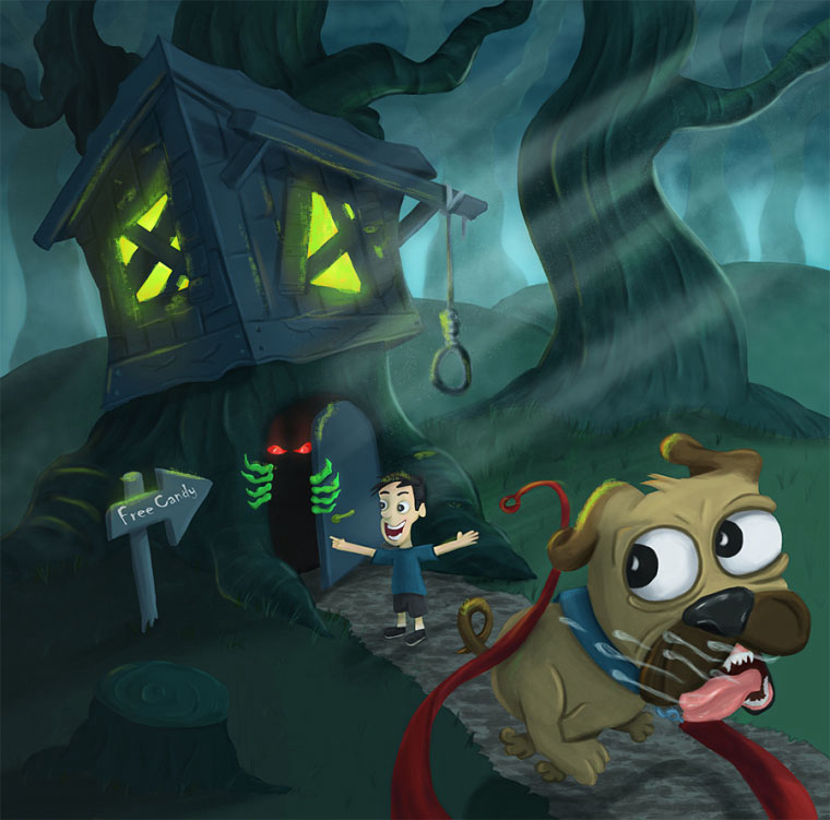
Just personal preference, as I think it characterizes the monster a bit.
-
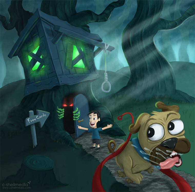
Here is my final. Thanks for all the advice @TessW and @tombarrettillo for your idea of the leash getting away from the boy.
-
@chip-valecek Hi Chip, I've wanted to give you a critique for such a long time now - since you've helped us with programming for so long! We really appreciate it!
I know I'm late on this one. You've done so much and received so much help thus far...so think of this as suggestions for your next painting - don't feel you have to make the changes (if you like them) on this one.
First - you created such a great spooky mood! It's really cool!
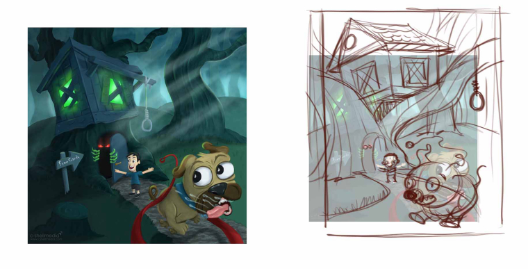
Second - here are some things I would consider: 1) The skin color of the boy should be a reflection of the colors surrounding him...he's so bright in that dark scene. 2) Your composition is split down the middle with both trees getting almost the same space and weight. If you make one much larger and dominant it will give you a better composition - making the others much smaller. 3) The tree seems like it will fill up the house leaving no room for occupants - I gave your tree a large branch so your house can sit in between the branches - you can even put a third one behind for more support. Remember that it should be able to function in the real world - or close - to fool your viewers into believing your illusion. 4) I saw in an earlier sketch you had the dog going the opposite way as the path curved. Your little boy looks too small because your path doesn't get wider in perspective at the same rate your dog gets larger...so this makes the boy look small compared to the dog. To solve this simply increase the rate to which the path foreshortens. 5) The dog coming into frame keeps us in your composition instead of taking us out through the corner.
I really hope this helps

Again - THANK YOU CHIP!!!
-
@will-terry Thanks for the critique! Its crazy how you don't see these things till someone else points them out to you. Great feedback, thanks!
-
@chip-valecek When I finished school in 1992 ( I know right?) I had no idea what was good or bad in my own work...until I relived it a year or two later - then I could see what was wrong. It's just mileage.
-
You should be proud of a job well done! Looks really creepy and funny at the same time.