Doodleworx's Sketchbook
-
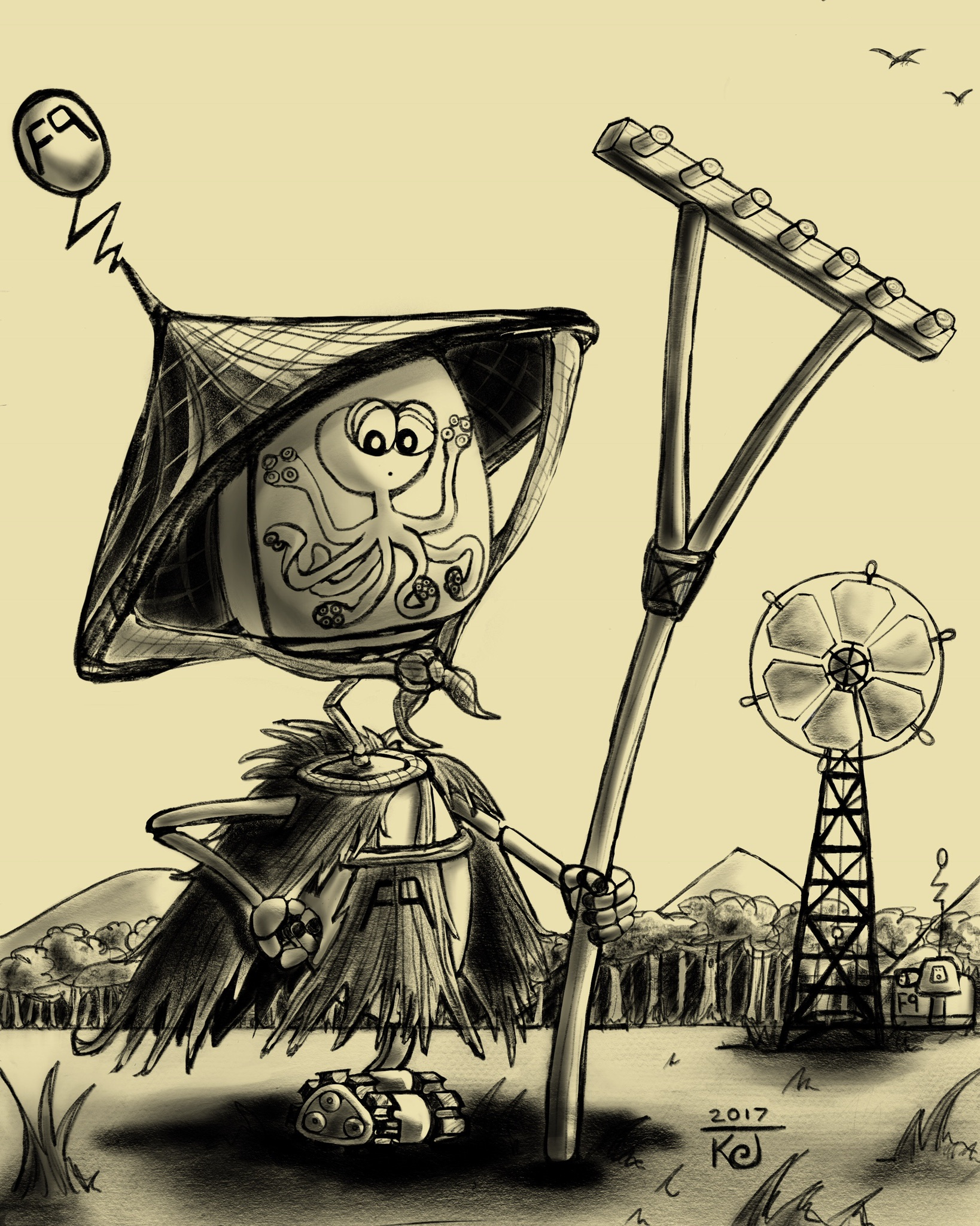
Here is my sketch from last week 'Farmer #9.' I did this on the Ipad Pro in pencil and I think I will paint it next week. I love Japanese culture, so this character speaks to me. I wrote a little story about him on my Instagram account, and I think that I will develop this little guy more. I normally draw something and move on to the next thing leaping out of my imagination, so I will focus more on this little guy, as he seems to have a story to him that I find interesting. -
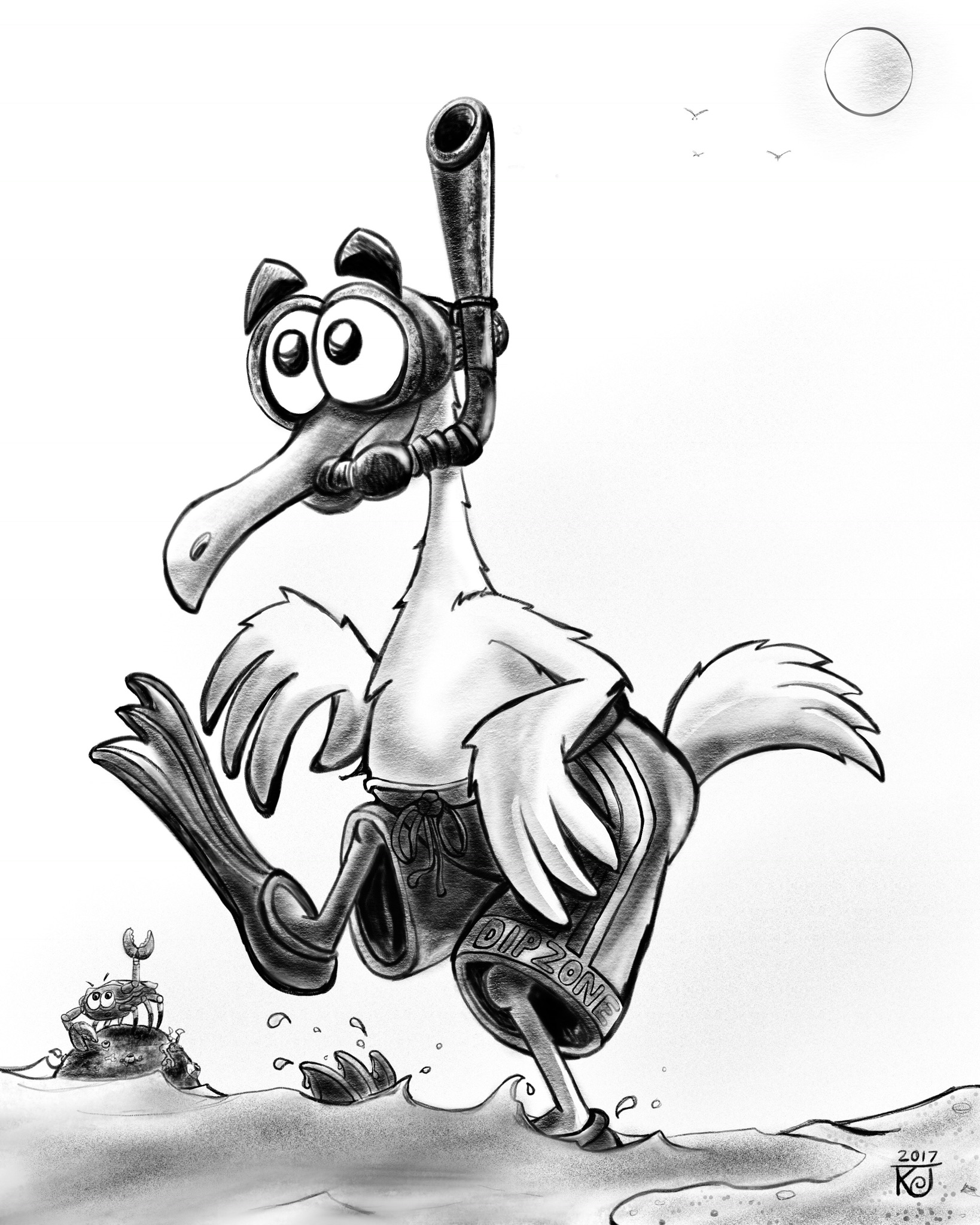
Drew this 'Snorkeling Seagull' while on the beach in Cabo San Lucas on my Ipad Pro. I painted this as well last month. -
This post is deleted! -
My first digital pencil sketch with Procreate. I love owls! -
@doodleworx
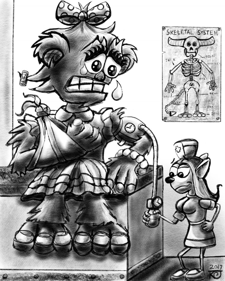
Nurse Nickernocker. I originally had the idea of a monster being a wimp at the doctors office, but I decided to switch it to a giant monster girl and liked how it turned out better, compared to the tiny nurse. -

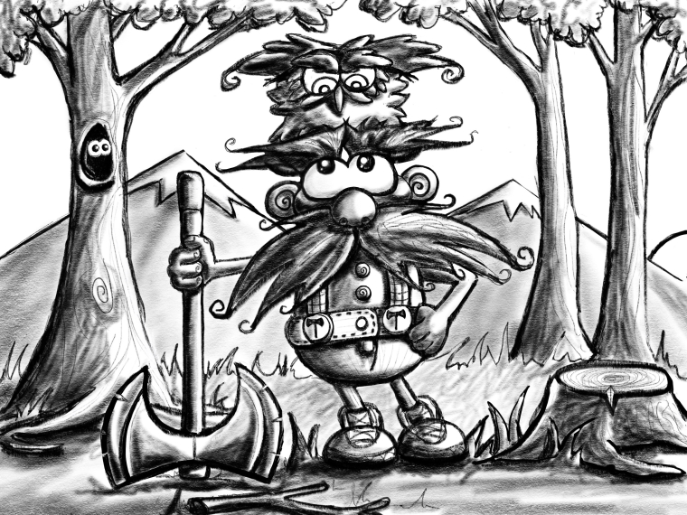
Digital pencil sketch of my 'One Tough Varmint' illustration. -

I love the tv show Vikings and it's ruthless, real life character Ragnar Lothbrok. I thought what would he do if he was alive today? Why he would rob lemonade stands! Easy pickings for a Viking! -

I love fantasy art, as I was an avid role player when I was a kid (Dungeons and Dragons, Teenage Mutant Ninja Turtles (it was an actual dark, rpg game before the cartoon!). Ravens have always interested me as well, as they are very regal and intelligent, so why not combine the two? I originally drew this for Inktober last year and decided to redraw it in digital as I loved the design. I am finding that I have to tighten up a lot of my original sketches, so some have been easier to update than others. -

This is a redraw of an old pencil sketch idea of mine that I always thought was a neat idea. I thought that I could just draw over it but it needed to much work to repair it and I decided to start all over again with just the concept and this is what came out! -
I think it is so great how prolific you've been since starting digital art. Are you open to critiques?Or are you just sharing your work at this point?
Website: www.tessawrathall.com
Instagram: www.instagram.com/tessawrathall_art/
-
@tessw For sure. I am still learning and any help would be appreciated.
-
I would keep doing what you are doing, which is creating your own original completed pieces, but what I would also suggest is that you do value studies on the side. Some value studies that could be helpful would be to take art that you admire, turn them to grayscale, if they aren't already, and see how they are structuring their values, and how they are structuring their values around the focal points vs other elements like the background. Copying them will also help, but always think about the values you are copying, and why you think the artist chose them. If you are signed up for a subscription here, I highly recommend the Creative Composition course as it deals quite a bit with value and contrast.
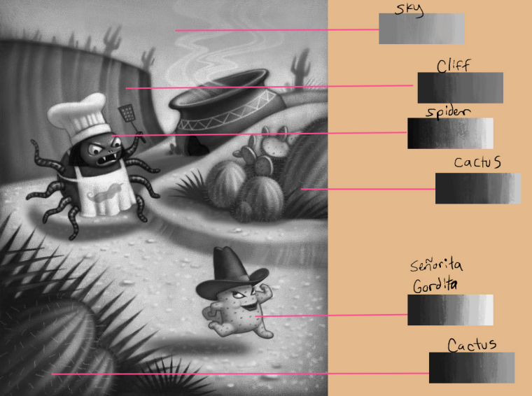
Here's some examples of what to look for when analyzing artwork. All of these are by Will Terry that I've turned to grayscale.
In the image below, I have used the color picker in photoshop to sample the values in different zones. Look at how the sky doesn't have much range in value, making it a nice backdrop for some of the other elements. and while it looks on the light side, it doesn't have the lightest value in the painting. Moving on to the cliff, it has a pretty good value range, but look at it in comparison to the spider (including it's clothes). The spider goes from almost black all the way to white, where as the cliff behind it stays more in the mid-range and doesn't have as much contrast. If he had chosen to go darker on the cliff, then the body of the spider wouldn't have stood out. If he had gone really light, then the chef's hat wouldn't stand out. Now look at the two groupings of cactus/foliage. It has a pretty good value range, but again, look at them in comparison to the spider and the gordita. So what we can learn from this piece is that one way to make the focal points stand out is to have more contrast with greater value range, and put them on a backdrop that will allow them to stand out. On the less important elements, limit the value range.
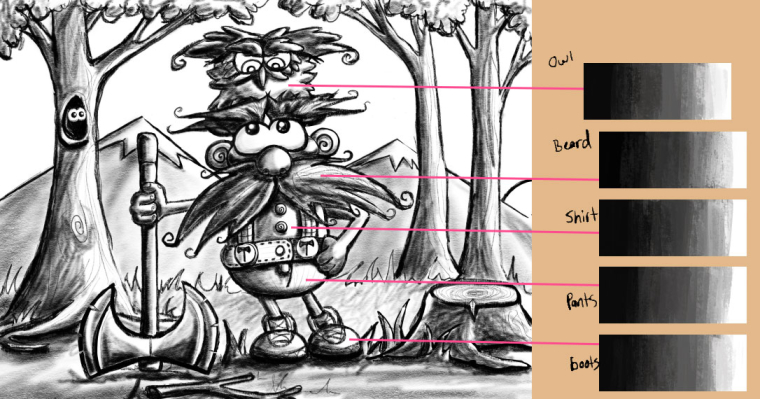
Here is another example that uses similar principles.
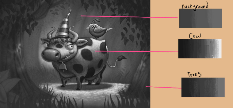
Something I'm noticing in your work, is that in a lot of your pieces all of the objects look like their local value is the same value. For example in the piece below, the value range for all of the different elements are pretty much the same.
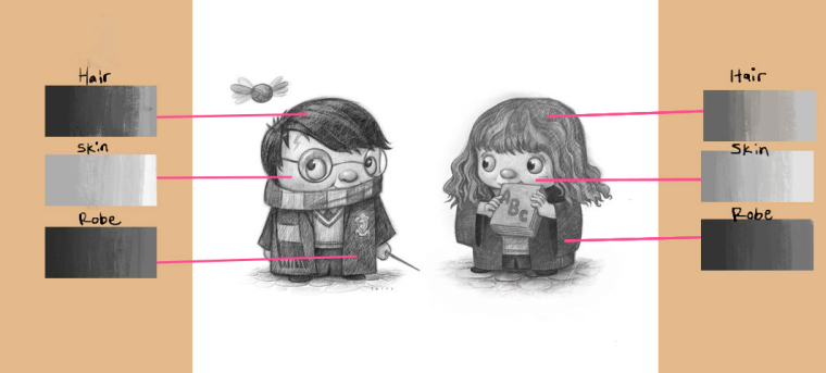
Look at this piece by Will Terry below. It's a good example of using different values on different objects. You get the sense that Harry's hair is darker than Hermione's and that Harry's vest would be a different color and value than that of his robe. Look at the value range of each element.
I think this piece of yours is probably one of the most successful in terms of value. Look at how you've kept the crab and water less contrasted in the value range, where you have contrasted more in the seagull, and given the different elements on the seagull different overall values. Well done!

I think learning how to structure your values more effectively would take your art to a whole new level.
Keep posting and good luck!
Website: www.tessawrathall.com
Instagram: www.instagram.com/tessawrathall_art/
-
@tessw This is EXACTLY what I was thinking. Wow, thanks for putting together that whole thing- value composition is something I have to really work at as well!
-
@tessw Thanks Tess! It is very much appreciated! Thanks for all of your work and help!
-
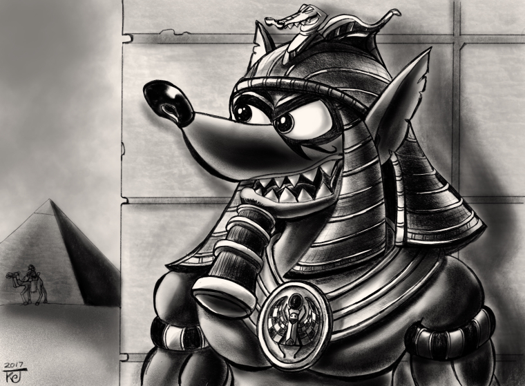
Anubis pencil sketch in digital. This was a favourite old pencil sketch from a few years ago that I redrew. I think the values are much better in this one. -
@doodleworx

Frontier Justice sketch. I redrew this character from an old pencil sketch of mine. It was probably my favorite piece of work I had ever made and I was very proud of it, until I decided to redraw it digitally and I realized how much work I had to put into it to repair it. The funny thing about art is you can see something that you have created and at that moment think that you can't do any better. Years later you realized that your art is always evolving and to be happy with what you can do at that moment in your life. Art is a journey. -

This is 'A Bump in the Night.' It was another redraw of a favorite, old pencil sketch. Our eldest son always dressed up as Batman when he was little, so he was the inspiration for this one, so it means a lot to me. I am going to enter this in the contest this month once I ink and paint it. -
Finished version with digital paint. -

This is called 'The Beaumont Bandit.' My sons high school mascot is a racoon and it is in need of a update. I drew this for fun and my son loves it. Our community is an old French Canadian town, so I thought it would be fun to throw in some old 'three Musketeer's' into it. I am very happy with it, I think I will ink it and send it off to the Principal to see what he thinks. -

This one is called 'LOeuf.' He is an egg Voyageur character and I wrote a story for him on my blog on my website. I really like this character and I am thinking about using him again.
