Draw 50 Things~ Little Witch Thrift Shop
-
I love this. I have a soft spot for witches and these kinds of shops.
-
I have spent many hours in antique shops, and this totally reminds me of those, so great job, I think you are on the right track. If you want feedback, I would say there doesn't seem to be any action in the image. What if she was opening a box, or brewing a potion, or chasing the cat... things that have potential for the beginning of a story.
-
Thanks for the feedback everyone! I'll take that into consideration. ^_^
-
Hi Washu,
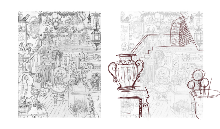
I hope it's ok that I do a little drawover for you. I really love the way this one is going! Very fun little shop indeed! I agree with some of the other comments - it's nice to give the eye a break by blowing up a few simple silhouetted objects in the foreground - i.e. small, med, huge! This way our eye doesn't get overwhelmed with the number of objects can more easily focus. Also I think your stairs are caught between dimensions. I think they make more sense to keep them in profile...or bring them out towards us but this will disrupt your current composition. Also - if you make a little room up above - a place that goes back further it will create more depth.
Cheers,
WillSVS Instructor
http://willterry.com/ -
@will-terry Thanks Will.
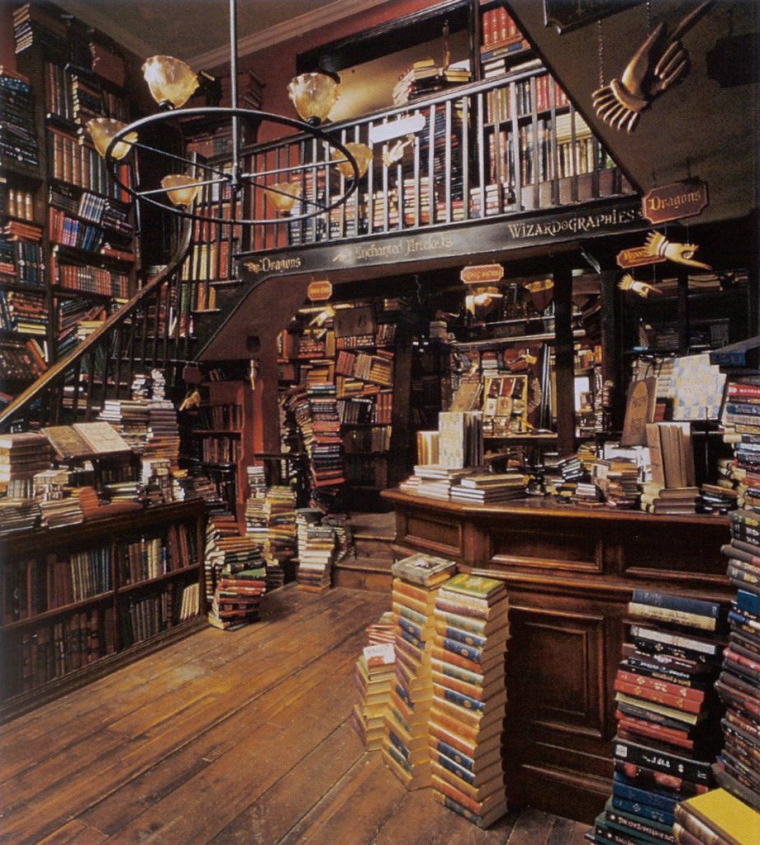
 I used a photo of a bookstore as reference for my room. The stairs are supposed to be turning. It was difficult to see. Looking at my reference now I think the upstairs actually slightly moves back towards the left.
Her little shop is supposed to be quite small, so is there a better way to show that it's small space? The room behind her is her home, I actually blocked it with a wall because I couldn't get all the little furniture perspective correct.Here is the reference I modified for her shop.
-
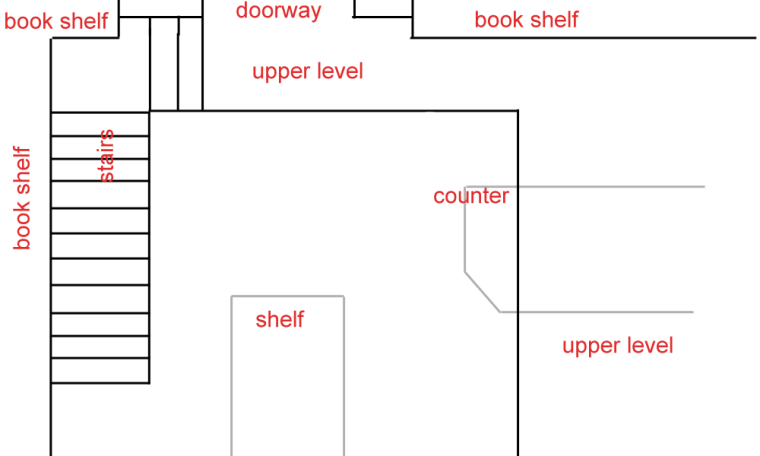
This is how I see the layout in your reference photo. Hopefully this helps with the layout of your illustration and the stairs.
-
@washu said in Draw 50 Things~ Little Witch Thrift Shop:
Her little shop is supposed to be quite small, so is there a better way to show that it's small space?
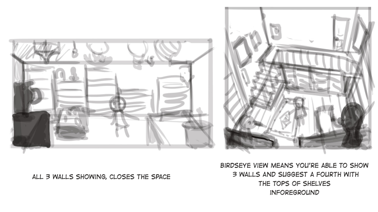
If you want to show that the space is small, I think you'd have to include more of the walls, otherwise the viewer uses their imagination to conclude where the walls are and they could imagine the space to be much larger. Is it super important to you to convey that the shop is small?
-
I think the trouble you're having to create a small space within your shop is that you've chosen a reference of a very large shop, it's cluttered but actually a very large space. I feel your image portrays the same feeling at the moment, I would suggest the same as Tess, if you can see 2 walls, you get more of an idea of where the corner is, add a further wall and you're very aware that it's a small space because the entire room then fills the page. You could either have it a little wider to portay this idea and have low cielings, or if you want to keep the height with the stairs, try and exagerate it by creating a the suggestion of a 4th wall in birdseye view maybe? Hope my sketches explain that better than my words haha
-
P.S. Love the style and the nod to Ghibli
-
@washu That's quite n accomplishment! I still need to do one and am thinking about an idea. I agree with @Chip-Valecek that it seems a bit flat but amazing details! I am trying to figure out how to make my own work less flat, it might be, as Chip said, that the color and value will take care of that but, I think it's awesome! Are you going to add color? How long did you work on it?
-
@washu I think the angle of th ereference photo at a more 3/4 view, hels to show the depth of the room. Your is more straight on. I wonder if that's why it looks flatter? This is all very helpful for me too!