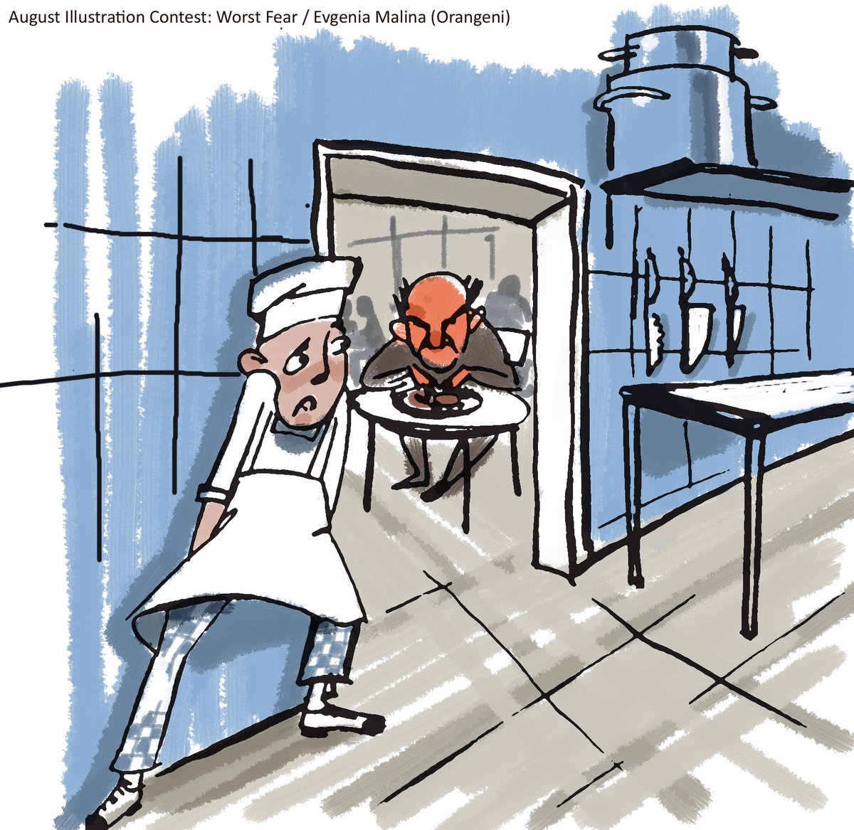
August Illustration Contest: Worst Fear
-
This post is deleted! -
-
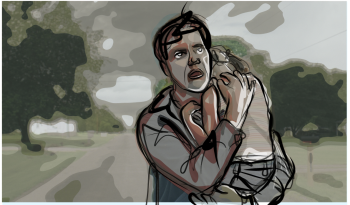
@juanentinta So scary! Why did our parents allow us to watch that movie when we were so young?!? I think I was 7 or something. Lol!
-
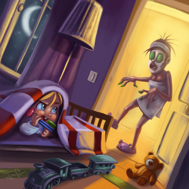
Hi guys, I had free time , and I decided to delete my previous entry and upload a new one, I hope you like it!

-
Love it Jose! Much more than your previous entry (it was good too, but the knife was maybe a little too gruesome for a children story!)
-
-
@pm00 Take Shelter? I love that movie.
-
@jose-ramos I like this entry better too. Very witty!
-
This post is deleted! -
This post is deleted! -
@nikivaszi I really like this A LOT!
-
@nikivaszi this is good! I would clean up her values and clean up the detail in her hands and body. You don't have to render it, but right now those areas need some polishing. If you get the girl and aquarium perfect, everything else can stay really loose.
Maybe change the fish light to a blue/green tone instead of the white.
great work
-
@NikiVaszi This is really...I mean really amazing! Great concept. It actually took me a minute to 'see' what was going on but I blame that on the fact that it's early in the morning for me and I haven't finished my coffee. LOL. Thumbs up!
-
@nikivaszi I love this story. Very powerful illustration.
-
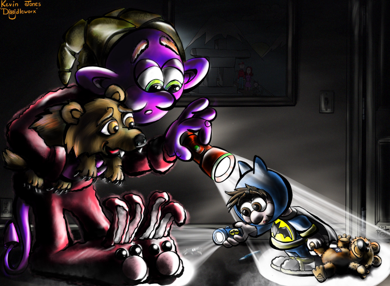
Hi all, my name is Kevin Jones (Doodleworx),This my submission for the contest, it's called 'A Bump in the Night.' This is my first submission for any contest, so go easy on me (cring)! I redrew a favorite old ink sketch of mine in digital. The little boy is our eldest, who was obsessed with Batman when he was little (I could never get him to take off his Batman pajamas). Now he is sixteen, 6' 10", 250 lbs and obsessed with basketball. Those 'little boy days' seem so long ago now, as a stay at home dad, but this picture will always remind me of those fun times when he was little!
-
This post is deleted! -
@lee-white !
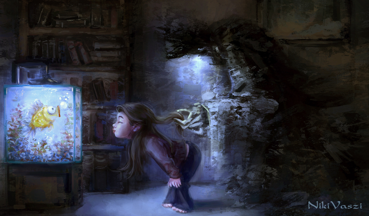
Thank you very much for your critique, I took your suggestions and I pushed it further. I hope it got better.
Should I delete the first version then? (I am new on SVS Forum and I red this thread is just for the final images and that one meant as a final image but now is not valid.)
Thank you again! -
@nikivaszi Amazing!!!

-
WOW! You have an amazing illustration here. This version is much better. Nice work.
-
@nikivaszi there ya go, very nice. I would go ahead and delete the first one just so there isn't any confusion.