Looking for Advice on Lighting and Color for this WIP
-
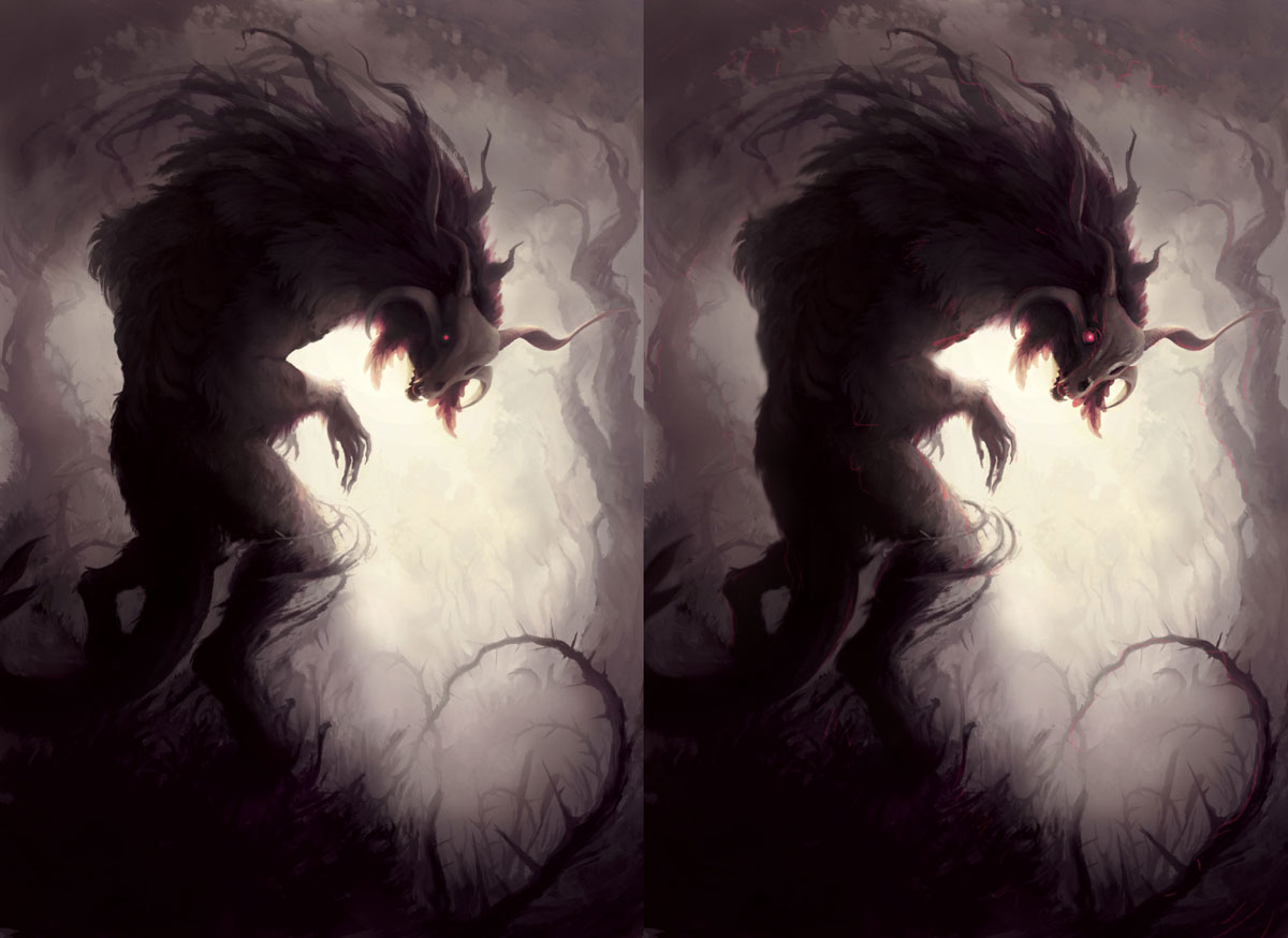
I think it's beautiful and I like the color palette, though I think you could distribute the pinks and reds more throughout the piece- just a personal preference. I know you are asking for color and light advice, but I also think your edges could use some fine tuning. You've got pretty sharp edges along the backside, and you are going softer on the interior edges of the skull. I think you could play with the edges a bit to bring more focus on the head (if that's where you want it). Bringing a bit of atmospheric perspective to the back leg and part of the tail may help too.
Did a subtle paint over, hope you don't mind. I tried to bring in the reds and pinks along the edges of some of the foliage and played with your edges a bit.
Again, I think it's really beautiful. I personally think that overall, you are achieving your desired intentions.
Website: www.tessawrathall.com
Instagram: www.instagram.com/tessawrathall_art/
-
I think it's great too. Try a little complimentary colour rim light on the left
-
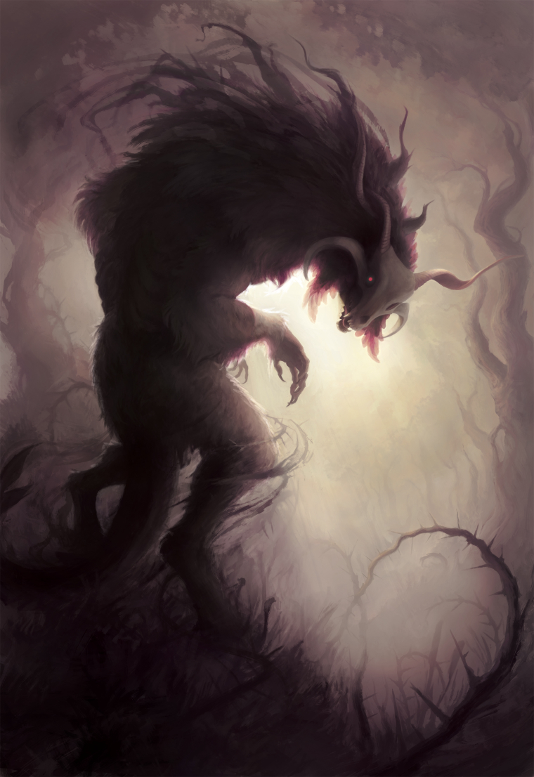
This is amazing! I think if you sharpen the image around the face and claws, give it more contrast it will give it a bit more of an ominous feel. And for crying out loud, do NOT touch the color palette!! Its stunning!
-
This is stunning. I agree with what was said already. Last thing that crossed my mind when I saw this was "How Romantic." Ha. It's definitely doing what you wanted. I liked what Tess W did too... His eye looks crazy cool with that glowy effect and a touch of red on his leg... looks very predatory, almost bloody. If he turned all the way around you better get ready to pee your pants.
-
@tessw already said it pretty well. I would just chime in and say I love the limited color palette, and this might just be a personal perference but if it were MY piece, I would bump up the colors around the center, around the face. Because of the limited subdued palette you can get a real impact by really punching your colors in way up in a few select areas.
-
Everyone else has pretty much got this covered. I would not have thought 'romantic' so your OK there. I like the idea of adding a little more contrast with light and colour to the focal point (The head). Basically what everyone else said! Awesome painting!
-
Thanks for the comments everyone. I think bringing a bit the established colors into the environment was what I needed to do, though I may have gone overboard. It's close to being finished at this point other than tightening up the closer horn and maybe addressing some of the looseness in the lower half.
-
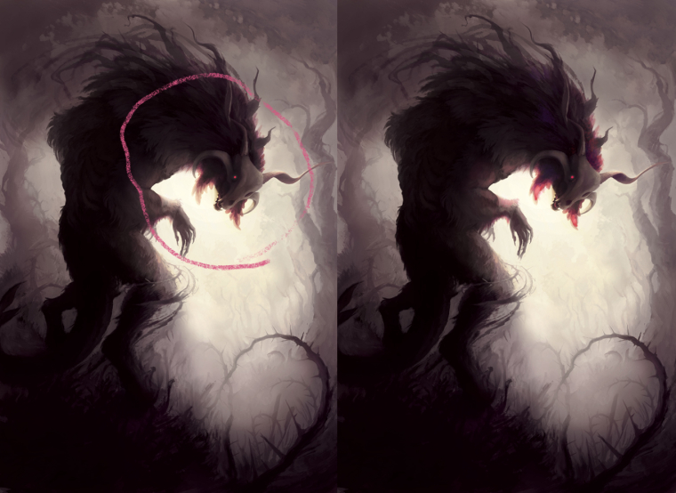
Oh one quick thing, is that X formation of the thorny vines distracting? I've been trying some other arrangements, but it starts feeling forced and I keep reverting back to this arrangement.
-
It's looking great and I had to look for that X formation so no it's not distracting. Not for me a least. Quality work!
-
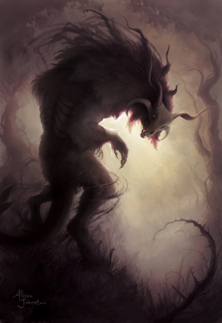
Alright guys it's done. Thanks for the help.
-
Really impressive! Cheers to a job well done- it looks great.