HELP! I need to learn color management - looking for resources.
-
Hello folks!
Can anybody recommend good resources for learning some solid basics in color management? I'm interested in useful books (ideally current ones), forums, videos or courses. Everything I've found online is either too complicated, outdated, or doesn't apply to my set-up (see below). Any information, links, or resource recommendations are appreciated!!
I'm a second-career artist and I have no formal training in the mechanics of digital art so my knowledge in this area is very inconsistent despite digital rapidly becoming my preferred medium for illustration.
That being said, in years past I was able to make reasonable prints of scanned traditional work (Epson 4180 scanner) and some digital work from both from my old desktop canon printer and online printers (Imagekind) just using my mac's native calibration tools and some trial and error so I feel like this ~can~ be done. I've also done a handful of digital illustrations for an online publication and as far as I could tell the colours matched up well (e.g. the final product looked good when viewed on different computers and the AD didn't give any feedback suggesting there were issues).
My set up:
For financial reasons I'd really like to use my current equipment which includes:- MacBook with Apple Cinema LED monitor
- Corel Painter 2016 (NOT photoshop) or Procreate on my iPad (exporting to Corel Painter for cropping, etc).
- Canon Pixma Pro-100 printer
- (I just moved so I'm still trying to find a local and/or online printer for offsite printing)
My Goals:
First and foremost - I want to make sure that the digital artwork I make will look the same on someone else's screen and that eventually if I send my work to people in the biz I won't look like a rank amateur. (My understanding is that this is a colour calibration thing - and so far my default calibration practices seem to have been working).Second - I have a new desktop printer (Canon Pixma Pro-100) and would like to print some images for direct sale. I could certainly tweak my monitor until it looks like what the printer is putting out now but I worry that will throw off my monitor calibration for sending it elsewhere (for both online viewing and sending to outside printers).
A few other comments:
I realize that the actual answer is that this is way hella complicated and I need a PhD in professional printing and ICC codes - but I'm just looking for 'beginner/close enough' level quality in my desktop prints. I see loads of artists on youtube self-printing for small sales and conventions, The Man Mr. Jake Parker makes his own prints - it seems like it's POSSIBLE.Canon does have ICC profiles for this printer (which seems like the thing I'm supposed to use) but I can't access them in Corel. The funny part is that I ~thought~ I saw those colour profiles before I upgraded to OS 10.11.6 but at that time I was in the middle of moving and wasn't working on colour stuff - it's possible that I imagined it.
If I have to get a Spyder or Munki or some other screen calibrator I will, but based on a previous thread comment by @smceccarelli I don't know if that's the problem.
If I have to subscribe to Adobe and use Photoshop I will (I used PSP for years until 2016). However, I'm working more in Procreate and would like to continue with that and use my existing Corel Painter 2016 for the PSP-like tools (cropping, colour profiles, etc) which theoretically should be possible. I'm jumping careers into freelancing right now and I have to be careful about where I allocate my savings.
I will be attending the SCBWI winter conference in February and taking the workshop "Digital Pre-Press Best Practices" which I hope will help, but the more understanding I can have going in to that the more I'll get out of it.
If SVS is thinking about offering a course I'd be all over that!
Any input is appreciated!
~ Pam
-
I am not sure I understand what your issue is, as it seems you have been able to calibrate your monitor and get decent printouts - did I understand right?
Images will never look the same on all monitors for the simple reason that, while your monitors may be calibrated to perfection, all other monitors will likely not be. I have sent perfectly calibrated design work into the world just to get panicky calls from customers who are viewing the image on some super-cheap laptop computer with pitiful graphic management and could not distinguish blue from green. I have had to use hideous color combinations just so that THEY could see the colors they wanted on their monitor.
Publishers will print offset, not digital, which is a different beast altogether and requires specialists to prepare and print the files. They will then send you proofs, so that you can see how it looks in print and require corrections (to the printer, not to the files). As for digital printing, no machine will print the same and the influence of paper type and quality is GIGANTIC. You can send the same perfect file to five printing services and get five different results. A good printshop will sit with you and calibrate the printer (not the file or the monitor) until you get the result you want.The Pixma comes with an added piece of software that allows you to print proofs - minithumbnails of your image with different adjustements in color space and contrast. WIth those, you can pick the adjustements you want that work with YOUR printer to give the result you want.
If you want to get close to printing you have to work in CYMK mode anyhow - which ProCreate does not support to my knowledge. But working in CYMK mode is really ugly - the colors are duller than RGB and there is added variable in the way the screen (which is RGB based) interprets the colors. I normally prefer to work in RGB then flatten everything (CYMK conversion sometimes does not like layer modes) and convert to CYMK at the very last step.
In essence - I would not worry too much. If you are happy with your printouts and your monitor and printer look more or less the same everything is fine.
-
@smceccarelli Thank you SO MUCH for the comments! Having to tweak your work for client's monitors sounds awful - yoiks!
I ~was~ getting decent printouts in the past (so I think it can be done) but after a few years' hiatus I have moved to a new country and have a new printer and my initial results are dismal. I am using Canon paper, but I don't seem to be getting the options to choose paper type in Corel Painter (which seems odd to me).
However, I wasn't aware of the color space software with the pixma (installing on my mac required a bit of song and dance and I might have dismissed that as a PC file) - I will start by going back to the canon installation process and see what I can find there!
Thanks again!
~ Pam -
I tell people I send pictures to to look on a Mac, iPhone or iPad as they ain’t bad. I trust printers quite a bit to work well with the work I send them. Tbh, I recon a good calibrated screen and trust the printer.
-
Here is a video that talks about it - it may be only for certain models of the Pixma. We have exactly the same printer this guy talks about at the agency and it prints very very close to what we see on screen. Unfortunately it’s too big and expensive for my private studio....some more time...
-
@smceccarelli Thank you again for this video link - I've bookmarked it and keep going back to it!
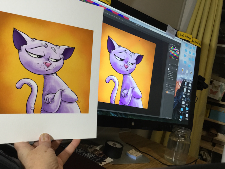
I'm recording my journey below just in case it's useful to anyone else in my specific situation (e.g. anyone who has a Pixma Pro-100 and a mac computer) ... and also so I can refer back to it if I ever have to redo any of these steps!

The software that he is using in the video is: Canon Print Studio Pro. If you don't have a disc drive you can download it from the canon site.
The software is a plug-in that requires one of: Photoshop, Lightroom, or Canon Digital Photo Professional Software (which apparently you can get if you have a canon camera). Here is a nice article I came across talking about it.
I wasn't able to get the printer to play nicely with Corel Painter 2016, so I ended up getting photoshop (hint - if you just need Photoshop and not other apps or storage, the 'Photography Plan - 20GB' is the most cost effective at $9.99 USD/mo. I felt a bit like I was selling my soul to Adobe but I'm getting over it rapidly).
With Photoshop installed I was able to download the plugin. There were some snags - because of permissions stuff, if you are on a mac you may have to use the Canon Utilities to install the software and 'specify a folder to install to' (making it the desktop instead of Photoshop), then drag the installed folder to the PS plug-ins folder. Once installed it should show up in Photoshop under File>Automate>Canon Print Studio Pro. Some notes here.
NOW I can select paper types and tweak the output to exactly what I want! I was also able to pattern the print for fine-tuned colour and brightness tweaking. I'm waiting on some Canon Museum Etching paper that was recommended by Kiri Leonard - so excite to see how it looks!!!
I still have to decide whether I need to calibrate my monitor (beyond the basic internal calibration) for external printing - but for now my own prints will look good!!
~ Pam
~ Pam
www.PamBoutilier.com -
Screen:
Honestly, unless they have a really bad monitor, all screens are going to look the same, if not then similar enough.Printers:
most printers print in CYMK which stands for Cyan, Yellow, Magenta, Black, which is the inks it uses and mixes on the paper to get your results. Usually, almost any digital image is made in with RGB (Red, Green, Blue) Now you may know that when painting you should use red, yellow and blue, but the physics of light acts differently making light's primary colors red, green and blue. the translation to CYMK from RGB will never be perfect due to it transferring between a medium of light and onto a physical medium, so sometimes you have to live with the results you get. If you did have photoshop, it has the ability to work in CYMK so you could edit contrast, color balance, and anything else to try and get as close as possible. This is the reason publishers will send proofs because of this issue so they can make those changes before they print hundreds of books that are unchangeable. -
@pam-boutilier Canon Museum Etching paper - crazy expensive, but GORGEOUS!