subsurface scattering/glow in watercolors?
-
the best thing to do is to stop looking for tutorials on the internet.
watercolors brilliance comes from not messing with them while they dry, and using a paper that doesn't absorb the water too quickly, so that the particles dry flat allowing the light to bounce off the pigment, and to penetrate the pigment to bounce off underlying colours.
you have around 3-5 layers before you lose the effect.
so let each layer dry perfectly before the next. and you have to add one layer, then not touch it. as soon as you start painting over and over, or rewetting you will destroy the underneath work.last thing is your reference. print it off. if you are looking at a screen and trying to paint it then you are dealing with the difference of reflected light vs emitted light.
now just work it out. light to dark techniques of watercolour. and just go duplicate what you see on your reverence. Lift out areas of whitetranslucency is more about blurs and gentle transitions, so try a wet into wet approach. use a spray bottle to wet areas you've already painted, but be ready to add your new paint quikly and in one stroke.
Helping people tell their stories, and discover their own.
https://www.instagram.com/onegraydot/
http://facebook.com/revandygray (happy to say hi...send me a message first!) -
@andy-gray Thank you very much. I sort of follow what you're saying but I have no experience in watercolor. That's why I wanted a tutorial. I have books from the library but they all have large white areas for highlights like the chicken painting above. Even in print the large white areas make me feel like I have to squint at the painting. I can't even find any painted references for what I'd like to do, aside from a digital artist's works. I'll probably just end up painting it digitally while I continue my search for a watercolor tutor.
") See, it's for this month's octopus theme.
See, it's for this month's octopus theme.digital example< of what I'd like to accomplish: https://apofiss.deviantart.com/art/BG-Dino-paper-306065036
-
The big thing you need to work on here is trying it from life in watercolor. To be a beginner in watercolor and want to paint a very tricky surface effect you may be setting yourself up for a frustrating experience.
try to do get as much reference and see how other people are handling it. It will be very tricky to compare it to something digital and you may never get it to look like that. In that case, maybe watercolor isn't the right choice. Maybe do it digtial or acrylic would be better. Watercolor is great for texture, but it's not so great for saturated brilliance that digital or other mediums can offer.
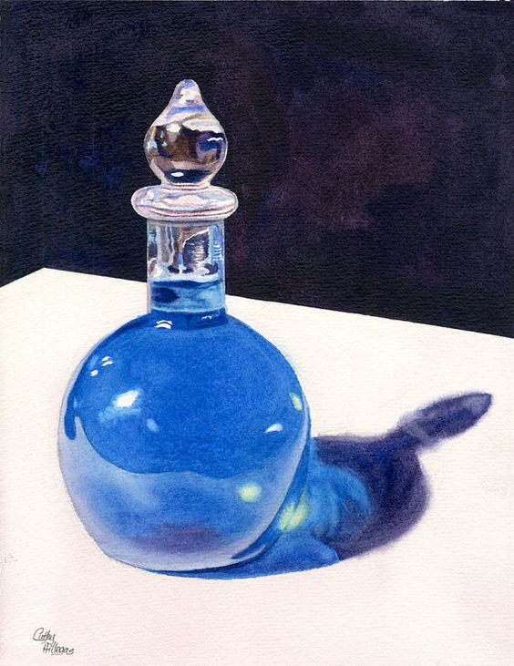
Here's a pretty nice effort though that I found online.
SVS Faculty Instructor
www.leewhiteillustration.com -
@lee-white Thanks Lee. I had a feeling you would say that.
 I can't find good references so I started to think, this is a really advanced technique or it's just not possible. I will paint my octopus digitally and practice watercolors later. Thank you for the reference!
 -
@washu books are rubbish, i know what you mean. they are all on beginner things. And the advanced ones are, as my wife puts it, wishy washy. its because most people interpret watercolour as gesture driven art, but you can create incredible stuff.
have a look at (google search term) 'watercolour rodney matthews fantasy artist'
who has been a hero of mine for decades. he's UK. there you will see how he works in inks, acrylics, but also watercolours.now I'll get into trouble here, but I slightly disagree with the amazing @Lee-White (sorry pal!). The reason I wouldn't start with live is that although this is crucial to developing your art, I'd break it down. So working from life requires getting the lighting right, drawing right, not moving your head too much - which reflective surfaces and subsurface scattering and so on can be changed dramatically when you move your head slightly and the light movement changes over the surface. So that's why I say hit a printed off picture first. Copy it. (master copy time). because then you can see how you can get similar effects.
then as soon as you can, paint from life.
the other things is there is a feeling you get to watercolour because of the nature of the medium. one thing I get really frustrated with is when people are trying to paint or draw so that something looks like a photograph. to get everything perfect. If you want a photo, then take a photo. Art has changed from needing to be the portraits hanging in galleries where that was the only visible record of a person. Now we can leave that to cameras (and phones).
interpretation can be best seen I recon when I draw or paint chrome. There is always a bit of the environment involved, but mostly I follow the advice i was given years ago, and it works like a charm,. As long as the chrome is not the main bit of a picture... paint what a desert would be reflected like. Roughly its a white stripe, a blue stripe, a white stripe, a wiggly black edge, dark brown, light brown stripe, and back to white. does it reflect the environment? no (maybe a tiny bit of it to colour if needed). When people look at it do they see chrome? Every time. They only notice its wrong when i tell them.
So don't worry about getting everything perfect. Have fun.
Helping people tell their stories, and discover their own.
https://www.instagram.com/onegraydot/
http://facebook.com/revandygray (happy to say hi...send me a message first!) -
@washu Hello Washu - this is not a water color specific answer but this guy is really in class of his own when it comes to explaining light and how it acts ways to paint it - lesson 4 is all about translucent properties - i skipped this class for a long time because the frog image did not grab me - but i should have watched it when i first started - here is a link and also the description of lesson 4 -
https://www.schoolism.com/school.php?id=3
Lesson 4 - Translucent Properties
In this lesson, we'll talk about translucent and transparent surfaces. I'll go into more detail about Fresnel reflection and refraction, including caustic effects. We'll learn simple ways to handle chromatic distortion and iridescence. I will demonstrate how to paint sub-surface scattering and density variations and talk about the laws that cause them. For your assignment, you will be asked to paint a simple scene of objects with various types of translucency. -
Hi washu! How familiar are you with water colors? In the link you posted it seems like it would be a matter of getting soft transitions on the interior of the object, and getting some firmer edges on the silhouette and the details. I would suggest looking at iraville videos on youtube. While I'm not sure if she demonstrates translucent materials specifically, the different techniques she applies- getting soft transitions, using masking fluid, getting in sharper edges, would probably be similar to the technique you would use to get a glowing affect. I believe saturation and hue would play a big part as well. I would take the reference image you linked (it looks like the artist you linked has a great variety of these glowy objects, and will be great for study purposes) and color sample them in photoshop to see what is happening with the saturation/ value levels of the translucent objects you are trying to replicate along the environment they are in. Notice how in these images some of the environment colors are integrated into the colors of the object. Notice how in most cases the object is more saturated than it's immediate background, or if it's not, the hue is warmer than the background. It may be helpful to do studies of the these paintings. As Lee said, doing some still life studies would help. Grapes, gummy bears, play dough, certain toys, etc, with a strong light source behind them may do the trick to observe what you are trying to achieve. Or glass objects, if you are trying to portray a shinier surface.
-
I recommend looking for a book called "atmospheric Watercolors" by Jean Haines. I bought my copy on Amazon
-
@andy-gray, good point, I think I need to clarify. When I say "from life", what I mean is from reference (or something you can actually see). As in don't try to make it up. A careful analysis of a good reference photo is all that is typically needed to get moving in the right direction.
-
Thanks everyone! I really appreciate your advice!
@TessaW I'm a beginner in watercolors, I only know how to keep them from running off the paper. lol But I'm not new to color and light, and I can paint both digitally and in acrylics.
I will certainly practice more and study from toys, that's a good idea. I'll have to pick up some translucent rubber toys from the thrift store to photograph in sunlight. My purpose for asking this was so I could paint my octopus character to look translucent. I decided for the contest that I would paint it digitally and work on watercolor techniques when I don't have a deadline to meet.
-
@andy-gray Yes, yes, yes! Rodney Matthews is awesome! My "dream portfolio" has artists like Arthur Rackham, Michael Hague, Tasha Tudor, Rodney Matthews, Aeppol, Tujiki Nao, and Kinoko Y Craft. I love the watercolor pen and ink style the best. I prefer brighter, more saturated colors colors though. I am greatly influenced by manga art too, and what first drew me to the manga art was the bright colors.
I definitely do not want photo realistic art, I want more comic art. The ~closest~ reference to what I'd love my style to develop into would be a Korean artist who goes by Aeppol. I think s/he works digitally, but since I can't read Korean and I can't find a bio to translate, I don't know for sure how they work. My characters will have a more comic book appearance to them though, compared to Aeppol. -
@washu Just checked out Aeppol. WOW. What beautiful work! Found out a little--female and deliberately keeps her real identity hidden. Haven't found out the medium yet. thanks--I always love to discover new amazing artists!
-
For "how-to" books on watercolours, i recommended the artist Claudia Nice- I find her work amazing and well-explained.
-
@surfshineart I agree. I have a couple of her books on water color pen and inks.
-
@eli I'm glad you like it! If I had to guess I'd say her art is a combination of traditional and digital. I say that because I haven't seen any original art for sale, only prints.