Society of Visual Storytelling

    SVSLearn Forums

    • Register
    • Login
    • Search
    • Recent
    • Tags
    • Popular
    • Users
    • Groups
    • Search

    character design

    General Discussion
    5
    6
    2117
    Loading More Posts
    • Oldest to Newest
    • Newest to Oldest
    • Most Votes
    Reply
    • Reply as topic
    Log in to reply
    This topic has been deleted. Only users with topic management privileges can see it.
    • Leontine
      Leontine last edited by

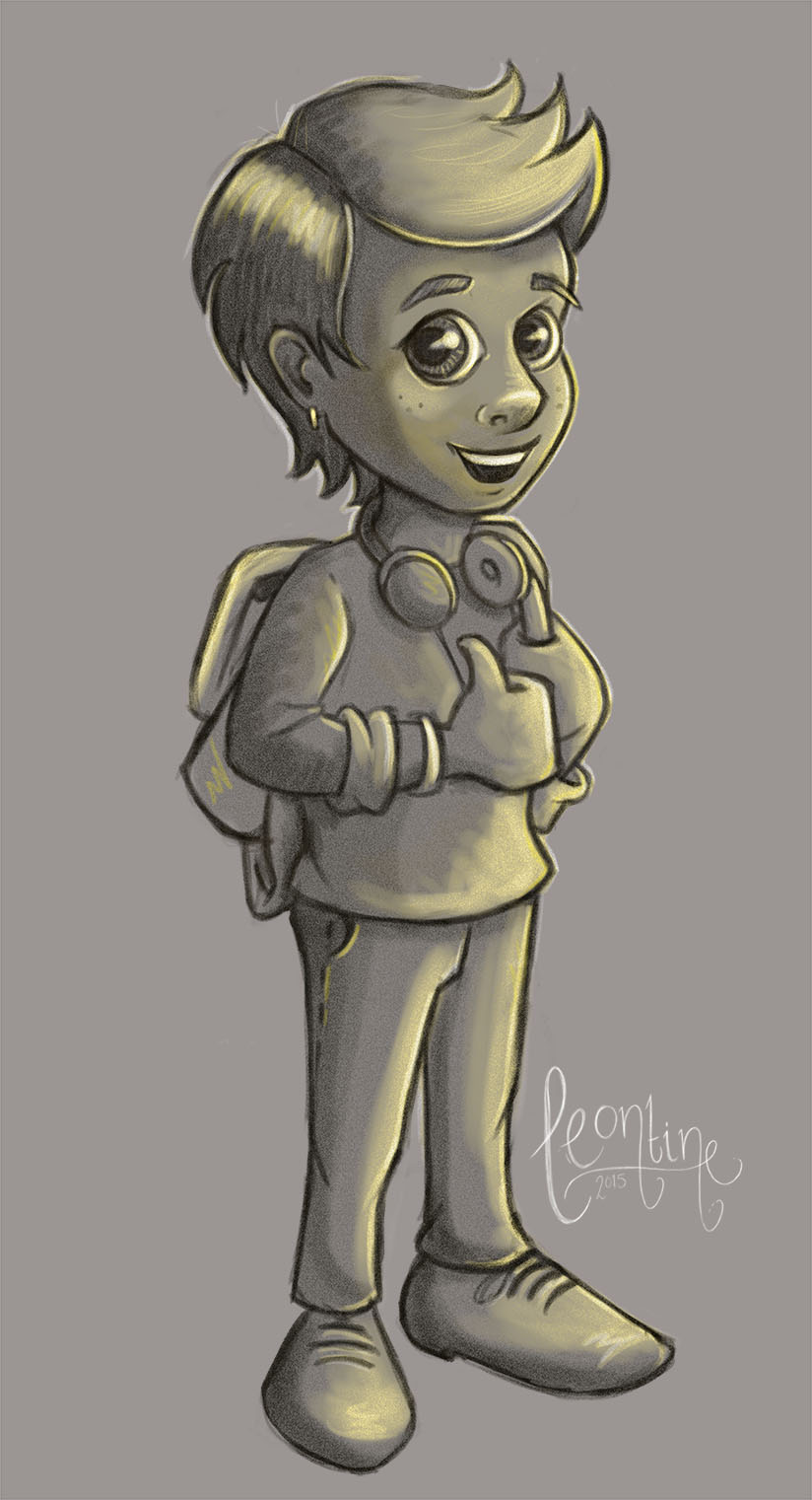
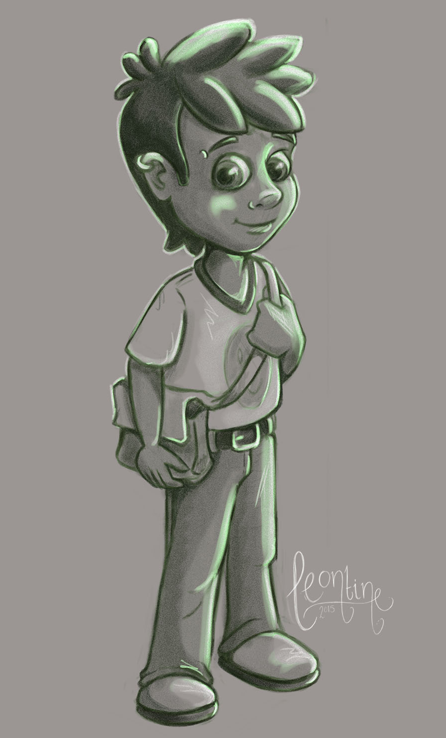
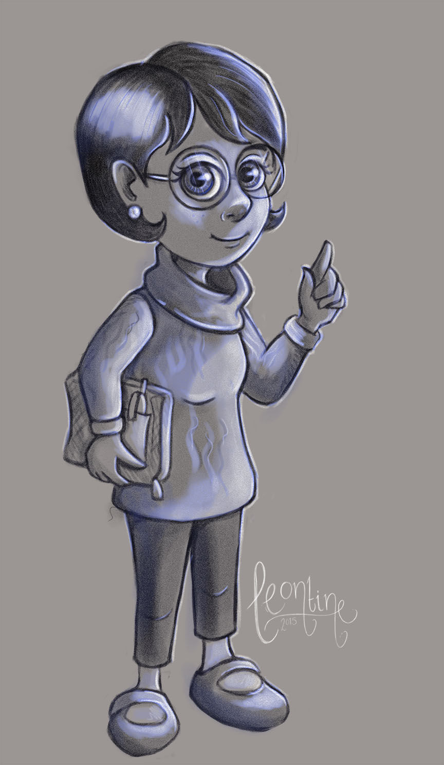
      for an client I've designed four characters for DISC. profile types, and these are designed for young teenagers. please comment...

      D=Dominance (Red)
      I=Influence (Yellow)
      S=Steadiness (Green)
      C=Conscientious (Blue)

      leontine disc D.jpg leontine disc I.jpg leontine disc S.jpg leontine disc C.jpg

      http://www.profilesglobal.com/DISC/DISC_Definitions.html

      Leontine
      "A picture is worth a thousand words."

      https://leontineillustrator.com
      https://www.instagram.com/leontine.illustrator/
      http://www.facebook.com/leontineillustration

      1 Reply Last reply Reply Quote 1
      • Ace Connell
        Ace Connell last edited by

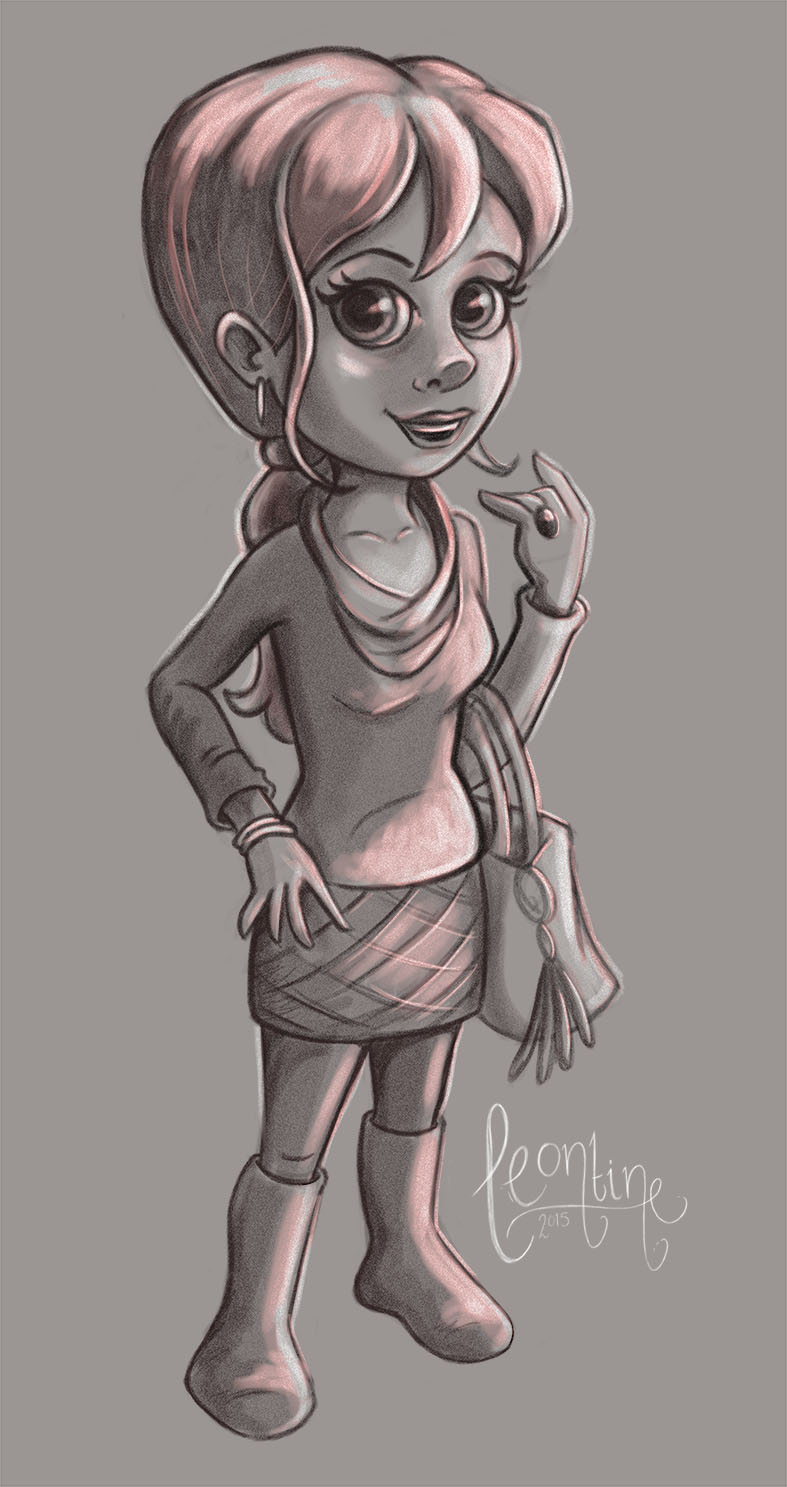
        These are really great! Really appealing

        Ace

        Leontine 1 Reply Last reply Reply Quote 1
        • Leontine
          Leontine @Ace Connell last edited by

          @Ace-Connell tnx Ace!

          Leontine
          "A picture is worth a thousand words."

          https://leontineillustrator.com
          https://www.instagram.com/leontine.illustrator/
          http://www.facebook.com/leontineillustration

          1 Reply Last reply Reply Quote 1
          • Naroth Kean
            Naroth Kean last edited by Naroth Kean

            I really like the design and it goes well with the words! great job. Maybe you can push red a just a bit more because she seems to have less contrast compared to others.

            http://narothkean.com
            https://twitter.com/narothkean
            https://www.instagram.com/narothkean

            1 Reply Last reply Reply Quote 0
            • mattramsey
              mattramsey last edited by mattramsey

              I like this style of art and I think you did a good job. One crit on the art would be: look at the difference in the nose shading on the second (Yellow) illustration compared to the others. The Yellow nose is fantastic however the shadow on the Blue and the Red (especially on the Red) appears to make the nose flat/stubby.

              In general though (and maybe I'm not understanding the point) but I don't get a sense that the characters match the character traits. I can see where maybe the Blue character would be "conscientious" (glasses/hand gesture) but I don't immediately get a sense of what it is about the other characters that make them represent, for example, Dominance.

              Maybe the Red character could be folding her arms and have a determined look on her face?

              Again, I might be missing the point so take these crits with a grain of salt.

              EDIT: Influence could have the kid waving someone to come follow and his body might be slightly turned as if to go somewhere. Steadiness might have have his hands on his hips...not sure what expression he should have.
              You could push the concept of Conscientious by adding a pencil above her ear and maybe a "list" of something in her hand with the book. Just some ideas.

              https://www.inprnt.com/gallery/mattramsey/
              https://mattramsey.artstation.com/
              https://twitter.com/mramseyART

              1 Reply Last reply Reply Quote 0
              • kevinpaul
                kevinpaul last edited by

                I really like the textures and values. I assume this is for some kind of educational purpose and meant to be subtle and non confrontational. I think they are well done.

                1 Reply Last reply Reply Quote 1
                • First post
                  Last post