Society of Visual Storytelling

    SVSLearn Forums

    • Register
    • Login
    • Search
    • Recent
    • Tags
    • Popular
    • Users
    • Groups
    • Search

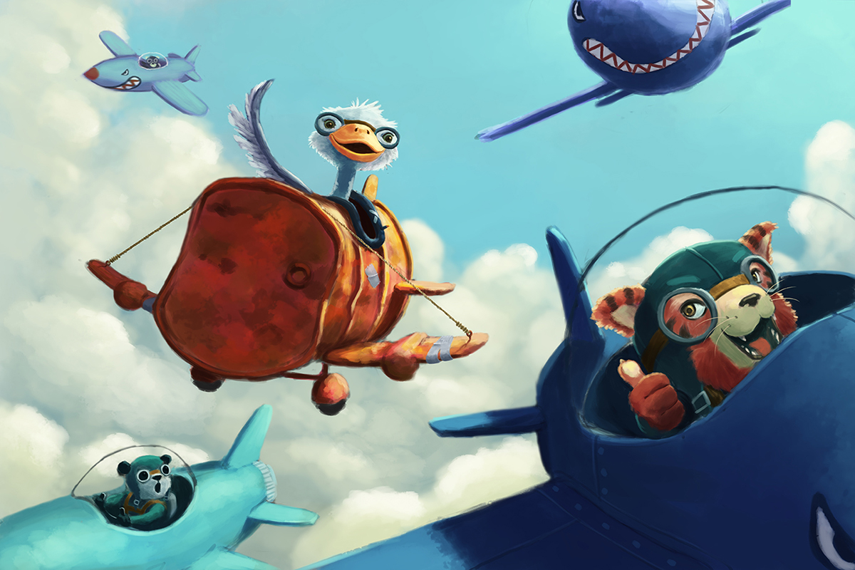
    3rd Thursday: Flying Ostrich

    General Discussion
    10
    15
    4373
    Loading More Posts
    • Oldest to Newest
    • Newest to Oldest
    • Most Votes
    Reply
    • Reply as topic
    Log in to reply
    This topic has been deleted. Only users with topic management privileges can see it.
    • shinjifujioka
      shinjifujioka SVS OG last edited by

      I started working on this over a week ago, but after hearing about Inktober, this has been neglected completely. I figured it's time to start working on it again.

      I wanted some people's opinions on which composition they prefer. With or without the plane in the top right?

      SVS Ostrich 7c 1200.jpg

      SVS Ostrich 7b 1200.jpg

      shinjifujioka.com
      https://www.facebook.com/shinjifujiokaart
      IG: @shinjifujiokastudio

      1 Reply Last reply Reply Quote 6
      • Thrace
        Thrace last edited by

        If it were my piece I would leave it out and put the writing up there instead. Nice work, I love your characters' expressions!

        1 Reply Last reply Reply Quote 2
        • Jiří Kůs
          Jiří Kůs last edited by

          I have to agree with Thrace, it is more readeble without the top plane. really really awesome drawing btw. Love the airbarrel 🙂 and tiger is really cute.

          Follow me on
          https://www.instagram.com/yiri_kus/
          http://yirikus.tumblr.com/
          https://www.facebook.com/yirikus/

          1 Reply Last reply Reply Quote 1
          • Naters.Art
            Naters.Art last edited by

            i like it. if you don't put the text in the top right, it would be nice to see more of the plane and it's pilot. right now it pulls your eye off the page. also think about putting something more on the front of the ostrich plane to make it slightly more dynamic. but otherwise, well done.

            my Sketch Blog
            https://www.instagram.com/naters.art/

            1 Reply Last reply Reply Quote 0
            • kevinpaul
              kevinpaul last edited by

              super nice

              1 Reply Last reply Reply Quote 0
              • Lynn Larson
                Lynn Larson SVS OG last edited by

                Great image!! I have to agree with the rest, great spot for text or bring the plane lower and finish it more 🙂

                https://instagram.com/lynnlarsonart/
                https://twitter.com/lynnlarsonart

                1 Reply Last reply Reply Quote 0
                • shinjifujioka
                  shinjifujioka SVS OG last edited by

                  Thanks for the suggestions 🙂 It's a tough call. Part of me feels that the image is more readable without the plane. But the other part of me feels like the added interest might be worth it to steer the viewers eye around the image and then the plane's wing directing the viewer back at the ostrich. I will work on it more today.

                  @Naters-Calderone the front of the ostrich's plane is going to be the final touch 🙂

                  @Jiří-Kůs I guess it is a tiger! Haha, I didn't know what kind of animal it was as I was drawing it.

                  shinjifujioka.com
                  https://www.facebook.com/shinjifujiokaart
                  IG: @shinjifujiokastudio

                  Thrace 1 Reply Last reply Reply Quote 0
                  • Thrace
                    Thrace @shinjifujioka last edited by

                    @shinjifujioka If you want to the leave the plane, I would change it to a lighter color because it is too dominate and the same color as the plane below it.

                    shinjifujioka 1 Reply Last reply Reply Quote 0
                    • shinjifujioka
                      shinjifujioka SVS OG @Thrace last edited by

                      @Thrace-Shirley-Mears

                      Like maybe similar to the color of the plane on the bottom left?

                      shinjifujioka.com
                      https://www.facebook.com/shinjifujiokaart
                      IG: @shinjifujiokastudio

                      Thrace 1 Reply Last reply Reply Quote 0
                      • Thrace
                        Thrace @shinjifujioka last edited by

                        @shinjifujioka yes but not same color as the sky.

                        1 Reply Last reply Reply Quote 0
                        • Naroth Kean
                          Naroth Kean last edited by

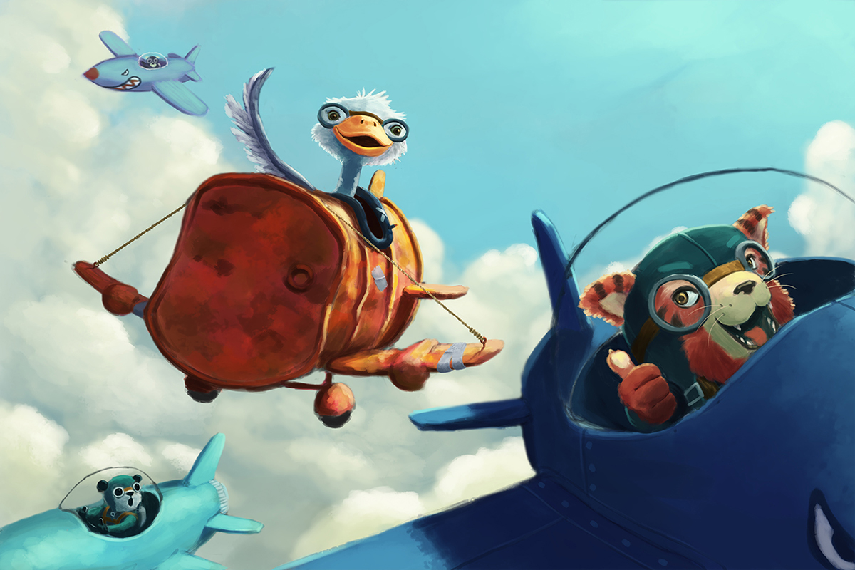
                          I love this image! the characters are so adorable. I like the second image better. I know it's not totally done but some reflection on the doors and sky trails would add a lot of movement and actions also. Great work!

                          http://narothkean.com
                          https://twitter.com/narothkean
                          https://www.instagram.com/narothkean

                          1 Reply Last reply Reply Quote 0
                          • mattramsey
                            mattramsey last edited by

                            I really like that plane (top right) but it is a stronger image, compositionally, without it.

                            https://www.inprnt.com/gallery/mattramsey/
                            https://mattramsey.artstation.com/
                            https://twitter.com/mramseyART

                            1 Reply Last reply Reply Quote 0
                            • Ace Connell
                              Ace Connell last edited by

                              I'm agreeing with the majority that the image reads better without it. It's sometimes hard to cut the cod when you're married to an image, but I do feel it's far stronger without it. Just my opinion though.

                              Ace

                              1 Reply Last reply Reply Quote 0
                              • tallison7
                                tallison7 last edited by

                                I like it either way! I do have one question... is it always necessary to leave room for text ON the illustration? Is there anything wrong with leaving the image as a stand alone, and just assume the text will be on the opposite page? I don't know about these things... When building an illustration portfolio, do you always leave space for text on finished pieces that are of an environmental nature?

                                www.traciallison.com
                                https://twitter.com/traciallison

                                Thrace 1 Reply Last reply Reply Quote 0
                                • Thrace
                                  Thrace @tallison7 last edited by

                                  @tallison7 I think this will answer your questions. Its from Lee White: "I'd say this is a good breakdown for a portfolio:

                                  Show three images from the same story. Try to highlight character interaction and get a sense of emotion and story.

                                  Show 2 images that highlight environment. You can have some characters in there, but make sure the environment is the main thing. Will does this extremely well so poke around his website for inspiration.

                                  For the remaining 5, try to vary the stories and how you show the story. Be specific to the type of work you want to get.

                                  Leave room for text in at least 75% of the work. I typically put the text in there. It shows art directors that you understand the business that we are in.

                                  Have fun! Don't put too much pressure to get 10 perfect images right away. Shoot for painting 20 or 30 and then picking the best 10 out of that.

                                  When I was leaving school, I did two things for my work that helped get the all important first book deal. I did half my portfolio on classic fairy tales from around the world which was a blast. Then I did the other half doing images from current magazine articles in kids lit (highlights, Spider, Cricket, etc.). This worked well. On my first trip to NY I landed an agent and a book!

                                  1 Reply Last reply Reply Quote 0
                                  • First post
                                    Last post