Society of Visual Storytelling

    SVSLearn Forums

    • Register
    • Login
    • Search
    • Recent
    • Tags
    • Popular
    • Users
    • Groups
    • Search

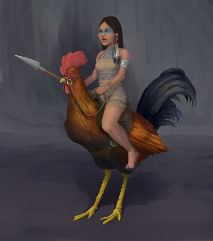
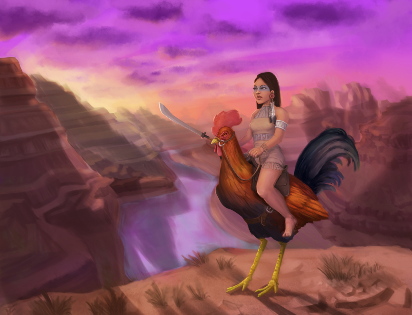
    Character design - Rooster rider

    Illustration
    5
    10
    2749
    Loading More Posts
    • Oldest to Newest
    • Newest to Oldest
    • Most Votes
    Reply
    • Reply as topic
    Log in to reply
    This topic has been deleted. Only users with topic management privileges can see it.
    • Jiří Kůs
      Jiří Kůs last edited by

      Hi, so I turned one inktober sketch into finished painting. What you think?
      cockRider.jpg

      Follow me on
      https://www.instagram.com/yiri_kus/
      http://yirikus.tumblr.com/
      https://www.facebook.com/yirikus/

      1 Reply Last reply Reply Quote 5
      • Lynn Larson
        Lynn Larson SVS OG last edited by

        Very cool 🙂 It's rendered wonderfully! So, is she tiny or is the rooster huge?

        https://instagram.com/lynnlarsonart/
        https://twitter.com/lynnlarsonart

        Jiří Kůs 1 Reply Last reply Reply Quote 0
        • Jiří Kůs
          Jiří Kůs @Lynn Larson last edited by

          @Lynn-Larson I thought the rooster was huge, but thinking about it it might be funnier the other way 🙂

          Follow me on
          https://www.instagram.com/yiri_kus/
          http://yirikus.tumblr.com/
          https://www.facebook.com/yirikus/

          1 Reply Last reply Reply Quote 1
          • mattramsey
            mattramsey last edited by mattramsey

            I really like this. One immediate reaction I had though was: that poor rooster. It looks like she is almost too big for it (like she may be on the verge of breaking it's back).

            What would it look like to increase it's size? One other thing is that the rooster has beautifully rendered feathers (seriously awesome job there) but less so on the head crest/comb/whatever you call it. Maybe push that part a bit more (and the flesh around the eye too maybe).

            Here are a couple small tweaks you could do: the spear point kinda curves down when I think it should be straighter (it might just be the angle on it though). The clothing fold over her upper thigh might need to be adjusted to be wider/more in line with her leg. There is something about the calf that seems off but I'm not sure if I can put my finger on it and finally, I would slightly widen her upper arm (her left/our right)--it has a somewhat skeletal look that clashes with her body type.

            I might be off on my ideas so if anyone else sees something different...

            Really awesome work--it's cool that you took your ink drawing to this level!

            https://www.inprnt.com/gallery/mattramsey/
            https://mattramsey.artstation.com/
            https://twitter.com/mramseyART

            Jiří Kůs 1 Reply Last reply Reply Quote 0
            • Rich Green
              Rich Green SVS OG last edited by

              Hi @Jiří-Kůs - I really like the rendering of the rooster it came out really nice and the colors and tones are also really nice.

              The one thing that stands out to me is that the girls leg seems larger in proportion than the rest of the girl. If you look at the thickness and length of her leg in comparison to her arm it is somewhat too large I think. Right now her upper leg/thigh is the same length as her entire arm. And that is where I think the balance between them is off.

              Perhaps if you trying making the size of her leg just a little bit shorter/thinner it will look more in balance with the rest of her.

              www.richgreenart.com instagram.com/richgreenart/

              1 Reply Last reply Reply Quote 0
              • Jiří Kůs
                Jiří Kůs @mattramsey last edited by

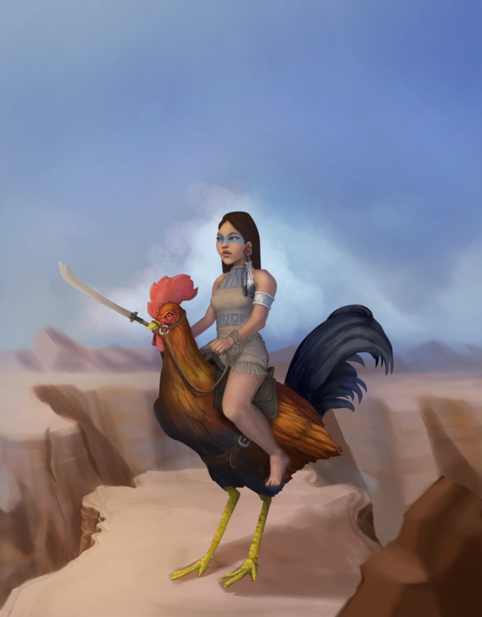
                @mattramsey Thanks! You are right in all points you made. I guess I will fix some minor issues. The dreaded proportions! I felt the chicken is too small, but I just couldnt picture it bigger. But yeah, the rooster would suffer.

                @Rich-Green Thanks! Probalby, I am trying to image she is standing and legs would probably get too big and yeah arm is too skinny... in my sketch, it was even smaller 😕

                Follow me on
                https://www.instagram.com/yiri_kus/
                http://yirikus.tumblr.com/
                https://www.facebook.com/yirikus/

                1 Reply Last reply Reply Quote 0
                • Jiří Kůs
                  Jiří Kůs last edited by

                  Finally got back to this piece, adjusted spear and thickness of her hand and added full background. I would like to do more variations with different backgrounds, this is the first one I had in mind from the very beginning, Grand canyon. Again, i will be happy for any feedback 🙂

                  cockRider_grand_canyon800.jpg

                  Follow me on
                  https://www.instagram.com/yiri_kus/
                  http://yirikus.tumblr.com/
                  https://www.facebook.com/yirikus/

                  1 Reply Last reply Reply Quote 1
                  • mattramsey
                    mattramsey last edited by mattramsey

                    maybe try and "blend" some of the hard edges of the character (girl & chicken) into the background more--if that makes any sense.

                    It kinda has a cut and paste look going on. Possibly bring in some cool rim lighting--that might help.

                    I like the changes on the main figure--looking really good!

                    https://www.inprnt.com/gallery/mattramsey/
                    https://mattramsey.artstation.com/
                    https://twitter.com/mramseyART

                    Jiří Kůs 1 Reply Last reply Reply Quote 0
                    • Lydia M
                      Lydia M last edited by

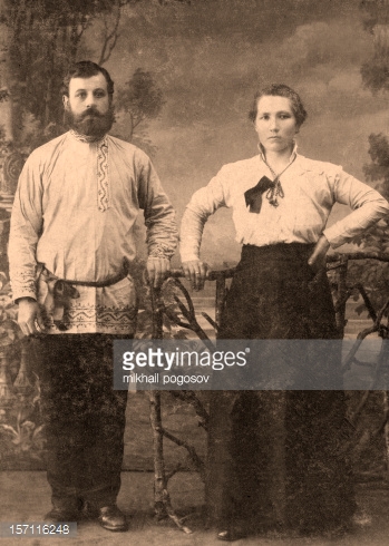
                      Their expressions and pose make me think of an antique portrait. Maybe that could be a version?

                      157116248.jpg

                      www.lydiamueller.com
                      Twitter @lydesigns

                      1 Reply Last reply Reply Quote 0
                      • Jiří Kůs
                        Jiří Kůs @mattramsey last edited by Jiří Kůs

                        @mattramsey said:
                        I felt too the edge is a bit too hard, tried to make it softer in the second variant. And the rimlight comes also in the second image. The first one is daylight so I thought it would look to forced to add rim light.

                        @gimmehummus I am going more for color variations and different times of the day.

                        Is it better with or without shadows? isnt the chicken too dark?cockRider_canyon_river_800nos.jpg

                        cockRider_canyon_river_800s.jpg

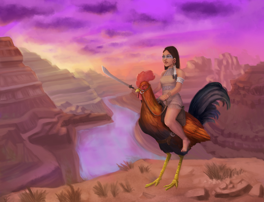
                        UPDATE: Ups I deleted also chadow under the character... That was not supposed to happen 😃

                        Follow me on
                        https://www.instagram.com/yiri_kus/
                        http://yirikus.tumblr.com/
                        https://www.facebook.com/yirikus/

                        1 Reply Last reply Reply Quote 0
                        • First post
                          Last post