Lion, Ocean and Submarine
-
@Leontine thank you so much for the reference images - they are going to prove very helpful here!
-
@Rich-Green I agree that the thumbnail is more dynamic. I like keeping the kids together. Then they read as one design element instead of two. I do think the sleeping lion should be smaller (sorry to disagree @Ace-Connell ...but I have your cookies. Pumpkin ok?). Right now you have a lot of shapes/lines that are the same size: the girl, the lions, the horizontal and vertical lines of the rock on the right, and the space between the sub and the right side... Scooting back the sub so the periscope isn't breaking the plane of the glass and making the sleeping lion smaller will vary your shape sizes. I love the lion's facial expression. This is going to be a great illustration!
Twitter: @Joy_Illustrated
Instagram: joy_illustrated
Website: joyheyer.com -
@Joy-Heyer Thanks for the input Joy! I have a few new ideas up my sleeve to give this scene a bit more of a story so I will be changing things like the sleeping lion for a different character completely. Stay tuned for that later today. I fully agree the sub needs to be pushed back a little and the issue with the periscope breaking the plane of the glass also has to be corrected. And I also agree the kids needs to be on the same side of the glass. Thanks so much for your input can't wait to keep posting updates on my progress to show how much better this is looking because of everyone's help here!
-
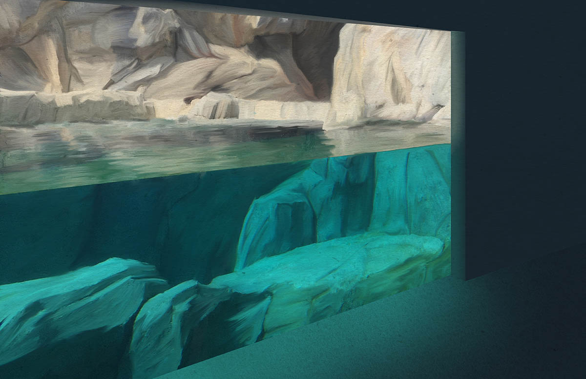
So far this morning I have worked on completely revising the image based on the perspective issues that Ace did such a great job of helping me see earlier.
I have then been working on all of the backgrounds which you will see here. I have found that using a painterly style really lets me create that rocky environment above and below the water. This style works for me at least based on my current skill level. I always think I am going to set out and create a more simple line work image but then I tend to find myself needing to add details in because I enjoy them so much. So hopefully this is working here.
As for colors I am sampling directly from my original photo as I absolutely love the teals/greens in the water - I think that is why the photo has stayed in my memory for months and I knew when the time was right I was going to do something with it. I just find it so appealing to my eye - so those are the colors I have used here.
I have moved around the brightest underwater rock and felt it will be best on the side where the kids will be placed as it gives a much stronger contrast for their silhouettes once I add them in. And then I left a darker gap towards the middle of the rocks which is where I plan on placing the submarine pushed back a bit like everyone has suggested.
-
Wow....nice!
-
That filtered lighting...friggin sweet.
-
It's looking fantastic! Love the color!
-
@Rich-Green Dude! Yes! This is looking awesome!
Ace
-
Hi Everyone,
Thanks for all the kind comments after my last update. OK so here it is now - I have to send it in this evening for a midnight deadline on an upcoming SCBWI illustration breakout session in November. So while I wont be able to make any changes for that - I am really thinking of using this to make my first ever postcards to send out.
So please let me know if you see anything else I should adjust.
A small change to the story I am imagining for this one.
-
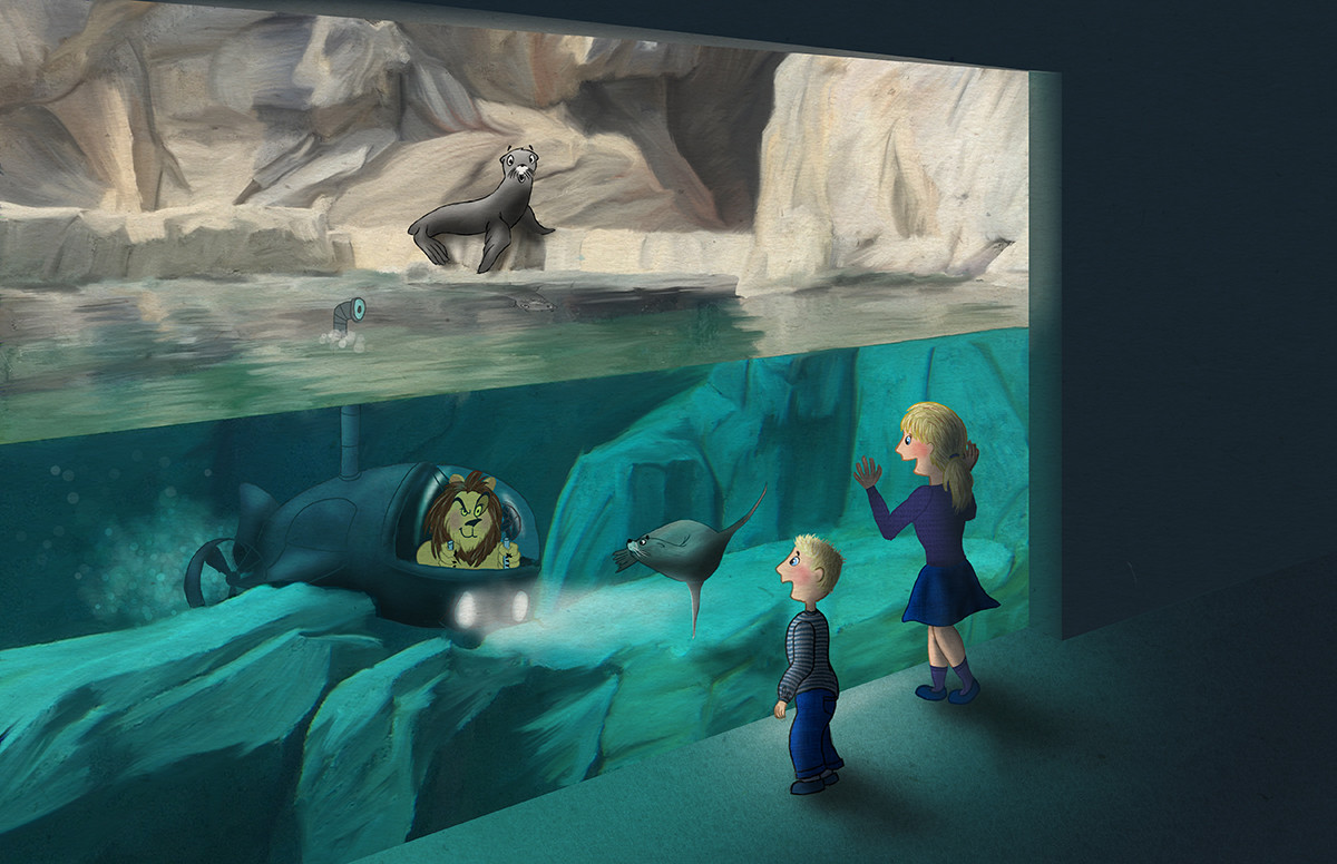
I removed the sleeping lion and instead have turned this into a Sea Lion exhibit.
-
I imagine the Lion getting jealous that the Sea Lions were always getting all the attention from visitors at the zoo. So he got himself a submarine so that he could be a "sea" lion too!
This piece really pushed me in several areas - perspective, backgrounds, trying to really think of that sub in 3D and for that matter creating a machine - something I do not think I ever really do. So it was good fun to push myself like this and I could feel myself getting better and things "clicking" in my mind as I figured out ways to solve the challenges I was facing in that moment.
Anyway - I hope you all enjoy this one as much as I do!!!

-
-
@Rich-Green Hi There Rich, It has turned out great! Love to see the flow your in and how you push yourself! Its a great piece. There is one thing that I think can be approved, thats the color of the lion. Because he is behind glass, he should have a cooler color. now the first thing you see is the lion. It would be nice to keep the first focus on the children, and there surprised faces.
Leontine
"A picture is worth a thousand words."https://leontineillustrator.com
https://www.instagram.com/leontine.illustrator/
http://www.facebook.com/leontineillustration -
@Rich-Green Hey Rich. It's looking great. The only thing standing out to me is the lion. It's not feeling like he's under the water. I'd add a bit go green into it, but still keep a lot of his colour because I like how he stands out. I just did this quickly, but you get what I mean.
Ace
-
Oops. Sorry. I's started typing before @Leontine had posted lol. But yeah, essentially I'm just mirroring what she said
")
Ace
-
@Ace-Connell Also, I do like the two children and the seal are creating a triangle that's pointing to the lion. Nice composition there
Ace
-
@Ace-Connell LOL
Leontine
"A picture is worth a thousand words."https://leontineillustrator.com
https://www.instagram.com/leontine.illustrator/
http://www.facebook.com/leontineillustration -
@Leontine and @Ace-Connell - yes I could not agree with both of you more. It's funny because I had some adjustment layers (for the submarines glass) that i kept turning on/off as I just was not sure if cooling off the Lion's colors a bit worked or if we lost him too much. But after reading your comments I agree and will definitely be making that adjustment for this piece in my portfolio and those postcards I plan to make. Thanks so much for the input!
And it would not be one of my pieces if it did not need a color toned down a bit - I told you those deliciously saturated colors get me every time!! Ha!
-
@Rich-Green whahaha! we all have our issues LOL Good luck at your presentation at SCWI.
-
Hey Rich, This is a cool concept and I love all the work you did to it. That environment is stunning!
In fact, the environment might be too stunning. What I mean is that the environment is painted in a much different style than the people, so it gives the appearance of the characters being placed on a background instead of really integrated with it. So that leaves you with two choices. Either go super realistic with the people and lion, or go more cartoony with the environment (which is the easier of the two).
Good luck. I love seeing all your progress!
SVS Faculty Instructor
www.leewhiteillustration.com -
@Lee-White Thanks for the feedback Lee - I read this the other day and I have just been letting it stir around in my brain a little bit trying to figure out which way to go. The look I have here is reminiscent of old 2D animation - which had those beautifully painted backgrounds with the outlined more flat cell characters layered over the top. And its no secret I am heavily influenced by that look and feel. But I can also see how this is jarring in a single illustration and also how this is not the norm in the illustrated books I enjoy or the images I save as inspiration from online. So I think the best thing for me to do will be try try taking this one illustration in both of those directions (super realistic characters to match the background and a version where the background is more cartoony to match the characters and see what happens). This might take me a little time to do with some client projects I am also working on currently but I will definitely share the updates here along the way.
Thanks for making me face this head on - I needed that!
Rich
-
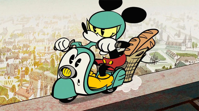
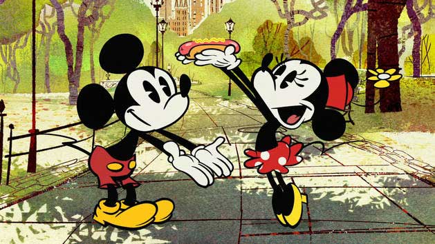
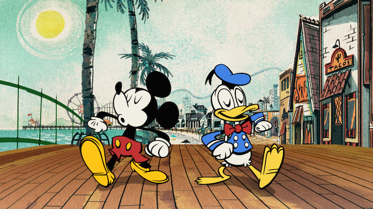
@Rich-Green I get what you're saying and you know how much I love those old cartoons as well. I think the difference here though is that they had beautifully painted backgrounds and the difference was vast to the characters. Here, the characters are in between a flat, animated look and realistic. If you look at any of the new Mickey Mouse shorts (some of the most creative storylines that animation have seen since the 40s/50s in my opinion). The backgrounds are so painterly and gorgeous and the characters are super flat and super stylised. Doing it that way, where the difference is extreme works really well but like I said at the top, I feel your characters are in-between (or tween if we're getting animation geeky on that word haha)?
Ace
-
@Ace-Connell - oh yes I completely get what you are saying - these are so intentionally stylized but at the same time do have a feeling of belonging in the environments which also share some similarities like black outlines or that they are flat shapes just heavily textured in contrast to the more simple color blocked characters of Mickey, Donald, Minnie etc. So while they are not the same they do have similarities in common to tie them together enough to make them believable for lack of a better word.