Help for mock-up book cover!
-
Hello guys!
Happy New Year
")
I was wondering if I could get your precious feedback on a piece I am working on? I asked my agent for a portfolio review recently and she said I should: 1) add more pieces with heavily characterized characters (giants, Vikings, pirates, etc) AND 2) do mock-up book covers, using existing stories that I love.
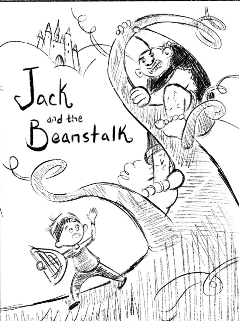
SO, to start, I decided to combine both and do a mock-up book cover of Jack and the Beanstalk. After a few rounds of thumbnails, here is my very rough sketch!
Thanks!
-
Cute! It's a nice composition, the eye travels from Jack, up the beanstalk to the giant, to the castle and then down to the title, which is great! I think this might look really cool if the beanstalk was a dark color, its silhouette on the cover would attract the attention very much (but not sure how this would look since typically the beanstalk is supposed to be a medium-light green). I'd say the one thing I have reserves about is Jack's pose, it looks very stiff and a bit odd, like he's waving to the giant?
-
Little update!
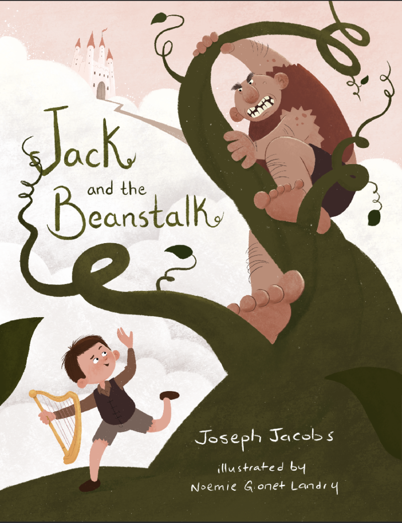
This is what I have so far for my first mock-up cover. I would say it's 90 % finished. I am still fiddling with the final details. Any thoughts before I call it done ?!
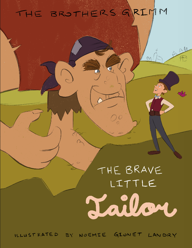
Also, I started working on another one, this time for a slightly lesser known story called the valiant little tailor. I am at the color comp stage. Any comments/critique would be greatly appreciated!
Thanks
noemiegionetlandry.squarespace.com
noemie_illustration on Instagram -
@nowayme Nice work. I really like the Jack one better with colors as you really changed the values on it. The values really lead the eye well and focus the viewer.
But I don't get the same feel with the little tailor. The values seem to be almost the same across the piece. They are not drawing the viewer to the focal points. One thing you could try is have giant and tailor be a much very stronger value than all of the background?
Just a thought. But looking good so far.
-
Both of these are great and have an amazing feeling of whimsy!
I do agree with @theprairiefox about the values on The Brave Little Tailor (a favorite of mine that I'm really happy to see getting some love lol). When you turn the image to grayscale it's all VERY close in tonal range. I a bit more nudging there and it'll be awesome!
The pieces are solid, though. Great character design and style. Can't wait to see them both finished

Thanks,
Aaron -
These pieces look great, I particularly like your style in the beanstalk one, lovely rendering and the characters are great. I'm still unsure about Jack's pose though like @NessIllustration says, is he running away scared or is he feeling smug because he's out running the giant? I couldn't really tell from his pose. If he's scared then i'd say just his facial expression needs changing, maybe also look at his arm too, it looks like it shouldn't be bending far back that way so by just adding a little shading/detail on his sleeves and his shorts should sort that out
With the second one, I'm finding the giant's foot distracting because we don't see all of it, maybe you could rework the hill so that we see all of his foot or lose the foot altogether. Maybe even by moving it a bit to the right so that it doesn't overlap the giant's hand? Absolutely LOVE your characters though, so much expression in their faces!
Fab stuff