March Prompt "Book Cover"
-
@kaitlinmakes Both of those would be so cool. I read Island of the Blue Dolphins LONG ago but remember really liking it. But I've got to say that I think Yellow Wallpaper would be AMAZING and darkly fun !!
-
Hey everybody,
I did The Knight in Rusty Armor by Robert Fisher. Below the piece.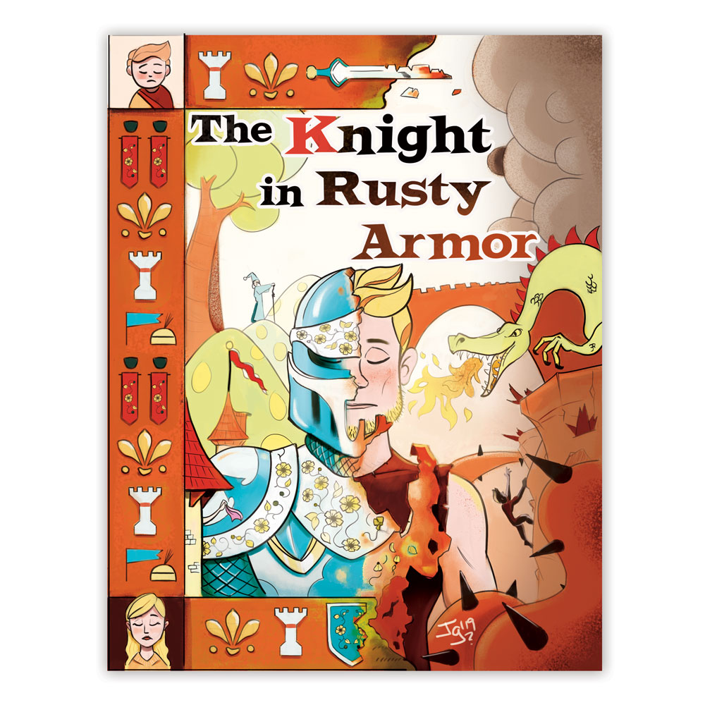
I read the book many years ago; but here is the best book summary I found.
The story is great and I highly recommend it. It is the story about a person finding the real values of family and facing hard challenges.
Thank you and good luck,
JoseJose A. Galue
www.instagram.com/artofjosegalue/ -
This post is deleted! -
@josegalue25 - Wow! This looks great! I'm really second guessing my entry after seeing yours!! Great job!
-
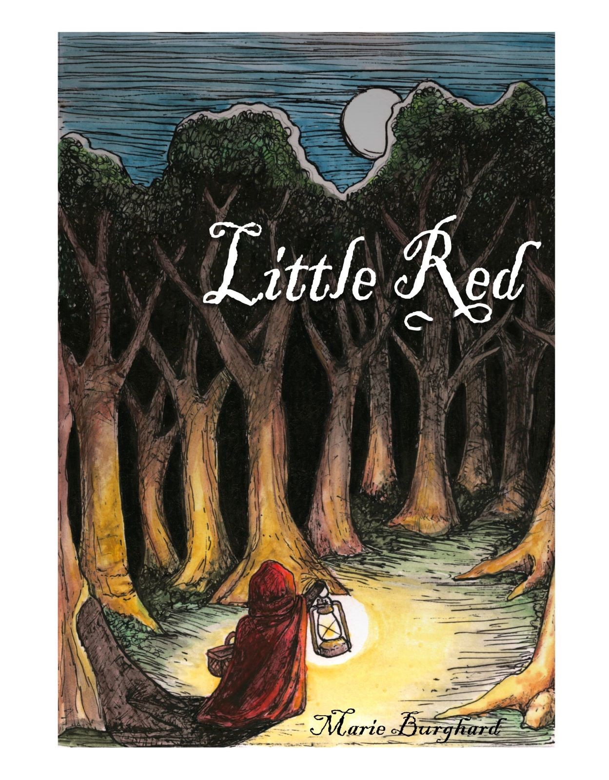
Hi, all! This is my first post. Eek! I'm excited to just dive in. I went with a classic - Little Red Riding Hood, but with a spookier vibe. Pen and ink with watercolor, and a little lighting work/text on the computer. Lots of great art on these forums. Best of luck to everyone! -Marie
-
@WindyWyoGal I like it. A darker take on the story.
-
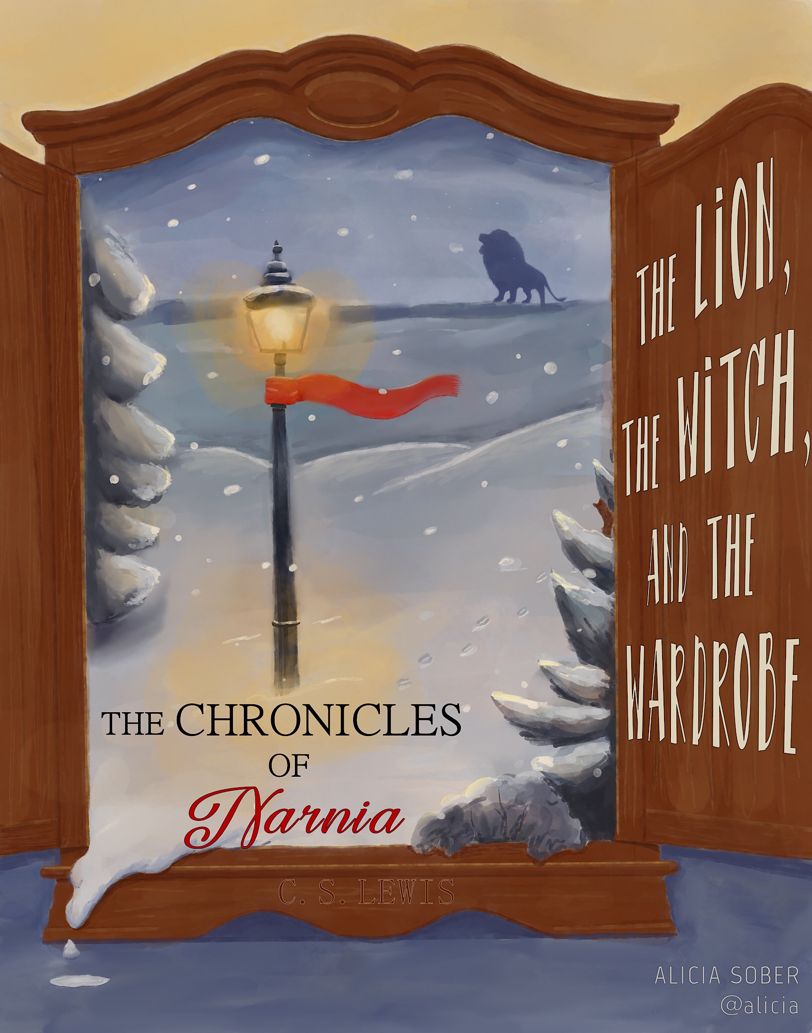
This is my first entry into one of these contests. I hope I’m up to par with everyone. I decided to go with one of my all-time favorite books, The Lion, The Witch, and the Wardrobe. If you haven’t read it, close your computer right now, go out, and purchase it immediately. It’s worth your time!
-
@alicia Your snow scene is quite nice and that added little snow "in the real world" so to speak
") .
.Instagram: www.instagram.com/heatherboyd.illustration/
Website: https://heatherboydillustration.ca
Shop: https://www.inprnt.com/search/products?q=HeatherBoydIllustration
Ko-Fi: https://ko-fi.com/heatherboydillustrationBe blessed,
-
@WindyWyoGal It reminds me of a paper cut out and a pop up book.
That's nice thanks. -
@Heather-Boyd - Thanks so much!
-
This post is deleted! -
This post is deleted! -
@WindyWyoGal Your cover is beautiful! I love pen & ink!! I think that may have to be my next project!
-
@Heather-Boyd Thank you! Great idea for a pop up.
-
@alicia Thanks so much
-
@josegalue25 Hey, this is sooo cool! But is there a way you could separate the frame a bit from the center detail? I mean by playing with the different saturation levels etc? Or a different complementary color because the orange is quite heavy when you include so much of it in the background as well. Unless you were not asking for input from people, in which case I'm really sorry!
 One last thing is just the heading, the word Armor is a bit detached from the rest of the title, and you need just a bit of breathing space as well for it to stand out better. Beautiful illustration!
♥ Illustration : https://www.instagram.com/coba_illustration/
-
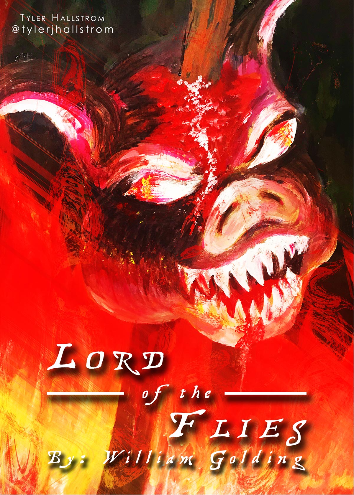
Hello everyone, my name is Tyler J. Hallstrom, and I am an art teacher from Central Illinois. Currently, my students are reading Lord of the Flies, and I had to make a cover for this incredible novel. When I saw that this was going to be the topic for March, I was extremely excited. I am a little nervous that Lee White used Lord of the Flies for his example, but regardless, I hope you enjoy my take!
Tyler J. Hallstrom
One Drawing at a Time.
https://www.tylerjhallstrom.com/ -
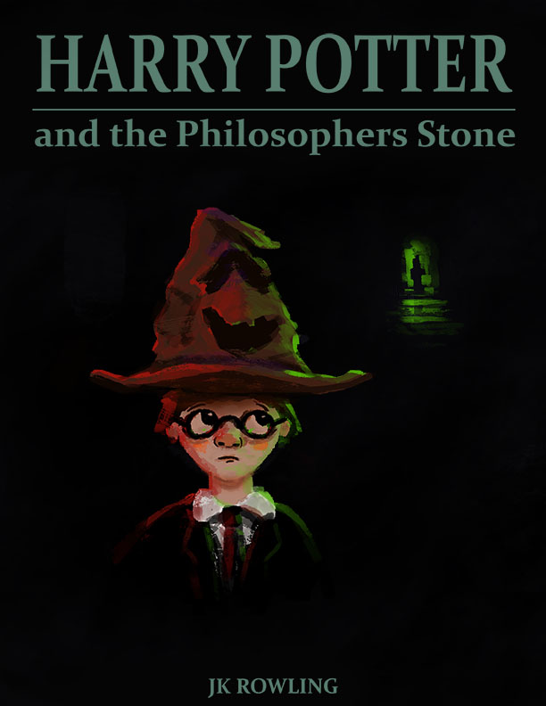
Here is my take on Harry Potter. I had my name on it but it ruined my design so I took it off hope that isn't a problem.
Insta: jasonbowenoils
Youtube: Jason BowenGood luck everyone.
-
@WindyWyoGal I love this. I’m trying to improve my ink and watercolor so I’m going to study your work!
-
@CobaB Hi, thanks for the feedback. I agree with almost everything you mentioned. On the link below you can see a little bit of my whole process...
https://forum.svslearn.com/topic/7202/art-book-cover-march-challenge-wip/22
Sadly, I only get to work on fun stuff and personal portfolio pieces on some weekends. Last weekend was one of those few weekends I had available to do the challenge and I won't have the time to address the issues you mentioned.
I appreciate your time and feedback is the only way I can grow as an artist. Hopefully we get to see you jump on this challenge as well.
Jose A. Galue
www.instagram.com/artofjosegalue/