Society of Visual Storytelling

    SVSLearn Forums

    • Register
    • Login
    • Search
    • Recent
    • Tags
    • Popular
    • Users
    • Groups
    • Search

    Prince Eddy Ipad-dy

    Projects
    12
    41
    15774
    Loading More Posts
    • Oldest to Newest
    • Newest to Oldest
    • Most Votes
    Reply
    • Reply as topic
    Log in to reply
    This topic has been deleted. Only users with topic management privileges can see it.
    • Leontine
      Leontine last edited by

      Thanks for the comment Steve! The reason the colors are different is because first i wanted to show that the story's timeline is during one whole day. Inside is dull, thats why its brown. When the prince jumps out of the window the colors change. first morning light, mid-day evening and night sky. Ill keep your comment in mind, wile finishing.

      1 Reply Last reply Reply Quote 0
      • Leontine
        Leontine @Steve Young last edited by

        This post is deleted!
        1 Reply Last reply Reply Quote 0
        • Leontine
          Leontine @Rob Smith last edited by

          @Rob-Smith thank you Rob!

          1 Reply Last reply Reply Quote 0
          • Rich Green
            Rich Green SVS OG last edited by

            In the first image of the bedroom - I wonder if it would help to give some color/life to what is outside the windows? Right now its just blah beige light flooding the room. But I think it would be more interesting if there was a hint that the world outside the room is actually colorful/bright and yet he still is choosing to focus on the iPad.

            www.richgreenart.com instagram.com/richgreenart/

            Leontine 1 Reply Last reply Reply Quote 0
            • Leontine
              Leontine @Rich Green last edited by

              @Rich-Green good call Rich! Thanks a lot!

              1 Reply Last reply Reply Quote 0
              • A
                Amanda Jean last edited by

                These illustrations are lovely. The lighting outside his room seems a bit off to me though, I would try to add more ambient light to them. Good luck finishing them!

                1 Reply Last reply Reply Quote 0
                • Maile McCarthy
                  Maile McCarthy @Leontine last edited by

                  @Leontine-Gaasenbeek Thanks for sharing your project.

                  I really enjoyed your use of perspective on the initial page. That combined with the contrast between the bright ipad screen and the dull room, really drew my eye to the focal point. I think it will be a challenge, but one that may really pay off, to find a way to add interest (like others have said, the carpet, the windows) but still hold onto that sense that life is dull inside the house. I'm wondering if you could maybe play around with really pushing the values. Or maybe add in some of the great watercolor textures like you have elsewhere. That way you could add some drama without losing the mood.

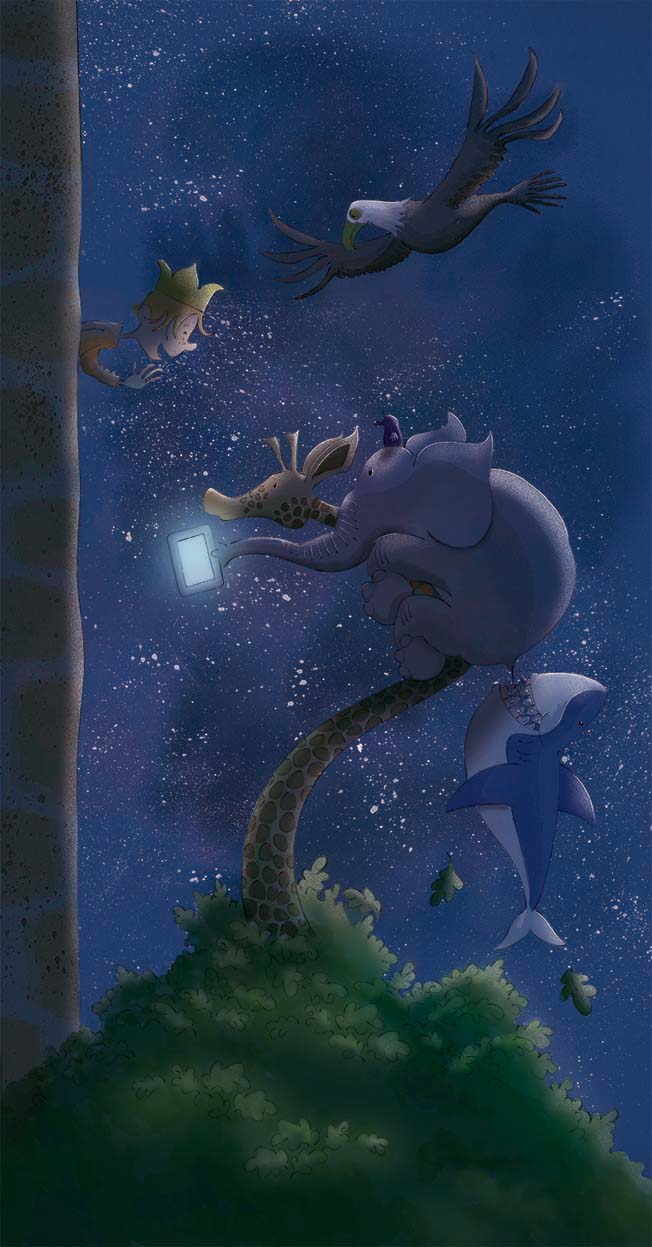
                  It's clear that the real adventure starts once he gets outside. Your animals are delightful. So much personality there. I especially love the giraffe and the pink elephant. To me, he blue of the underwater scene seems out of place against the pinks and browns of the on-land drawings. I'm not sure how you could create more unity -- pink water might look weird, but what if you chose a warmer blue, something closer to green? Might be something to play around with.

                  All in all, there's a lot of stuff going on here that I really like. Can't wait to see the other illustrations!

                  Maile

                  Twitter @MaileMcCarthy
                  www.mailemccarthyillustration.com

                  1 Reply Last reply Reply Quote 0
                  • Leontine
                    Leontine last edited by

                    Suggestions for coloring this one? Tips and tricks are very welcome!
                    spread 14 blauw.jpg

                    Maile McCarthy 1 Reply Last reply Reply Quote 0
                    • Maile McCarthy
                      Maile McCarthy @Leontine last edited by

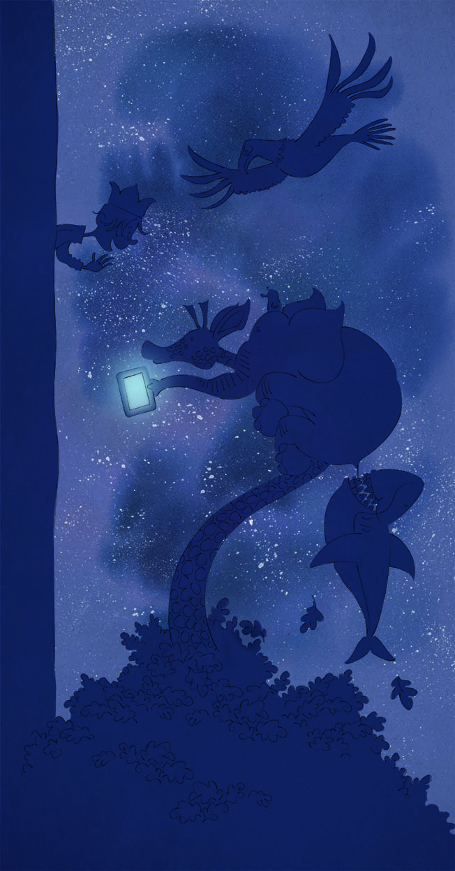
                      @Leontine-Gaasenbeek Ooh, I'm loving the feel of this new one. I think just rendering out the characters in different values of the same blue, them maybe highlighting with greenish ipad-blue (Something like this image from Will's Pinterest page: https://www.pinterest.com/pin/432838214160085350/). I'm curious to hear what others think.

                      And I know you didn't ask, but I really like the composition.

                      Maile

                      Twitter @MaileMcCarthy
                      www.mailemccarthyillustration.com

                      Leontine 1 Reply Last reply Reply Quote 0
                      • Leontine
                        Leontine @Maile McCarthy last edited by

                        @Maile-McCarthy Thanx so much Maile! I think i can use that inspiring note very well. I will work on that today, and show my progress! thanx also or the compliments!

                        1 Reply Last reply Reply Quote 0
                        • Leontine
                          Leontine last edited by

                          edje spread 14.jpg the next version...I choose to use more color than in Will's example. Now we an also make a posterprint. How would you like to hang a copy in your house?

                          Lee Holland 1 Reply Last reply Reply Quote 1
                          • Lee Holland
                            Lee Holland @Leontine last edited by

                            @Leontine-Gaasenbeek

                            Really love the look of all of your pieces perspective is great and the watercolour texture looks so cool. well done .

                            https://www.facebook.com/pages/Lee-Holland-illustration/285517801577676?
                            https://www.instagram.com/lee_holland_illustration/
                            http://lholla56.wix.com/lee-holland

                            Leontine 1 Reply Last reply Reply Quote 0
                            • Leontine
                              Leontine @Lee Holland last edited by

                              @Lee-Holland Thanx Lee!

                              1 Reply Last reply Reply Quote 0
                              • A
                                Amanda Jean last edited by

                                That last one turned out great!! Lovely work on the colour and lighting as well as composition.

                                1 Reply Last reply Reply Quote 0
                                • Leontine
                                  Leontine last edited by

                                  Yeeeah, the Printer send us the first prints before it finally becomes a real book. We have worked hard on this one, and we are so excited that people are already so enthusiastic about it. leontine edje.jpg Thanks SVS, for tips and tricks. without your help, it would n't have become what is is now! #svslearn!

                                  Rich Green Maile McCarthy 2 Replies Last reply Reply Quote 1
                                  • Steve Young
                                    Steve Young last edited by

                                    Welldone!

                                    Never give up, always push yourself two steps further than you believe you can go.

                                    Leontine 1 Reply Last reply Reply Quote 0
                                    • Rich Green
                                      Rich Green SVS OG @Leontine last edited by

                                      @Leontine-Gaasenbeek So exciting! Congrats!

                                      www.richgreenart.com instagram.com/richgreenart/

                                      Leontine 1 Reply Last reply Reply Quote 0
                                      • Sarah LuAnn
                                        Sarah LuAnn SVS OG last edited by Sarah LuAnn

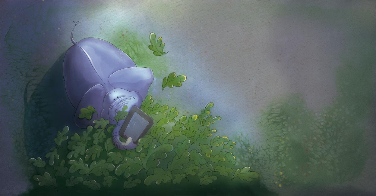
                                        Lots of fun stuff here! I have one small comment, though. Maybe this was just me, but it took me awhile to figure out that it was an elephant in that second picture. I think if the eyes were easier to find (darker, maybe?) it would have been a quicker read for me.

                                        sarahluann.com

                                        Leontine 1 Reply Last reply Reply Quote 0
                                        • Leontine
                                          Leontine @Sarah LuAnn last edited by

                                          @Sarah-LuAnn Thanx, this is the final result. The color has been changed, because the story has a timelaps from morning till it is late at night. So The color of the first one is to early time a day. When the elephant finds the Ipad, the sun should be down already. (liked the soft color of the other one more, but changed the eyes, ahead of what your comment was. i like the eyes better when they have a sparkle like this one is. spread 13.jpg

                                          1 Reply Last reply Reply Quote 0
                                          • Leontine
                                            Leontine @Rich Green last edited by

                                            @Rich-Green thank you so much!

                                            1 Reply Last reply Reply Quote 0
                                            • First post
                                              Last post