Feedback on my Website?
-
@nikolett I didn't even notice the multiple fonts! I thought I just had the script and the serif! I'll definitely double check that, thank you! I'm so not a graphic designer, haha. Just hope that isn't too apparent to the art directors, eek.
@ShannonBiondi Thanks for the suggestion on the gryphon! I've wondered about that, maybe I'll fade it more or just make the homepage a solid, like you said.
I've always heard that art directors don't want to click around a bunch when looking at a portfolio, so that's what concerns me about leaving the sections. But I do agree that it makes it easier to find genres, especially kidlit. I am sending to a few places that do kidlit and I'd like them to be able to see easily that I have that stuff in my portfolio.
Gah! Not sure what to do.
-
@Kasey-Snow - I personally like the subsections. I think it might make it easier for someone to come to your site and looking for a specific genre. I do think for the Portfolio landing page it may help to have all the titles the same size and maybe you could kick back the opacity so that the titles are a bit more legible? Just my 2 cents, I hope it is helpful.
-
Hi
") I think you have a lovely website there with a good chunk of work to look through, I think I would put your 'Illustration' and 'Kidlit illustration' sections together as they would both work for children's illustration in my opinion But they work separately too
I think you have a lovely website there with a good chunk of work to look through, I think I would put your 'Illustration' and 'Kidlit illustration' sections together as they would both work for children's illustration in my opinion But they work separately too
I think I would also lose the background image , to me it distracts away from your other pieces in your portfolio and makes the whole website seem a bit dark and muddy. Maybe a plain colour background, or just white might help to really bring attention to all the great details you have in your work -
@Kasey-Snow I am actually going to code it. I do web design and development for a full time job, so I don't use any platforms for my site. Thanks for the tip on my footer link here, just fixed it.
-
Hi @Kasey-Snow You've got a great website with a fairly large collection! Good job on putting this together.
I agree with @hannahmccaffery on the background - I feel like the current brown background might be taking away from the actual artwork, and wonder if just white would make everything look a little sleeker.
As you're shooting for work with YA/Fantasy series publishers, the work in the "Illustrations" and "Creature Designs" category might be most relevant to them. If you are also sending your postcards to kidlit publishers, I'm thinking they might want to see a slightly larger number of pieces in that category? This depends on your strategy, of course.
All the best, and again, good job on this website!
-
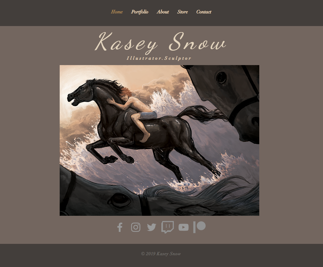
It's a nice lil site, I really like it Kasey, especially the brown colour , feels very calming
The black bars seem sort of aggressive though, did you play with other colour combinations? Maybe brown bars with that cream/white behind the images? or cream bars and keep the brown middle like you have it?I like Chip's idea of adding a filter … but than I also think the way you have it, as it's future proof for when you have 1000's of paintings
I find trying to organise the content to be the hardest bit about a creating a website.Nice site though and I love your artwork
-
@djly Thanks for the feedback! I fixed the title sizes as best I could, I hope they look more uniform now? I need to see if I can fiddle with the opacity easily, maybe like the way the images in the portfolio fade when you mouse over them.
@hannahmccaffery I was worried some of the illustration stuff would be too dark for kidlit since a lot of the work in there is from a creepy retelling of fairy tales series I did. But I'll look at it more. I took out that background image though, just made it a muted sort of brown, hopefully it looks better now?
@animatosoor I switched it to a greyish-brown, what do you think? Still too muddy? Some of the publishers do kidlit as well and I definitely need more stuff in that section, you're not wrong, haha. Been trying to finish up some pieces to throw in there, but so far they are slow going. There's one more going up in a bit that features a ~gasp~ kid in it, haha. So hopefully that'll help. I did throw a few cutesy sticker illustrations that look pretty kid-friendly in there, maybe that helps? I'm hoping they pass as spot illustrations. :smiling_face_with_open_mouth_closed_eyes: At least until I can get more kid stuff done.
@Sophie-Lawson Thanks so much! You're very kind.
 I changed up the color in the background, what do you think? I think you were right on that black, so I switched things up. Better? Worse?
Thanks SO much everyone for all of the feedback in this thread! You've all been super helpful and I already feel better about art directors looking at my site thanks to you all!

-
Here's a screenshot to save some link clicking time. x)
-
@Kasey-Snow This looks so much better in my opinion, it's cleaner and looks very professional
I would also maybe make your social media icons the same colour as your name and make them a bit smaller?
It's looking really great -
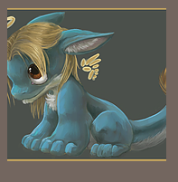
@Kasey-Snow - sorry to just get back to you, sick kiddo! Your site is really coming together nicely, I really like how you changed the mouse-over to a lower opacity. The only other thing I might add is taking another look at the thumbnails and seeing where they cut-off. I know some are not a "square" but maybe you could crop so you are getting the best piece of the image?
For example, on the dragon in the kidlit page (below), perhaps you could focus in on the top portion or head of the dragon, right now we are cutting off on both the tail and the head.
Feel free to take it or leave it, of course! Again, really nice progress.
-
@djly For sure valid feedback! I am frustrated with those thumbnails as well, the platform atuocrops it and there isn't really a way for me to adjust it that I can find.
 The only thing that seems to fix it is making the squares bigger so that face isn't cut off. But then the squares on the kidlit page are much bigger than the others. I dunno how important uniformity of thumbnail size is across the site though.
 -
@Kasey-Snow - oh I see, that is frustrating! Perhaps someone here with more experience than me on what publishers look for would be helpful. I don't think it is a huge issue but just wanted to provide the feedback.
I'm not sure if you can control any of the html/css coding, but if you can, maybe that would be a route if it something you end up wanting to fix. It seems like this is a fairly straightforward tutorial: https://www.w3schools.com/howto/howto_css_thumbnail.asp
Again, I think it looks fine the way it is but just wanted to put it out there.
-
I love your artworks! I think the website is already nice and tidy.
The only thing which I can give input is, from my own experience when I check my website's traffic, most of my website visitors only check the front page. They barely click on the thumbnails to check for more images possibility. Also, from what I heard on Podcasts that art buyers/ art directors they are a very visual and busy person. They probably will only check the front page and make decisions from that frontpage without digging more (CMIIW).
So, what I did is I try to keep my website as simple as possible without too many menus or links and try to put all the best images on the front page so visitors can immediately have an idea about my works right after they hit my website. Hope it helpsGood luck for you!

-
Thanks again everyone for the input! I took it all in and ended up totally revamping the website with a newer and hopefully more professional-looking design. Also stuck all my better (in my opinion) portfolio pieces on the front to hopefully entice prospective clients.
If you have a sec to check it out, let me know if it looks okay or if I need to consider changing some other stuff.
https://www.kaseysnow.com/
Image preview: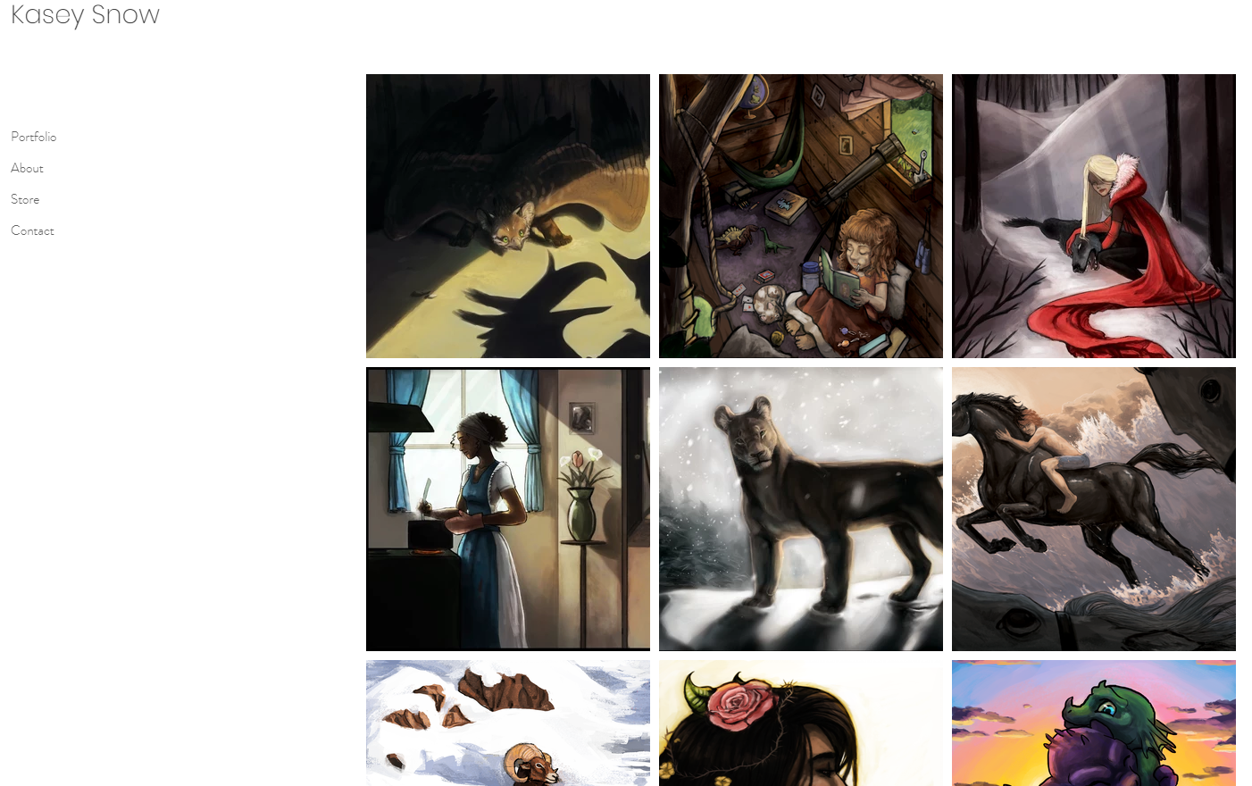
-
@Kasey-Snow looks great! I like the white background. That loin in the water is amazing.
-
@Kasey-Snow neat portfolio. Very tidy website.
I echo what @lenwen is saying. I actually did not realize there was a sub-menu on the Portfolio tab. I thought the front page is the portfolio page, until I read @lenwen 's commentIf you want to show art buyers your creature design skill, and sculpture skill, they need to be more prominent. Make the submenu visitble at glance without needing hover to discover will help a little, if you really need section your work to avoid getting too messy (I am struggle to find this balance myself ).
Hope this make sense, and good luck
-
Thanks so much @Chip-Valecek ! I appreciate the feedback.
@xin-li Thank you for your feedback! I'm glad it looks tidy.
As for the sub-menu, I tried loads of menu styles for sectioning my portfolio to show more work (it's so tough to figure out that balance!) and so far this is the best--but I agree, it does make it easy to miss the sections. Perhaps I'll add some text on the portfolio page that elaborates about clicking to see more, especially for people not using a desktop.I am struggling at the moment with even keeping the sculpture/creature design sections in there, to be honest. I love doing those things, but they are more "passion projects" and not something I foresee being able to actually get clients with. I am also worried that it will make me look like a jack of all trades, master of none type thing and maybe decrease my professionalism? Not sure. Don't want to confuse or turn away future clients.
I also worry that perhaps my style is too all over the place. I am trying to work on that, but it's tough. I'm definitely still in the stage of figuring out how I like to work. Time will fix that, I hope. But it'd be nice if things could look a little more cohesive.