Momzilla WIP
-
Any last minute critique that I can do traditionally? Thanks!!
I know I should have painted the letters on the apron more concave but kind of too late for that. I also darkened the bases of the the two buildings in front of Godzilla so the don't look so abruptly cut off. I kind of like the white parts for contrast though. -
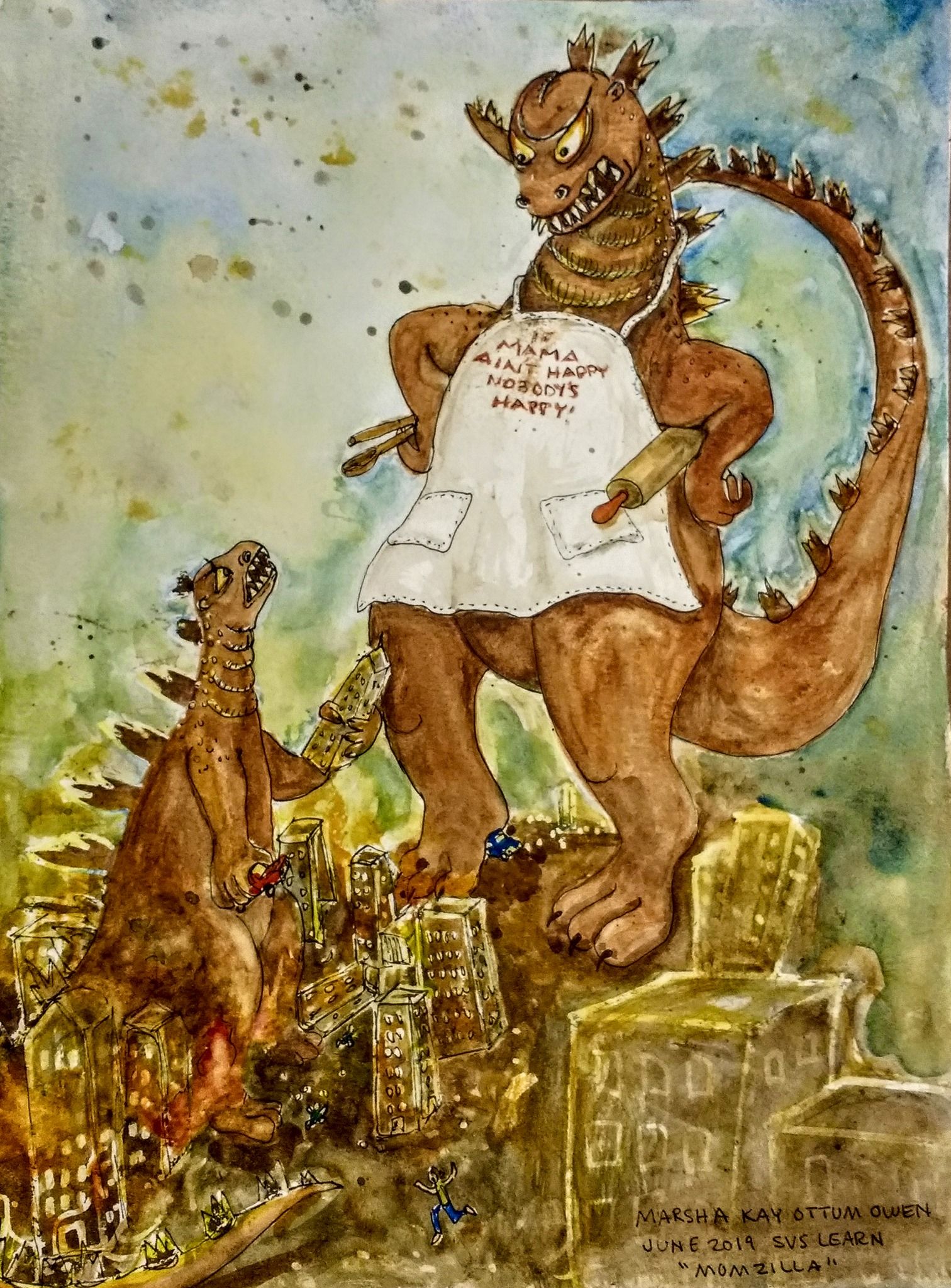
Here it is without color enhancement from my phone. It also shows the darkened bottoms of the two buildings.
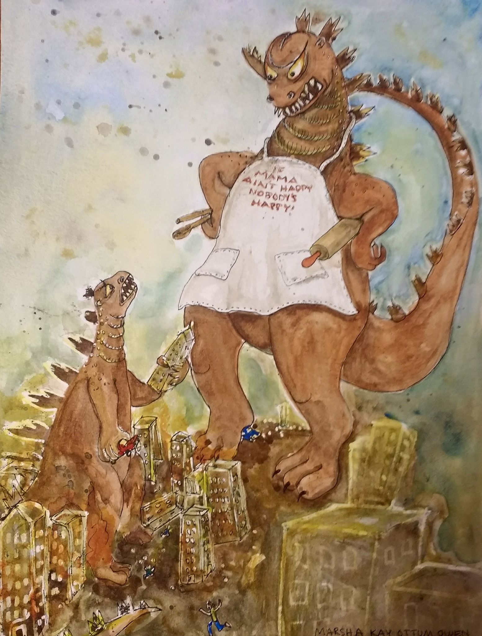
Marsha Ottum Owen
-
@Marsha-Kay-Ottum-Owen Nice work

I'm reticent to give too many suggestions on tweaks to make with traditional media (I don't really use traditional media these days).
In a perfect world I think I'd like to see more value contrast on the lower half of baby godzilla and the city scape. However, I can see how going darker than it already is could be disastrous. COULD be
")
Sorry I can't be of more help.
Looks pretty awesome regardless of any changes you make!
-
@Braden-Hallett Thanks Braden. I might be able to do something with that
-
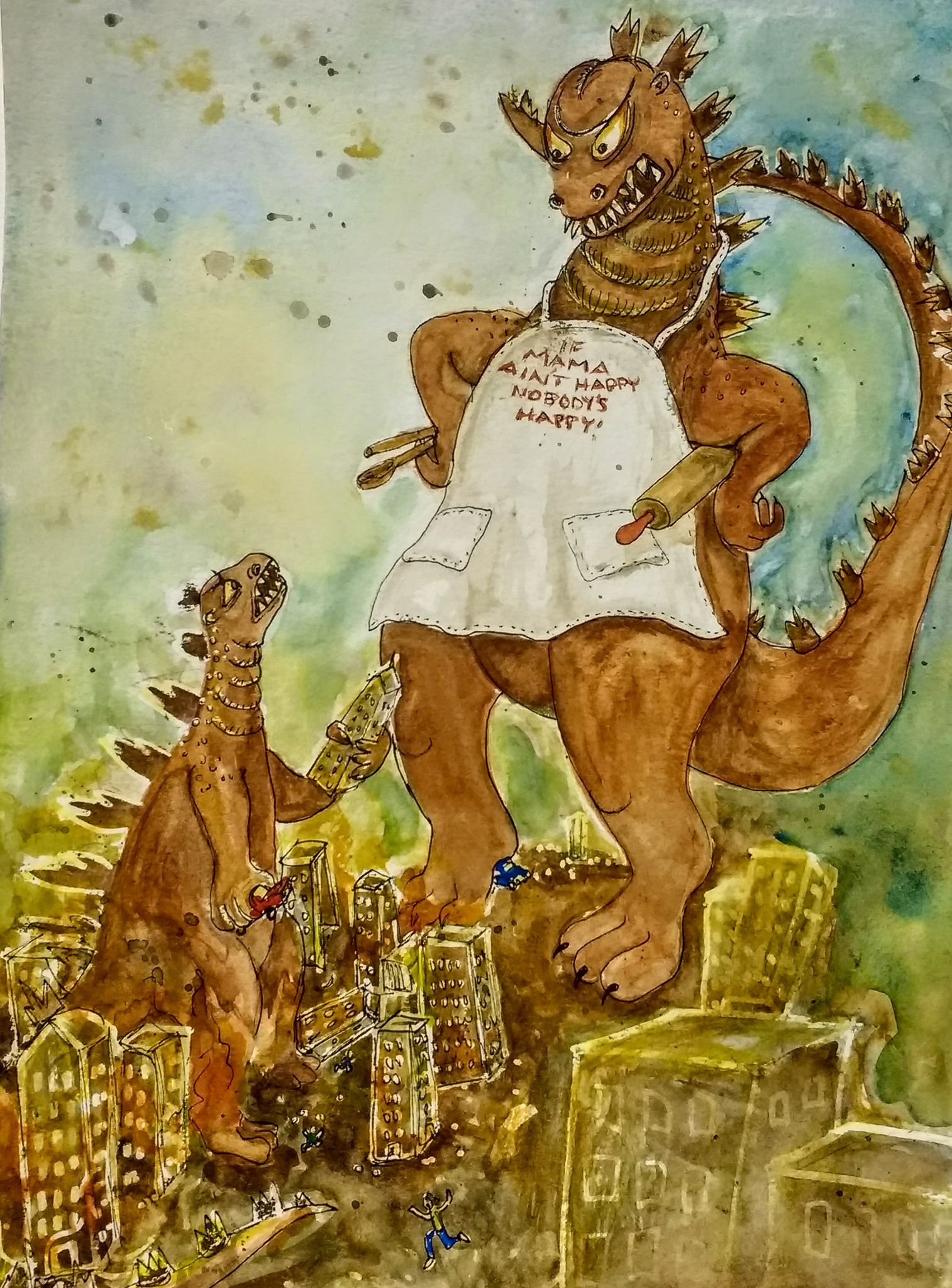
Okay, I think I'm done. @Braden-Hallett Does it work better now?
Marsha Ottum Owen
-
@Marsha-Kay-Ottum-Owen Seeing them side by side I think the version without the colour enhancement reads better
-
Hi Marsha, just wanted to say I’m a fan of your work and sense of humor you portray with it. Also, the stylistic feel of this is so great! The white outlines on the buildings - wow.
Perhaps you could crop that right side just a tad bit more so the edge of the page isn’t showing?
Thanks for sharing this.
-
@KathrynAdebayo Thank you. I will scan it with a real scanner and make sure it's cropped well
 . Good eye