Contest entry crits needed--time sensitive
-
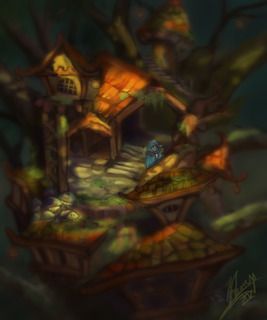
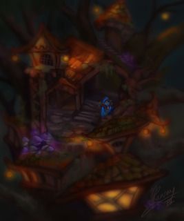
Hey guys, I submitted a character concept to the Relax Just Create contest and made it through to round 2. The prompt is that it is a landscape that relates to the character from round 1 (and has the character in it--the main focus is the landscape though).
I'm trying to decide between two versions. I think I prefer the day/sunlit one over the night/lamp lit one. Each round only lasts something like 4 days and I've got about 2 days until I need to submit this.
I really wasn't even going to bother with entering this contest because I do not work fast but I'm trying not to stress on this one and I think it is helping me generate stuff faster than I would normally.
My mantra through the process is to just keep everything really loose and try not to have too high expectations. That said, if there are areas that can be improved definitely let me know. I may not be able to get to them though due to time constraints--so don't think I'm just ignoring you.


Here was the character concept. We had to include (3) facial expressions.

-
I think I am going to reduce the blur effect on whichever one I choose.
-
The daylit one. Good luck in the contest!!
-
yeah I like your daylight one as well because right now you handle your daylight scene lighting better than the 2nd one. Good luck!
-
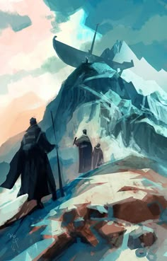
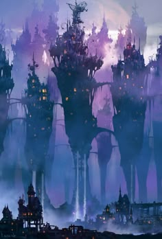
Love the colors on both, but definitely prefer the daylight scene! I would get rid of the blur altogether. It makes it look half finished to me. I love environment design, and here are a couple that i think are cool...no blur, but they are loose
 And your character is beautiful!! Love the expressions! Now you need to do him justice
Ian McQue...love his stuff!

Paul Lasaine...

-
I like the daylit one too and agree that the blur is a bit distracting, maybe add in some more texture to balance it out, also maybe find a way to put a bit more dramatic lighting on your main character I feel like he is getting a bit lost in all the details of the piece. It is a fun character and nice concept, keep at it!! Lovely examples, Lynn.
-
@Charlie-Eve-Ryan said:
I like the daylit one too and agree that the blur is a bit distracting, maybe add in some more texture to balance it out, also maybe find a way to put a bit more dramatic lighting on your main character I feel like he is getting a bit lost in all the details of the piece. It is a fun character and nice concept, keep at it!! Lovely examples, Lynn.
I THINK the idea for round 2 is to have the environment as the main character and the actual character just placed in it. I could be wrong on that though.
@Lynn-Larson Thanks for the refs--I love when people take the time to do that, it's really helpful!
-
@mattramsey I do too, and it is so much easier to get the idea across
 I love your stuff, you definitely deserve to move on! Keep up the gorgeous work!
 -
Relax, Just Create!
 @relaxjustcreate 15m15 minutes ago
How's it going creators? Remember, Round 2 deadline for all contestants who advanced ends 11.10.15 at midnight EST! #clashofthecreatorsRuns around room yelling The streesssss!
-
@mattramsey Hehe...Relax!! Take a deep breath. You got this

-
Day lit!
-
I too prefer the daylit version. Neat character.