Society of Visual Storytelling

    SVSLearn Forums

    • Register
    • Login
    • Search
    • Recent
    • Tags
    • Popular
    • Users
    • Groups
    • Search

    Snow Fall Watercolor Painting Critique

    Illustration
    12
    24
    10161
    Loading More Posts
    • Oldest to Newest
    • Newest to Oldest
    • Most Votes
    Reply
    • Reply as topic
    Log in to reply
    This topic has been deleted. Only users with topic management privileges can see it.
    • Rob Smith
      Rob Smith last edited by

      Thanks all for your suggestions. I think what I will do is repose the kids to make their actions clearer. I will do this on a new sheet and then scan it and add it digitally to the image.

      1 Reply Last reply Reply Quote 0
      • Charlie Eve Ryan
        Charlie Eve Ryan Pro SVS OG last edited by

        This is so pretty Rob, and the colors in your revised piece are really nicely handled. I agree that the tongue, though cute is not reading well and I think a side pose would be much stronger for that particular action.

        Happy Creating
        www.charlieeveryan.com

        1 Reply Last reply Reply Quote 1
        • Rob Smith
          Rob Smith last edited by Rob Smith

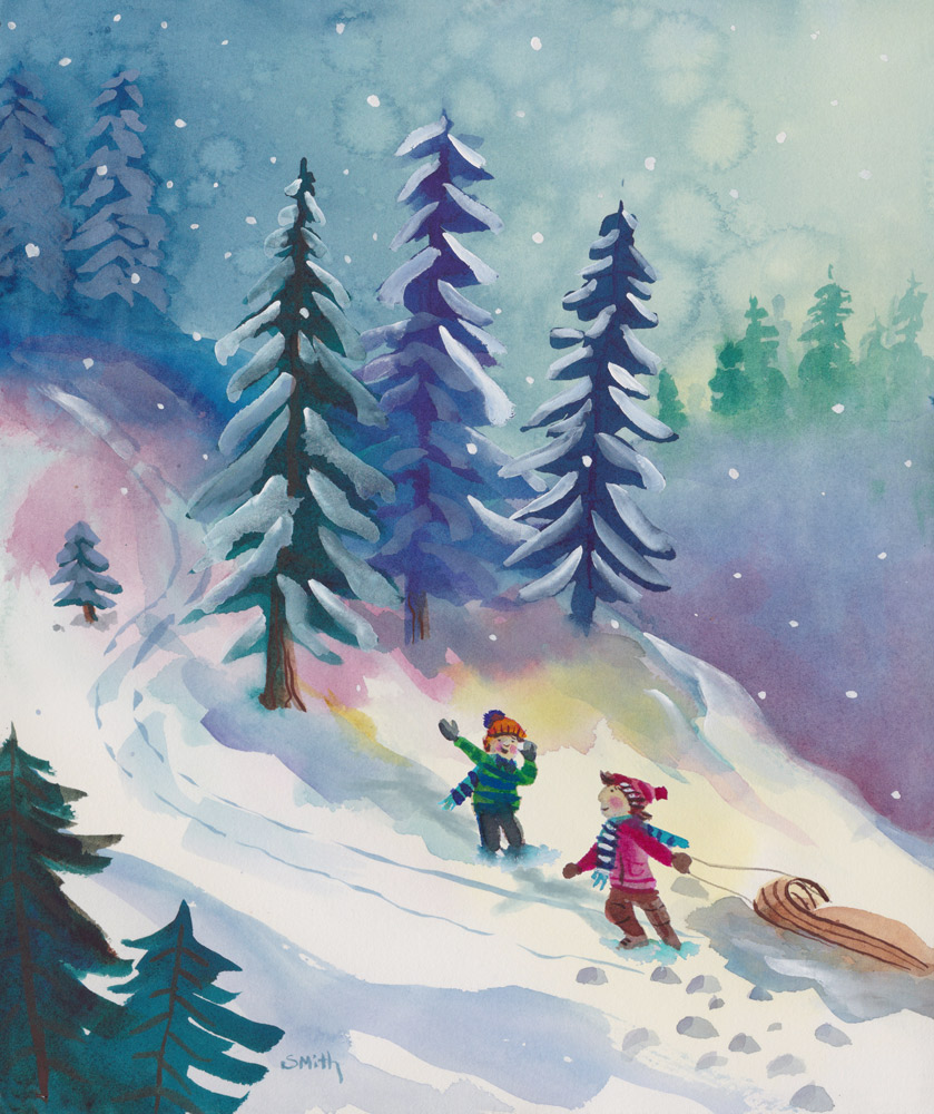
          Here is an updated painting. I repainting everything including the sledders.This time I painted the scene on 140 lb Hot Press Arches watercolor paper. I scanned the figures in separately and merged the images in Photoshop. Is this image reading better? Thanks again!

          Snow_fall_4.jpg

          1 Reply Last reply Reply Quote 3
          • Leontine
            Leontine last edited by

            Nice work Rob! winter is a great time for beautiful snow paintings...There's one small thing, the threes in the front don't have snow?

            Leontine
            "A picture is worth a thousand words."

            https://leontineillustrator.com
            https://www.instagram.com/leontine.illustrator/
            http://www.facebook.com/leontineillustration

            1 Reply Last reply Reply Quote 1
            • Lynn Larson
              Lynn Larson SVS OG last edited by

              Ooooh, this one is best by far! Such beautiful colors! Leontine is right about the snow though hehe

              https://instagram.com/lynnlarsonart/
              https://twitter.com/lynnlarsonart

              1 Reply Last reply Reply Quote 1
              • Charlie Eve Ryan
                Charlie Eve Ryan Pro SVS OG last edited by

                Love the postures here, gives a really nice sense of movement. The colors are wonderful, it's such a hard medium and you are working it well!

                Happy Creating
                www.charlieeveryan.com

                1 Reply Last reply Reply Quote 1
                • shinjifujioka
                  shinjifujioka SVS OG last edited by

                  For me, there's a wonderful feeling of childhood in this piece 🙂

                  shinjifujioka.com
                  https://www.facebook.com/shinjifujiokaart
                  IG: @shinjifujiokastudio

                  1 Reply Last reply Reply Quote 1
                  • Dulcie
                    Dulcie SVS OG last edited by

                    @Rob-Smith again great work…your skills are so good 🙂 The children are so much better, seeing their faces is much more engaging. I like the colour drift from pink into yellow from the trees, leads your eye down to the children. I also like on this one, the light white highlight on the snow trail in the top corner, small detail but I like it. The one thing that bugs me a bit, not meant to be criticism just a thought…but I did like the way you painted the trees on the second piece…the way you could see the trunk, a few branches, and the snow highlights so precisely painted. I wonder if maybe the middle blue tree on this last piece could use just a couple more snow highlights, a bit like the second piece…might also help to emphasise the light from the right hand side…but it is beautiful work…I think this last piece is the best overall especially in terms of the values and composition…. (zooming out it has good impact at small size)…. and the way it leads your eye across the page 🙂

                    www.dulciemascord.com
                    https://www.instagram.com/dulciemascord
                    https://twitter.com/dulciemascord
                    https://www.facebook.com/dulciemascord

                    1 Reply Last reply Reply Quote 1
                    • Rob Smith
                      Rob Smith last edited by

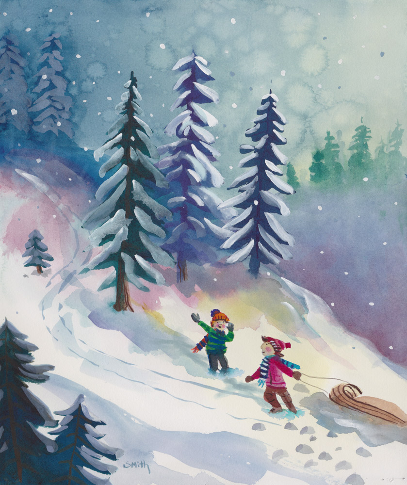
                      I took everything that you guys pointed out and made some corrections. Thank you!!! Here is the updated painting.

                      Snow_fall_5.jpg

                      1 Reply Last reply Reply Quote 4
                      • MOO
                        MOO SVS OG @Rob Smith last edited by

                        @Rob-Smith

                        It looks more lively and a bit lighter-or brighter. I thought your first one was great-loved the colors but this one does feel more light and active.

                        Marsha Ottum Owen

                        1 Reply Last reply Reply Quote 1
                        • Naroth Kean
                          Naroth Kean last edited by

                          now that is very lovely!

                          http://narothkean.com
                          https://twitter.com/narothkean
                          https://www.instagram.com/narothkean

                          1 Reply Last reply Reply Quote 1
                          • First post
                            Last post