WIP Critique?
-
@Charlie-Eve-Ryan Thank you-- specific feedback like this is so helpful! The left lower leg is something I totally would have missed, but I can clearly see what you mean about the plumpness of it.
And thank you for your suggestions about the facial features. When I drew that-- especially the one in the middle-- I kept thinking it looked a bit like me. And really I wasn't intending to have a 35 year old's head on a toddler's body!
-
OK, I've made some changes. Any thoughts before I move on to painting the details?
-
Here's another image from the project. It's one I did earlier, and the style is a bit different. Any input on how to bring them closer together style/color wise? Any other thoughts?
As always, thank you so much for the help!
MaileTwitter @MaileMcCarthy
www.mailemccarthyillustration.com -
One more:
-
Cute! On these spreads make sure to handle the hands with as much care as you did with the top front girl...her hands are well done so you want to carrry that thru....otherwise it makes the lack of attention too obvious. ..if this is still an early sketch stage feel free to disregard. These are fun, I look forward to seeing more.
Happy Creating
www.charlieeveryan.com -
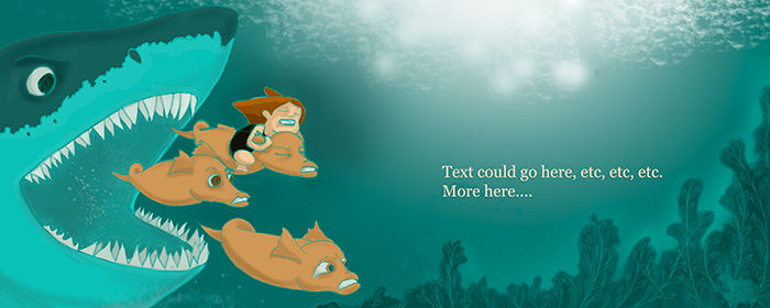
I don't have much to add except the suggestion of playing with the colour of your line work there. Especially in the underwater scenes, it seems they blend in too much with the background and (to me) detract from their potential. If you have them on a separate layer in a drawing program like photoshop, perhaps try playing around with the hue and contrast a little bit.
You don't have to, it's just a suggestion.
In other news, this project is looking very fun and interesting!
-
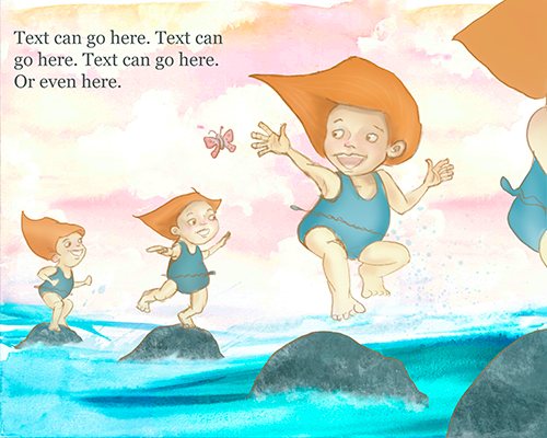
@Maile-McCarthy Hi Maile, I am loving all the illustrations from this project. Loving the colours and the characters.
I hope you don't mind, I have a few comments. I would remove the girl to the right, in my mind, the focal point of the piece is the girl reaching for the butterfly. If she is chasing it, would it not be in front of her? Because the rocks are so dark, they are the first thing you see. They could do with pushing back. They would be lighter because the water would be lapping against them. The girl reaching for the butterfly, I would stretch her leg out towards the last rock. It would add forward movement. Also, as the main character is coming towards the front of the image, she would be in more detail than the ones in the background. They could look better in lighter colours to push them back a little.
I hope I have read the image correctly and you don't mind my comments.
I love it and I am looking forward to seeing more of these.
Have a lovely day.
Pete
-
@Maile-McCarthy I love this. The composition is great. Love the emotion in the eyes of the characters. Great work.
-
@Charlie-Eve-Ryan Thank you! I really appreciate your eye for detail, especially regarding the sketch. I'm starting a to-do list now, and the hands will be at the top.
-
@Amanda-Jean Thank you! I do have the sketch on a separate layer, so this should be easy to play around with. I'll definitely give it a try.
-
@Peter-Jarvis I don't mind at all. I'm finding everyone's feedback incredibly helpful. I like what you're saying about the forward movement. I'll add in some atmospheric perspective, lightening up the girls/rocks as they go back, and see what that does.
I'll have to play around with the girl reaching for the butterfly. I struggled with this early on, and I guess it shows. I initially had her reaching forward but worried about leading the viewer off the page. Then, once she was reaching back, the right side of the page looked blank so I added another girl. Maybe if I just darken out the right side a bit... hm...