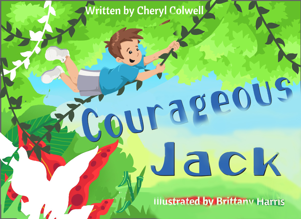
Hard time with a book cover. Help!
-
here's my thoughts...I love the change of title.
I thought the vine to the left needed to come downward. I cleared the way to read the illustration and title better...and I moved the plant out of the way..the plant move is white...and the vine move is in color...ugh...
-
@Cheryl-Eklund I also made that particular vine move! Yes! Much better!
-
I like the idea of removing the right-hand leaves @Cheryl-Eklund, it does help the text and it's like maybe now he is swinging into the unknown, it's more exciting

-
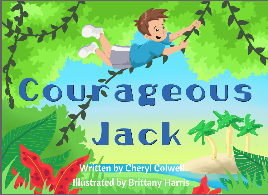
Here is an update on the cover. What do you folks like, don't like?

-
Really nice, redo... nice action, sense of place and more open. I like that you grouped the written by and illustrated by text, makes it cleaner and gives the main character more room. Maybe darken the color of the sand behind the author last name so we don't lose those last few letters.
-
What a valuable resource this community is!
@Charlie-Eve-Ryan Thank you so much for the input, it's working so much better now!
-
It's definitely getting there!
I have a couple of nitpicky things now that you're feeling better about composition.Text: General kerning on the title seems a little too wide, along with the leading.
The Written by line butts up to the horizon line/top of the water a little too closely, i'd recommend knocking it down a little bit or moving the water line up, and also decreasing the leading here.Color: Since you are working in rather flat colors, your value choices are even more important than ever. Using the darker green for the foliage around Jack will help him pop out from it more.
Flat vs shaded style: The island in the background, and some of the water and sky are soft shaded whereas everything else has a very hard cut, almost pixel style feel to it. These two styles really clash against each other, and could use some unification.
I hope you'll share the final with us!
-
So this is why one has contracts... yet I don't with this author since it's my first. She approved the beginning version, but wanted the changes. Then she approved the new version so I began the revision, but now she wants the first version back...
Sigh.@Bobby-Fasel thank you for your input! I'm not married to anything, and I'll take your suggestions!
-
Ohh man, sorry to hear that you're having those back and forth issues. They can definitely be frustrating...
Btw - I don't know if you know about this, but there's a "Freelancers Union" that isn't a real union, but has a lot of helpful resources. I signed up and wound up ignoring most of it, BUT - they have a quick contract creator that's pretty helpful as a base. You can then pull it into Word or another editor and tweak stuff.
https://www.freelancersunion.org/contract-creator/Hope the rest of the process goes well!!
-
@bharris I really like the last one! If she wants the first one back, then you should be ahead of the game. Tell her any more changes there will be a fee

-
Hi Brittany, I think it's much better with small flowers but they still "too red" maybe if you desaturate the background so we can see Jack, also his t-shirt is just one blue darker than the sky so he disappers...
I'm having the same issue with my book cover, my background is green and my girl t-shirt is yellow...

-
@Bobby-Fasel Thank you for that I will certainly check it out! Lessons learned, and luckily on a small scale!
@Lynn-Larson Yeah it's all working out okay. The original look is so simple that it's an easy visual for young readers to approach. Thanks for all your help!
@Camila-Picheco I've down graded the size of the red and made some minor adjustments. I'm now toying with the blue shirt as you suggested and it is looking better! Thank you very much!