How to do awesome illustrations EVERY time!
-
In preparing for Inktober I decided to use the 50 thumbnails approach except with text, writing down 50 things that came to mind for each prompt word. It was hard but I admit, after I wrote down the obvious things I had to do more mental work (and googling) and came up with many more ideas than I would have otherwise. Now I’ll have to do 50 thumbnails of whichever ideas I choose. Yikes! I may not be done with Inktober until March but it was a really good strategy and stretched my creative muscles.
-
@BichonBistro I know what you mean. Sometimes I do a thumbnail that I think is great, but when I get to roughs, it makes no sense anatomically or in terms of perspective. It's just too abstract! And then when I fix it, it loses its charm.
But in general, I really like pushing it on the thumbnails, like we did in Turbocharging Your Creativity. I've subscribed, and will listen ASAP because this is a great topic! Welcome to the world of YouTube creators, @Lee-White!
-
@BichonBistro right! What did i get myself into!!!
-
@peteolczyk Haha love the hash marks.
-
Not 50. But I pushed myself more than I normally would’ve. And when it’s on the line, I can totally see how this process will totally help!

-
So this is a big sticking point for me when creating any work that pushes past a sketch level design.. But I wonder how does this apply to comics? Comics are single still illustrations that convey moment to moment actions and I cant see myself even attempting to do 50 thumbnails for say a single panel.
Any thoughts on this? @Jake-Parker @Lee-White ?
I would think limiting them so you aren't spending weeks on a single panel
-
@Lee-White I'm wondering for a full 32 page children's book. Do you do 50 thumbnails for each page separately or as a whole?
So for example, do you mock up what text is going on which page, and then thumbnail each page individually 50 times? Or do you thumbnail out the full book, and then do that fifty times? So the text might also move to a different page as you re-thumbnail?
Check out my art and tutorials :)
Instagram: www.instagram.com/carliannecreates/
Youtube:
https://youtube.com/c/CarlianneCreatesShop: www.carliannecreates.com
-
In spite of my thinking that I didn’t have the creativity to come up with 50 thumbnails, I tried it today for a simple line and wash of butterflies on a bee balm plant. I thought I had a good image in my head but when I started doing thumbnails suddenly the possibilities piled up - number of plants, number of butterflies, angles, postures. It only took 1/2 hour to do 50 quick thumbnails but will definitely result in a better picture than the one I was going to do. I apologize to @Lee-White for doubting him!
-
@carlianne @jthomas I'll be addressing this in my next video. : )
SVS Faculty Instructor
www.leewhiteillustration.com -
@Lee-White Will You be posting on youtube regularly at some time (liek monthly or weekly) or more spontaneously?
-
@MichaelaH every two weeks
SVS Faculty Instructor
www.leewhiteillustration.com -
@Lee-White I wish it were every day!
-
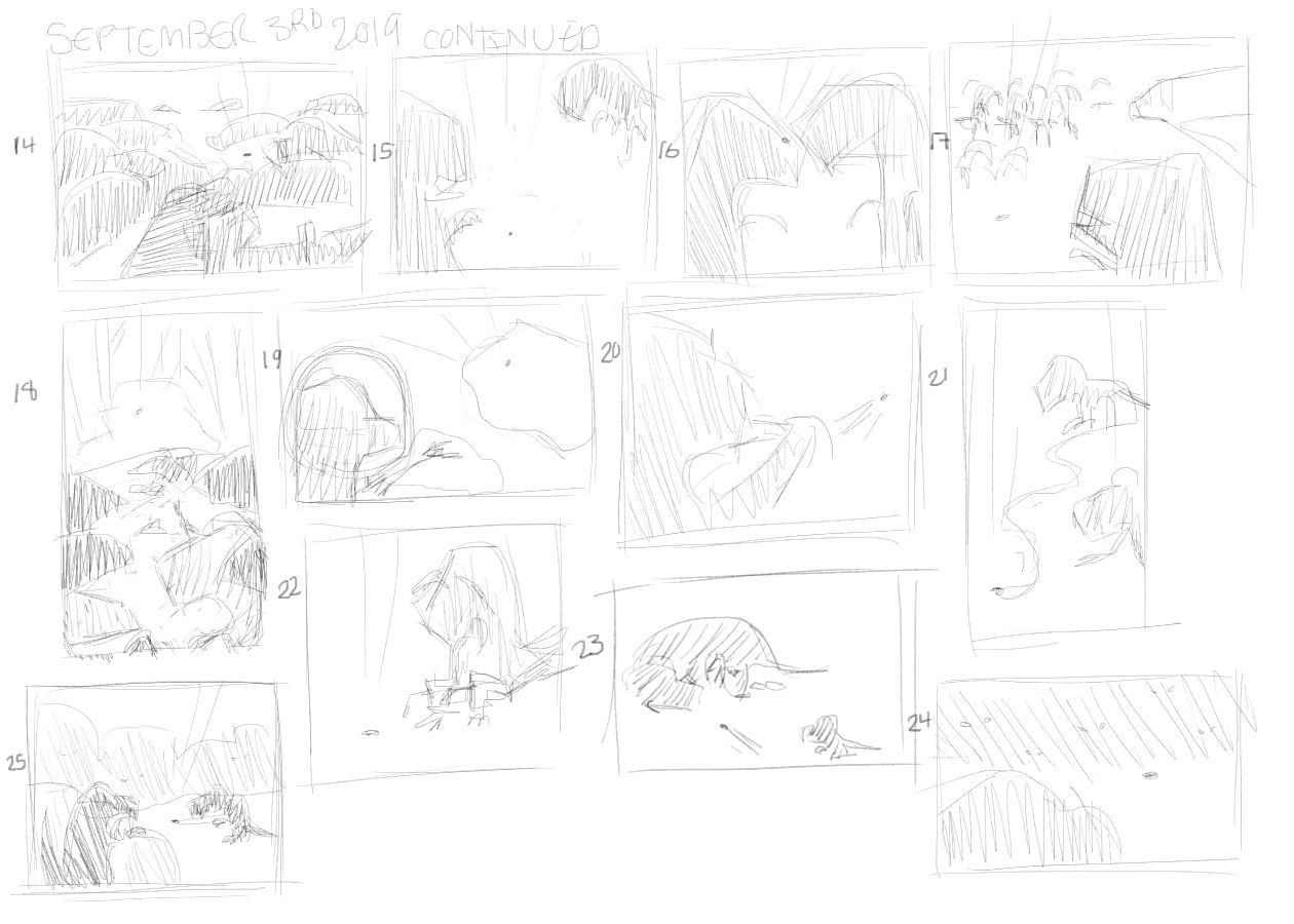
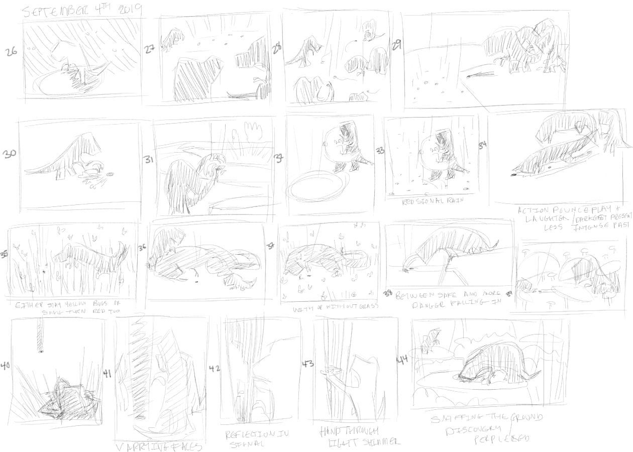
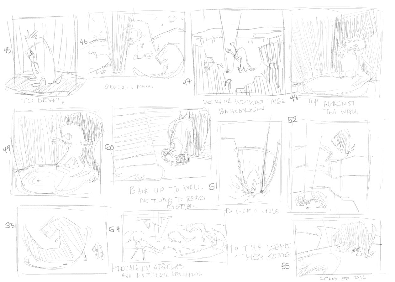
So I made past 50 by 5
") Here are mine and yes @Lee-White I would do well in knowing how to pick the best 1 or even down to 3. I have it down to 10. I'd appreciate what interests others then I can maybe narrow it down.
Here are mine and yes @Lee-White I would do well in knowing how to pick the best 1 or even down to 3. I have it down to 10. I'd appreciate what interests others then I can maybe narrow it down.Story is inspired by the red laser light I play with my cat and the red angel in Star Trek Discovery (Big
 Fan of).
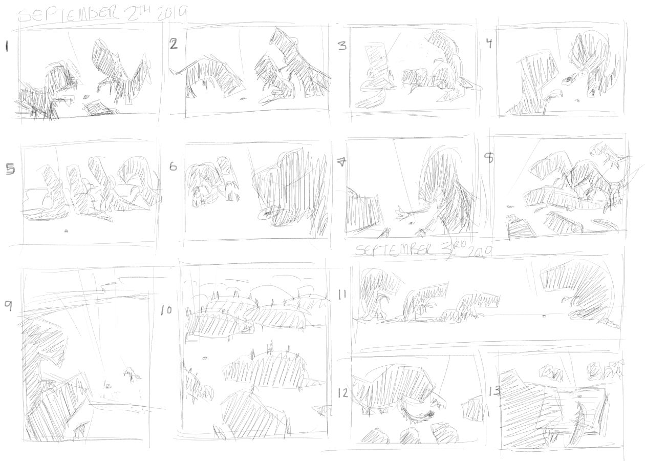
Thanks
I appogise if these show up large. They were thumbnails I promise. lolsInstagram: www.instagram.com/heatherboyd.illustration/
Website: https://heatherboydillustration.ca
Shop: https://www.inprnt.com/search/products?q=HeatherBoydIllustration
Ko-Fi: https://ko-fi.com/heatherboydillustrationBe blessed,
-
New video on Thumbnailing is up! Check it out here (hd version will be available shortly).
Subscribe if you haven't already! I need to catch Will and Jake!
SVS Faculty Instructor
www.leewhiteillustration.com -
@Lee-White I am so happy to see this video out. I was talking about the 50 thumbnails concept to a friend who is not an illustrator, but working with interaction design and writing. He was very inspired and incorprated some of the ideas in his writing process. I think the gist of the 50 thumbails concpet applies to much more than making a good illustration. Now I have a source that I can send to people who want to know more about it.
-
I have a question for you – wondering what is the thought process behind doing color after values please @Lee-White? Because I’m having problems with selecting a simple and effective palette from color references that evoke the feelings from Step 1 – the references seem to use lots of colors but harmonious – and in your video too you selected only a few colors from an image. Perhaps how to use references for color selection will be in a future video! Thank you so much for sharing your expertise – your videos are always just-in-time!
Qi
-
@Qi Thanks for the message. I sympathize with what you are saying about color selection. It's tricky. And it's one of the tougher areas of illustration to teach (in my opinion). The main advice I give to students is to pick a color to key the whole illustration off of. Such as "What is the MAIN color cast of this image?" Then all other colors are selected around that main color. Otherwise the palette starts to get out of control for me. But I typically prefer analogous color schemes and color that isn't too saturated. Someone else might prefer much brighter colors or whatever, so it's hard to have a solid rule there.
The other advice I give is find a bunch of images that you like and look at how they are using color. Then steal their color palette! Color is not copywriteable! You can use any of it from other artists. You can even sample their work if you are working digitally. Now isn't this a bad/unethical practice? Nope! The reason that it's ok is that your drawing and value are what really hold an image together. Even if you color pick from another artist, it won't look exactly like they did it because the values and drawing are so different.
SVS Faculty Instructor
www.leewhiteillustration.com -
@Lee-White - what a great question "what's the MAIN color cast of this image?" that you've suggested to help keep things under control. Have attached the original image & the updated image - not intended for you to critique, just to show there does seem to be an improvement on overall color harmony from my view after trying the methods you advised – thank you! Stress levels lower too! And after sampling & stealing some other artists’ colors (this is fun to do too) - realized that my image has fundamental issues in the drawing & value areas that pretty colors can’t hide/fix.
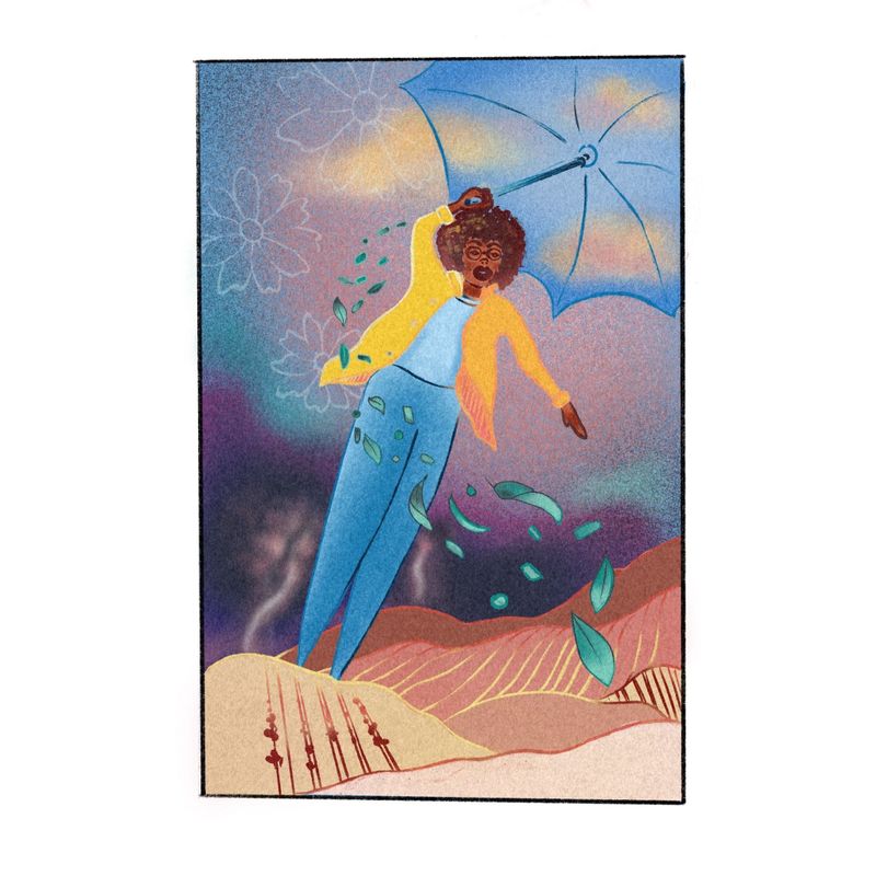
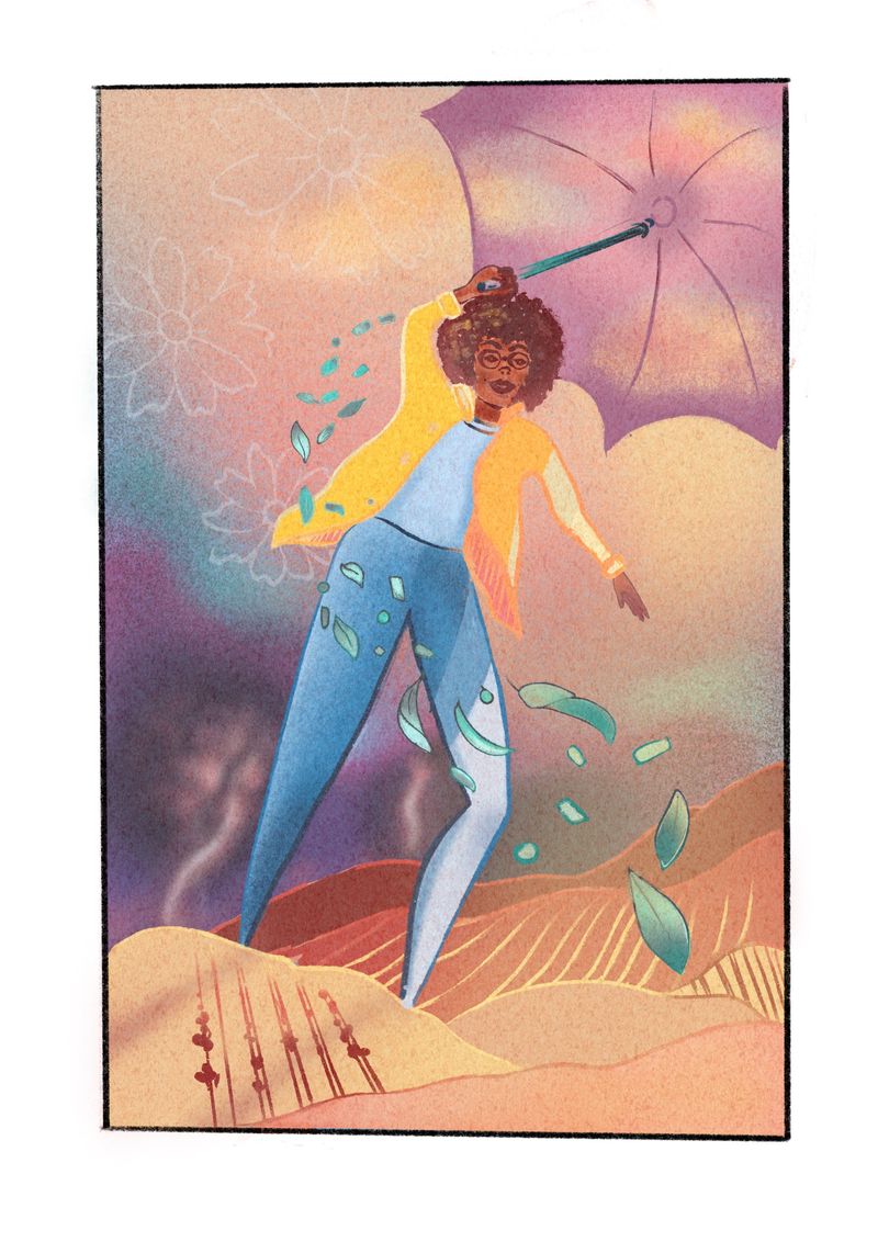
Yes! – have been enjoying seeing your low contrast paintings – thought them intriguing, like someone whispering instead of shouting
