Society of Visual Storytelling

    SVSLearn Forums

    • Register
    • Login
    • Search
    • Recent
    • Tags
    • Popular
    • Users
    • Groups
    • Search

    Poe Cover Late Crits Welcome Revised x3

    Illustration
    6
    16
    2931
    Loading More Posts
    • Oldest to Newest
    • Newest to Oldest
    • Most Votes
    Reply
    • Reply as topic
    Log in to reply
    This topic has been deleted. Only users with topic management privileges can see it.
    • Lydia M
      Lydia M last edited by

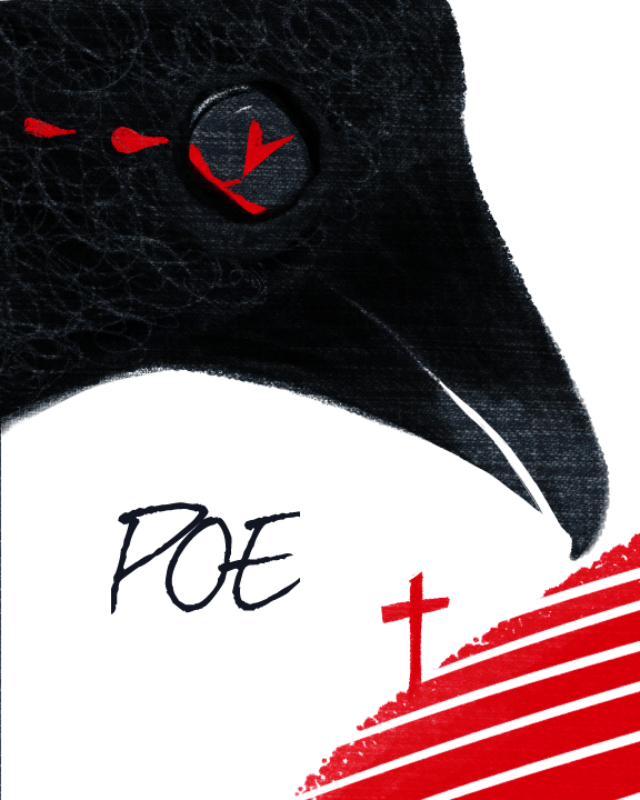
      I dig the heart pupil concept, the contrast and the texture! The raven looks a little dazed and lovestruck though with the heart in his eye and his head tilted skyward. I don't know Poe very well but my impression has always been he was a melancholy fellow. The raven came to him when he was in deep grief and didn't bring any hope, so maybe if you flipped it so he's coming in from the top and looking down? It would read more like oppressive and suffocating grief (which is exactly what you want in art, right?! Ha!)

      www.lydiamueller.com
      Twitter @lydesigns

      Charlie Eve Ryan 1 Reply Last reply Reply Quote 0
      • Charlie Eve Ryan
        Charlie Eve Ryan Pro SVS OG @seanwelty last edited by

        @seanwelty Thanks Sean, I'll add some variety in the feathers.

        Happy Creating
        www.charlieeveryan.com

        1 Reply Last reply Reply Quote 0
        • Charlie Eve Ryan
          Charlie Eve Ryan Pro SVS OG @Lydia M last edited by

          @gimmehummus Thanks for the feedback, I'll test that out and see if it feels more dramatic.

          Happy Creating
          www.charlieeveryan.com

          1 Reply Last reply Reply Quote 0
          • Charlie Eve Ryan
            Charlie Eve Ryan Pro SVS OG last edited by

            Here is a revised version...Poecover3flatsm.jpg

            Happy Creating
            www.charlieeveryan.com

            1 Reply Last reply Reply Quote 1
            • Charlie Eve Ryan
              Charlie Eve Ryan Pro SVS OG last edited by

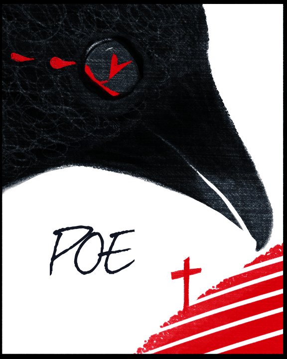
              Here is one with a quick border on it, since it is getting a bit lost against the white site page.

              Poecover3flatsme.jpg

              Happy Creating
              www.charlieeveryan.com

              1 Reply Last reply Reply Quote 0
              • Suzy Heitz
                Suzy Heitz last edited by

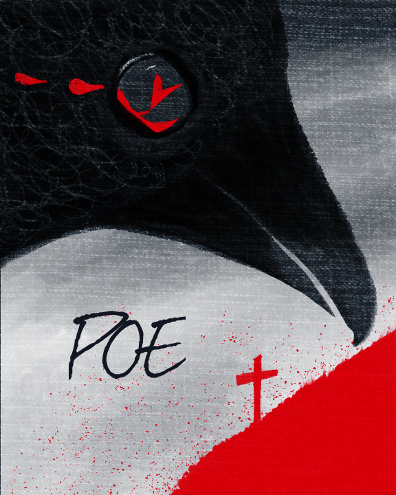
                I love your aesthetic. This piece is evolving nicely too. Did you consider putting the elements on a toned gray background instead of the stark white? Even the shade of red could be more ominous. Perhaps with some of your texture and shadow. Poe is so dark and this piece is somewhat bright. The other think that I noticed first was the direction of the tears. It's right in your first iteration, but now that the bird is facing down, the direction of flow would change also. Consider what makes sense and ignore the rest. 🙂

                1 Reply Last reply Reply Quote 0
                • Charlie Eve Ryan
                  Charlie Eve Ryan Pro SVS OG last edited by Charlie Eve Ryan

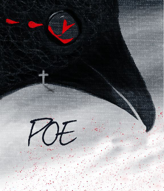
                  Thanks Suzy. Testing out a darker background and added some splatter.Poecover3flatrevisedsm2.jpg

                  Happy Creating
                  www.charlieeveryan.com

                  1 Reply Last reply Reply Quote 0
                  • Charlie Eve Ryan
                    Charlie Eve Ryan Pro SVS OG last edited by

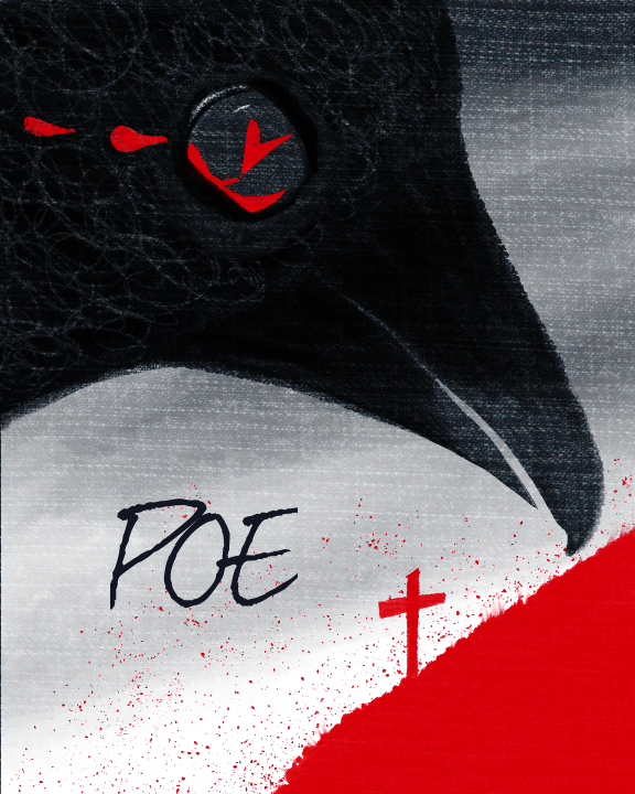
                    I pulled back a bit on the gray on the bottom to let some of the white through.

                    Poecover3flatrevisedsm3.jpg

                    Happy Creating
                    www.charlieeveryan.com

                    Thrace 1 Reply Last reply Reply Quote 1
                    • Thrace
                      Thrace @Charlie Eve Ryan last edited by

                      @Charlie-Eve-Ryan These are awesome! I think I like the second one with a little white coming through. Its too bad you didn't have a chance to enter!

                      Charlie Eve Ryan 1 Reply Last reply Reply Quote 1
                      • Lydia M
                        Lydia M last edited by

                        With his head angled down he looks more hopeless. Nice! I looked at the negative space in his neck and it made me think of a hill so what about this....?

                        idea.jpg

                        www.lydiamueller.com
                        Twitter @lydesigns

                        Charlie Eve Ryan 1 Reply Last reply Reply Quote 2
                        • Charlie Eve Ryan
                          Charlie Eve Ryan Pro SVS OG @Thrace last edited by

                          @Thrace-Shirley-Mears Thank you! I'll do next month for sure, I had a few things going on so I didn't enter this time. It was a fun one to work on though.

                          Happy Creating
                          www.charlieeveryan.com

                          1 Reply Last reply Reply Quote 0
                          • Charlie Eve Ryan
                            Charlie Eve Ryan Pro SVS OG @Lydia M last edited by

                            @gimmehummus Oh nice! Good eye, that is pretty sweet looking!

                            Happy Creating
                            www.charlieeveryan.com

                            1 Reply Last reply Reply Quote 0
                            • First post
                              Last post