Finding my style (slowvember WIP & beyond)
-
The look of my artwork and the materials I use jump all over the place. I tell myself I’m experimenting and ‘finding my style’ but I never seem to settle and, as Lee White said in his slowvember video, I think this is my crutch, my excuse for not producing beautiful, finely finished portfolio pieces - everything is just a quick experiment with a new technique or approach.
Slowvember has come at a perfect time and I will use it to settle on a style and stick to it and improve and refine. Not forever (that would be paralysing to choose one style forever!) but for the next, say, 6 months, and then I can revisit and repeat.
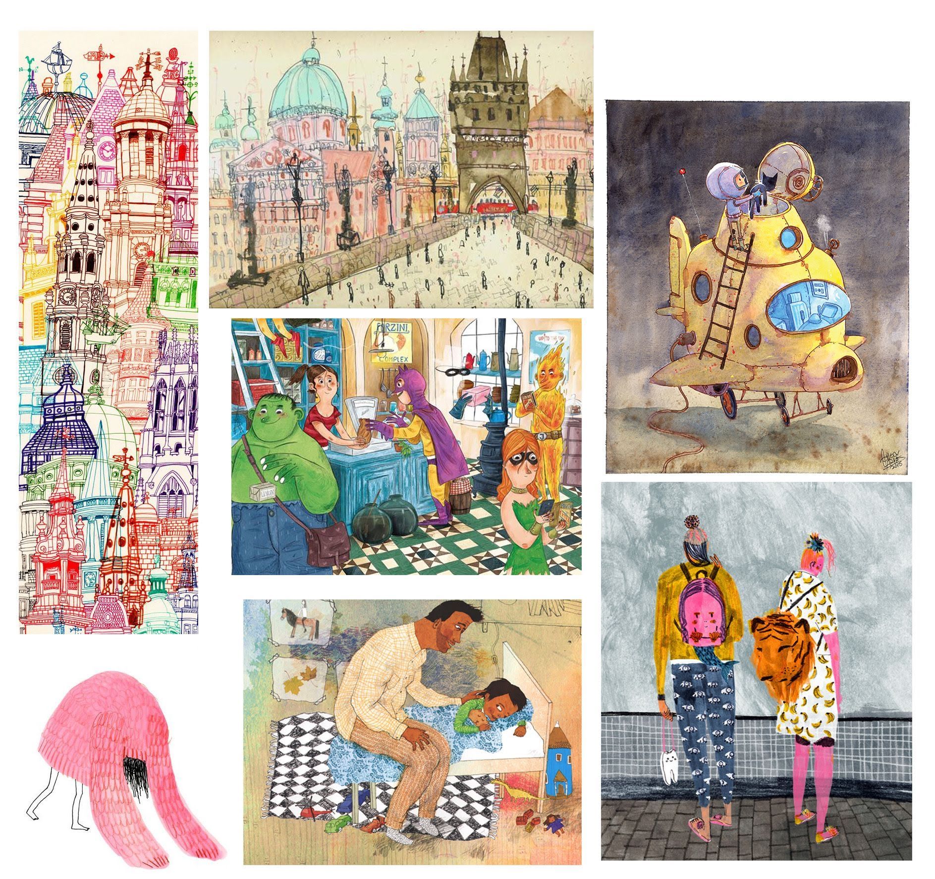
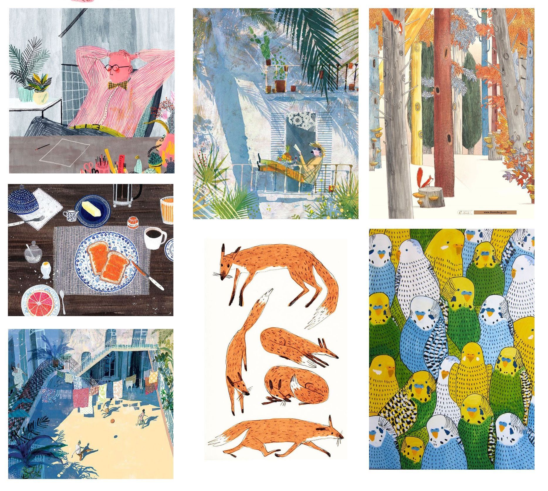
For years I’ve been collecting images on Pinterest that I wish I’d created. Mostly I would just browse them from time to time and they would brighten my day. Time to put them to use! Here’s my current dream portfolio:


You can see some of these artists’ other work here:
http://clarecaulfield.co.uk/
http://www.mounifeddag.com/
https://www.artistpartners.com/portfolios/david-roberts/
http://www.wolphins.com/illustrators/victoria-semykina
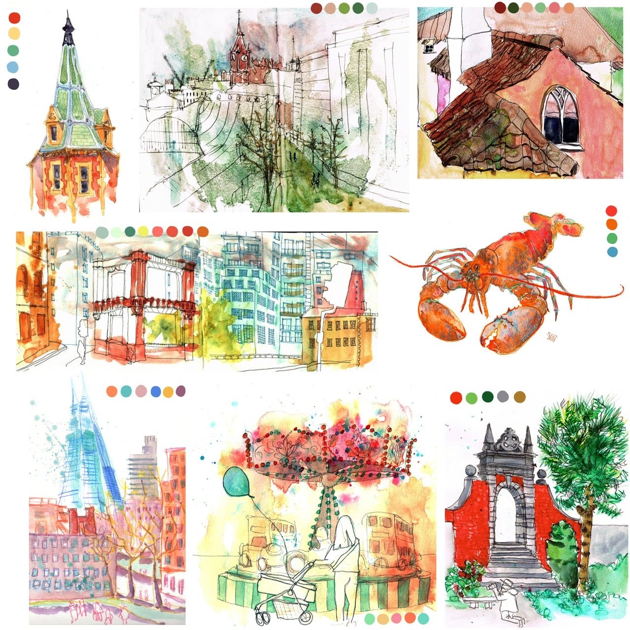
http://www.jennylucander.com/booksI went through my work and picked some pieces that I think are closest to these in style, and added some analysis of colour:

The first thing I note is that these are all quite old artworks - from a couple of years ago. They’re all traditional - watercolour and ink or pencil. They’re all drawn from life. So nothing digital and nothing since I’ve been trying to illustrate rather than just paint what I see has made it onto here. Interesting!
I think both sets of images have an organic feel. Mine seem to have more energy/movement in the paint but this is verging on scruffy at times and the more controlled pieces seem to work better. Both sets use lines in similar ways but again mine are generally messier. I seem to have a love of red/green through to orange/turquoise palettes while the dream images are overall dullish brown / grey / blue with pops of more vibrant colour - often pink or orange. I also think the dream images seem more solid / opaque. My watercolour tends towards transparent and ‘washy’.
(Thank you to @Zachary-Drenski for your help here)
So, an action plan for my next images:
- work traditionally
- use opaque colours in controlled blocks
- try grey / brown palette with pops of pink / orange
- more controlled line work
I’ll post here when I have something. Any thoughts on any of the above or additional things you see in any of the images would be very welcome.
-
I love your dream portfolio! Your pieces definitely feel related. I like your analysis so far.
A couple of things you may want to play with going forward, based solely on the dream portfolio-
Repeating patterns- You've seemed to pick a lot of images with repeating patterns- tiles, rug, clothing, dishware, feathers.
Figures- The figures all seem to be intentionally warped in shape and proportion,
-
@TessaW Yes, I love patterns and need to get more of them into my work!
Your observation on figures is really helpful - I think I'll have to try and tackle that separately at first as this is a weak area for me. I might hunt out some picture books with distorted figures to study more closely - like how do the distortions change / remain constant throughout a whole book / different poses, emotions.
Thank you very much for commenting - these are super valuable insights.
-
@neschof Without a lot of analyzing (because short in time): I like your works much more then those from your dream portfolio (most of it). Love the loose lines and those colors!
-
That's very kind of you to stop by and say

Thank you for the confidence boost!@Meta said in Finding my style (slowvember WIP & beyond):
@neschof Without a lot of analyzing (because short in time): I like your works much more then those from your dream portfolio (most of it). Love the loose lines and those colors!
-
@neschof I just got a book out of the library by Beatrice Alemagna. Her characters are distorted a bit. I love her work and maybe you could look to her for how to handle that style from page to page, scene to scene.
-
@neschof who does the boy spaceship cat work?
-
@Heather-Boyd Adilson Farias: https://adilsonfa.myportfolio.com/projects
-
@Zachary-Drenski Thanks, I'll look up her stuff.
-
@neschof I like the 2014 boy in the stars/clouds with his plane. Not sure it will be one of mine but nice nonetheless.
-
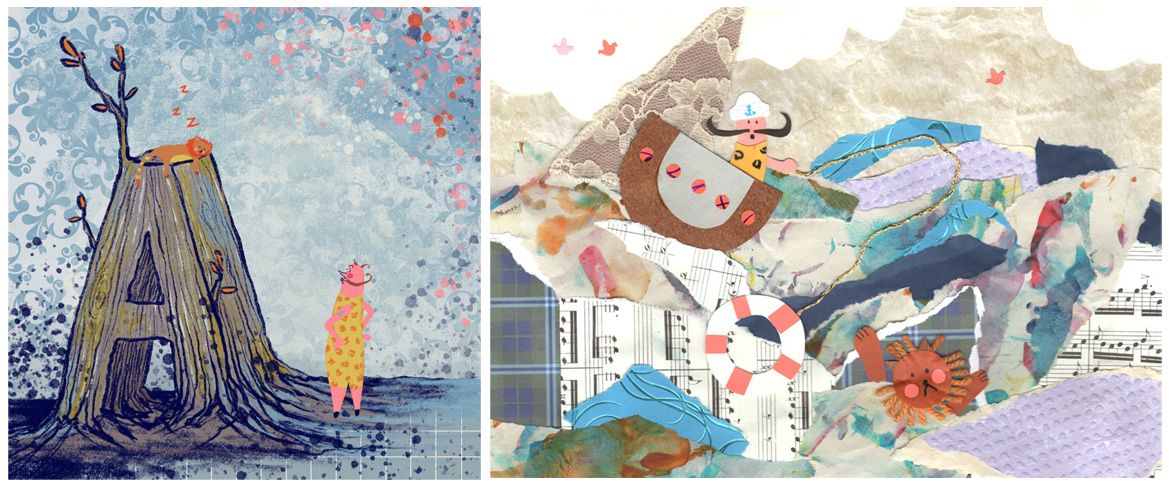
This weekend I had a task for a different class I'm doing to create a few small illustrations based around letters of the alphabet and each using a different material. I tried to keep in mind some of the pointers from here while I did this. Mostly the colour palette. A is digital and C is collage. For B I tried gouache for the first time to try and get the opaque brush strokes seen in the dream portfolio. It was a bit of a disaster! I'll have to try it again sometime :smiling_face_with_open_mouth_smiling_eyes:

-
@Heather-Boyd I also really like his viking - the lost and found edges of the beard and cape into the floor are lovely: https://adilsonfa.myportfolio.com/vinking
-
@neschof I especially liked that one as well. If there wasn't blood I may have added it to the portfolio. Did you scan in or photograph your collage work?
-
@Heather-Boyd I scanned the collage - it came out quite well but a bit more confusing than looking at the real thing. The lace triangle at the top left is supposed to be the sail of the boat but it doesn't really look like that here - it just blends into the water layers.
-
Slowvember came at a bad time as I've been super crazy busy this month!

I'm still plodding along in the background though. Here is a master copy from the dream portfolio I've been working on:
It's been really tough but very useful. There's so much texture here and I know it was created digitally but I don't think I have similar brushes - to get anywhere near I had to build of lots of layers of various brushes and textures (and it's still not quite got enough)
I might think about making some new brushes.
-
@neschof I am right there with you! I have the same problem of never creating portfolio pieces because I made the excuse of "honing my skill" and "developing a style", all the while playing around with tons of things that never look cohesive or finished. Now is the time to get it together...I will do it along with you!
P.S. Great dream portfolio! I see a few aspects in common with my own dream portfolio, and others that are very different...but what a great collection to be inspired by, and a wonderfully thoughtful analysis!
-
@nkdrawings thank you, I think I'm going to be crawling along with all this into the new year
