Dream Portfolio and growing as an artist.
-
@Chip-Valecek Really cool Chip. Nice collection. You can see how your work will move into the direction of these pieces. This past month I started thisproject and what I'm doing now is looking and at each piece and making mental notes on a laptop just before I go to sleep. Some how, where I want to move towards is starting to sink in, it's a long journey ahead of course. Good luck with this and your journey.
Website http://www.judyelizabethwilson.com/
Instagram https://www.instagram.com/judyelizabethart/
Sharing positivity through art.
-
@Judy-Elizabeth-Wilson long journey indeed. I am glad so many of us are on the same one right now. Feels good to be with other artists traveling the long dark path together
")
-
@Chip-Valecek I think this is great! you've hit all the main components - just small differences in tone and detail - and I bet you've already learnt so much from the process!
I really should try and do a master study... -
@NessIllustration I think this could be really valuable. The copy is warmer and more saturated, which is also the standout difference between the dream portfolio and the images in the OP, as you noted Chip. I heard recently a piece of advice about fixing work which stuck with me: instead of trying to fix everything at once, ask what the biggest problem is and tackle that first. Rather than a problem it's just a difference in this case, but you might get satisfaction tackling this first?
-
@Chip-Valecek You chose one with a mighty amount of small details, but don't consider it a fail. Fail is not trying at all, which sounds redundant. I like your version, it's softer but I see areas that if you pushed more to get his/her edges around the head/face, feet and hands and the white water. Take a break from it but return and try those darker edges on your work like they have in theirs. But it's up to you.
-
@NessIllustration I tend to try and find the colour, and then colour pick and learn how the real colour was chosen- I did that for my first fox one months back.
Instagram: www.instagram.com/heatherboyd.illustration/
Website: https://heatherboydillustration.ca
Shop: https://www.inprnt.com/search/products?q=HeatherBoydIllustration
Ko-Fi: https://ko-fi.com/heatherboydillustrationBe blessed,
-
@Heather-Boyd That seem a very valuable exercise!
-
I think it's a good first try on a copy. It's not easy at all! There are many things in the original piece that you don't see, namely the process! Before you start your next master copy, you could go and see if you find out how the artist uses to build up the image. Some artists post process videos. So you see if and how they use layers, if they change colors and so by manupulating curves after drawing. I saw artist who use a layer for local colors, another one for shading, yet another one for highlights ... You couldn't tell how to do this just by looking at the ready image.
Keep on going! -
@Chip-Valecek this is amazing for a first master copy. Your version kinda needs more texture but over all, the forms, the values, and the colors are amazing. Great job. You’re getting there.
-
@Meta I have a few process videos on how Matt Dixon goes about painting. His process is sorta hard for me to do. The process you speak of is the process Aaron Blaise uses. I learned how to do that from him and find that is the easiest way to paint but not always are the colors correct when I do that. I learned that lesson on one of my last paintings where all the shadows got muddy.
I am trying to stick with how Matt Dixon process is for my next master study. So far its working. I hope to finish it this week.
-
@Chip-Valecek Did you play around with hue and saturation of the shadow layer to see if it turns out less muddy?
-
@Chip-Valecek it’s really great to see your progress Chip. Did you go straight into painting or did you start with a sketch layer?
-
@Meta I usually mess around with the levels and saturation at the end of a painting. I think it was more of my color choices that went wrong with it.
@peteolczyk I did a sketch first, then values, and then color layer on top.
-
@Chip-Valecek this is coming along great. Matt Dixon's work is beautiful. I have followed him for a while as well. I am very interested to see your next piece. Keep it up.
-
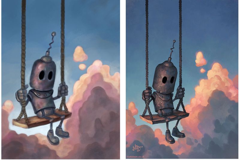
Next master copy. I am much happier with the result of this one. Still not a perfect copy, but I really learned a lot on process and how to come up with different color variations through out the painting. Mine is on the left (obviously)
-
@Chip-Valecek Really good copy!! I can see how much you're learning from this process, it's awesome to see
I think one of the main things yous might want to focus on next is how much blurrier yours looks compared to your originals. This is very tricky. When doing digital painting there's a lot of blending and airbrushing going around to get that really nice smooth shading. However there are still sharp edges to the shapes themselves, it would really boost your painting quality to figure out how to make those sharp edges -
@Chip-Valecek You did not fail I think you did really well.It needs a bit more detail or texture now.I notice he has a lot more blues and purples in the skin of the original
-
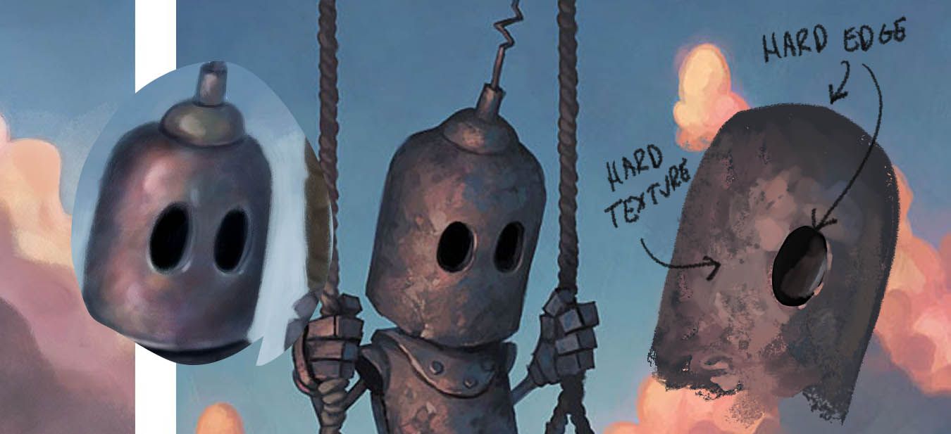
very nice Chip! Now I think it would benefit you to start looking closely at surface detail and hardness instead of doing another master copy. I would recommend taking very small areas of each of the paintings you have done so far and just doing sample paints of them. Just focus on getting the quality of paint they are getting.
In the second painting, the edges of the objects are hard. So you need to be making selections to paint within and that becomes very easy. Next, you need to get a set of brushes that works better for this type of painting. The general photoshop brushes wont work. And you need to turn off the opacity control and paint at 100 opacity using a textured oil brush. Here's a sample paint I did with your head on the left. Mine is on the right and I just messed around with it until it started having that look. I think it could be closer, but it's getting there. Very fun and good to do this type of work. Remember, doing the full painting is just one type of master copy. You can focus on any little thing that is giving you trouble. That is what this exercise is for. : )
One other thing I will note here- You need to make sure your description of your work and the mastercopy are just fact based, not judgement based. A judgment would be something like "the original is good, and mine is bad". Avoid this at all costs. The way to really use this exercise is to be specific. Example: "The original has harder texture and edges and mine has softer and less focused edges". Or the "The original has more color than mine does" etc. This is important because it is specific and tells you what you need to do to fix it. The goal here is to match it perfectly, and you can't do that without constant non-judgemental feedback.
Lastly I will add that this process of doing master copies should not be taken lightly. It may take months to really get it down. Or years. There is a school in Europe for sculpting. They don't let students do their own sculptures for the first THREE YEARS. The whole time they have to do perfect master copies and if they don't get those down, they don't advance in the program. My point here is to be kind to yourself and don't have the expectation that a few weeks of work is really anything in the grand scheme of things. Take your time and enjoy the process. Go slow and really look at each piece you are studying. Break it down into smaller chunks. And use specific feedback to guide you.
Hope that helps some. Keep it up! : )
SVS Faculty Instructor
www.leewhiteillustration.com -
@Chip-Valecek you have made great progress with the colors!
I can't give better advice than @Lee-White on your next steps. But I can see this process already paying off for you!
-
@Lee-White awesome feedback! I will definitely break them down. I think that might help from overwhelming me with trying to nail all parts of the painting.