Society of Visual Storytelling

    SVSLearn Forums

    • Register
    • Login
    • Search
    • Recent
    • Tags
    • Popular
    • Users
    • Groups
    • Search

    Slowvember progress.

    Slowvember
    17
    72
    6624
    Loading More Posts
    • Oldest to Newest
    • Newest to Oldest
    • Most Votes
    Reply
    • Reply as topic
    Log in to reply
    This topic has been deleted. Only users with topic management privileges can see it.
    • J
      jdubz @Chip Valecek last edited by jdubz

      @Braden-Hallett The 2nd piece definitely looks more "pro" just from a first glance standpoint. I've been struggling alot with pulling back my color saturation levels and looking at your two pieces that subtle difference is making a huge impact.

      Maybe try this - pull back the colors just a little bit more, and then bump up her red bandana significantly so it's one of the few saturated elements in the piece.

      Josh White
      https://www.instagram.com/joshwhiteillustration/

      1 Reply Last reply Reply Quote 1
      • braden H
        braden H @chrisaakins last edited by

        @chrisaakins I like the Cato stuff too. But I was still just picking random colours. It was, for the most part, luck. I don't want my process to be luck based 🙂

        I'm a fan of the texture, too. It's still a bit too oily for my taste, though. I want the end product to look more chalky.

        theprairiefox 1 Reply Last reply Reply Quote 0
        • braden H
          braden H @Coley last edited by

          @Coley said in Slowvember progress.:

          but I do think I like the colors better in that second piece!

          Well that's good! Thank you 🙂

          @Chip-Valecek said in Slowvember progress.:

          Of course I look forward to seeing your progress!

          Thanks, Chip 🙂 Yeah I'm gonna try a bunch of different stuff to get that texture right for my linework. It's been a while sinced I've just kinda fiddled around.

          @jdubz said in Slowvember progress.:

          The 2nd piece definitely looks more "pro" just from a first glance standpoint

          This is good! Using a spot of saturated red is something I'd usually do. As I figure out how to pick and choose colours based on a simple palette I'll start doing that kind of ting again. But right now I wanna limit things a bit 🙂

          1 Reply Last reply Reply Quote 0
          • theprairiefox
            theprairiefox @braden H last edited by

            @Braden-Hallett Have reviewed the tutorial by @Lee-White on using textures? I wonder if you could actually take a picture of a chalky surface you like and really just use that to provide the texture you want? Just a thought.

            -The Prairie Fox
            https://www.instagram.com/theprairiefox
            https://www.theprairiefox.com

            braden H 1 Reply Last reply Reply Quote 1
            • braden H
              braden H @theprairiefox last edited by

              @theprairiefox I will check that out 🙂 There's a certain luminescence? I guess? That I'm going for that I think is more rooted in my technique and brush choices. But I will absolutely check that out, thanks!

              theprairiefox 1 Reply Last reply Reply Quote 0
              • theprairiefox
                theprairiefox @braden H last edited by

                @Braden-Hallett here is the link to the one I was thinking about...

                https://www.youtube.com/watch?v=N7DedDc7aU0

                -The Prairie Fox
                https://www.instagram.com/theprairiefox
                https://www.theprairiefox.com

                braden H 1 Reply Last reply Reply Quote 1
                • braden H
                  braden H @theprairiefox last edited by

                  @theprairiefox said in Slowvember progress.:

                  https://www.youtube.com/watch?v=N7DedDc7aU0

                  Thanks! I've been meaning to take a look at that one 🙂 Will do so sooner rather than later now.

                  1 Reply Last reply Reply Quote 0
                  • LauraA
                    LauraA SVS OG last edited by

                    I like how you used the questionnaire and are getting really intentional about troubleshooting your style. I hope this brings a lot of fruit--or corn! I'm going to try to learn from your example.

                    Instagram: https://www.instagram.com/lauraintorino/
                    http://lauraaldersonart.com/

                    braden H 1 Reply Last reply Reply Quote 1
                    • braden H
                      braden H @LauraA last edited by

                      @LauraA it definitely opened my eyes to a few things 🙂

                      1 Reply Last reply Reply Quote 0
                      • braden H
                        braden H last edited by

                        I started my first master study. It's terrible 😃

                        I will not be sharing it, but I certainly see the need to do more of them. I learned a LOT.

                        Chip Valecek 1 Reply Last reply Reply Quote 2
                        • Chip Valecek
                          Chip Valecek SVS Team SVS OG @braden H last edited by

                          @Braden-Hallett can't be any worse then mine LOL but lee made a good point and focus and little sections rather then the whole thing.


                          https://www.instagram.com/chipvalecek/
                          https://www.facebook.com/cvalecek
                          http://www.cshellmedia.com/

                          braden H 1 Reply Last reply Reply Quote 1
                          • braden H
                            braden H @Chip Valecek last edited by

                            @Chip-Valecek said in Slowvember progress.:

                            can't be any worse then mine

                            oh, you have NO idea :smiling_face_with_open_mouth_closed_eyes: It's baaaaaaaaaaad. But it's fuel to try again 🙂

                            ArtofAleksey 1 Reply Last reply Reply Quote 1
                            • ArtofAleksey
                              ArtofAleksey @braden H last edited by

                              @Braden-Hallett i wish i was as organized aa you

                              instagram and twitter: @artofaleksey
                              alekseyillustration.com

                              1 Reply Last reply Reply Quote 1
                              • braden H
                                braden H last edited by

                                SO! I've been spending my daily time just kinda exploring concepts from a ranch with reverse sized animals. Big things are small (or gone) and small things are big.

                                This has given me kind of a pool of concepts which I think are fun. Biggest reaction was to the hawk rider. So that's the concept I'm gonna rethumbnail and go slowly from scratch.

                                alt text

                                I've also fiddled with brushes and stuff on one picture to kinda compare. I haven't included the ones that were really rough. I'm still gonna print it out and try literal watercolour for giggles, too.

                                e5cfb7bf-e205-4b63-87ef-72427f68859e-image.png

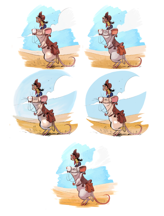
                                The BIG thing that doing master studies and playing with recolouring and going to an illustrator's meeting did was prompt me to literally mix colours instead of picking and choosing. For the local colour and value absolutely. This means that it's much more likely (so far always) harmonious, and I never get to go all the way black (it's really hard to).

                                So this panel is now always open when I'm colouring:
                                ac5238f7-09e9-4c10-9542-669ac5e6fcde-image.png

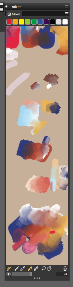
                                I'm sure I'll get a less messy palette at some point 🙂

                                I'm optimistic moving forward! The worst thing this exercise will do is force me to redo my whole portfolio 😃

                                1 Reply Last reply Reply Quote 6
                                • SFischer
                                  SFischer last edited by

                                  Hey @Braden-Hallett I just want to say your artwork grind is really inspiring. I've been learning a lot from just looking at your art under a magnifying glass lol

                                  braden H 1 Reply Last reply Reply Quote 1
                                  • braden H
                                    braden H @SFischer last edited by

                                    @SFischer lol Thank you 😃 'Grind' is definitely the right word for it 🙂

                                    1 Reply Last reply Reply Quote 1
                                    • braden H
                                      braden H last edited by

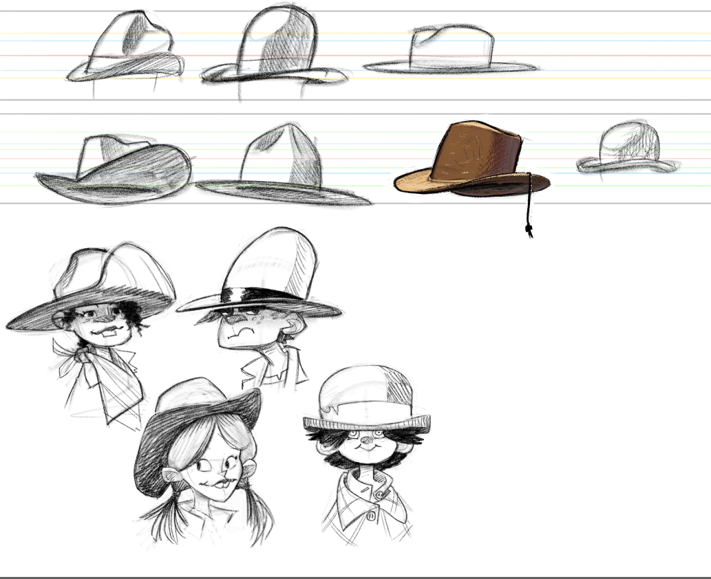
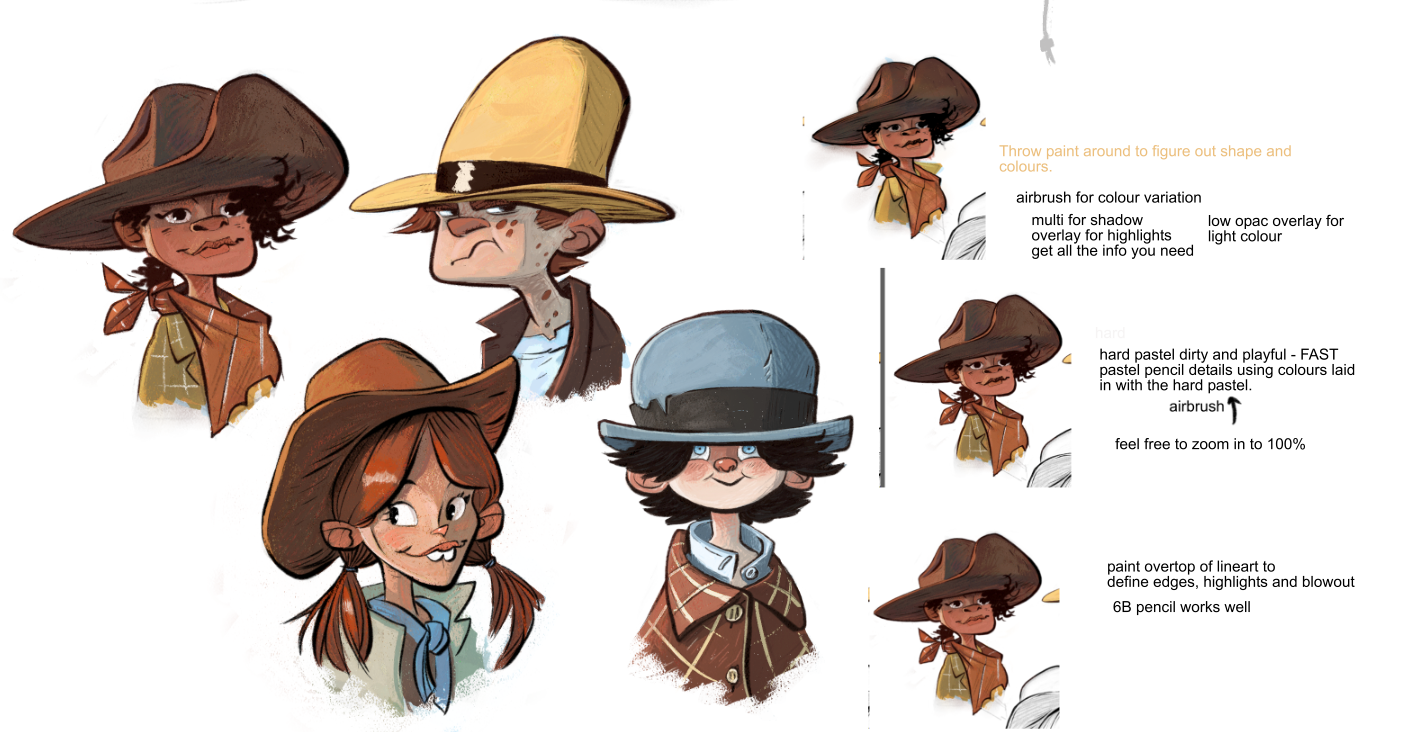
                                      Exploring and playin' around with characters as well as, of course, hats.

                                      86dd4e7b-992d-44bf-a285-2505a8e0098f-image.png

                                      1 Reply Last reply Reply Quote 4
                                      • braden H
                                        braden H last edited by

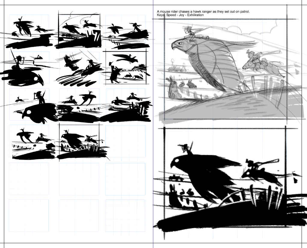
                                        Okeedokee! So I essentially had the concept and an image already, but i went back and re-thumbnailed since the first concept was very much off the cuff.

                                        I tried some different points of view (from the ground, from above, from the mouse, from the hawk, etc). I settled on one close to what I had before (since I really liked it) but I get a much better sense of the keywords (and there are now massive bunnies and it's obviously a ranch).

                                        Super rough sketch is done, so from here I'm gonna do some value studies, and then some colour studies.

                                        de272bec-cb04-4cae-985d-1cbe322d5749-image.png

                                        1 Reply Last reply Reply Quote 5
                                        • braden H
                                          braden H last edited by

                                          Whenever I try to change tools and processes, I often change things, like the change, move on, and then forget how I got there.

                                          So I spent some time experimenting, labelled all my layers with their type/purpose, and made some notes along the way.

                                          The two left faces are using the new(ish) process. It involves a lot more throwing around of paint with an airbrush.

                                          The BIGGEST thing that has changed and that I am INCREDIBLY happy with is getting my colours from mixing a fairly limited palette. Hooray for colour harmony 😃

                                          052672b2-a15e-4132-b134-3777997fcfcd-image.png

                                          1 Reply Last reply Reply Quote 5
                                          • KaraDaniel
                                            KaraDaniel last edited by

                                            Just wanted to say your digital art making skills are on point! I wouldn't even know where to begin lol. I love the idea of the large animals with characters (could see that as a whole series of stories) I was especially drawn to the guy on the owl (looks like a cool villain) and the kids with the bat.

                                            instagram.com/sha_kara
                                            karadaniel.net

                                            braden H 1 Reply Last reply Reply Quote 1
                                            • First post
                                              Last post