Society of Visual Storytelling

    SVSLearn Forums

    • Register
    • Login
    • Search
    • Recent
    • Tags
    • Popular
    • Users
    • Groups
    • Search

    Slowvember progress.

    Slowvember
    17
    72
    6638
    Loading More Posts
    • Oldest to Newest
    • Newest to Oldest
    • Most Votes
    Reply
    • Reply as topic
    Log in to reply
    This topic has been deleted. Only users with topic management privileges can see it.
    • ArtofJoseGalue
      ArtofJoseGalue last edited by

      Yes, your linework is great! and I was under the impression that your color palettes were always careful picked.
      I've been wondering a lot about SCBWI, I visit the site regularly and it's definitely a shorter drive for me, would you recommend it to a friend?

      Jose A. Galue
      www.instagram.com/artofjosegalue/

      braden H 1 Reply Last reply Reply Quote 1
      • braden H
        braden H @ArtofJoseGalue last edited by

        @josegalue25 Thanks! As for the SCBWI are you talking about locak illustrator groups, or the organization itself?

        ArtofJoseGalue 1 Reply Last reply Reply Quote 0
        • braden H
          braden H last edited by

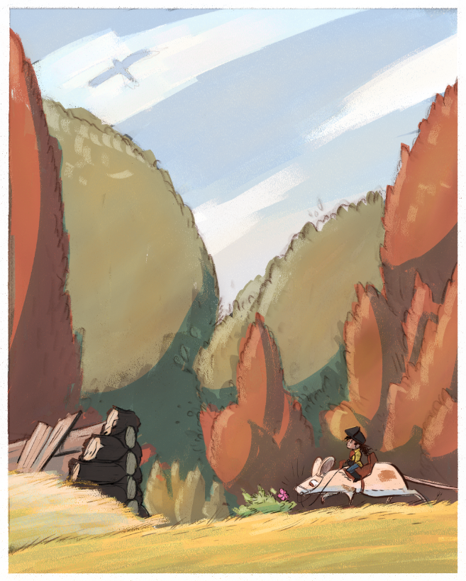
          Tryin' to integrate the process, texture and colour palette to include some environment elements. This is not finished (might get it done today)

          I'm cheating a little with multiply and overlay layers for blocking in the shadows and some hightlights, but for the most part the colours were all mixed.

          0f64842e-c07f-47b7-b8cc-89fe58db0964-image.png

          chrisaakins 1 Reply Last reply Reply Quote 2
          • chrisaakins
            chrisaakins @braden H last edited by

            @Braden-Hallett I really like the color pallet you are getting. One little thing, the pink flower stands out as an anomaly (ooh big word!) amidst all your nice fall tones. Was it part of your original pallet? One trick I learned to flatten a color that stands out too much is to glaze over it with a very light wash of its complementary color.

            And is that how you spell pallet? Palet? Pallette? Ahhh Grammarly just corrected me. Palette. I have learned. 🙂

            Chris Akins
            www.chrisakinsart.com
            www.instagram.com/chrisakinsart/

            braden H 1 Reply Last reply Reply Quote 0
            • ArtofJoseGalue
              ArtofJoseGalue @braden H last edited by

              @Braden-Hallett The organization itself and the quality of the meet ups

              Jose A. Galue
              www.instagram.com/artofjosegalue/

              1 Reply Last reply Reply Quote 0
              • TessaW
                TessaW last edited by

                Whenever I need to gain some clarity and organization- I know I can always count on your posts. It's been fun seeing your color exploration. ðŸĪ“

                Website: www.tessawrathall.com

                Instagram: www.instagram.com/tessawrathall_art/

                braden H 1 Reply Last reply Reply Quote 1
                • braden H
                  braden H last edited by

                  alt text

                  xin li MichaelaH 2 Replies Last reply Reply Quote 3
                  • braden H
                    braden H @chrisaakins last edited by

                    @chrisaakins thanks 😃 !

                    I'm trying really REALLY small spots of colour that aren't in my palette. I wanted the wild rose to be wild rose coloured 🙂 It was worth a try, right?

                    @josegalue25 said in Slowvember progress.:

                    @Braden-Hallett The organization itself and the quality of the meet ups

                    The organization itself seems pretty solid. I've only had dealing with my regional chapter. It probably varies from chapter to chapter. But in general, they've been nothing but supportive 🙂

                    1 Reply Last reply Reply Quote 1
                    • braden H
                      braden H @TessaW last edited by

                      @TessaW said in Slowvember progress.:

                      Whenever I need to gain some clarity and organization- I know I can always count on your posts. It's been fun seeing your color exploration. ðŸĪ“

                      :smiling_face_with_open_mouth_smiling_eyes: thank you. I'm amazed it seems organized or clear at all, lol

                      TessaW 1 Reply Last reply Reply Quote 0
                      • TessaW
                        TessaW @braden H last edited by

                        @Braden-Hallett Lol, well what you present here seems very organized and delineated. I guess behind the scenes might be a different story? 🙃 Either way, your presentation is therapeutic for my scattered brain. ðŸĪŠ

                        Website: www.tessawrathall.com

                        Instagram: www.instagram.com/tessawrathall_art/

                        1 Reply Last reply Reply Quote 2
                        • braden H
                          braden H last edited by

                          Simple 5 value breakdown and first colour test. I really, REALLY like it.

                          e8c7d38c-f05e-41fa-a371-549b33ee504a-image.png

                          xin li 1 Reply Last reply Reply Quote 1
                          • xin li
                            xin li @braden H last edited by

                            @Braden-Hallett I love this color. beautiful early autumn feel.

                            Web: www.lixin.no
                            IG: www.instagram.com/lixin.illustration/

                            1 Reply Last reply Reply Quote 1
                            • xin li
                              xin li @braden H last edited by

                              @Braden-Hallett I looked at your color study closely on this one. Did you paint with color straight on top of the sketched line work? (I mean this does not look at a color layer, or multiply layer on top of a value sketch).

                              I struggled to get a way to do color study I liked. Layer properties such as (multiply or color) easily makes the color look muddy. My current method is to use hue/saturation adjustment to give my value sketch a tone, and I paint on top of it with a normal layer. I am curious on what is your process.

                              Web: www.lixin.no
                              IG: www.instagram.com/lixin.illustration/

                              braden H 2 Replies Last reply Reply Quote 1
                              • MichaelaH
                                MichaelaH @braden H last edited by

                                @Braden-Hallett Wow I love this one so much, great illustration for autumn season.

                                https://www.instagram.com/michaelaheimlich/
                                https://www.heimlich-illustration.de/

                                braden H 1 Reply Last reply Reply Quote 1
                                • braden H
                                  braden H @xin li last edited by

                                  @xin-li I have a really hard time doing colour studies consistently that I like, too. It's infuriating 🙂

                                  What you see here is a sketch layer set to multiply and a value layer underneath. Overtop of that is a colorize layer (I'm using painter, but I THINK that in photoshop it's a color layer.) A colorize layer only alters hue and saturation, but doesn't change the value.

                                  xin li 1 Reply Last reply Reply Quote 0
                                  • braden H
                                    braden H @MichaelaH last edited by

                                    @MichaelaH I friggin' love autumn 🙂

                                    1 Reply Last reply Reply Quote 2
                                    • braden H
                                      braden H @xin li last edited by

                                      @xin-li Sometimes I just paint overtop with whatever colour i want, too 🙂 This one though I like as is.

                                      1 Reply Last reply Reply Quote 0
                                      • xin li
                                        xin li @braden H last edited by

                                        @Braden-Hallett thanks for the explaintion. Hmm. Your colorize layer does not look muddy or overly saturated. I do that as well, I often having a hard time with colorizing, because it feels a bit random. I eventually got something I satisfied, but it feels like a guessing game for me. I think I will just do more of paint overtop with whatever color :-).
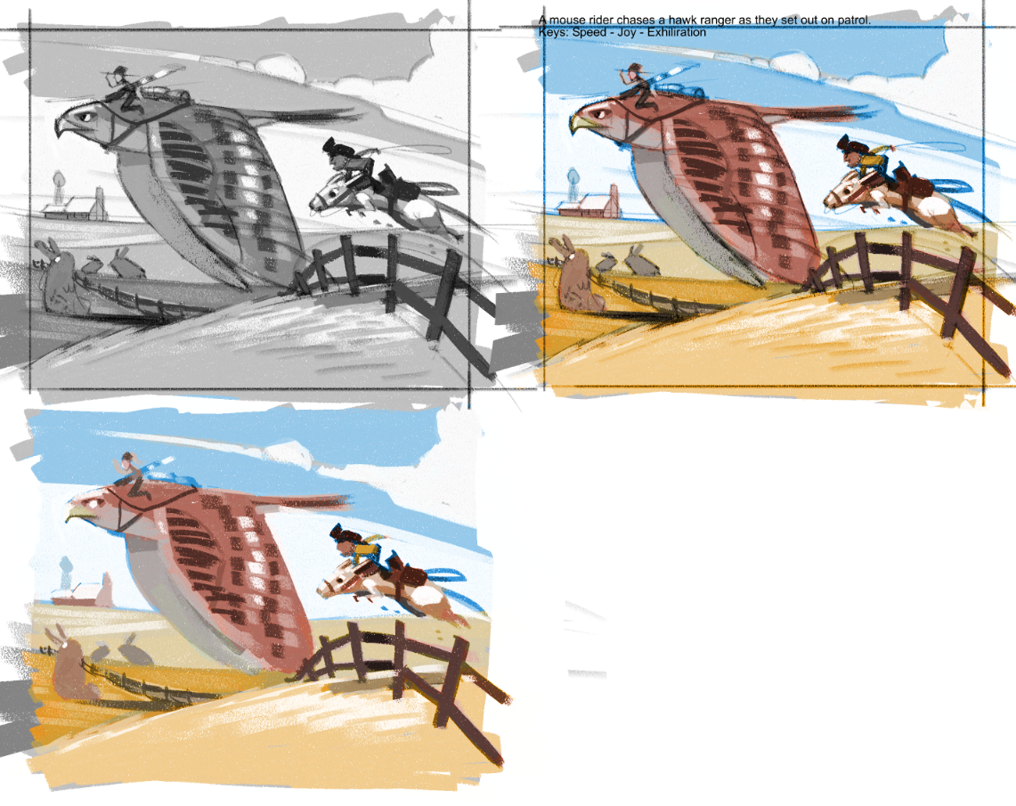
                                        Web: www.lixin.no
                                        IG: www.instagram.com/lixin.illustration/

                                        1 Reply Last reply Reply Quote 1
                                        • braden H
                                          braden H last edited by

                                          Sketch!

                                          I think I redrew that friggin' mouse rider at least 12 times.

                                          0e4facfd-9d56-4f0a-bcb9-20fe0df659fb-image.png

                                          1 Reply Last reply Reply Quote 2
                                          • braden H
                                            braden H last edited by

                                            Hyah!

                                            debdbcb5-1870-46a6-a7cf-174b83bb9ca9-image.png

                                            1 Reply Last reply Reply Quote 1
                                            • First post
                                              Last post