Discovering our style - Who's in?
-
@neschof Thank you for your reply! I think the things I can dissect are:
Energetic linework
Pencil and brush textures
A focus on character (in particular children and their expressions and interactions)
In general softer colours, maybe with one brighter accent colourI think for my work personally, I love drawing characters but I need to focus more on their environments and improve on my backgrounds! I also want to work on my colour palettes. I tend to work digitally (with the line art done traditionally and scanned in) but a lot of the work I like has a traditional feel so I want to work on making my digital colouring feel more traditional.
Instagram and Twitter: @eriberart
Website: www.erinmcclean.com -
@neschof , I don’t know if it’s of any help, but I was thinking later that the pink color is similar to Magenta in CMYK.
Yes, I think most of us are in the “illustrating people is a weak point” boat! People are hard to get right! -
@neschof & @LauraA , maybe “blended” & “subtle”?
-
@eriberart , Have you seen Lee White’s YouTube video on texture? It may be helpful to you in achieving a traditional look to your digital painting.
-
Yes, I think I had in mind the effect you see in a lot of Rembrandt paintings where there is no clear border / edge between people/objects and backgrounds. They just flow into one another, mostly through shadows, but in @LauraA 's portfolio I think also through texture and hatching. Though maybe it's just an artefact of the small images.
@Miriam said in Discovering our style - Who's in?:
@neschof & @LauraA , maybe “blended” & “subtle”?
-
This post is deleted! -
Mine is still in progress, but here's a sampling I have so far. Some things I've noticed: inky linework, "blotchy" watercolor (by which I suppose I mean that wet-on-wet effect), limited color palettes, and quirky/whimsical character design. I'd love any other observations (and am open to suggestions of other illustrators or pieces).
Artists featured here: Gris Grimly, Quentin Blake, Aurelie Blard-Quintard, Manka Kasha, Lee White, Lucia Stewart
-
I'm going to jump in on this! @eriberart I liked looking at your board because we pulled a few similar images/artists. Similarities that I am identifying with my board's images are:
-
Light, earthy, warm color schemes and lots of warm neutrals
-
Use of color is relatively flat but still has a little dimension implied
-
expressive use of line with a lot of energy
-
the drawing shows through (not painted over)
-
texture and detail are implied with mark-making but not realistically rendered
-
Characters all have strong shapes and expressions
I'd be interested to see what other people think. Right off the bat, looking at my work and looking at my dream board I see that I need to lighten and warm up my colors and push my line work to be more expressive. I think I should be a little less tight with my executions, focusing less on trying to model light and shadow and more on playing with shape, expression and texture.
-
-
@Miriam I don't think I have, I will have to check it out!
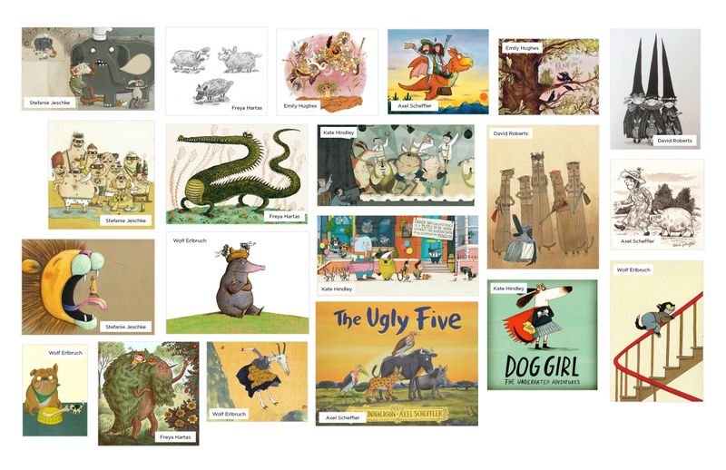
@StudioLooong Nice! I don't think I have much more to add to your analysis, but I do notice that there seem to be a lot more animal characters in your dream portfolio while in your own work there is more of a focus on human characters!
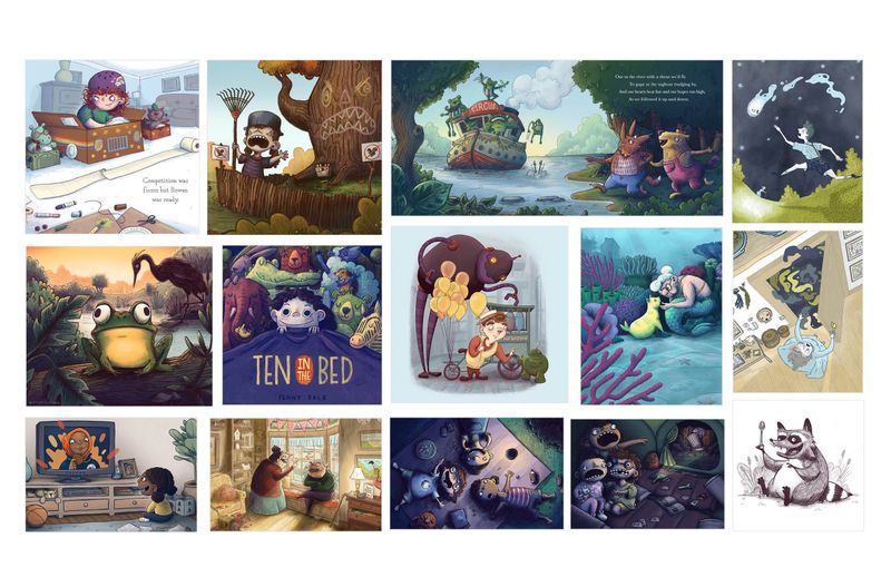
I really like your 'Ten in the Bed' piece. I think the linework is great and feels energetic and close to the vibe I get from your dream portfolio") Your style of colouring feels more rendered and darker than your dream portfolio, it would be interesting to see you maybe try some watercolour style brushes under your line art. I think this would help give the traditional and loose feel that Emily Hughes, Freya Hartas etc have in their work.
Your style of colouring feels more rendered and darker than your dream portfolio, it would be interesting to see you maybe try some watercolour style brushes under your line art. I think this would help give the traditional and loose feel that Emily Hughes, Freya Hartas etc have in their work. -
@nkdrawings very nice selection of images. Maybe check out Daniel Miyares, his sketchy inks and watercolours are along these lines and beautiful. Though his published illustrations seem to be a lot tighter and orderly:
https://instagram.com/danielmiyaresdoodles?igshid=x6iqa62frekz
Also, I've totally painted that clock! (No elf though)

-
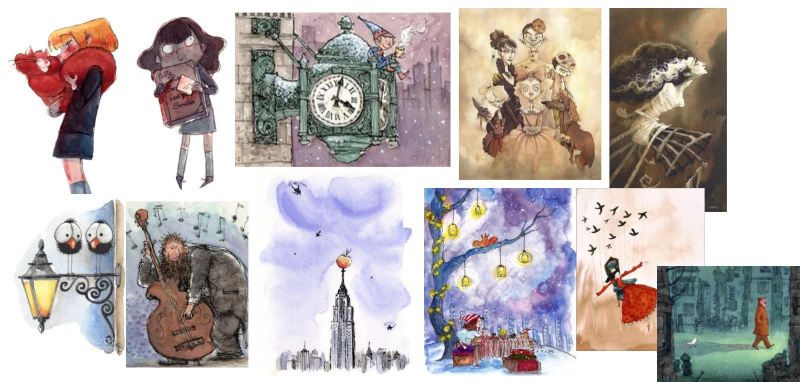
Third instalment but there are definitely works in this one I absolutely love and I will work on those studies first. Some in smaller sections and others in full. Not a full 20 and not entirely children based like the woodsman at the bottom right but I have always loved this work since I first saw it (how the unknown artist shifted from blues very subtly) beautiful.
I also tried to focus on works with a story and collect a variety (more depth, grey scale, people, animals, buildings, interiors etc.) And focus reminder was I could make these in other mediums (specifically away from staring intently into a screen and getting a headache).
Top left to bottom right: Ciaran Duffy, Danelia Volpari, Benji Davies (love his videos for his books), Alex Smith, Unknown, Unknown, Gianluca Garofalo, Unknown, Matt Dixon (his robots melt me), Unknown, John Klassen, Franswazz (only work on hers I liked), Unknown.Sorry for all the unknowns.
Though I started this 3rd process refreshed I have come to the conclusion that it's so tiring and I don't want to do it again anytime soon.Thanks,
-
@nkdrawings I love these! These are all very similar to the pieces from my dream portfolio, specifically the inky outlines and blotchy watercolour, my goal is to replicate as closely as possible digitally
-
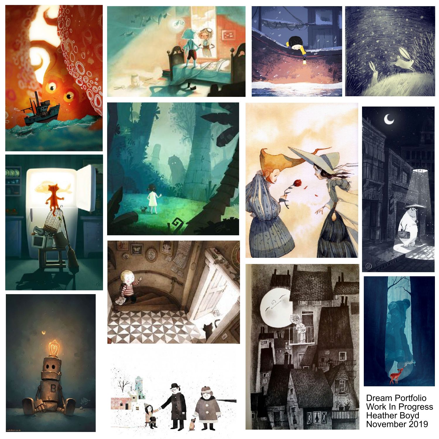
Hey everyone, I am inspired by all of you posting your dream portfolio. So I have been working hard to come up with mine. I had to cut back on many images to be able to fit here at a decent size. I noticed that I tend to like illustrations with a strong sense of linework and images that are dreamy or have some element of magical, dreaminess in it. I also found that I like the lighting in the images. I tend to like colors (not necessarily limited colors). I am not sure if that is a trend these days to have limited color palettes. I also noticed that some of the artist's work I like have won the Caldecott medals(!)
I am not sure what my style is but I tend to draw more realistic (not stylized). I am not sure if that is negative. Maybe it is. Can you artists expand on my inferences or add more to it? Thank you so much.
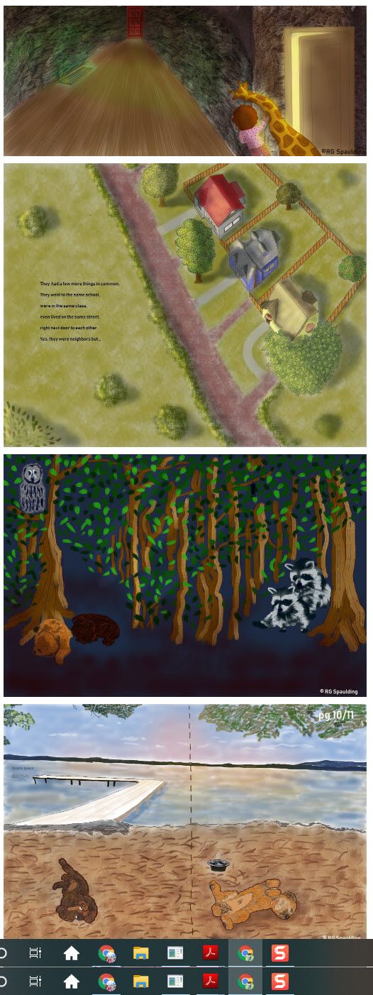
Here is my dream portfolio.
Here is my current portfolio.
-
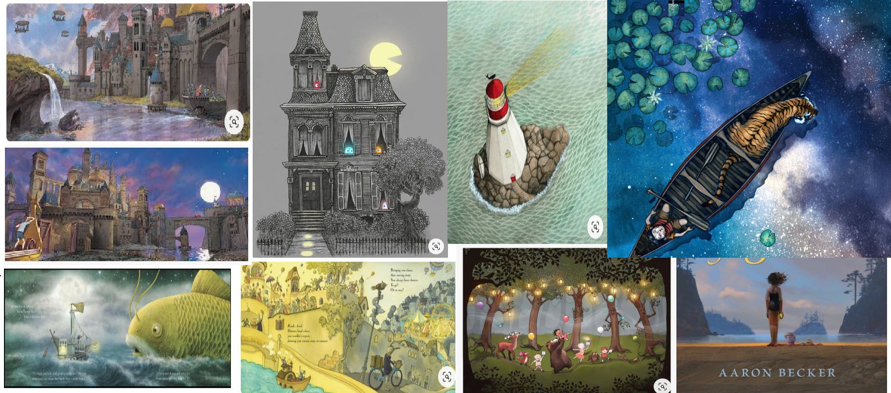
@RG-Spaulding I love the same kind of dreamy, magical images! Do you know the artist that did the piece with the boat and tiger?
-
@anya-macleod That was done by John Rocco (book title is 'Camp Tiger').
The artist's name are as follows.
Top line: Aaron Becker, Don't know the artist of the house with ghosts, Sophie Blackall, John Rocco.
Next line: Aaron Becker
Bottom line: Fan Brothers, Eliza Wheeler, Dow Phumiruk, Aaron BeckerI also love art by David Weisner and Brian Floca. I guess I tend to lean towards magical realism if there is such a thing.
-
I'm really liking this thread, as I've also watched Lee's course, and started the assignments.
Is this thread still alive? Did someone make a new one?
Did the pandemic stop everybody from moving on?
What happened?Anyway, my dream portfolio is loaded with fantasy artists/illustrators like, Donato Giancola, James Gurney, Paul Bonner, Ralph Horsley, Jesper Ejsing, and moving closer to children's art with, Scott Gustafson, Jim Madsen, Cory Loftis, Peter de Seve, and one of my long time favourites Jack Davis. Can't forget Frank Frazetta, and Mort Drucker.
Piecing it together, and wondering if this is a good place to put it.
-
@Meta I am still discovering my style and this class is defiantly a must for me. I would love to see what you come up with. I will be taking the class after the basic classes I am enrolled in right now.
-
@jsnzart Sure, we can keep the thread alive! I am a big fan of keeping threads alive, especially ones that lots of people participate in, because it means we can find a lot of info in one place. I say this even though, when I do a WIP thread, I often find that I get more response if I start over
 I think it has a lot to do with what people see at the top of their feed, because some people have their feeds set to new threads only. I don't. I just scroll through the first couple of pages of active threads.
I also think this exercise is well-worth doing repeatedly, as our styles develop. Right now I'm thinking of doing one just for landscapes, because I did one landscape I really liked, but the style felt sort of half-baked and didn't quite go with my figures.
So, go ahead and post! I'll comment on it and I bet others will too!
-
@LauraA Thanks. I agree, lots of good reads full of good info.
-