Slowvember Comp Feedback
-
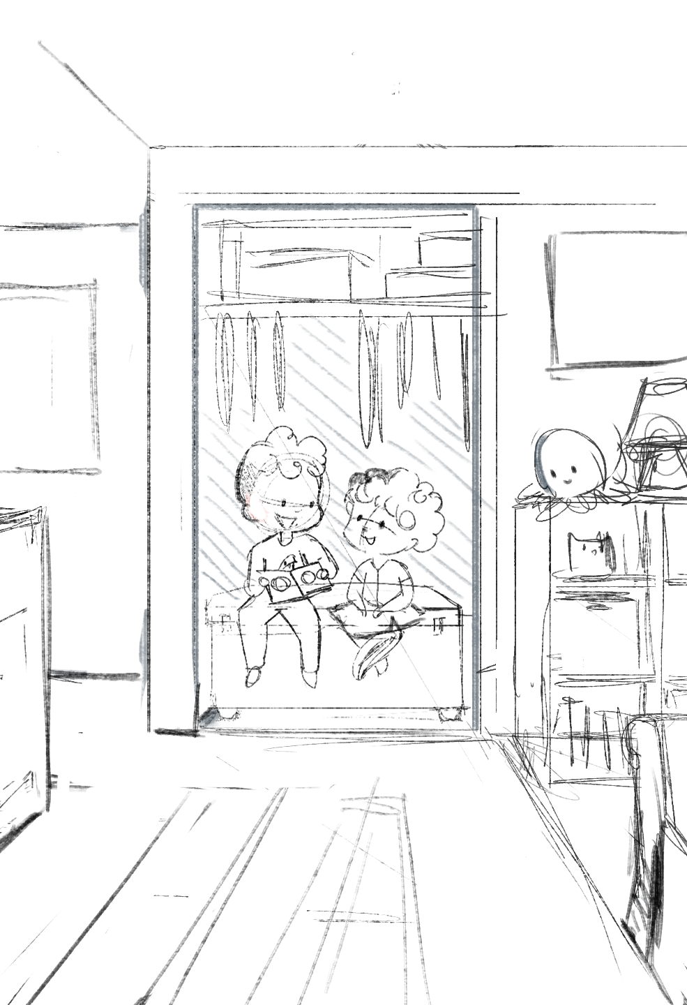
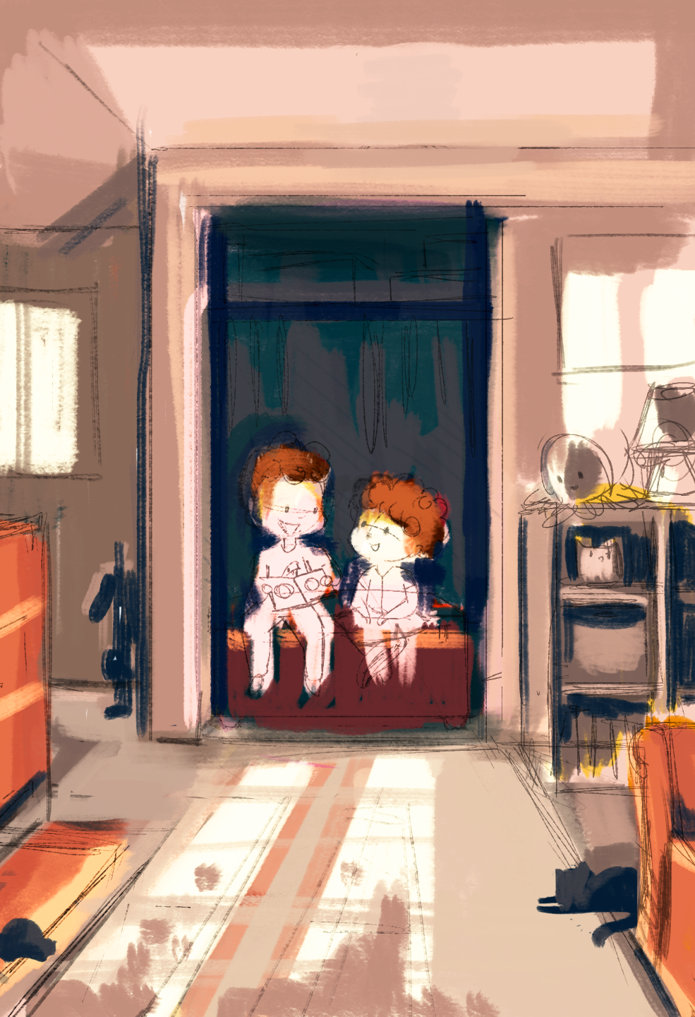
Hello! I am working on slowvember and I settled on a comp and a sketch that I like. I would love any feedback as to if this is working or not, or if there are any changes I should be making to composition/color. I'd also like to know what the story you see here is (to make sure it's reading correctly)
Thank you

Check out my art and tutorials :)
Instagram: www.instagram.com/carliannecreates/
Youtube:
https://youtube.com/c/CarlianneCreatesShop: www.carliannecreates.com
-
It's looking lovely so far. I really like the comp and the color. I see it as a big brother reading a book to his little sister in a closet- with light from the window giving them some dramatic lighting. I'd just make sure you sell us on the window lighting- it's still a bit unclear how it fall on the children at this point
Website: www.tessawrathall.com
Instagram: www.instagram.com/tessawrathall_art/
-
I agree with @TessaW I'd also be inclined to zoom in a bit on them and lose including the ceiling...seems like the space around them isn't as important as what they are doing specifically in the closet. Interested to see your next step!
-
@carlianne I'm in love with the colours! I agree with @KaraDaniel that zooming in could solve some problems. One of the being that those kids are, essentially dead centre of the page.
My instincts would be to either nix everything around the closet, and crop in on only the closet space (and have the kids occupy the lower third of the page with the closet junk occupying the top third) OR pan the camera up moving the kids to the lower third again, keeping a little bit of the window light, and make the closet and ceiling cartoonishly high to keep the space above the kids interesting.
Once again, I'm in love with those colour and values
")
-
@Braden-Hallett said in Slowvember Comp Feedback:
Once again, I'm in love with those c
Thank you so much for your helpful feedback!
-