Color Critique
-
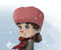
Really cool concept of the girl riding the wolf. I like the colors you have chosen thus far. Her hat does blend into the background a bit though. Also they don't look like they are looking at the same thing but that may be intentional, idk the story behind it. The first thing I did notice after the beautiful sky was the wolfs missing 4th leg. Looking forward to seeing the final piece!
-
Thanks for the comments so far.
Hmm I wonder if I'm just being too picky about the styling from the first image. I just felt like the contrast on her face/hair didn't work as well and it was too bold and didn't look right. I'll also do the grayscale check. Now that you mention it I think I saw a YouTube video where he said something like that.
Yeah the 4th leg fell behind the main leg in the foreground when I had sketched it so it never made past that.
I'll try and split the difference between the two colors and tweak maybe the hat a bit. If the leg is noticeable that it should be there I think I just need to resketch that and incorporate it otherwise that might be the focus lol.
-
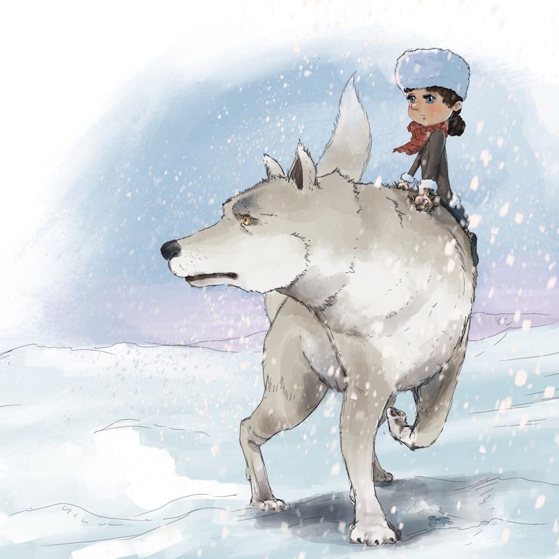
Does this look better than the previous version? I basically split the difference between the two contrasting colors on the face, and I backed down some of the extra stuff on the wolf. I also added the back paw, and I adjusted her head a little so that they're looking more in the same direction based .
Originally I was kind of thinking that the wolf would notice stuff way faster, so she'd be trying to peer ahead to see what her wolf is seeing, but I think it makes more sense to just have them looking together.
I backed the mountains off as well. It was weird - those had a pretty low saturation level but they definitely drew the eye as it was contrasting.
-
I'm not an expert on lighting but I think the shadow color of the snow in the environment and the cast shadow under the wolf could be different versions of the same color. It looks like you're using blue shadows and grey shadows. I posted 2 different types of snow lighting examples, one gray and one blue, just so you can see what I mean.
-
@Zachary-Drenski thanks again for these and what I ended up doing was going more towards that first one that was bluish.
So I basically reworked this completely in Photoshop rather than redoing it in ProCreate. There were some things I wasn't happy with so I basically just brought the linework layer only into PS and then took out the linework for the environment which felt to me like it was taking away.
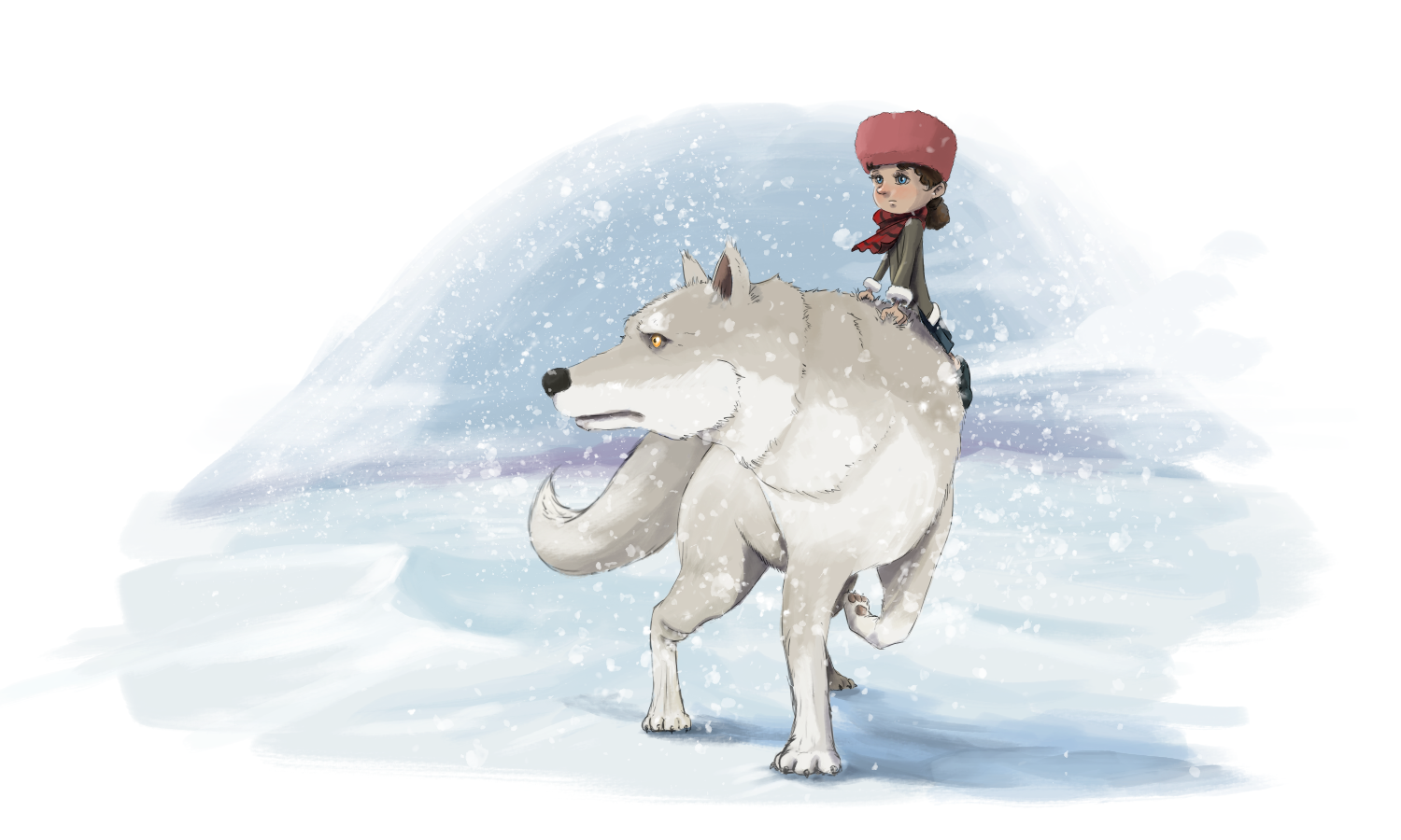
Comparatively, how does this feel??
-
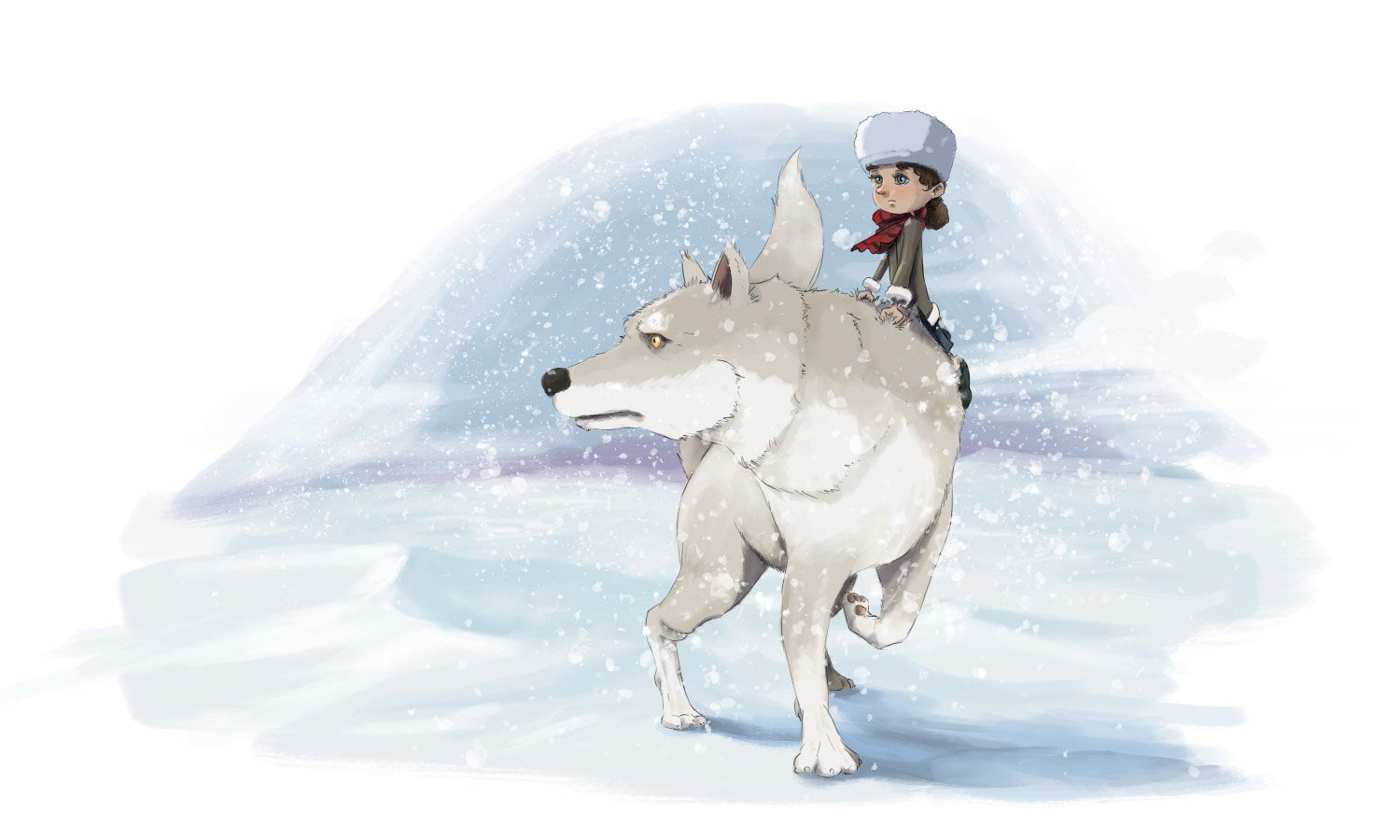
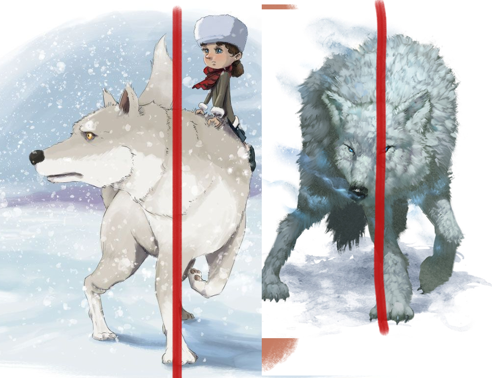
My gut reaction is that the blue color on the girl's hat is blending too much with the blue sky, but I love the scene overall. I want to see more of this! I thought your colors on the girl were great. But the wolf's tail is distracting in the position upright near the girl's body, maybe lower the tail to the left of the wolf instead if you end up liking that?
-
I think that the shadow color under the wolf is much improved. A couple of suggestions-
-
If it doesn't mess with the story, make the girl's hat white, much in the same way the cuff's of her coat are. This will help it contrast with the background, and visually balance all the white of the wolf.
-
Adjust the front leg of the wolf that's contacting the ground so it's at a diagonal and supporting it's weight in a more convincing and dynamic manner. Right now the center of gravity feels very unstable.
Great job overall!
-
-
@TessaW @Amanda-Bancroft thx for the feedback! I tried a burgandy-ish color. What do you think? I had tried white in the previous iteration but it was blending in also quite a bit. I'll give it another go on a different layer to see how that looks also.
-
@jdubz It's hard to say how it balances without seeing the whole thing, but it definitely stands out more and it looks really nice with her skin tone.
-
Do you mean swing the leg out this direction?
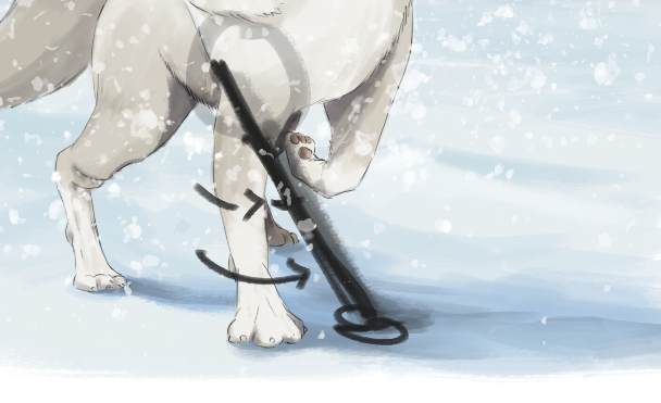
Edit - oh wait, I think you mean more locked downward, right?
-
@jdubz Oh yeah that looks fantastic and matches the scarf as though she intentionally picked them out to wear together.
-
Yeah, pretty much like that. I'm not too familiar with wolf anatomy, but right now it doesn't look quite supported or natural for the pose and movement. The example image I've posted is a slightly different pose, but you can kind of see how it's supported a bit by bringing some of the leg underneath it at a slant.
-
How does this look? I adjusted both the left legs to tilt inward slightly. More so on the front one.
Also I have the new hat color and the tail I brought to the left. I took it to the right but it almost looked like the girl had a tail so I couldn't find a way to make that work.
-
@jdubz personally think this looks better than the first one, however, the value of the boy's hat is giving it gravity, so his head looks a bit heavy.
How about try use a much lighter and still warm value for his hat, and change the color of his coat (between light warm yellow-ocher and light orange ) so that the who picture is balanced color-wise, and it will also give people an immediate point of focus. I would also change the scarf to a more saturated red, but that will totally depends on the mood of this story and age group.
something like this would work well for little kids.
https://www.schemecolor.com/orange-and-blue-color-combination.php -
@jdubz this is looking great. The change of the cast shadow color improves the piece a lot for me. I also love how you gave some shape and definition to the snowy landscape.
-
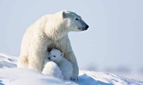
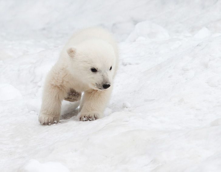
Hey @jdubz I think you can go a lot deeper in your values on the wolf. If you look at the polar bears, even though they are white, there is actually very little white on them. It's mostly grey and brown and even charcoal in spots. I drew a lot of white mice in Inktober and I several times had shadows up to 70% grey on most of his body and added a few highlights yet it very much read "white". I think you could do the same here. The chin doesn't have any shadow and based on your lighting, it would.
-
I'm sorry if this is just me and I haven't been reading all the comments left but she looks like she's sliding off. I did agree about the colour of the hat blending too closely to the sky but I would have gone with moderately darker blue than a pink. The red scarf draws me close to her but with the addition of the pink my eye sits on her character and doesn't move to the wolf as easily (despite it being larger). The raised paw looks improved, I was concerned about it but unsure how to correct it.
-
@jdubz looking great! love the progress. I like the color of her hat and now I feel like they are both looking at the same point on the horizon. Great adjustments!
-
Thanks for all the continuing comments all. I just finding some more time to work on this with all the other stuff going on
")
@Hui-Li I'm doing a color test with the orange/ochre color but I don't know if I like that particular combination. I may not be the most objective though, so if I'm just being color blind to it and it looks better I'm all ears
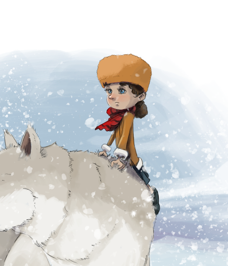
@chrisaakins I'm going to mess with the wolf today and see what I can do with her. I agree there needs to be some more shadow work for sure.
@Heather-Boyd I'm hoping by working on the wolf that should solve the problem. With her falling off, she kind of is - I think I need to work on indicating the action because the her other leg would be swung on the other side of the wolf, but think of it as if the wolf was trotting along and then suddenly saw something and she swung her body immediately up to see what was happening - so the girl is clutching her fur to keep steady. I think I need to add some kicked up snow or something to help visualize the action sequence.
-
@jdubz maybe you could bring more expression of gasp of the suddenness of the event in her face -she looks quite calm, to match or to add to the expression on your wolf which is working strong for your story. That way if your two characters colours are not as similar their expressions would be.