Society of Visual Storytelling

    SVSLearn Forums

    • Register
    • Login
    • Search
    • Recent
    • Tags
    • Popular
    • Users
    • Groups
    • Search

    Slowvember Work

    Slowvember
    8
    17
    1665
    Loading More Posts
    • Oldest to Newest
    • Newest to Oldest
    • Most Votes
    Reply
    • Reply as topic
    Log in to reply
    This topic has been deleted. Only users with topic management privileges can see it.
    • Whitney Simms
      Whitney Simms SVS OG @Chip Valecek last edited by

      @Chip-Valecek I like this guy. The texture and molding look nice. I like the direction you’re going. Keep it up!

      1 Reply Last reply Reply Quote 1
      • Elena Marengoni
        Elena Marengoni last edited by

        I like your character, he's really cute and it makes me want to see more of the story. Just a couple tiny tweaks I would make: I would enhance the gesture of the hand (maybe 5 fingers or more variation in the length of the fingers can make it more explicit that he's trying to grab the little animal like a ball) and I would perhaps sketch out the volumes of the trunk/branch a little bit more, just to make shapes look more solid. Definitely not a must, but I like the character so much that I would love to see more of his equipment or other bugs he has captured! πŸ™‚ Keep it up, great work! I also love your latest style studies!

        Instagram: https://www.instagram.com/elena.marengoni/

        1 Reply Last reply Reply Quote 1
        • Chip Valecek
          Chip Valecek SVS Team SVS OG last edited by

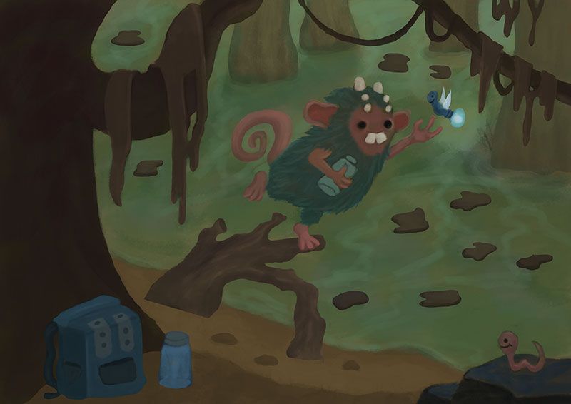
          I named him Gary. I find when I name my characters, I have more fun painting them and bringing them to life. Anyway here is some more process.

          Rough values:

          values01.jpg

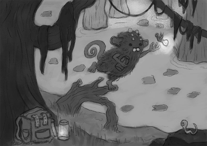
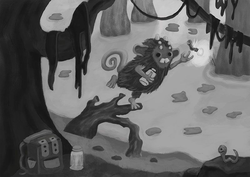
          Cleaned up values before I start throwing color at it:

          values02.jpg


          https://www.instagram.com/chipvalecek/
          https://www.facebook.com/cvalecek
          http://www.cshellmedia.com/

          Chip Valecek 1 Reply Last reply Reply Quote 2
          • Chip Valecek
            Chip Valecek SVS Team SVS OG @Chip Valecek last edited by

            Put some color ideas together. My first thought was night and a lighting bug:

            color01.jpg

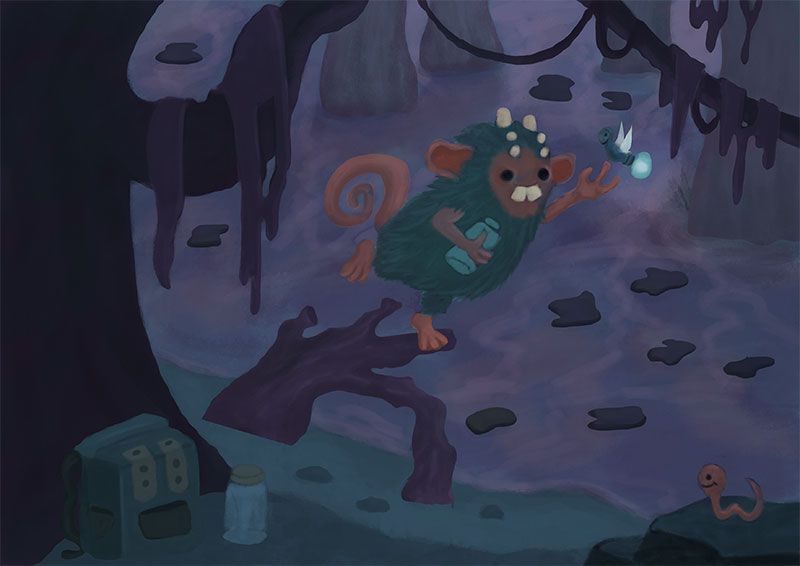
            Then I thought let me change the color of Gary:

            color02.jpg

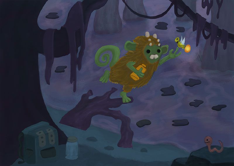
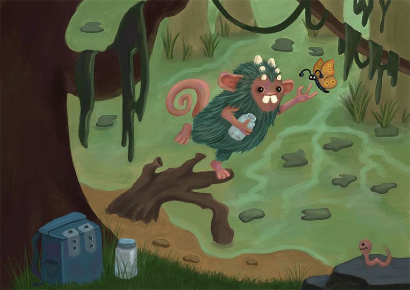
            Then I thought, what if its day:

            color03.jpg

            Day is the winner. I really wanted to do some color rim lighting from the lighting bug, but now I will prob make it a butterfly and use some dapple lighting through out the piece. Onto painting now.


            https://www.instagram.com/chipvalecek/
            https://www.facebook.com/cvalecek
            http://www.cshellmedia.com/

            1 Reply Last reply Reply Quote 3
            • KaraDaniel
              KaraDaniel last edited by

              Cute! I love the creature alien. I like the coloring on the bottom image best. Gives that swampy vibe. The lightning bug is cool maybe it's dusk he gives a nice extra bit of lighting that could be dramatic. The only thing I see a little off is the roots he's standing on..where its connects to the ground is a straight line across and therefore feels quite flat. I assume its nestled in the ground, it might need some rounding at the base. Overall I think its a cool idea and i love the little worm too πŸ™‚

              instagram.com/sha_kara
              karadaniel.net

              Chip Valecek 1 Reply Last reply Reply Quote 1
              • Chip Valecek
                Chip Valecek SVS Team SVS OG @KaraDaniel last edited by

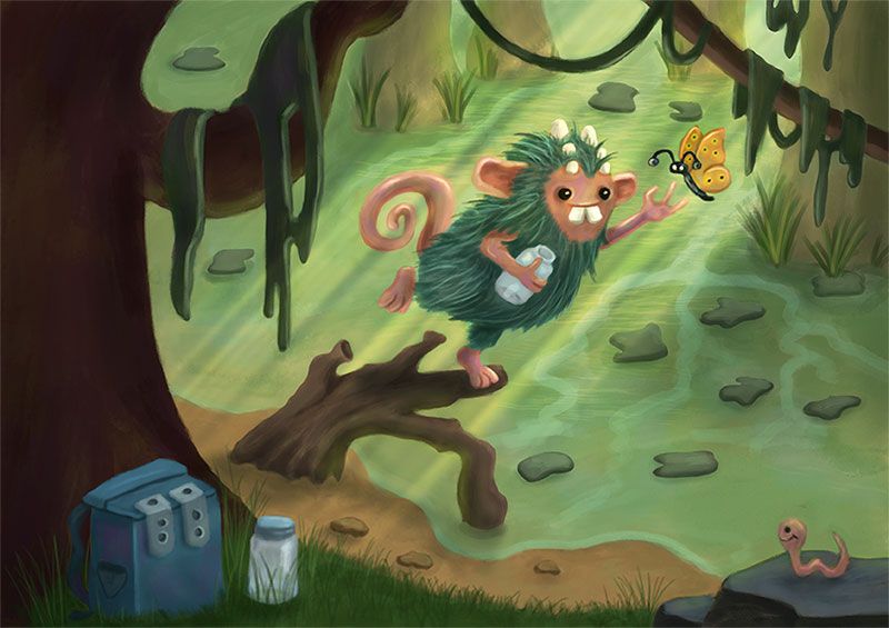
                @KaraDaniel Yes those hard edges will get lost when I actual start to paint. Here is an updated version. I need to clean up some areas and then I will start on the lighting and shadows.

                color04.jpg


                https://www.instagram.com/chipvalecek/
                https://www.facebook.com/cvalecek
                http://www.cshellmedia.com/

                Heather Boyd Z 2 Replies Last reply Reply Quote 7
                • KaraDaniel
                  KaraDaniel last edited by

                  gotcha, yeah that look awesome already! πŸ™‚

                  instagram.com/sha_kara
                  karadaniel.net

                  1 Reply Last reply Reply Quote 1
                  • Heather Boyd
                    Heather Boyd @Chip Valecek last edited by

                    @Chip-Valecek this colour palette is best of the ones shared.

                    Instagram: www.instagram.com/heatherboyd.illustration/
                    Website: https://heatherboydillustration.ca
                    Shop: https://www.inprnt.com/search/products?q=HeatherBoydIllustration
                    Ko-Fi: https://ko-fi.com/heatherboydillustration

                    Be blessed,

                    1 Reply Last reply Reply Quote 1
                    • LauraA
                      LauraA SVS OG last edited by

                      I agree. That's a nice color palette!

                      Instagram: https://www.instagram.com/lauraintorino/
                      http://lauraaldersonart.com/

                      1 Reply Last reply Reply Quote 1
                      • Z
                        ZeeZeeMonster @Chip Valecek last edited by

                        @Chip-Valecek I agree with everyone about that last coloe palette. It really helps draw the attention to the central character

                        1 Reply Last reply Reply Quote 1
                        • TessaW
                          TessaW last edited by

                          I can see you sneaking in some color variation already, where I think you normally wouldn't, right? The eyes are also a different choice from your usual. It's interesting to see you incorporating changes.

                          Website: www.tessawrathall.com

                          Instagram: www.instagram.com/tessawrathall_art/

                          1 Reply Last reply Reply Quote 1
                          • Chip Valecek
                            Chip Valecek SVS Team SVS OG last edited by

                            Thanks everyone! @TessaW yes I am trying to get different color variations of the same tone but different color. Also with the new process I am trying some of the colors are naturally mixed when I am adding different tones. After I try to grab that tone and brush a little extra in. As for the eyes, yes trying different things. Right now I am doing something and then say to myself lets do the opposite and see what happens lol.


                            https://www.instagram.com/chipvalecek/
                            https://www.facebook.com/cvalecek
                            http://www.cshellmedia.com/

                            1 Reply Last reply Reply Quote 0
                            • Chip Valecek
                              Chip Valecek SVS Team SVS OG last edited by

                              Here is where I am now. I might put a little guy in the jar on the hill front. Not sure yet. Any other things anyone sees that might need to be tweaked?

                              final.jpg


                              https://www.instagram.com/chipvalecek/
                              https://www.facebook.com/cvalecek
                              http://www.cshellmedia.com/

                              1 Reply Last reply Reply Quote 4
                              • TessaW
                                TessaW last edited by

                                I'm not sure how close to finished you are, but I think more work could be done with edges and tweaking value contrasts. When I look at Matt Dixon as a model, he tends to soften edges, and lessens the contrast of elements going into the background. I think you could follow suit and soften the edges of trees and rocks, and lessen the contrast of value in the grass as you go toward the background. He also does this within the figure itself, generally being more contrasted in value and edges toward the focal point of the figure and softening edges and contrast in certain areas of a figure.

                                Something I've learned lately from a schoolism class, is that you can often really simplify detail in areas as long as you keep the silhouettes intact and it will keep the piece from being too busy visually. So for example, you can really simplify the detail in the grass, but if you keep the silhouette of the grass intact, it will still be convincing. Similarly, you can simplify the fur in the non focal point area, and just keep the silhouette of the fur intact and it will still read nicely. If you pop in bigger contrasts between light and shadow around the upper portion of the creature, it will help us have a focal point within the figure itself.

                                Chip-2.png

                                Website: www.tessawrathall.com

                                Instagram: www.instagram.com/tessawrathall_art/

                                Chip Valecek 1 Reply Last reply Reply Quote 4
                                • Chip Valecek
                                  Chip Valecek SVS Team SVS OG @TessaW last edited by

                                  @TessaW thanks for the great feedback, it was to late when i saw it. But all things I need to work on. I have a real hard time not trying to put detail all over the place. But I am going to keep on trying.


                                  https://www.instagram.com/chipvalecek/
                                  https://www.facebook.com/cvalecek
                                  http://www.cshellmedia.com/

                                  1 Reply Last reply Reply Quote 0
                                  • First post
                                    Last post