Feedback on style
-
Hey guys,
So far I've seen a few of the SVS courses. I haven't looked at Jake's "drawing comics" yet (I'm saving this until I've practised some more). I'm a bit worried my style doesn't fit with some of the key advice being offered and wondering if I should be concerned.
For example, I really get a kick out of using flat colours and fairly distinct black line work for foreground elements. But this doesn't seem to fit with most of the critiques I've seen so far where there's a lot of discussion on building up value, using colour transitions, avoiding dark colours and mixing colours on canvas. I don't tend to do these things all that much as I do most of my work with vector tools.
I want to keep doing what I enjoy but my goal is also to build an audience. Will my style contradict this? Comments most welcome, I've included 2 images as an example.
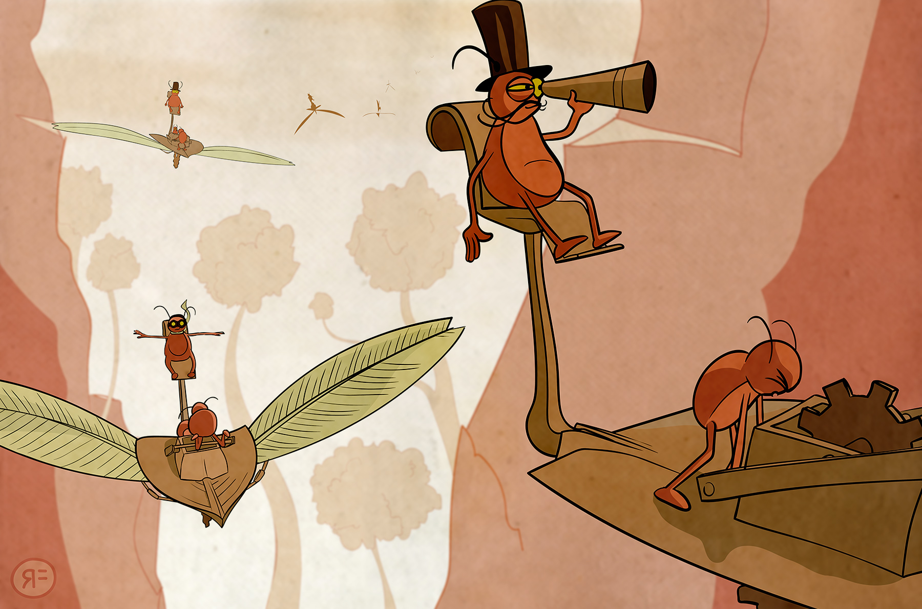
On warm spring currents the Limpits set off aboard feathered flying machines
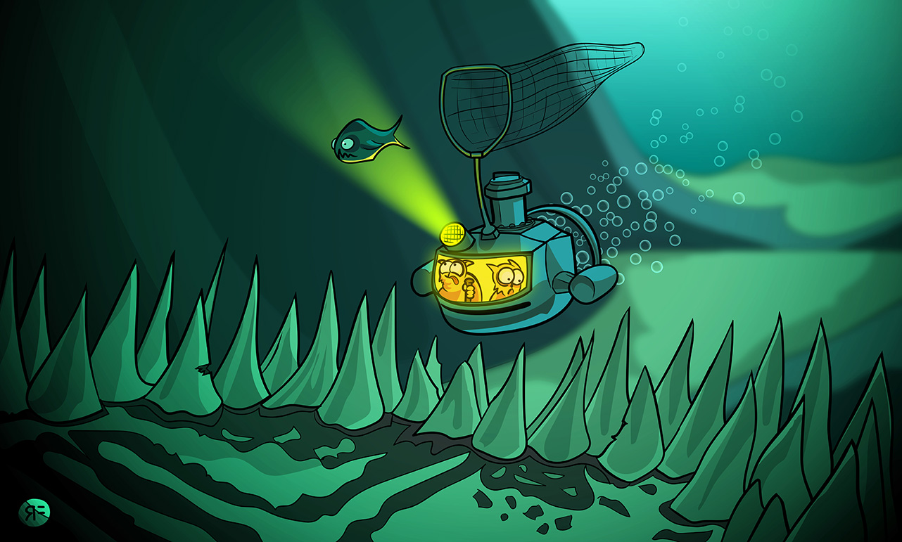
The Sea Cats chase dinner into a dark cave under the sea
-
@Rowan-Ferguson Hi Rowan, I quite like your first one because of the texture you've got in the background to pair nicely with the vector elements. The second one is a bit too digital looking IMHO which makes it look more 'generic' since there isn't as much unique about it from other digital artists out there. I think if you add in some of that nice texture feel into your second one it would give it more charm
") You've got great colour harmony in both and they're strong compositionally too btw Love the top hat on the lookout bug!
You've got great colour harmony in both and they're strong compositionally too btw Love the top hat on the lookout bug!That said - I think you should stay true to your style. Just because classes/critiques talk about a more traditional approach to art, doesn't mean you should conform. I don't know if you're going a comics direction or children's book - but I think either can work with a flat style. Comics in particular are quite flat, but there's a few children's books too that have done really well with a flat style that are just gorgeous I think: check out Grandad's Island or Mr Tiger Goes Wild
-
Wow I love your theme. You style is consistent fun and readable. I would not change a thing.
-
@Rowan-Ferguson I think the first one has some nice texture. really nice style.
I think put some texture on the second and thats also a winner. they both look like great pieces.
-
I agree about adding a bit of texture too on the second piece...it'll add a bit of depth and more interest, overall great style. I especially love the top one.
-
Great feedback, thanks a lot.
I like mixing in subtle texture to give the piece more feeling and allow the focal elements to pop out more. Based on feedback it sounds like continuing down this path is a good idea.
Perhaps also, adding the texture also allows my art to appeal more more broadly across genres - like the sharp comic/graphic novel style but bleeding over to a softer illustrated children's book aspect? This would be nice anyway, so here's hoping
I believe it is possible to evolve slightly so you still please yourself in making the art but also appeal to an audience. Cheers again.
-
I like the first one a lot because it has consistent line work, thick and thin. The texture is nice addition to the piece however it appears to be a bit flat for me. Did you use Illustrator to apply the texture? It might be a good idea if you try in photoshop where it offers more dynamic ways of applying texture. Good luck!
-
These are lovely concepts! I really like your approach to color as well. I think the line work in the second is holding it back. It almost has a "coloring book" look to it because it's so even and deliberate. I would try to add some energy with thick and thin marks. Maybe try to ink with a dip pen. It's amazing how much energy that can add to the work!
Very nice stuff! Thanks for sharing!
-Lee
-
Lee, can you please point me to one of the courses that explains a dip pen? For the August challenge piece I'm going to experiment by knocking back some of the cleaner line work with a stipple/textured type eraser - I think this will be interesting.
I'm really glad I posted these images because the feedback has been incredibly useful. Now the faults seem so obvious where they didn't before. For example, the sea cats piece looks like a McDonald's colouring in challenge haha! This is a great thing, it means I'm growing as an artist (well, a pretend artist for now
")